Cadillac reveals the real reason behind its logo shift
Change has been baffling car fans... but there's a solid explanation.

The news of a change – however subtle – to any much-loved logo will inevitably spark reactions. Cadillac found this out when it decided to rethink the positioning of its emblem on its newest cars, baffling many fans. If the move has been bothering you, fear not, because the car manufacturer has provided a solid explanation to satisfy your curiosity.
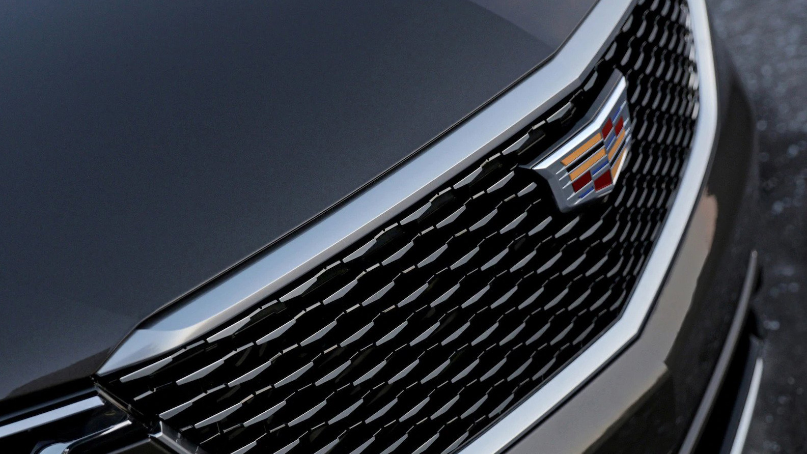
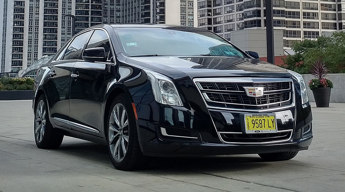
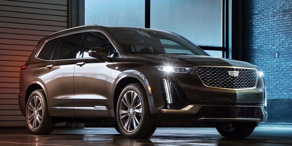
The Cadillac logo holds a special place in many car fans' hearts (to find out more about it, explore our guide to the best car logos – or see how it stacks up against the best logos of all time). Historically, it has always been positioned in the horizontal and vertical centre of the cars' grilles. However, in its newer fleet of vehicles, it's shifted towards the top of the grille.

The Cadillac Society spoke to designers at Cadillac to find out the reasoning behind the move. It all comes down to overall composition, and specifically the size of the grill and where the headlights sit on the front end of the vehicle.
The latest iteration of Cadillac's design language features headlights that sit higher up on the front end of the car – as seen for example in the XT6, pictured below. The designers explained that visually, the headlamps form a kind of "bookend" to the grille. So if these are positioned higher up on the car, a vertically centred Cadillac logo will look like it's "falling". A higher placement that lines up with the headlamps creates a more balanced look to the front end of the vehicle.

So there you have it. The Cadillac logo change isn't a statement in itself, but part of an evolving design language for the car manufacturer. Mystery solved.
[Via Cadillac Society]
Read more:
Get the Creative Bloq Newsletter
Daily design news, reviews, how-tos and more, as picked by the editors.

Thank you for reading 5 articles this month* Join now for unlimited access
Enjoy your first month for just £1 / $1 / €1
*Read 5 free articles per month without a subscription

Join now for unlimited access
Try first month for just £1 / $1 / €1

Ruth spent a couple of years as Deputy Editor of Creative Bloq, and has also either worked on or written for almost all of the site's former and current design print titles, from Computer Arts to ImagineFX. She now spends her days reviewing small appliances as the Homes Editor at TechRadar, but still occasionally writes about design on a freelance basis in her spare time.
