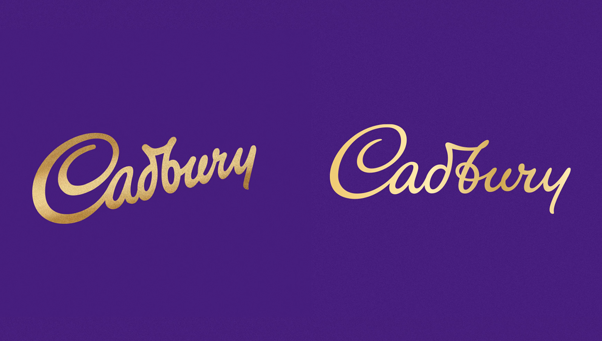
We love the new Cadbury logo – but is there a problem?
We can't unsee this one tiny detail.
Rumours began circulating a few weeks back that Cadbury was about to update its logo to a new design, based more closely on the signature of its founder. Lo and behold, the rumours were true – Bulletproof has been revealed as the agency behind the new logo, as well as new, bolder packaging for the Dairy Milk bar.
The new logo is a thinner affair, with a more cursive quality emphasising its handwritten nature (especially with the newly looped 'b'). It isn't a huge change, but we'd say that's to be expected – Cadbury has one of the most recognisable wordmarks around (a pretty essential criteria for making our best logos list). That said, Twitter users (below) have pointed out a peculiarity with the new logo, and now we just can't un-see it.

Now that we look at it, it does kind of read like 'Cadbwy.' Whether we'd have noticed that the 'r' looks like a 'w' without having it explicitly pointed out, we're not sure – it was arguably still present in the old version. That said, now that we've seen it, it's going to be weally hard not to see it. The logo is still unmistakably Cadbury's, though, and we stand by our previous assertion that the thinner wordmark looks more refined.
One potential reason for Twitter's animosity towards the new logo is that, according to the Birmingham Mail, it cost Cadbury £1 Million – hence a "but it looks the same!" pile-on. Some marketers have begun defending the cost, however, explaining (below) that there's so much more to the rebrand than a quick logo tweak (which is news to nobody in the design world). As Bulletproof's video (above) shows, there's rather a lot more going on.
A million for a logo sounds a lot... but they actually paid it for the complete global redesign of a multi-billion brand with hundreds of product variants. If you work in marketing but don’t think it’s worth paying people to do a good job on your biggest consumer touch point 🤷♂️ https://t.co/76IKWjXjcGApril 28, 2020
Bulletproof explains that it wanted to capture John Cadbury's "warmth, humanity and authenticity" with the new look. We'd say they've achieved that with the more cursive style – perhaps enough so that we're willing to look past the slight legibility issue. And hey, perhaps it even adds to the authentic, handwritten charm?
Related articles:
- KFC shows how NOT to troll your rivals with iPhone tweet
- Leaked Xbox Series X logo has zero personality
- 6 magnificently minimal logos
Get the Creative Bloq Newsletter
Daily design news, reviews, how-tos and more, as picked by the editors.

Thank you for reading 5 articles this month* Join now for unlimited access
Enjoy your first month for just £1 / $1 / €1
*Read 5 free articles per month without a subscription

Join now for unlimited access
Try first month for just £1 / $1 / €1

Daniel John is Design Editor at Creative Bloq. He reports on the worlds of design, branding and lifestyle tech, and has covered several industry events including Milan Design Week, OFFF Barcelona and Adobe Max in Los Angeles.
