Burger King rebrand is a sizzling masterclass in flat design
The overhaul is deliciously retro.

Burger King has embarked on a major rebrand across all elements of its visual branding – and it's a masterclass in how to deliver a design-first makeover for the digital age. As with many redesigns of late, BK has joined the flat design party, but unlike some other brands, has pulled it off in a celebratory, personality filled way that we just love.
With new, bold elements focused on replicating the shapes of BK's menu items, the vibe is deliciously retro. It includes a swirly new typeface, which, along with the custom colour palette, evokes 1970's psychedelia, and a much-improved logo based on a combination of the original 1969 iteration (a contender for the best logos ever) and the most recent 1999 version.
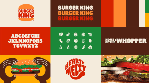
The rebrand by agency Jones Knowles Ritchie is a major overhaul, with no stone left unturned . There's new packaging, menu design, merchandise, decor, social media and, well, everything really.

The new logo (complete with a genius monogram iteration, see it above) feels familiar because it is so similar to the 1969 original. The Burger King name is once again simply sandwiched between the two halves of the burger bun, with the blue swish nowhere to be seen. But it feels fresh, too, and that's mostly down to the juicy new typeface, which is as plump and squidgy as you want your burger to be.
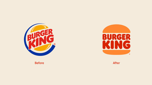
This is exactly what Burger King wanted to achieve according to Restaurant Brands International Head of Design Raphael Abreu, who said in a statement that "we wanted to use design to get people to crave our food; its flame-grilling perfection and above all, its taste".
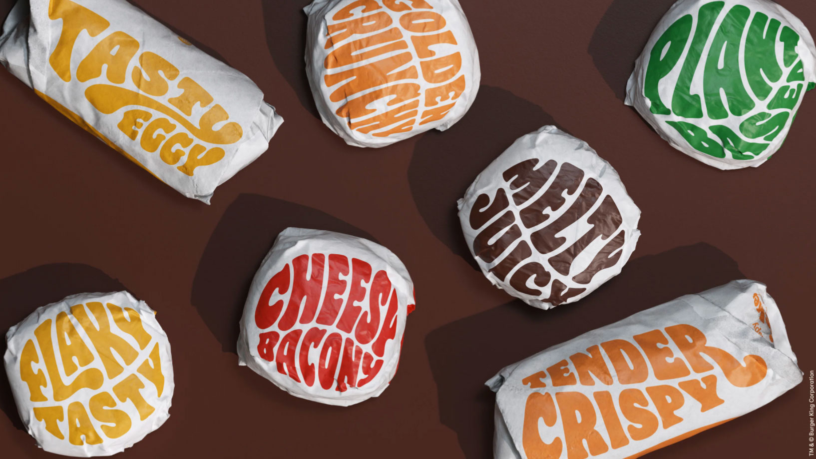
The typeface, called 'Flame' (see it above in situ on burger packaging), is inspired by the shape of the food – "rounded, bold, yummy" and, according to Abreu is a font that "makes people want to take a bite out of it". We wholeheartedly agree.
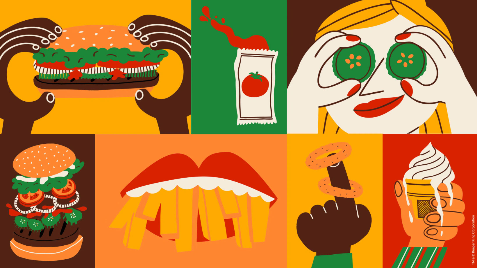
'Firey Red', 'Flamin' Orange and and BBQ Brown' feature in the bold colour palette, which is designed to evoke fun and freshness – shifting the perception of fast food from inauthentic and bland to vibrant and sizzling. And the illustrations (see above) aim to do the same, depicting people having fun with their food, as they hula hoop onion rings around their fingers, turn gherkins into binoculars and get covered in ice cream.
Get the Creative Bloq Newsletter
Daily design news, reviews, how-tos and more, as picked by the editors.
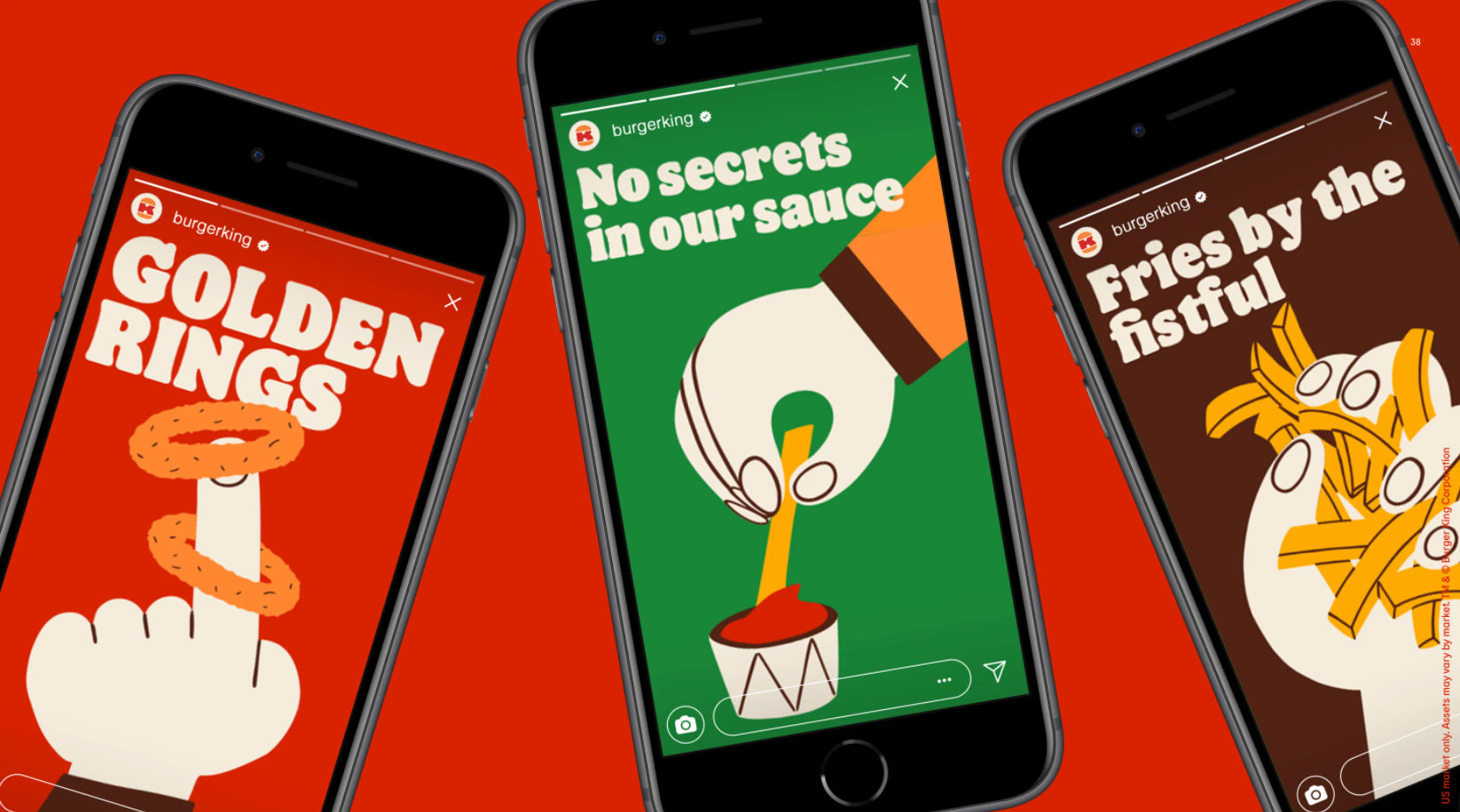
It's flat design done in a way we haven't yet seen from many big players, with the block colours and bold shapes working perfectly across digital platforms as well as physically. The design community is already welcoming this approach with open arms, with entirely positive reactions flooding social media. It feels like a collective sigh of relief after recent concerns were expressed on Twitter that 2020 ruined the art of logo design.
Design has been the first consideration here, and it's a triumph – we just hope other companies start to take note in order to reverse the issue of 'blanding' in branding. Want to read more about this? Check out our post further debating whether branding has become boring.
Read more:

Thank you for reading 5 articles this month* Join now for unlimited access
Enjoy your first month for just £1 / $1 / €1
*Read 5 free articles per month without a subscription

Join now for unlimited access
Try first month for just £1 / $1 / €1

Georgia is lucky enough to be Creative Bloq's Editor. She has been working for Creative Bloq since 2018, starting out as a freelancer writing about all things branding, design, art, tech and creativity – as well as sniffing out genuinely good deals on creative technology. Since becoming Editor, she has been managing the site and its long term strategy, helping to shape the diverse content streams CB is known for and leading the team in their own creativity.
