Burger King's new print ad is outrageously misleading (and I love it)
It's a carnivore's worst nightmare.

One of the print best ads we saw in 2020 was Burger King's infamous 'mouldy burger' campaign, which saw the company show off the Whopper's 'natural' ingredients by depicting it riddled with spores. And this latest striking campaign is in a similar vein.
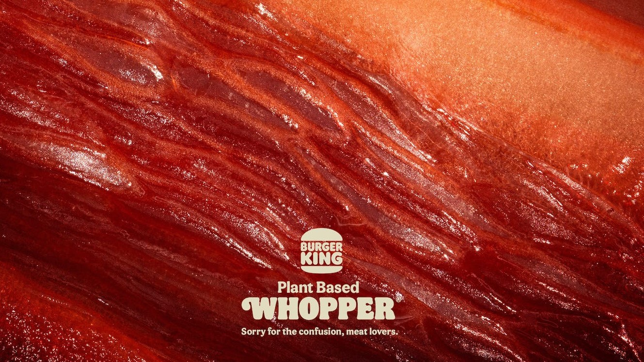
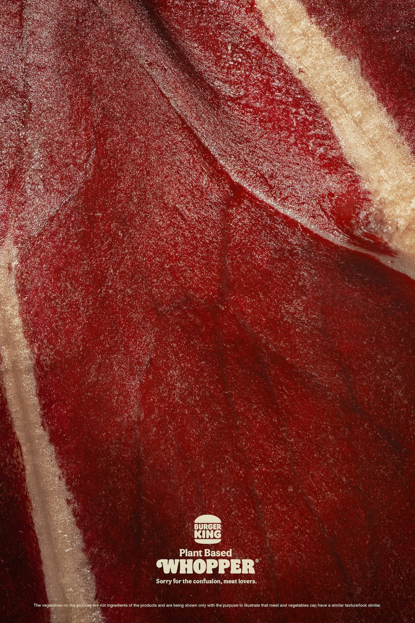
At first glance, you'd be forgiven for thinking you're staring at a macro close-up of some red meat. But no, those are peppers, beetroot and radicchio. Like all of the best print ads, this one is designed to make you double-take.

"Sorry for the confusion, meat lovers," reads the tagline – and indeed, you wouldn't know that's veg you're looking at. From the deep red colour to those thin fibres, the whole thing looks disconcertingly, well, meaty.
Which is exactly the point. "Many times, guests can’t tell the difference between the traditional Whopper and the plant-based Whopper," André Toledo, executive creative director at David Madrid, told Creative Review. "So we challenged a food photographer and a food stylist to shoot some vegetables in a way that would make them look like meat. The idea was to create ads that would make people ask themselves ‘Wait, is this meat or is this a plant?"
A post shared by BURGER KING® Deutschland (@burgerkingde)
A photo posted by on
It's certainly a clever way of drawing attention to the (supposed) similarity in taste between the traditional meat Whopper and meatless alternative. And hey, the visual comparison is much more bearable than those insufferable 'meat alternative' names ('facon', 'not-dog', that sort of thing).
This is another smart print ad from Burger King – like the company's brilliant rebrand last year, it's both bold and original. Not that the burger pedallers always get it right, who can forget last year's disastrous International Women's Day tweet? If you're inspired to create an ad of your own, take a look at our guide on how to download Photoshop.
Read more:
Get the Creative Bloq Newsletter
Daily design news, reviews, how-tos and more, as picked by the editors.

Thank you for reading 5 articles this month* Join now for unlimited access
Enjoy your first month for just £1 / $1 / €1
*Read 5 free articles per month without a subscription

Join now for unlimited access
Try first month for just £1 / $1 / €1

Daniel John is Design Editor at Creative Bloq. He reports on the worlds of design, branding and lifestyle tech, and has covered several industry events including Milan Design Week, OFFF Barcelona and Adobe Max in Los Angeles.
