People think the new Buick logo looks like, er, lots of things
Teeth? Claws? A beard trimmer?

While it might not be common here in the UK, across the pond in the US, Buick is one of the most recognisable car brands around. It looks like it might be about to reveal a brand new logo – and fans are a little baffled by the updated design.
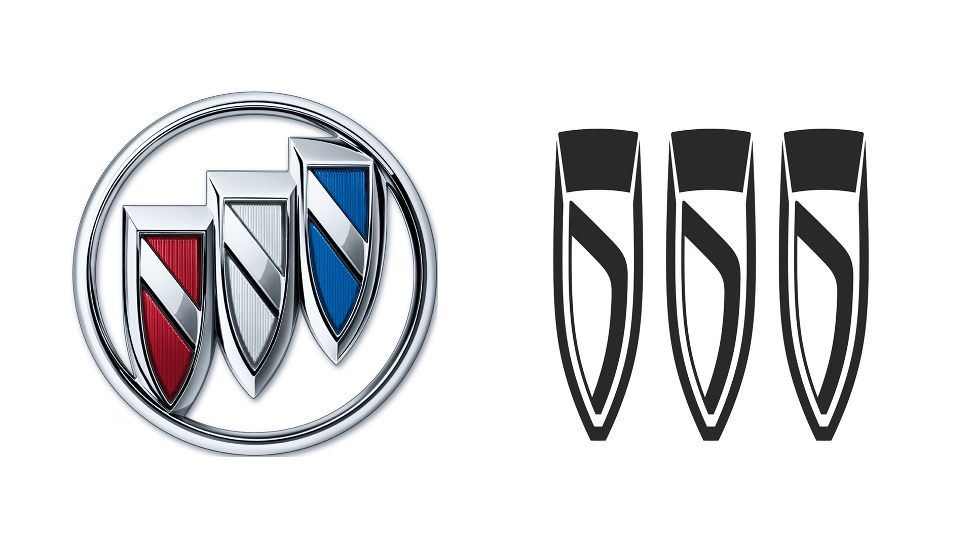
Buick owner General Motors has filed a trademark for a redesigned version of its traditional tri-shield logo. Instead of diagonally, the three shields are arranged horizontally, and at present the design appears to be monochrome, doing away with the red, white and blue hues. (Looking for inspiration? Check out our guide on how to design a logo.)

As spotted by CarBuzz, the new filing surfaced this week. Gone is the ring around the three shields, and the diagonal line through each has been replaced with a curved line. As is the trend for new car logos right now (looking at you, BMW and Nissan), Buick has gone for a minimal, flat refresh. But that new horizontal layout isn't pleasing everyone.
Article continues belowFrom vampire fangs to superhero claws, it seems plenty of car fans think the new design looks resembles, well, lots of things. "Call me when Buick changes its name to Wolverine or All Day Nail Spa," one Twitter user comments, while another adds, "Bullets? Vampire teeth? Icicles? What is it?" Indeed, as the user below notes, it seems there's no end to what people might see in the logo.
Judging by the Twitter response, this is more like a Rorschach test than a car brand logo. https://t.co/nGBOTK8sRAMarch 22, 2022
Buick itself hasn't commented on the reports, but we wouldn't be surprised to see an announcement shortly (probably not on the scale of KIA's explosive new logo reveal, mind you). And while it might resemble teeth, nails and around 40,000 other objects, Buick's isn't the only slightly confusing car logo out there – just look at these hilarious car logos drawn from memory.
Read more:
- How did I not know about this ingenious iPhone hack?
- Marvel’s 3D Morbius poster is absolute nightmare fuel
- What are NFTs? Non-fungible tokens explained
Sign up to Creative Bloq's daily newsletter, which brings you the latest news and inspiration from the worlds of art, design and technology.

Daniel John is Design Editor at Creative Bloq. He reports on the worlds of design, branding and lifestyle tech, and has covered several industry events including Milan Design Week, OFFF Barcelona and Adobe Max in Los Angeles. He has interviewed leaders and designers at brands including Apple, Microsoft and Adobe. Daniel's debut book of short stories and poems was published in 2018, and his comedy newsletter is a Substack Bestseller.
