BT reveals new logo – and it's not as bad as you think
Don't judge the telecom giant's new logo too soon.

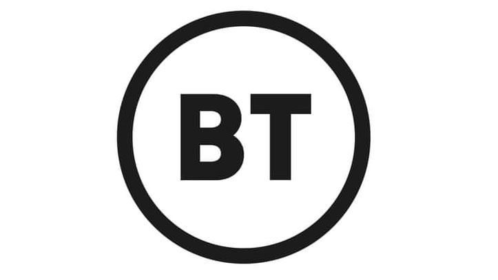
BT has trademarked its new logo, which it plans to roll out later this summer, and at first glance, we were decidedly underwhelmed. It seems we're not alone, either, as the rebrand has faced pretty widespread ridicule on Twitter.
The new logo design is similar to one the company trademarked in 2016, which was also a circle containing its name, and differs only in its use of colours. This newer version of the logo could still change, however, as BT's employees are being "consulted on the detail," according to a BT spokesperson.

London studio Red&White created the new logo, and while it is easy to call it yet another example of logos paring back until they're almost non-existent – Burberry springs to mind – it's also worth considering whether this is actually a very clever move. And when you view the logo in action – as in the video below – it starts to make a lot more sense.
Our extensive work with @bt_uk was previewed to BT colleagues across the world yesterday. Launch later this year. Full case study to come, with more to show. Very proud to be working with the best of British #BT #redandwhitestudio #corporateidentitysystems pic.twitter.com/MTF1vT0f1zMay 17, 2019
By stripping back any element of what the company actually does and focusing solely on the name, BT is demonstrating absolute confidence in its brand and in itself. And as the company has expanded to cover several remits – mobile, internet and TV – this logo cleverly leaves room for further expansion. It also allows customers to make up their own mind about what that brand means to them – although so far, the response has not been good.
There was talk of blandness...
Sorry, @bt_uk it looks like a film age rating certificate and is bland #visualidentity #rebrand #bt pic.twitter.com/eN1Xcy2Y1KMay 17, 2019
Talk of MS Word (and MS Paint, naturally)...
The new @BT logo is one of the finest uses of MS Word I have ever seen. #BT pic.twitter.com/X616B5WG29May 16, 2019
The inevitable comparison with other brands...
Get the Creative Bloq Newsletter
Daily design news, reviews, how-tos and more, as picked by the editors.
The new #BritishTelecom logo makes me thing of one thing and one thing only... #kytv #BTLogo #BT pic.twitter.com/VlnPiAmnG2May 17, 2019
And other brands also joined in on the slating, with Poundland stating it had also updated its logo... costing a whole £1 and looking "just like" BT's. It's even gone as far as to update its Twitter image with the new design.
Hey @bt_uk we've just spent a £1 updating our logo to be just like yours. #LoveYaNewLogo https://t.co/F0Rzv66Rhr pic.twitter.com/9f5VFoabzrMay 17, 2019
But of course, there were also those who took a little more balanced view.
Agreed. And a lot of minimalist logos could be drawn in MS Paint. It’s the idea (and the application) that matters - it’s like saying ‘I could have written that novel using Notepad.’May 17, 2019
It's also important to remember that logos are just one part of a wider identity, and viewing a single, black-and-white logo in isolation is unlikely to inspire at the best of times. We're intrigued to find out more behind this rebrand, and look forward to seeing more of the design in context. (Not, you understand, that we'll necessarily be switching to BT anytime soon.)
Read more:

Thank you for reading 5 articles this month* Join now for unlimited access
Enjoy your first month for just £1 / $1 / €1
*Read 5 free articles per month without a subscription

Join now for unlimited access
Try first month for just £1 / $1 / €1

Rosie Hilder is Creative Bloq's Deputy Editor. After beginning her career in journalism in Argentina – where she worked as Deputy Editor of Time Out Buenos Aires – she moved back to the UK and joined Future Plc in 2016. Since then, she's worked as Operations Editor on magazines including Computer Arts, 3D World and Paint & Draw and Mac|Life. In 2018, she joined Creative Bloq, where she now assists with the daily management of the site, including growing the site's reach, getting involved in events, such as judging the Brand Impact Awards, and helping make sure our content serves the reader as best it can.
