I'm mesmerised by the new British Land identity
Brand evolution fuses AI, nature and design with stunning results.
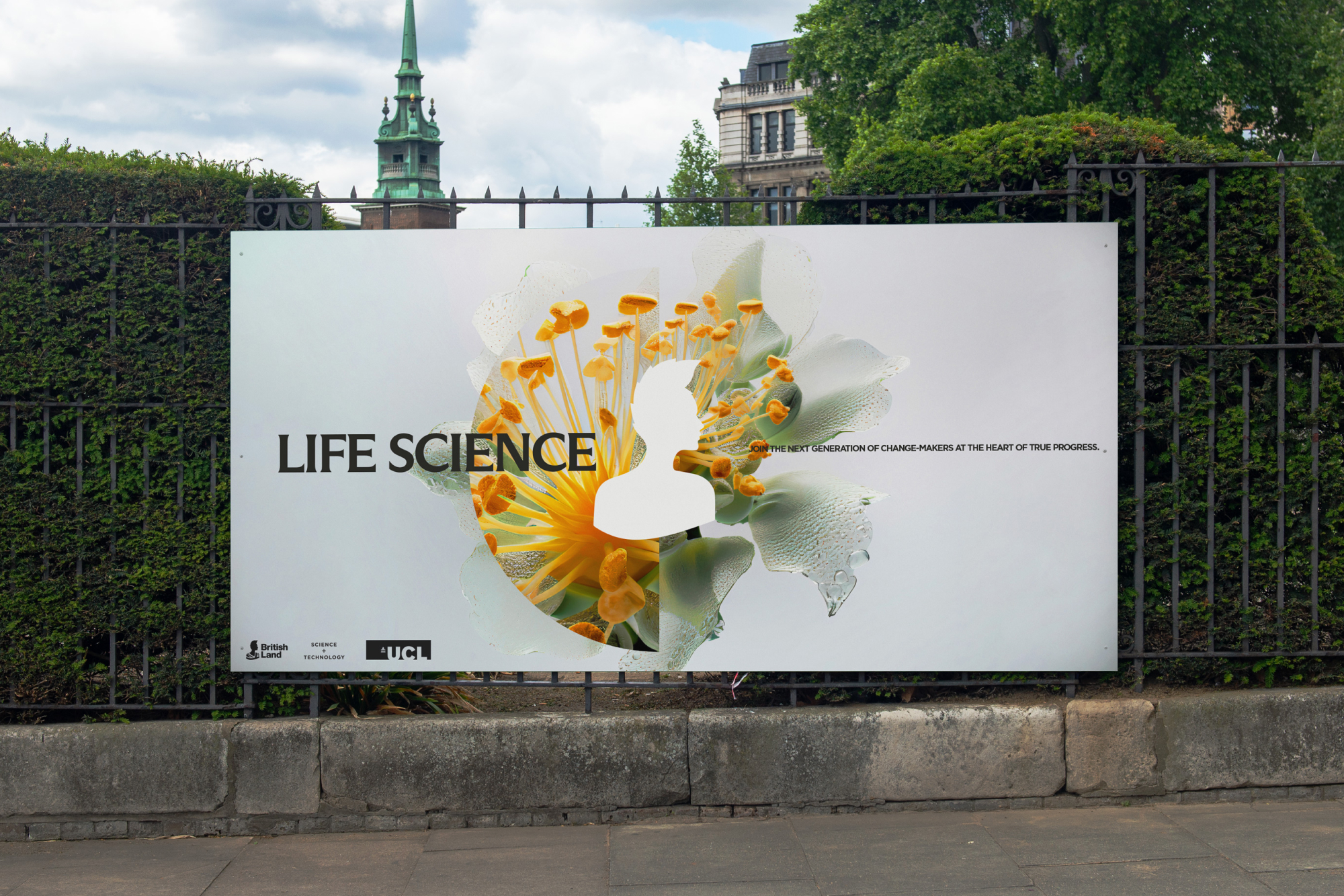
British Land creates, owns and manages some of the UK's best and most sustainable real estate and a few years ago, London agency DixonBaxi rebranded the company, reenergising it to guide the company to its next chapter, without losing site of its heritage.
Now, DixonBaxi has expanded the system for British Land's Science + Technology offering, for use in its new London spaces for innovation, growth and experimentation. The result is a strikingly beautiful system, which merges AI and real imagery to celebrate the fusion between nature and technology, and is a far cry from the sterile and cold environments often associated with the sector.
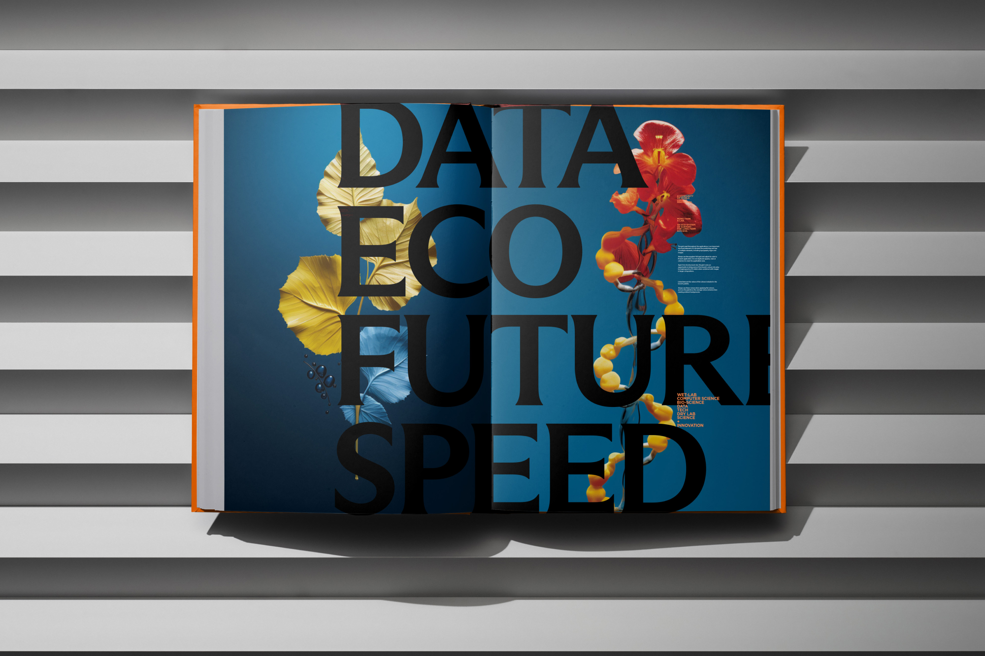
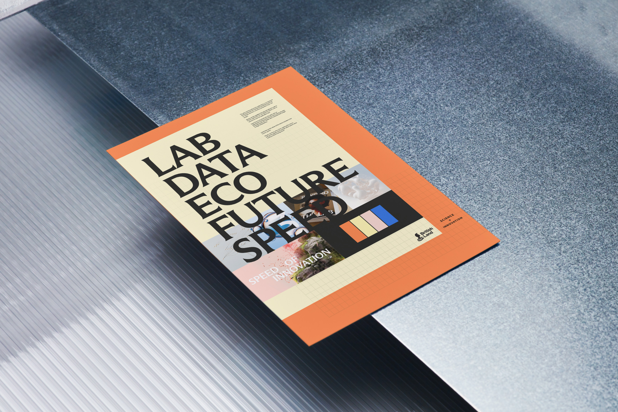
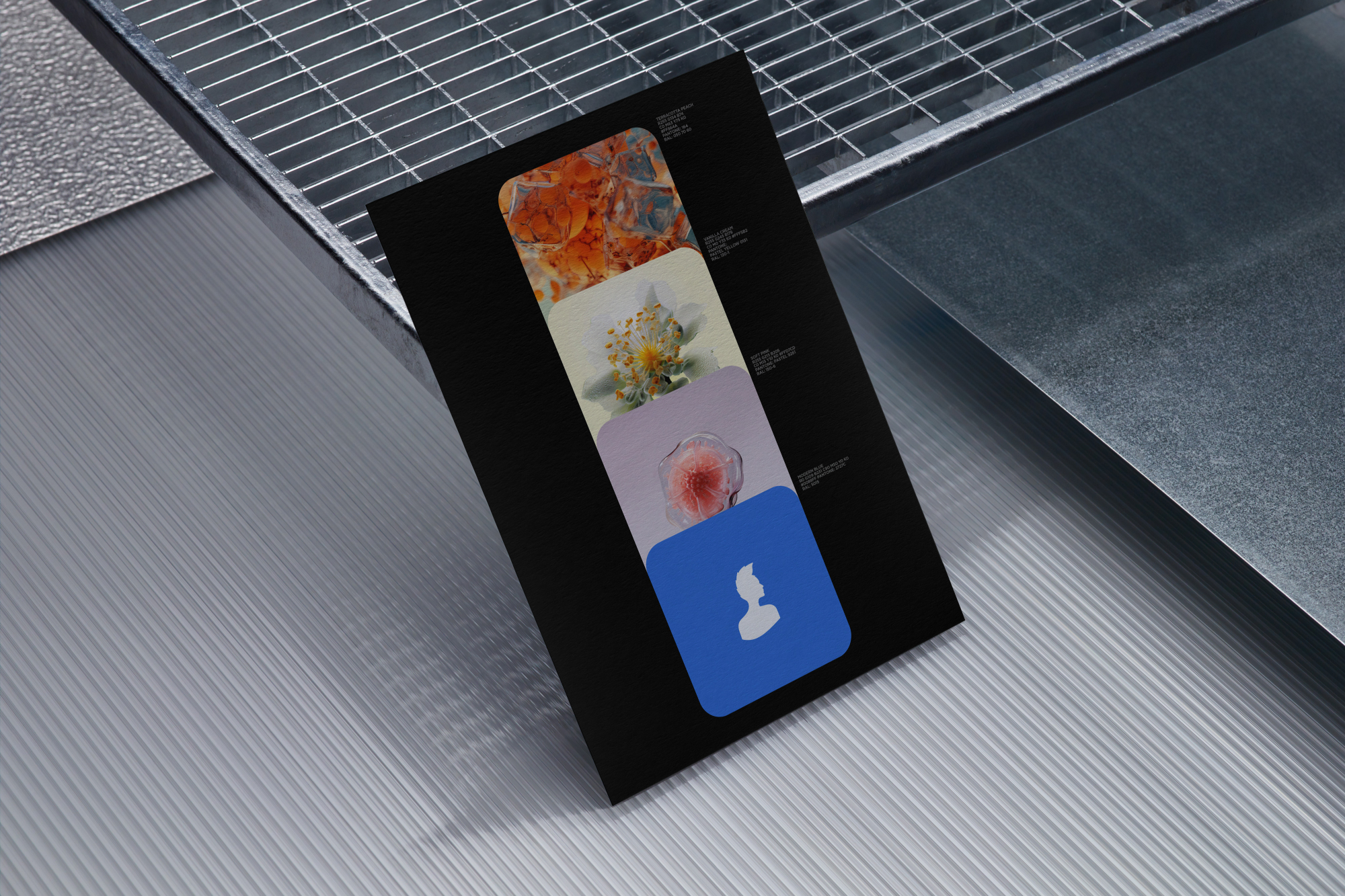
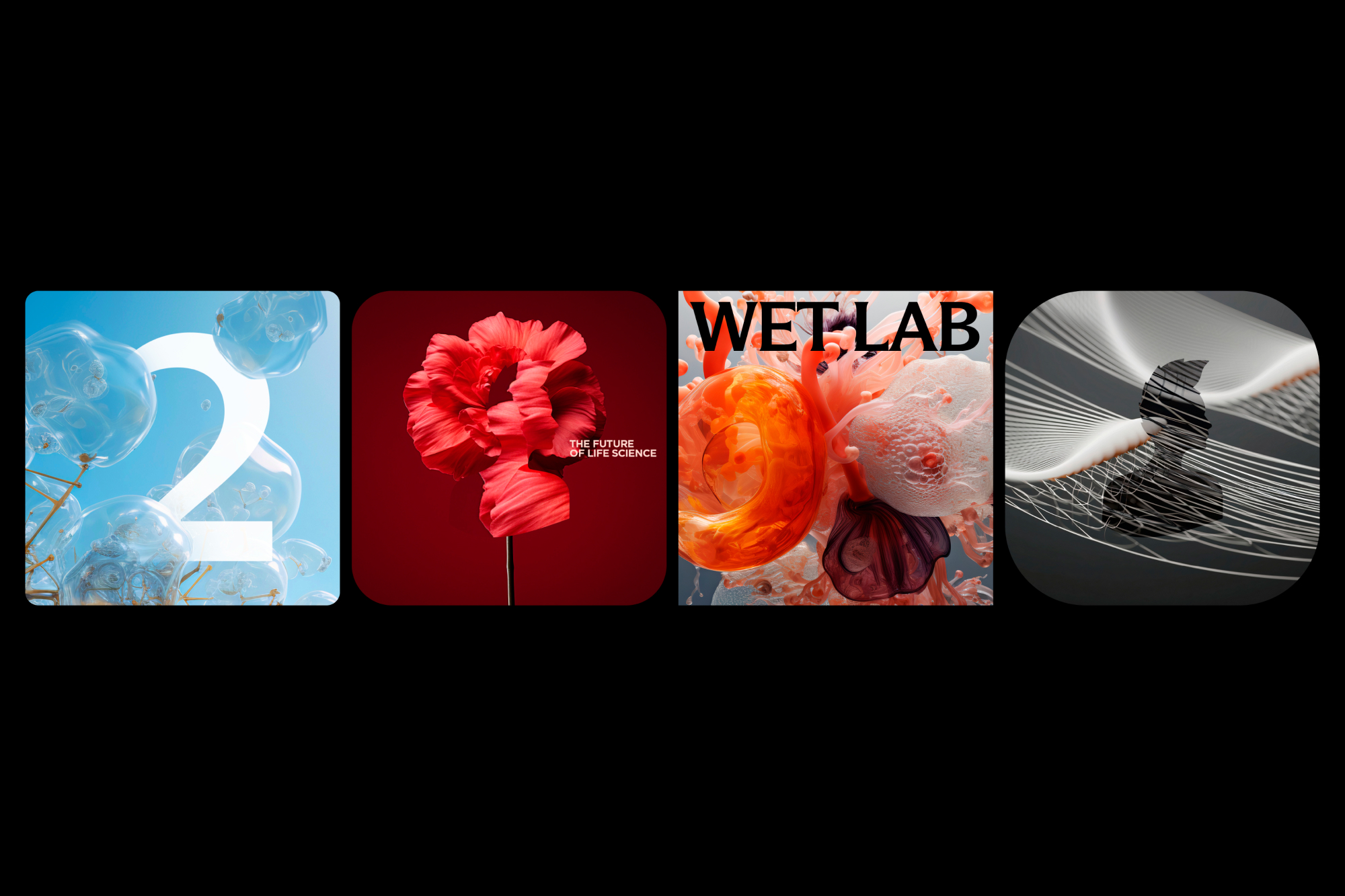
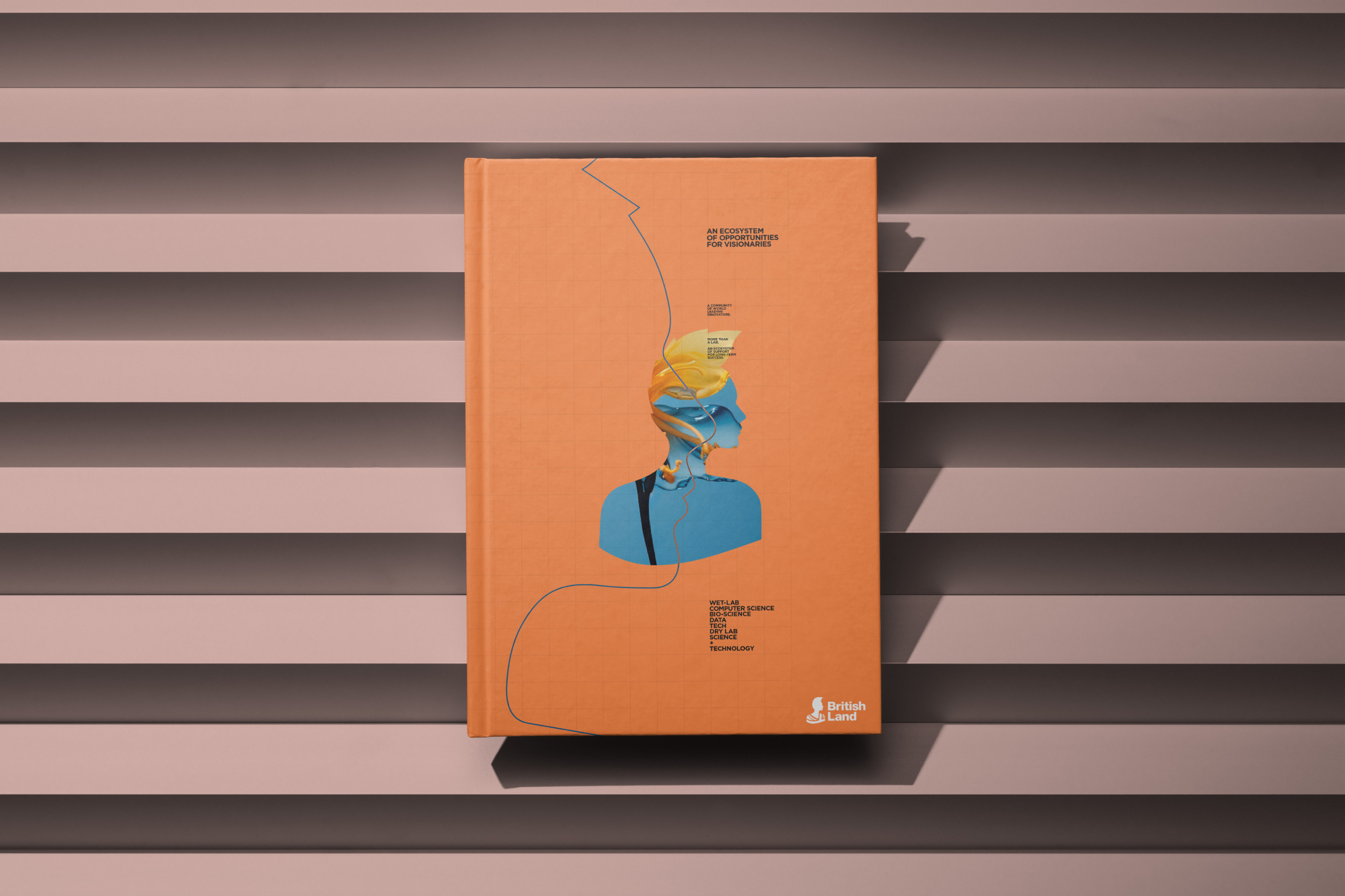
The identity draws inspiration from macro photography in cellular structures, genetic engineering and nature. AI was used as "a starting point for creativity to then manipulate, rework and edit the visuals to create something that smashes the industry standards of cold, generic lab stock photography", explains design director Leah Surynt. "This meant we could give British Land a visual style they could carry into the future, creating their own visuals as needed," she adds.
The brand constantly refreshes, and has an "air of organic creativity", says DixonBaxi (I'm inclined to agree).

DixonBaxi previously refreshed the Britannia symbol associated with British Land, refining it to make it simpler and more modern. In this brand extension, Britannia is "liberated further, taking on the qualities of its environment, in a subtle shift from the parent brand", explains Leah.
What were the challenges of this project? "Overall, it was about being sensitive to the parent brand and maintaining the heritage, while pushing British Land towards an innovation driven future." As for which part she feels most proud of, Leah says: "The team created an approach that feels warm, inviting and immersive in an otherwise sleek, cold and mechanised world. It feels fitting for a venture that revolves around creating not just workspace, but communities."
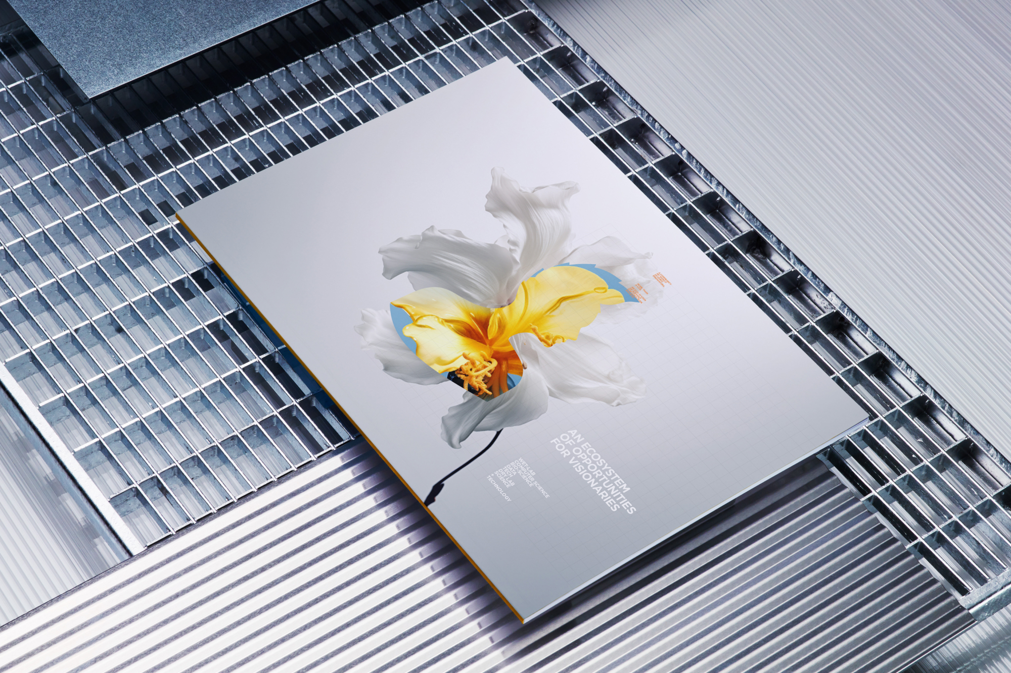
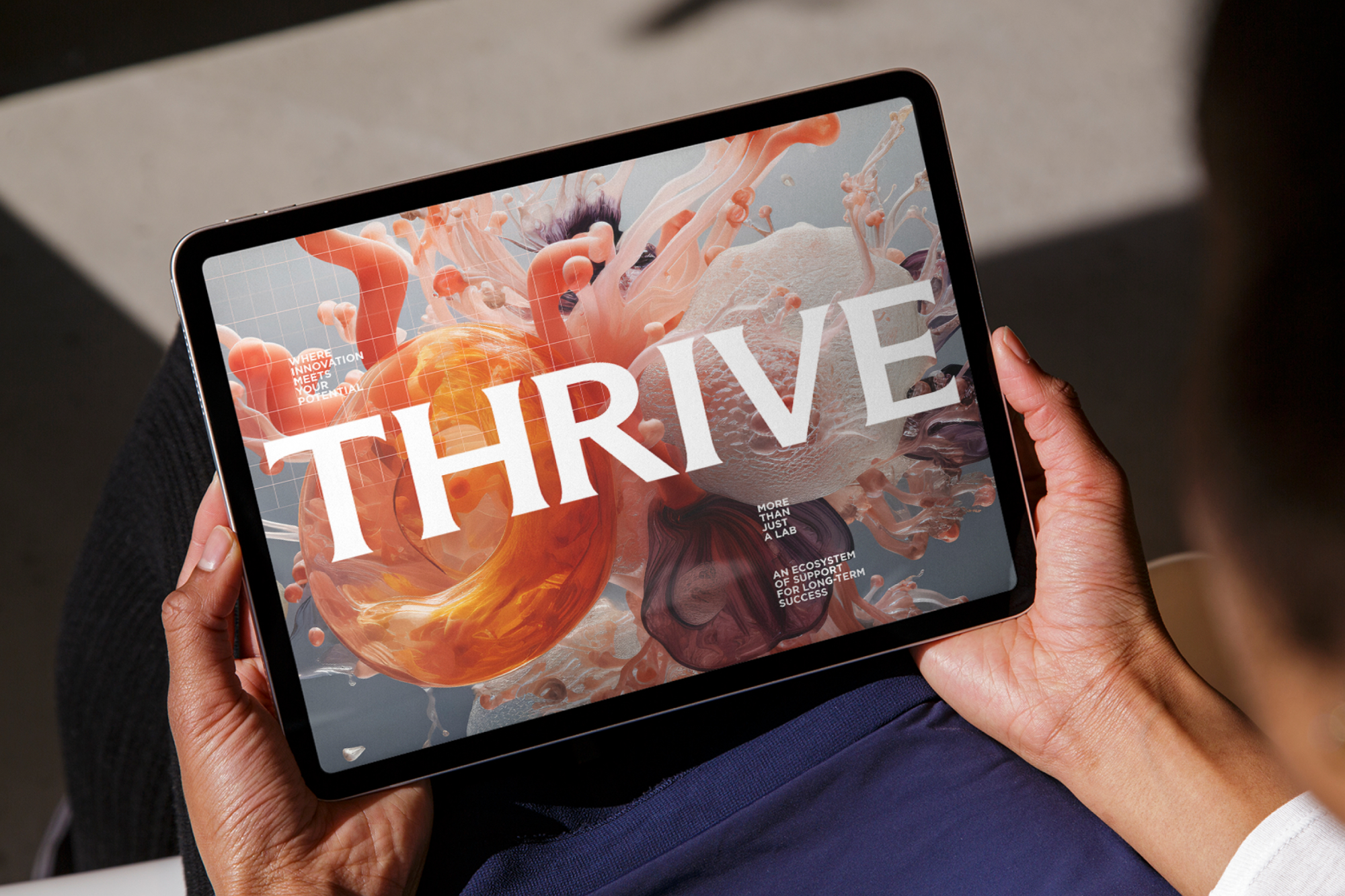
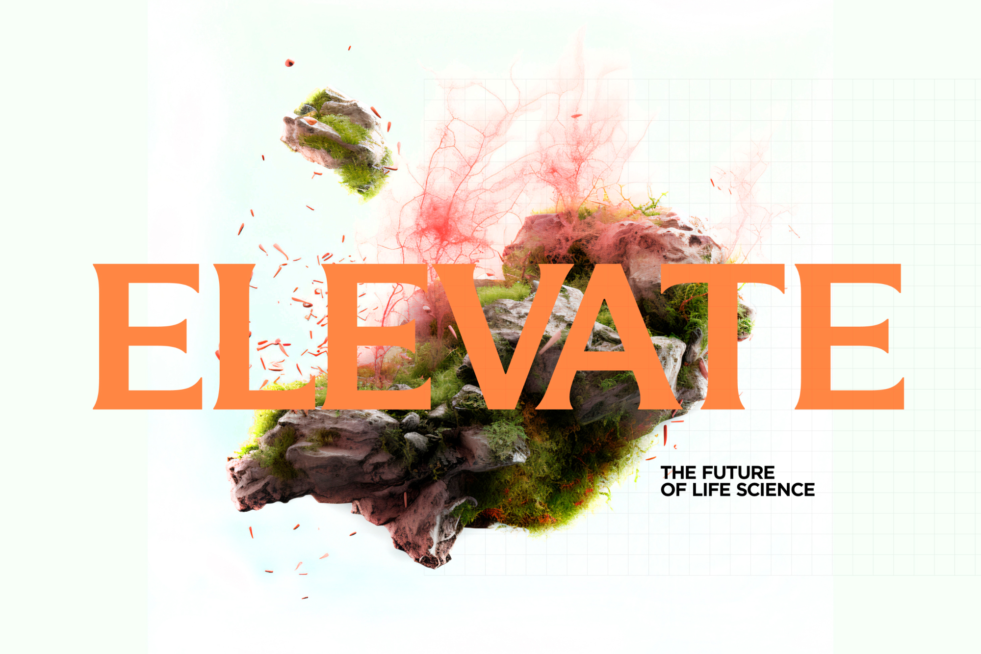
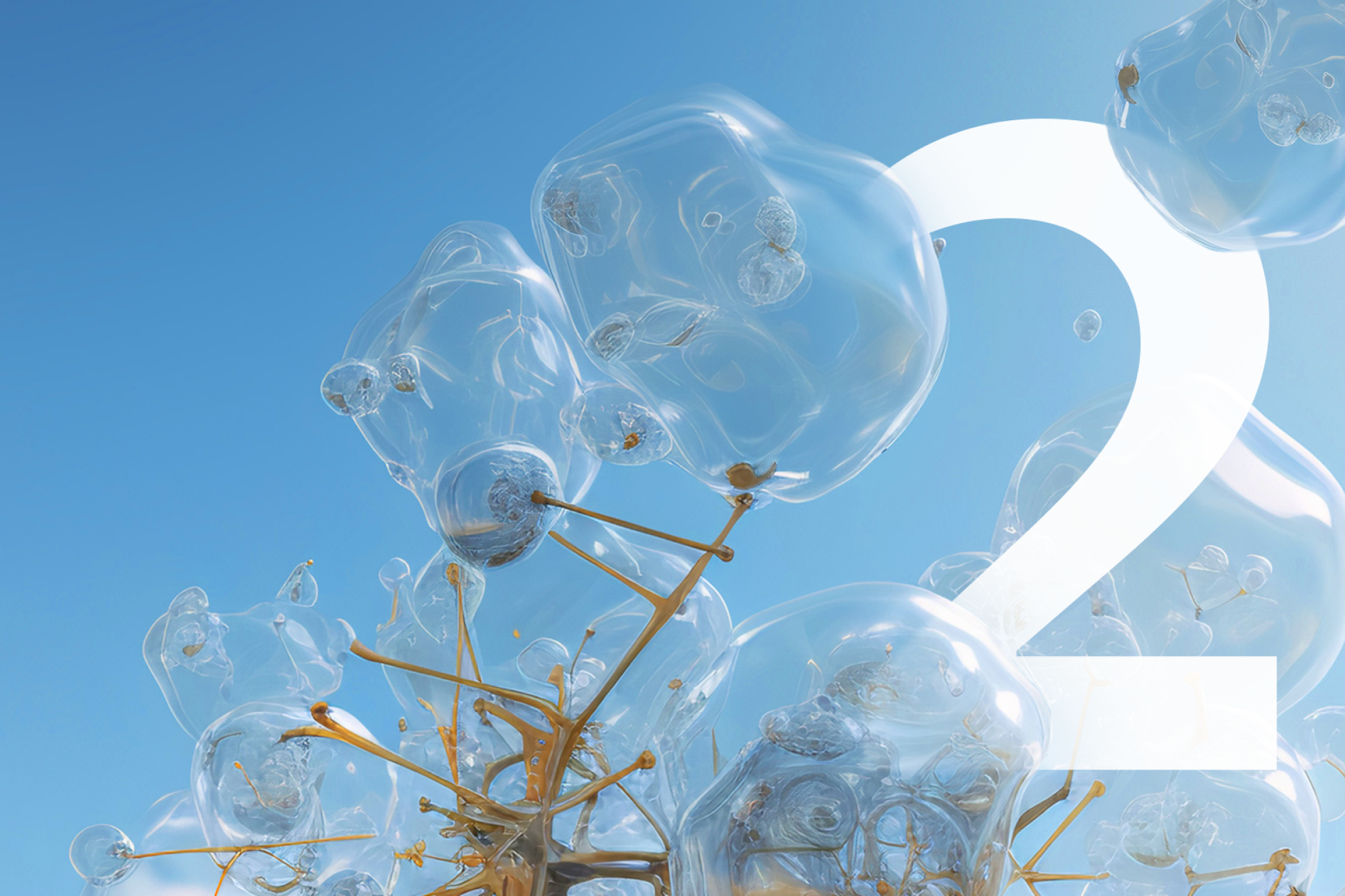

For me, the beauty of this brand extension is that it really brings the wonder of science and technology to life, in a way that is both stunning and functional. Find out more on DixonBaxi's project page.
Get the Creative Bloq Newsletter
Daily design news, reviews, how-tos and more, as picked by the editors.

Thank you for reading 5 articles this month* Join now for unlimited access
Enjoy your first month for just £1 / $1 / €1
*Read 5 free articles per month without a subscription

Join now for unlimited access
Try first month for just £1 / $1 / €1

Rosie Hilder is Creative Bloq's Deputy Editor. After beginning her career in journalism in Argentina – where she worked as Deputy Editor of Time Out Buenos Aires – she moved back to the UK and joined Future Plc in 2016. Since then, she's worked as Operations Editor on magazines including Computer Arts, 3D World and Paint & Draw and Mac|Life. In 2018, she joined Creative Bloq, where she now assists with the daily management of the site, including growing the site's reach, getting involved in events, such as judging the Brand Impact Awards, and helping make sure our content serves the reader as best it can.
