Brewdog gets neutered in sensible rebrand
New look ties in with the launch of sustainability initiative.

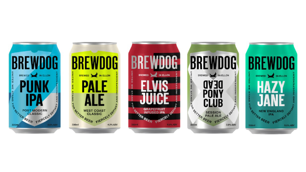
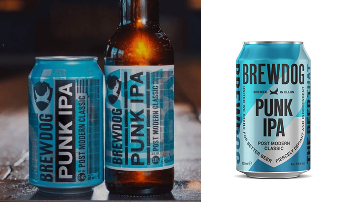
Self-styled 'punk' brewery Brewdog has unveiled a new brand identity that's the graphical equivalent of taking out its earring and getting a sensible haircut. The new-look cans pare everything right back, replacing the fussy background with bold, block colours and shapes, rotating the typography so it sits the right way up, and removing the grungy styling in favour of something altogether smarter.
A cleaner, less fussy identity is certainly more in line with current branding wisdom, and we agree it was time for Brewdog to refresh its identity. But we can't help feeling that the brand has stripped out all of the things that made it unique in the first place. "We've grown, and we've grown up," reads Brewdog's press statement. Boo to that.
Compare the previous and new packaging below (or see how it stacks up against our pick of the coolest packaging design right now).

Brewdog has a history of causing upset with its campaigns – its misguided attempt to promote gender equality in 2018 being a particularly memorable example. So we were a little apprehensive to discover this rebrand also comes with a new initiative for Brewdog.
Thankfully, this one looks like it might be a little more well conceived. The 'Brewdog tomorrow' campaign makes steps to tackle the climate change crisis. There are several parts to this initiative, including a plan to reuse old cans ("don't be surprised if your beer comes in a cola can" says the site), reduce waste by turning imperfect beer into vodka, and encouraging fans to brew their own Brewdog beer at home to reduce transport miles. See the full campaign here.
Read more:
- BrewDog gets a roasting for its punk whisky design
- New Sonic logo proves difficult to swallow
- Google Maps gets a new look, and it’s simply genius
Get the Creative Bloq Newsletter
Daily design news, reviews, how-tos and more, as picked by the editors.

Thank you for reading 5 articles this month* Join now for unlimited access
Enjoy your first month for just £1 / $1 / €1
*Read 5 free articles per month without a subscription

Join now for unlimited access
Try first month for just £1 / $1 / €1

Ruth spent a couple of years as Deputy Editor of Creative Bloq, and has also either worked on or written for almost all of the site's former and current design print titles, from Computer Arts to ImagineFX. She now spends her days reviewing small appliances as the Homes Editor at TechRadar, but still occasionally writes about design on a freelance basis in her spare time.
