First Pepsi, now KFC: why brands need to stop featuring competitors in their ads
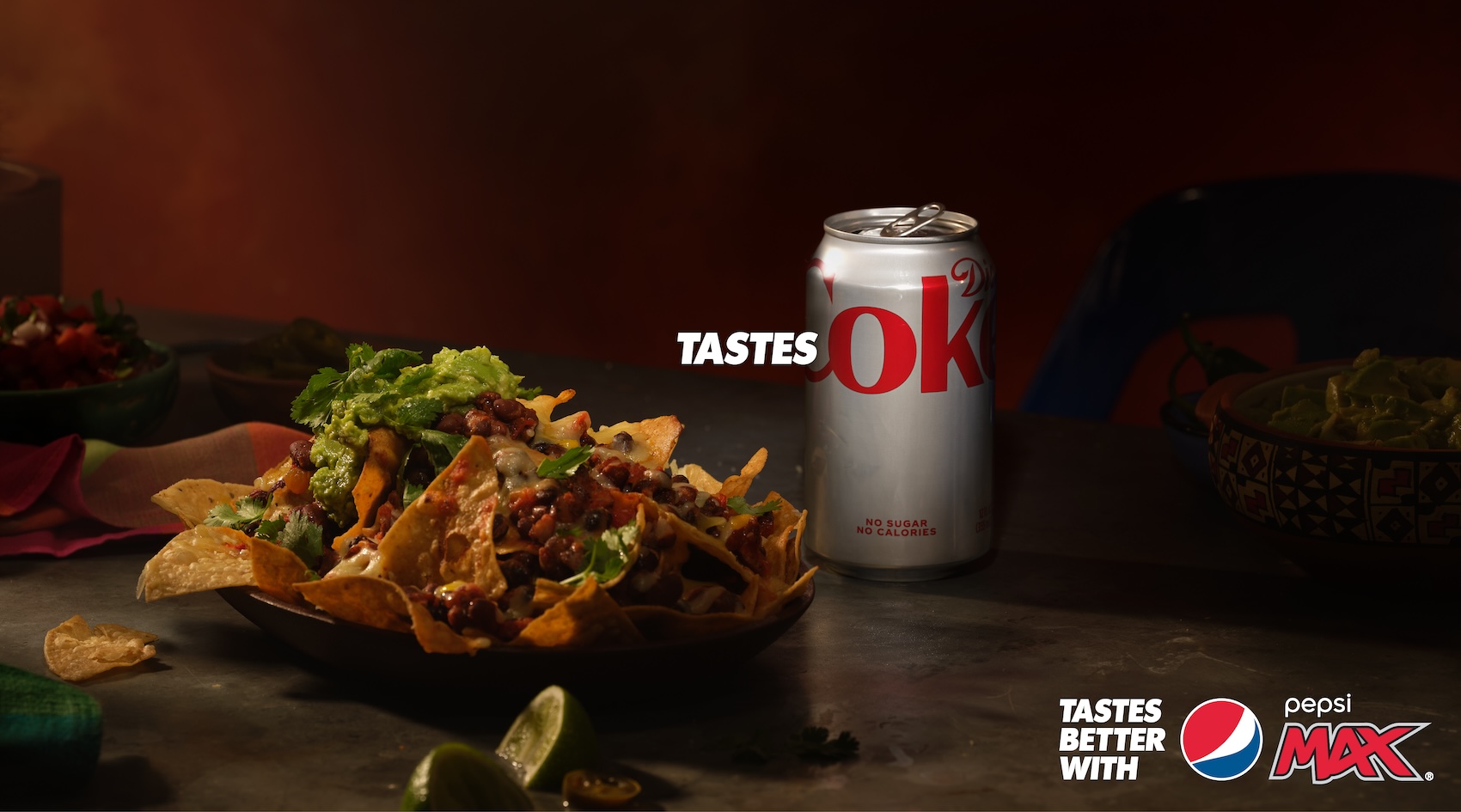
If your ad shows a Coca-Cola can, it looks like a Coca-Cola ad.

From McDonald's vs Burger King to Pepsi vs Coca-Cola, some brand rivalries feel as old as time. This might be because brands love poking fun at their competitors in their ads – which, when done well, can be a whole lot of fun. But we've seen a rise in recent months in brands trying to be clever by including their competitor's actual products in their ads, which arguably slips over into the realm of the counterproductive.
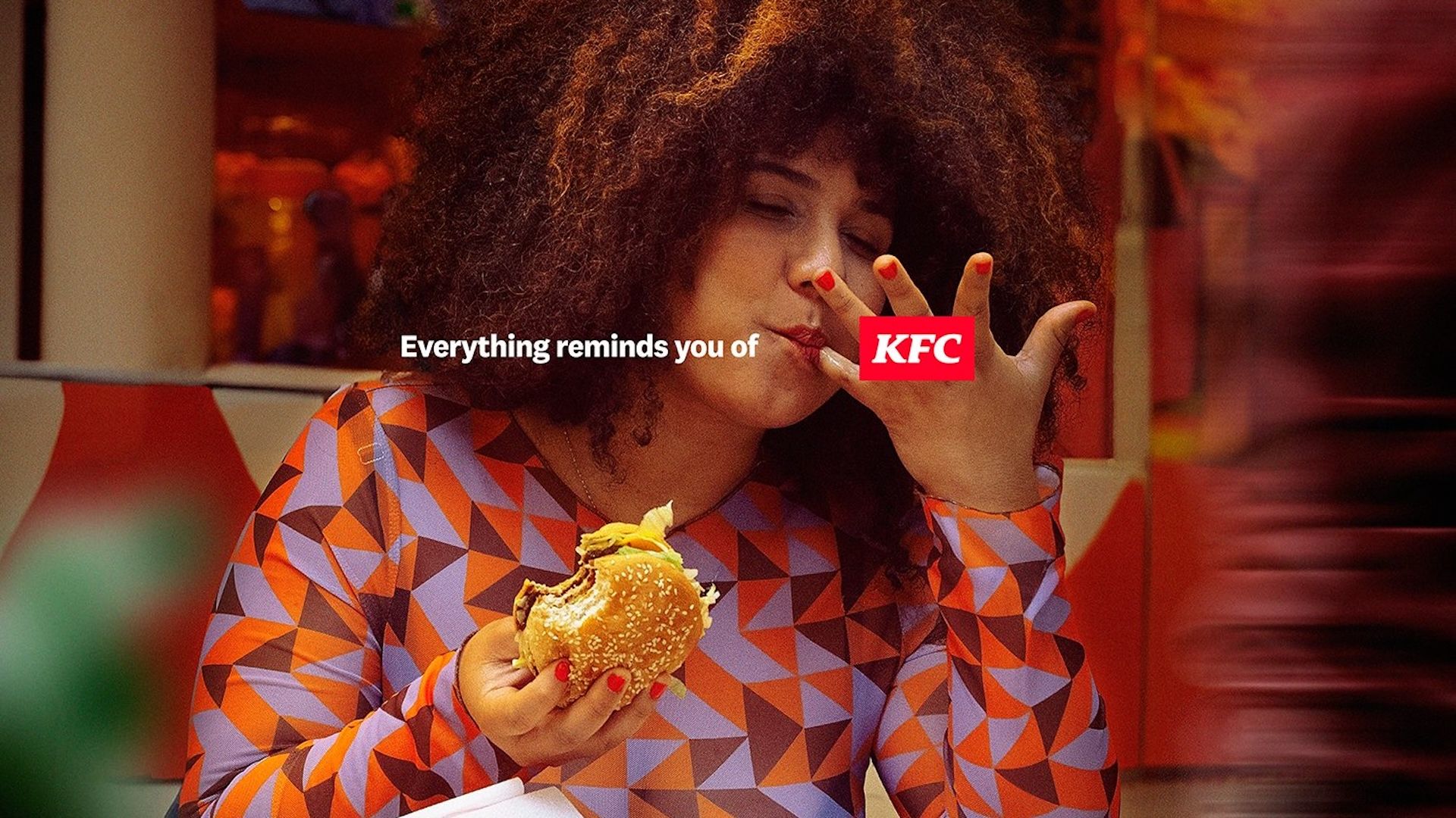
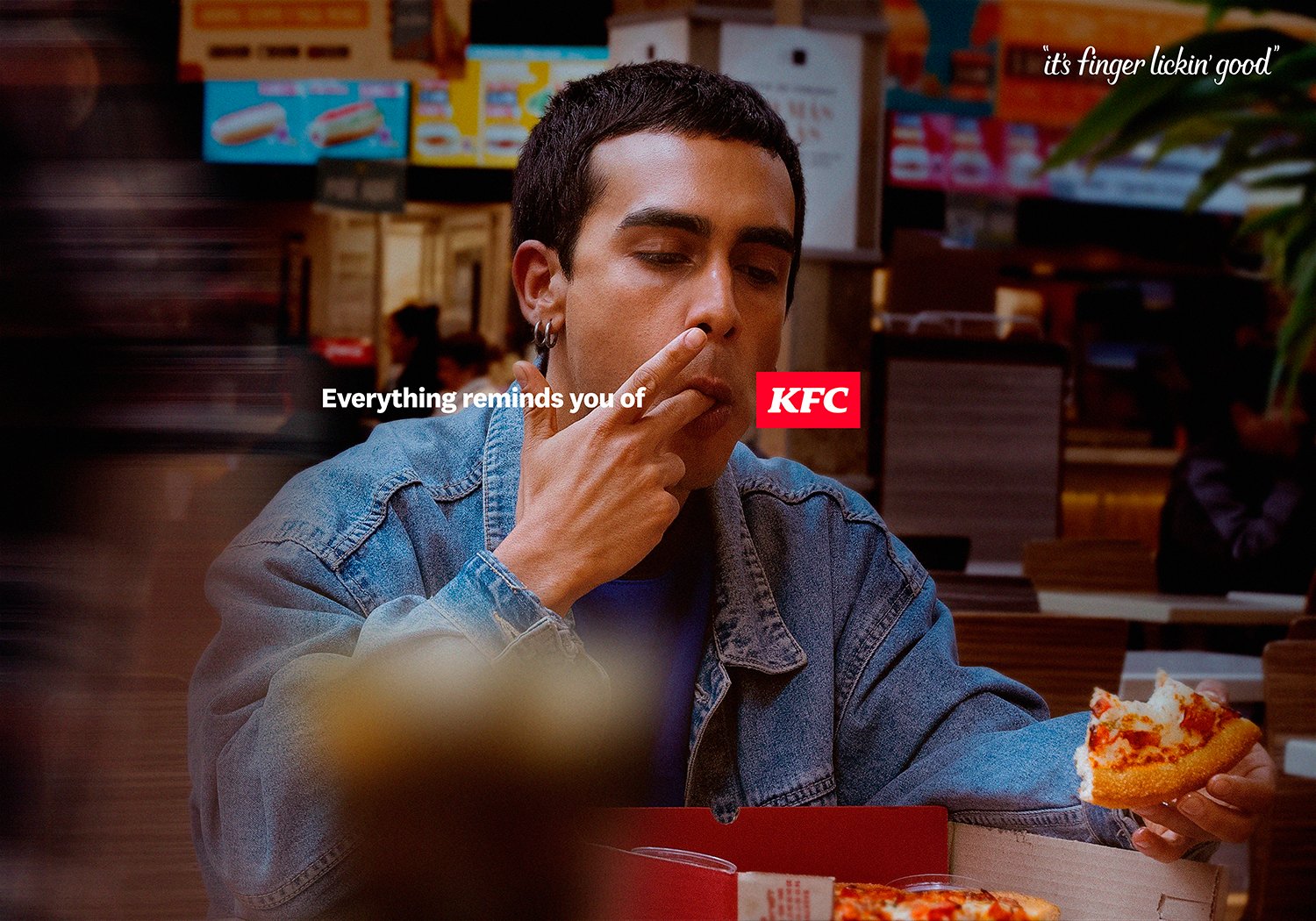
First it was Pepsi including an actual Coca-Cola can in its new print ads. And now, KFC has released a series of similar ads featuring fast food customers eating at various fast food restaurants including McDonald's, and licking their fingers. The tagline? "Everything reminds you of KFC" – a reference to the famous tagline, "It's finger lickin' good".

We've seen examples of successful ribbing of competitors before, from Pepsi's optical illusion ads that hid the brand's logo in competitor's packaging, to Burger King's 'mouldy Whopper' which sought to emphasise its more natural credentials compared to McDonald's.

These work because the focus is on the advertising brand, not the competitor. But placing a competitor's actual product in the ad has been proven to confuse viewers, with many thinking Pepsi's recent 'OK' ads featuring a Coke can were, in fact, Coca-Cola ads. And the same is arguably true of these new KFC ads – at a glance, we're seeing somebody eating a hamburger or a pizza. It's only when squinting to read the tagline that we start to process the joke.
Once again… https://t.co/yRZkcO4grg pic.twitter.com/h7skcOl5dAApril 3, 2024
Some have speculated that, in trying to be clever with references to their competitors, brands are forgetting their actual audience. Indeed, KFC's ads seem rather pitched at adland (or as one X user hilariously puts it, 'Cannesumers'). Sure, Cannes Lions voters might appreciate the smug play on words, but the average consumer probably took one look at these ads and fancied a hamburger or a pizza.
"I think the “punching up” nature of this form of advertising can work but mentions of the competitor need to be more subtle and not the focus," brand asset expert Cathal Gillen recently told Creative Bloq while discussing the aforementioned Pepsi ad. "The key takeaway if undertaking comparative advertising is to remember that consumers won’t be reading the advert slowly on Powerpoint in a boardroom, but instead glancing at it for a few seconds while in the middle of doing something else. It’s all about a balance, between developing interesting and attention grabbing creative and at the same time ensuring it’s ultimately attributed back to your brand."
Get the Creative Bloq Newsletter
Daily design news, reviews, how-tos and more, as picked by the editors.

Thank you for reading 5 articles this month* Join now for unlimited access
Enjoy your first month for just £1 / $1 / €1
*Read 5 free articles per month without a subscription

Join now for unlimited access
Try first month for just £1 / $1 / €1

Daniel John is Design Editor at Creative Bloq. He reports on the worlds of design, branding and lifestyle tech, and has covered several industry events including Milan Design Week, OFFF Barcelona and Adobe Max in Los Angeles.
