What happens when iconic brands change colour?
Netflix should never be green.
Colour is central to a brand's identity. Before we even read a brand name, the logo's colours have often subconsciously communicated to us what the brand is about, and how it wants to be perceived. Studies have shown that the average person makes a judgment on a product within the first 90 seconds of viewing, so designing a logo must be a careful operation with thoughtful intent.
Often we can recognise a brand based on its signature colours, so what happens when those colours are inverted? Icon Press has teamed up with Karen Haller to explore this very question. If you've got a logo design in the works, our collection of the best logo designers could help make the task a little easier.
01. Netflix
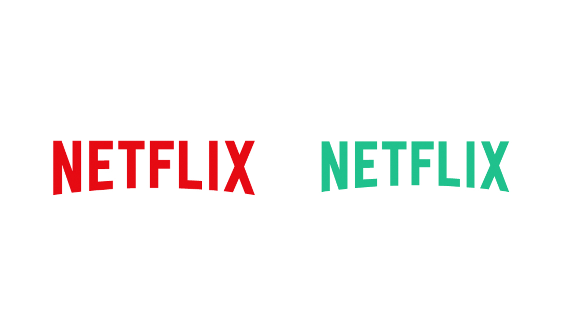
It's strange to imagine Netflix's iconic logo in anything other than red and black. The sleek and simplistic design gives off an air of luxury that we associate with lush velvet seats and glossy cinema screens. "It encourages us to get excited," says Karen Haller, a leading international authority in Applied Colour Psychology. "Red stimulates the physical. It raises the pulse rate. By using red in its branding, Netflix is building on that emotional experience."
With the colours flipped to their opposites on the colour wheel, the logo has a sense of calm. The feeling of urgency and anticipation is transformed into serenity. It's not exactly making us want to binge-watch a whole series, that's for sure (in fact, it's making me want to Netflix and chill – minus the Netflix).
02. Cadbury
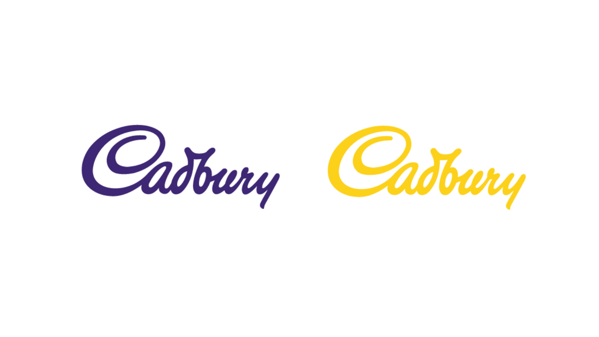
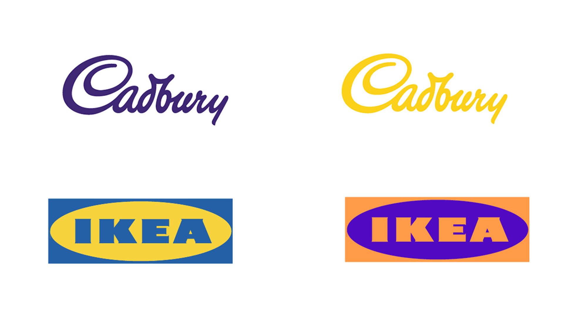
Food branding is particularly important, as certain colours can increase feelings of hunger or desirability. According to Haller, "Dark purple conveys the message of quality and luxury". In line with the brand's affordability, Cadbury's logo creates a sense of accessible luxury that feels elevated above ordinary confectionary competitors.
In its inverted form, the logo loses the sense of luxury, with yellow connoting happiness and positivity instead. While that's never a bad thing, this would miscommunicate the brand's identity, losing that sense of subtle luxuriousness.
03. Ikea
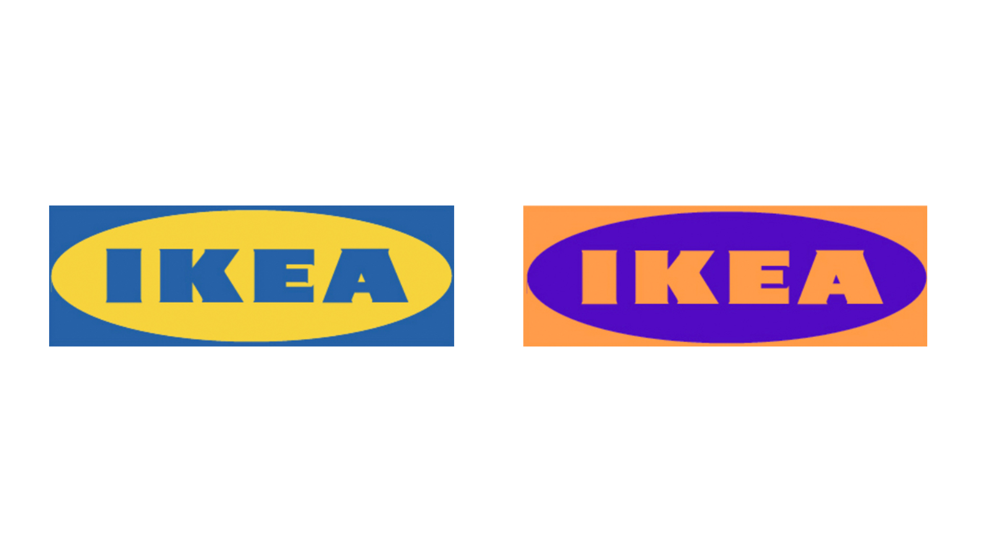
Ikea's logo is iconic in its simplicity and functionality. The choice of blue, according to Haller, creates a sense of "reliability and dependability." However, on its own, the colour can often convey a sense of corporate conventionality, which is expertly offset by the interjection of playful yellow.
Get the Creative Bloq Newsletter
Daily design news, reviews, how-tos and more, as picked by the editors.
In its inverted form, the logo takes on a 'juvenile' quality, with the focus shifting to "fun and play," according to Haller. While the colour scheme is not necessarily too extreme, "it might alienate its core age group," she warns.
04. Royal Mail
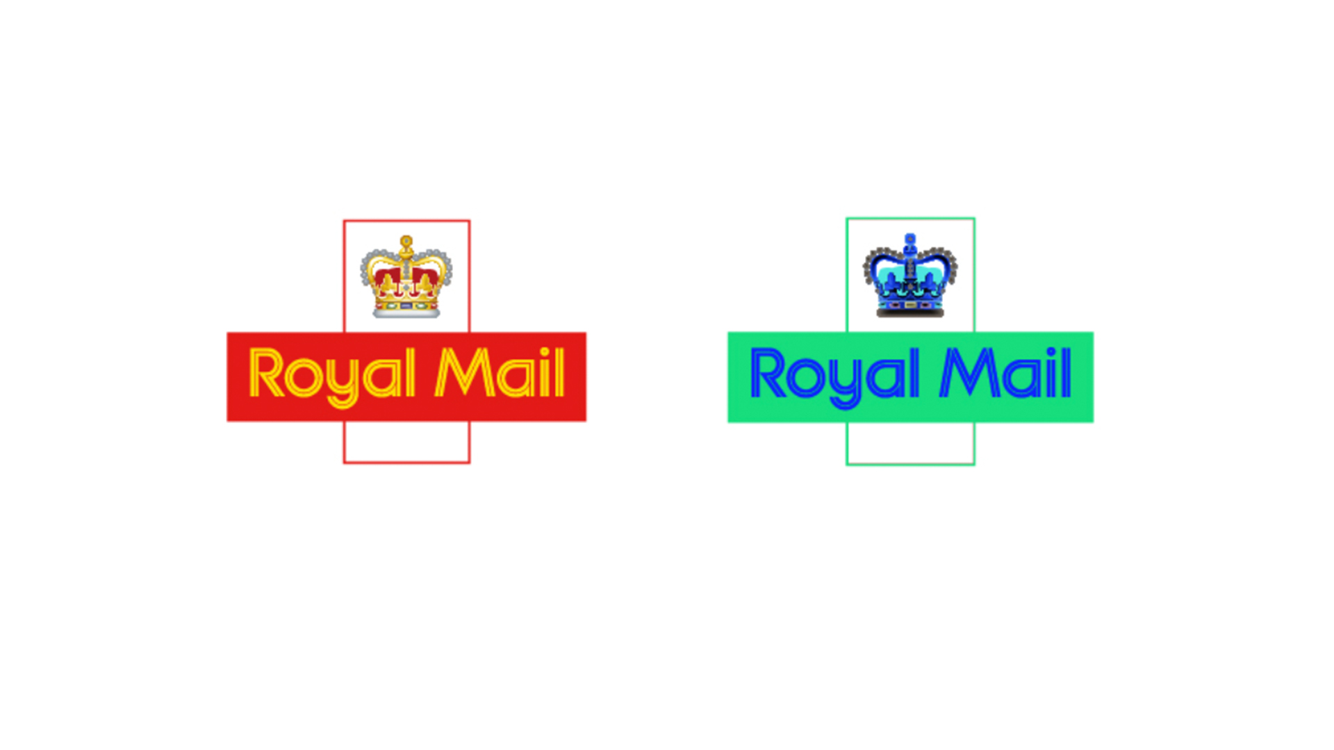
Royal Mail has a very important job to do when it comes to its branding, as it carries a regal legacy in its namesake. Red and gold are suitably grand colours that grab our attention instantly. According to Haller, "Royal Mail use a specific red to ensure its brand is instantly recognisable," (so you can spot those post boxes from a mile off).
In the inverted green and blue hues, the logo doesn't carry the same grandeur. It would "be difficult to spot and lose its iconic presence and status," says Haller.
With a clear identity at the centre of any successful logo, colour can be the key to attracting consumers, so don't neglect colour theory when you're trying to make a good impression in those vital 90 seconds. For more examples of the power of colour, check out Icon Printing's full article here.

Thank you for reading 5 articles this month* Join now for unlimited access
Enjoy your first month for just £1 / $1 / €1
*Read 5 free articles per month without a subscription

Join now for unlimited access
Try first month for just £1 / $1 / €1

Natalie Fear is Creative Bloq's staff writer. With an eye for trending topics and a passion for internet culture, she brings you the latest in art and design news. Natalie also runs Creative Bloq’s Day in the Life series, spotlighting diverse talent across the creative industries. Outside of work, she loves all things literature and music (although she’s partial to a spot of TikTok brain rot).
