Brand Impact Awards 2020: All the winners revealed
Discover which projects picked up Gold, Silver and Bronze trophies this year – plus download the full winners showcase.
The winners of the Brand Impact Awards 2020 were revealed last night in an exclusive online channel for all the shortlisted agencies.
Covid-19 restrictions meant that BIA judging had to take place remotely, but we were keen to maintain the same level of passionate group debate and probing discussion that helps the best work rise to the surface each year.
After more than 20 hours of video debate in total, our discerning judging panel whittled over 150 entries to just 39 projects, from 31 different agencies. All of these are featured in a special 44-page winners showcase.
Read the full winners showcase
In total, 11 Gold Awards, 13 Silver Awards and 20 Bronze Awards were presented, plus the Social Impact Award and Best of Show.
Read on to find out which projects took home the gongs...
Best of Show
Brand Impact Awards 2020: Best of Show
All Gold Award winners were considered for the prestigious Best of Show accolade, but three projects made the final shortlist.
Find out more: read the full winners showcase
Get the Creative Bloq Newsletter
Daily design news, reviews, how-tos and more, as picked by the editors.
Best of Show 2020: Britain Get Talking by Uncommon Creative Studio
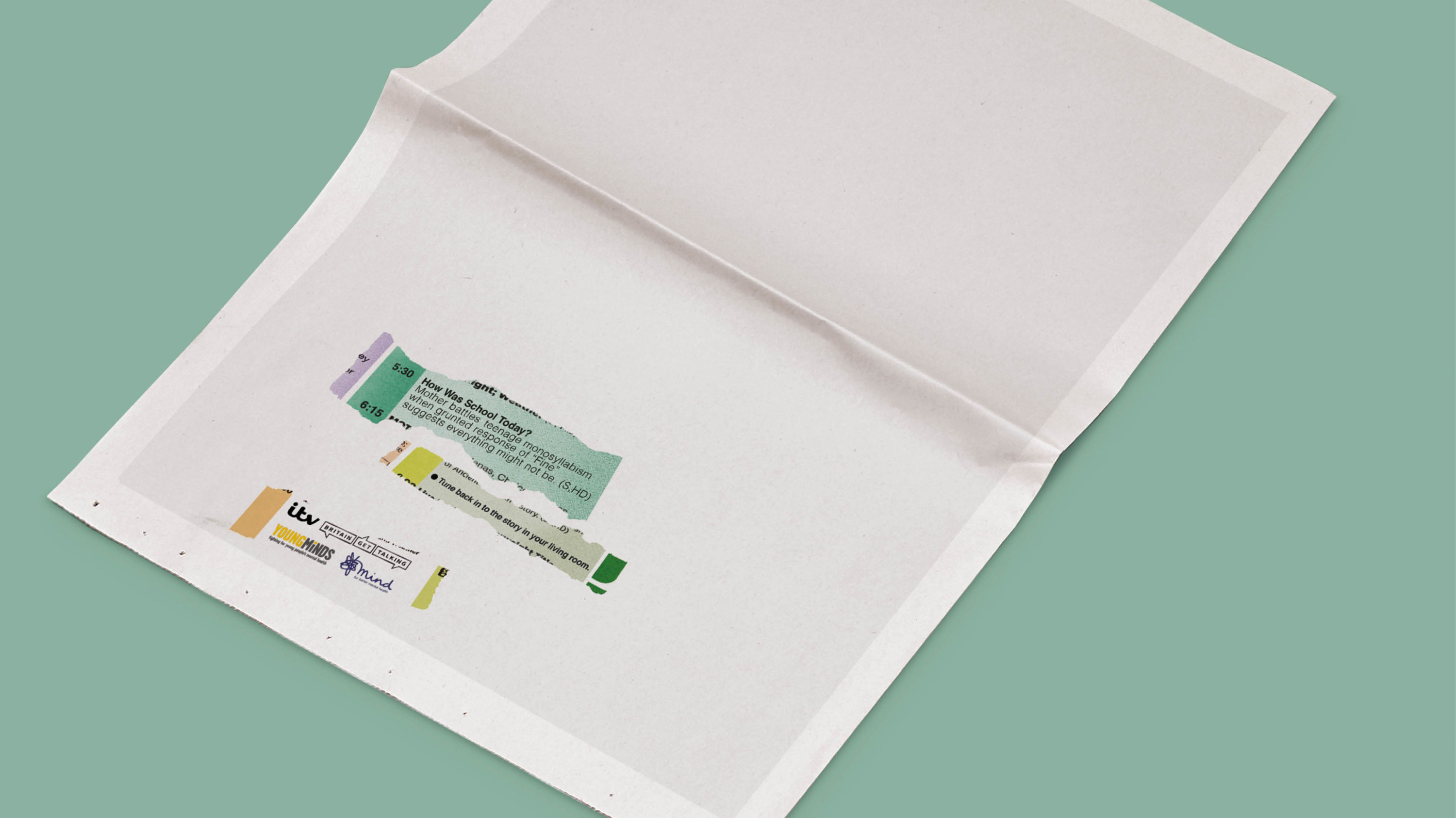
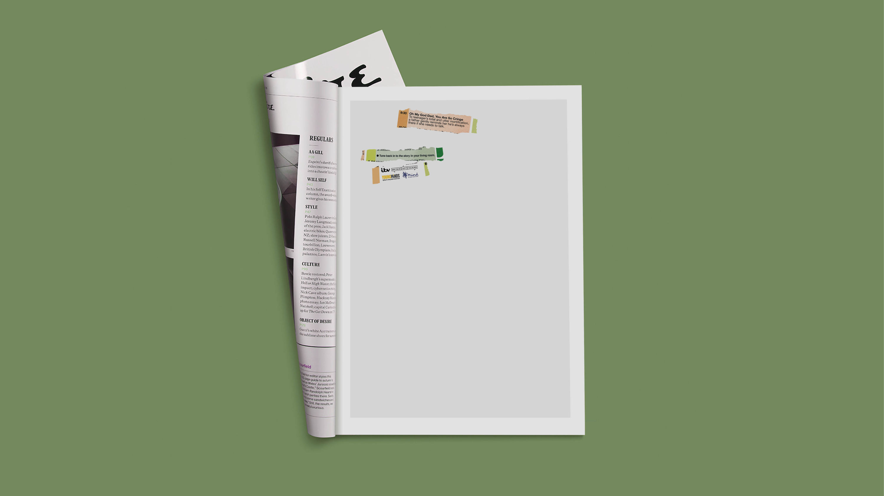
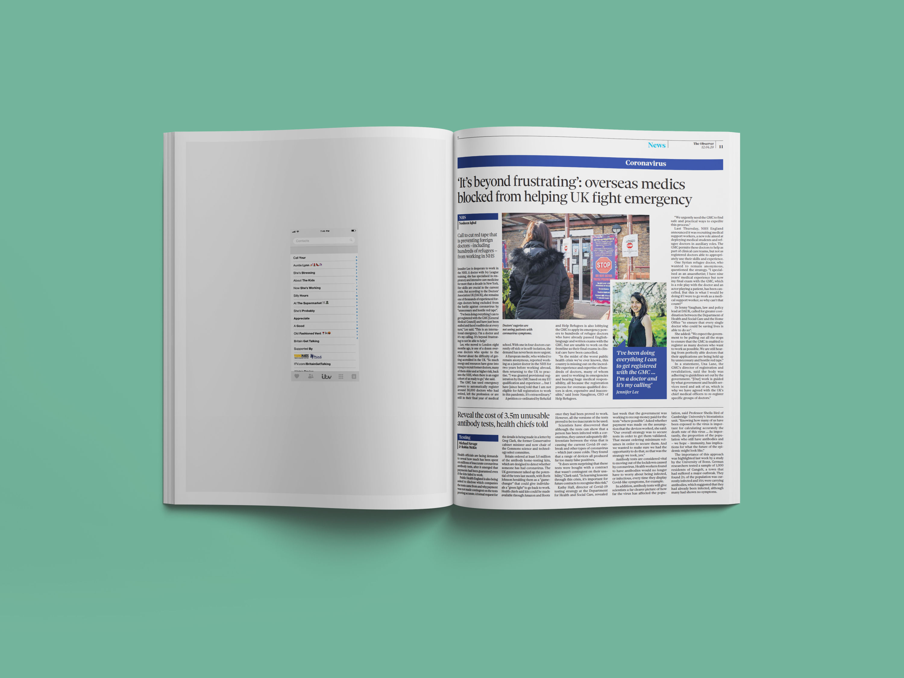
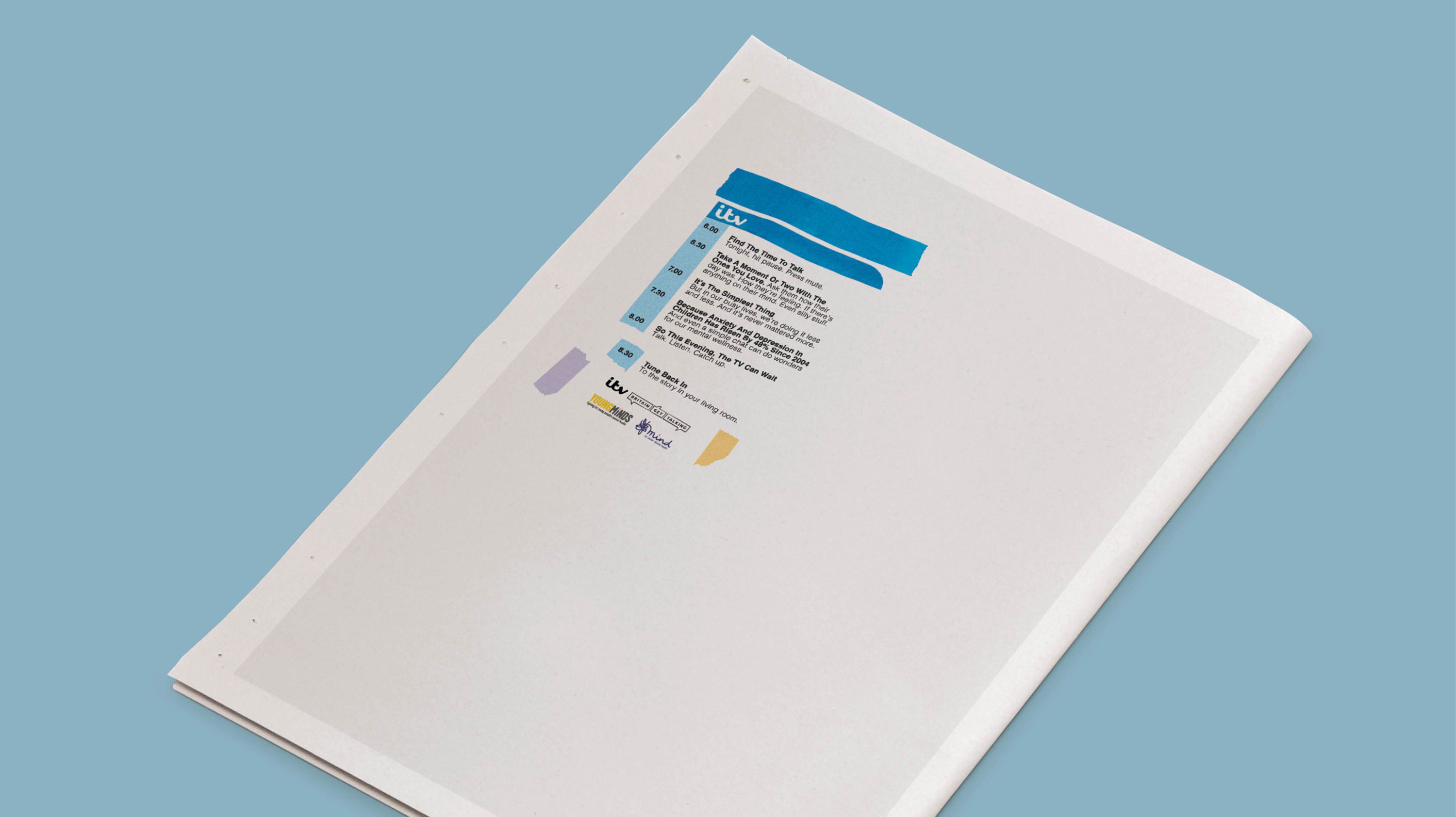
- Winner: Best of Show
- Winner: Social Impact Award
- Bronze Award: Copywriting
Britain Get Talking clinched the Best of Show accolade after its unanimous victory for the Social Impact Award.
"It was the standout piece of work," says Domenic Lippa. "The most memorable piece out of everything we reviewed. It was understated and arresting; calmly and beautifully crafted."
As ITV's landmark mental wellness initiative, Britain Get Talking had a simple goal: to raise awareness of mental health by encouraging more people to talk about it, bringing families closer as a result.
With the endline: 'Tune back in to the story in your living room', the designs replicate TV listings – but replacing the familiar program summaries are moments of connection between people when they open up to each other.
"The generous use of negative space reflected the idea at the heart of the campaign: take time out to breathe, a topic that more than anything else we saw seemed to sum up the year we’re living through," adds Sean Thomas.
Supported by the MIND and Young Minds charities, the campaign provided advice to improve your everyday mental wellbeing. In total, it inspired over 6 million people to make calls or send texts to friends and family.
Shortlisted for Best of Show: All Watched Over by Tom Sharp x Accept & Proceed
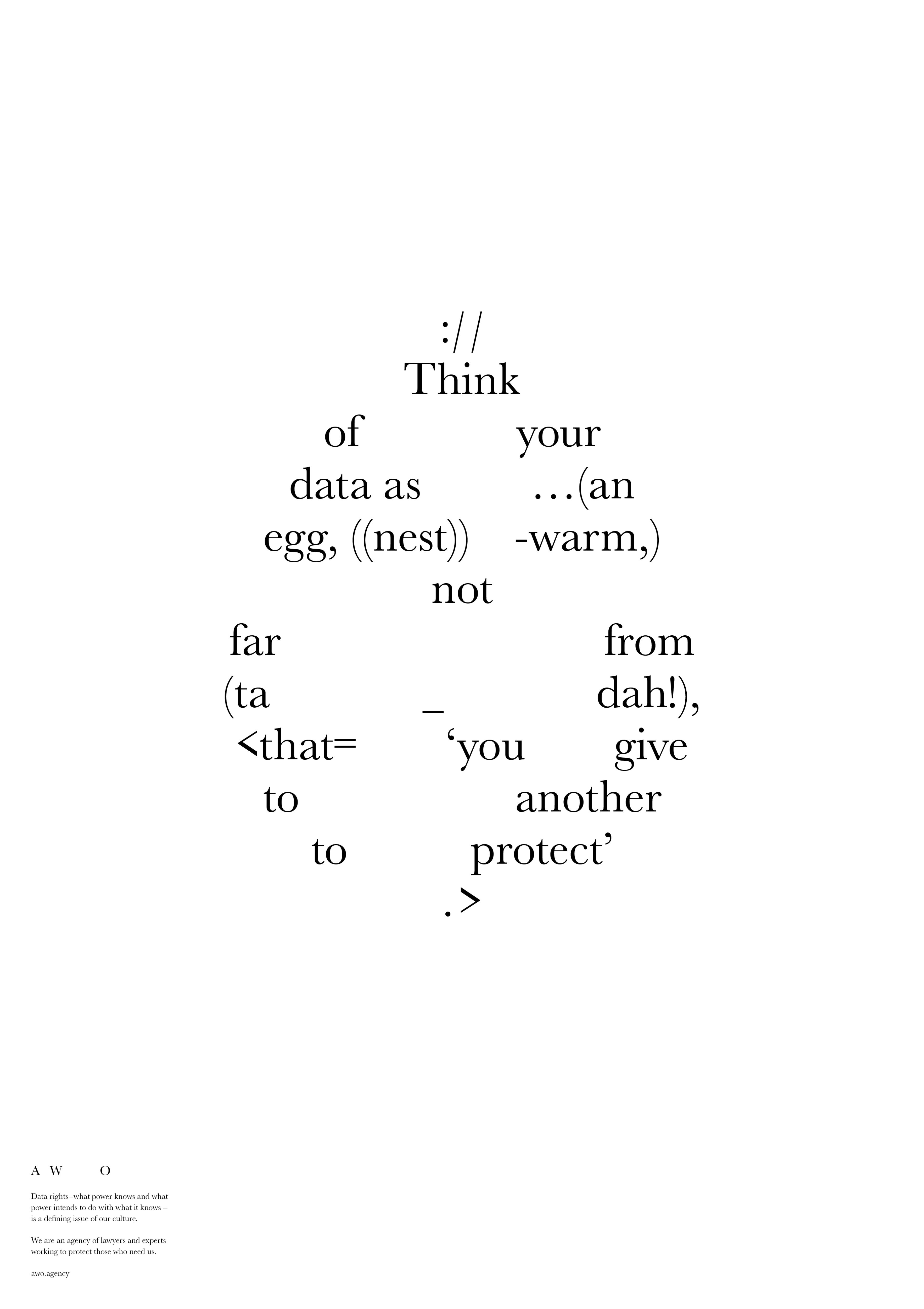
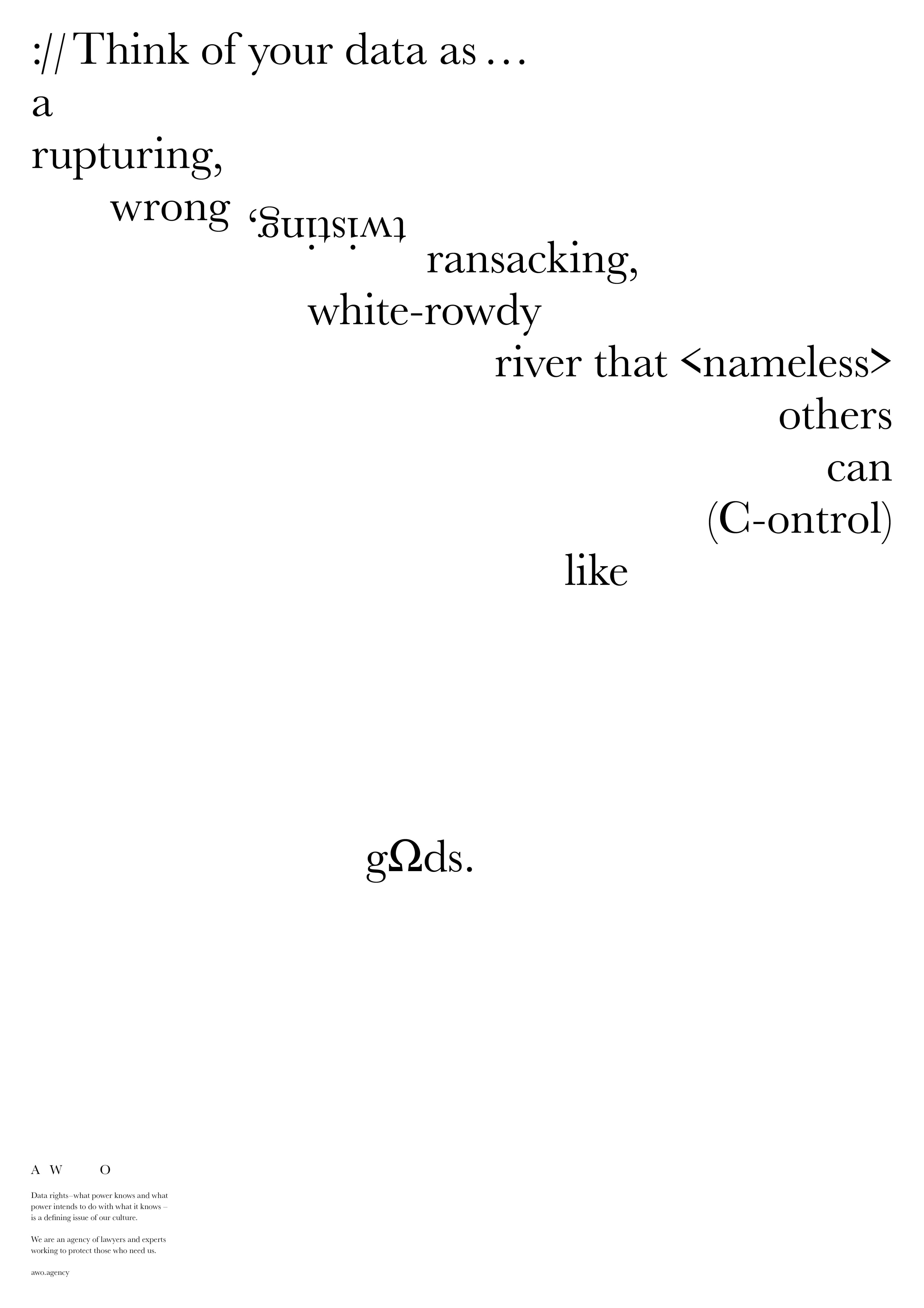
- Shortlisted: Best of Show
- Gold Award: Professional Services
- Gold Award: Copywriting
- Bronze Award: Typography
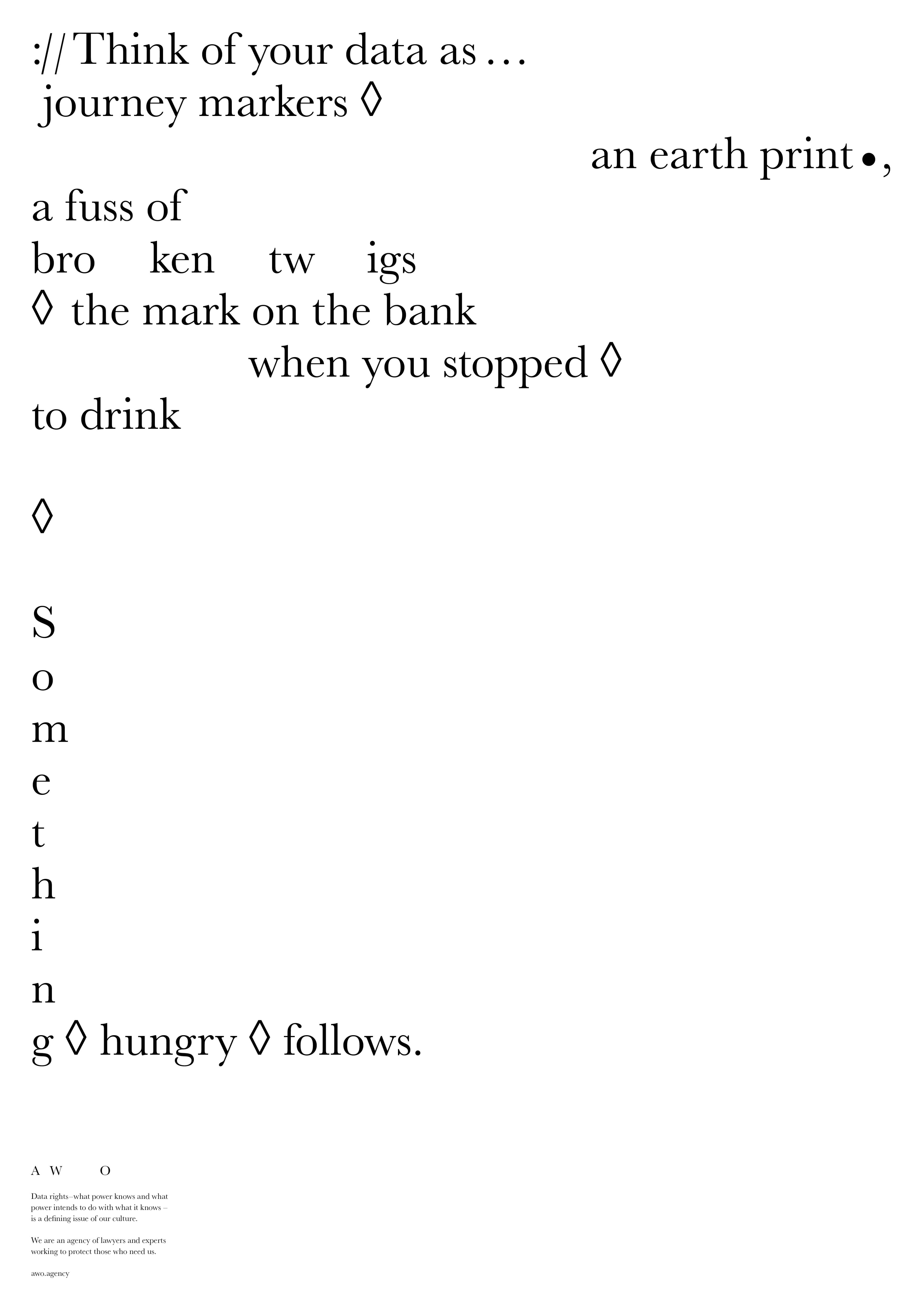
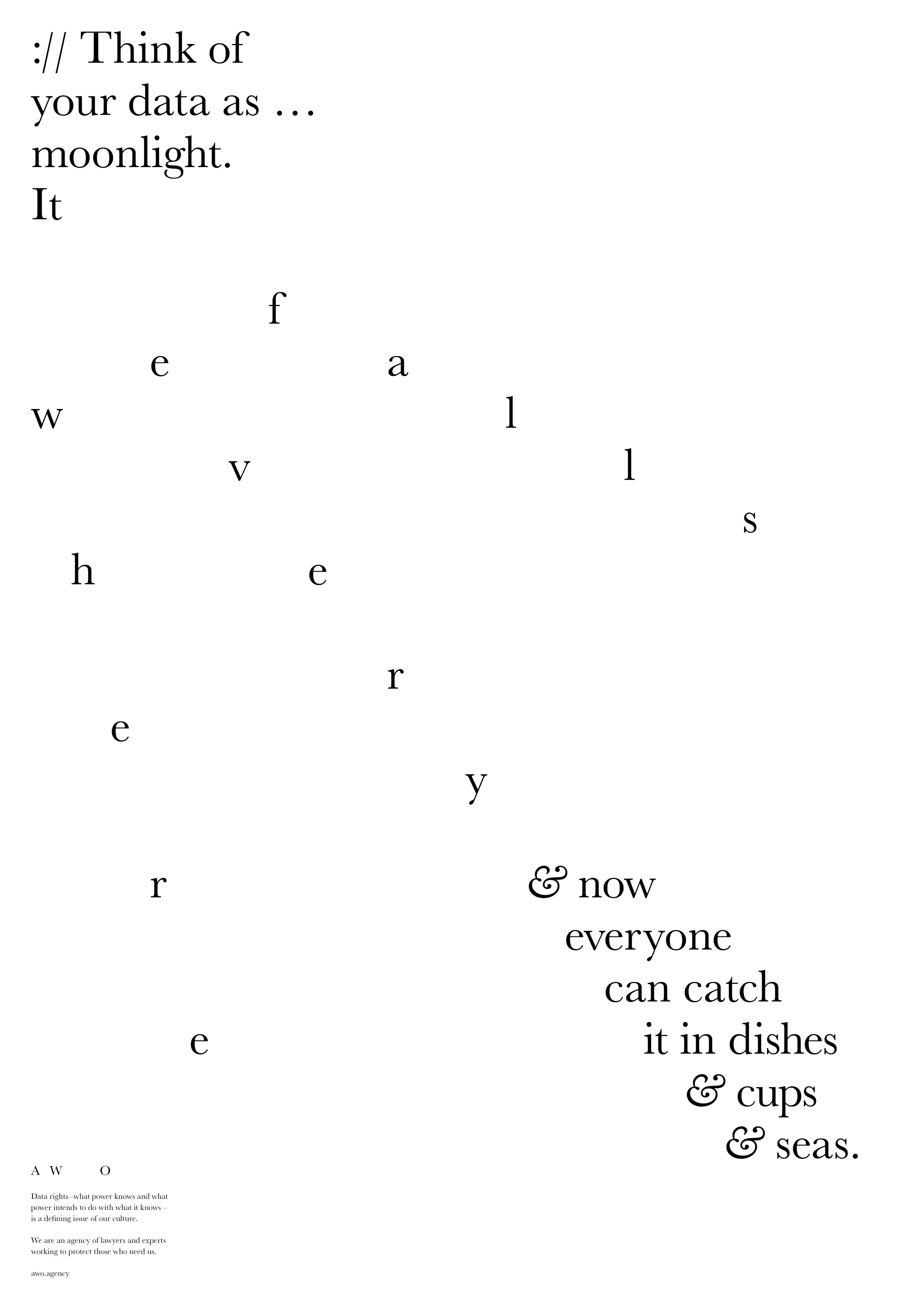
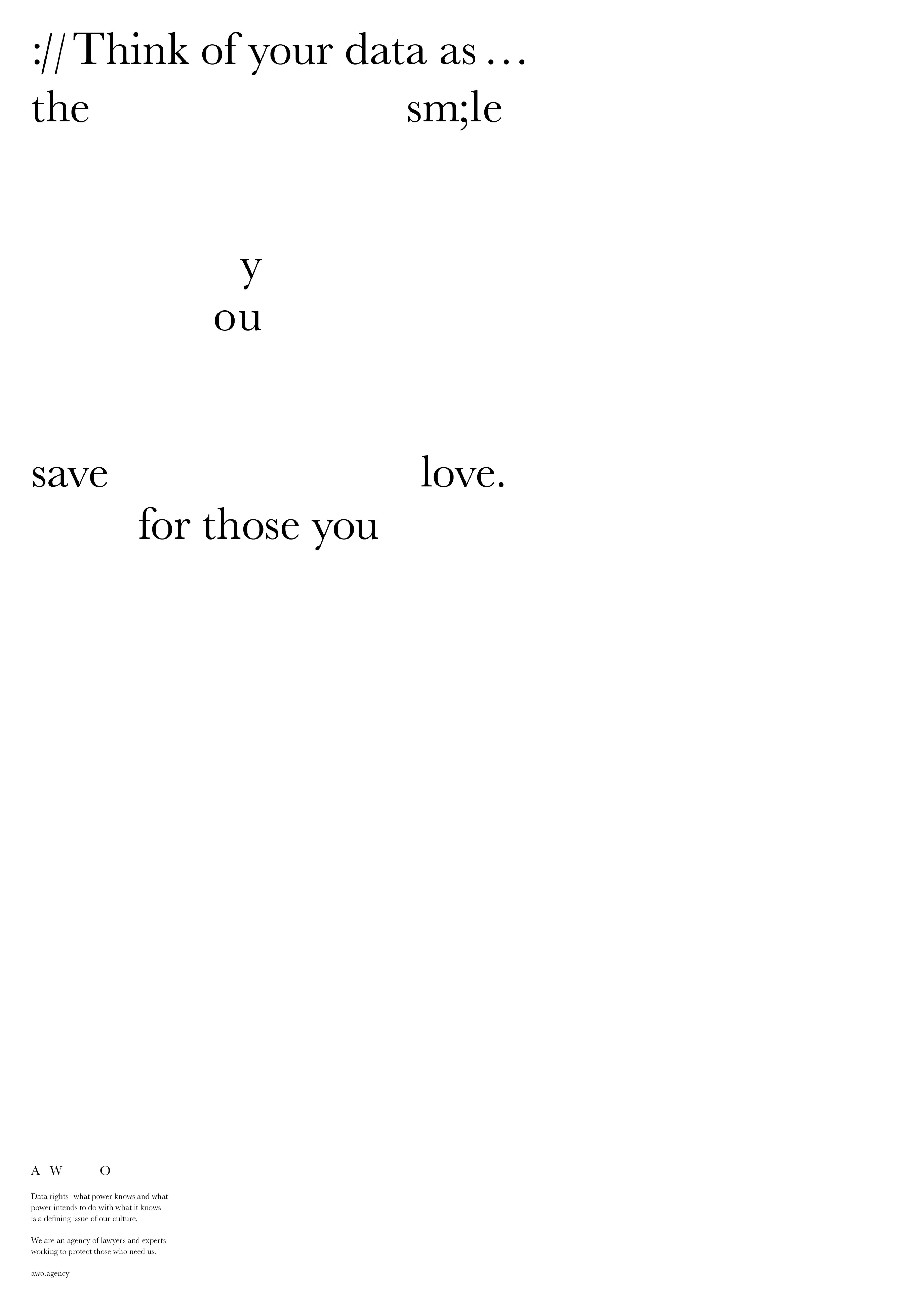
One of the most hotly-debated projects in this year's judging process, double-Gold-winner All Watched Over (AWO) caused a few ideological rifts on our judging panels – and the Best of Show deliberations were no exception.
The AWO brand is a provocative blend of concrete poetry, typewriter art and scrolling lines of code. It builds on an engaging premise: "What power knows and what power intends to do with what it knows is a defining issue of our time."
"Sometimes a piece of work like this comes along that will, in years to come, be seen as the start of something new," reflects Rishi Dastidar.
"It deliberately eschews conventions, using a unique and poetic sensibility to bring to life privacy and data rights. Will it be to everyone’s tastes? No. But this is bold, brave work, seducing the reader with intrigue and intelligence."
"You have to applaud the ambition of this project," agrees Max Ottignon. "It caused a lot of debate, which can only be a good thing."
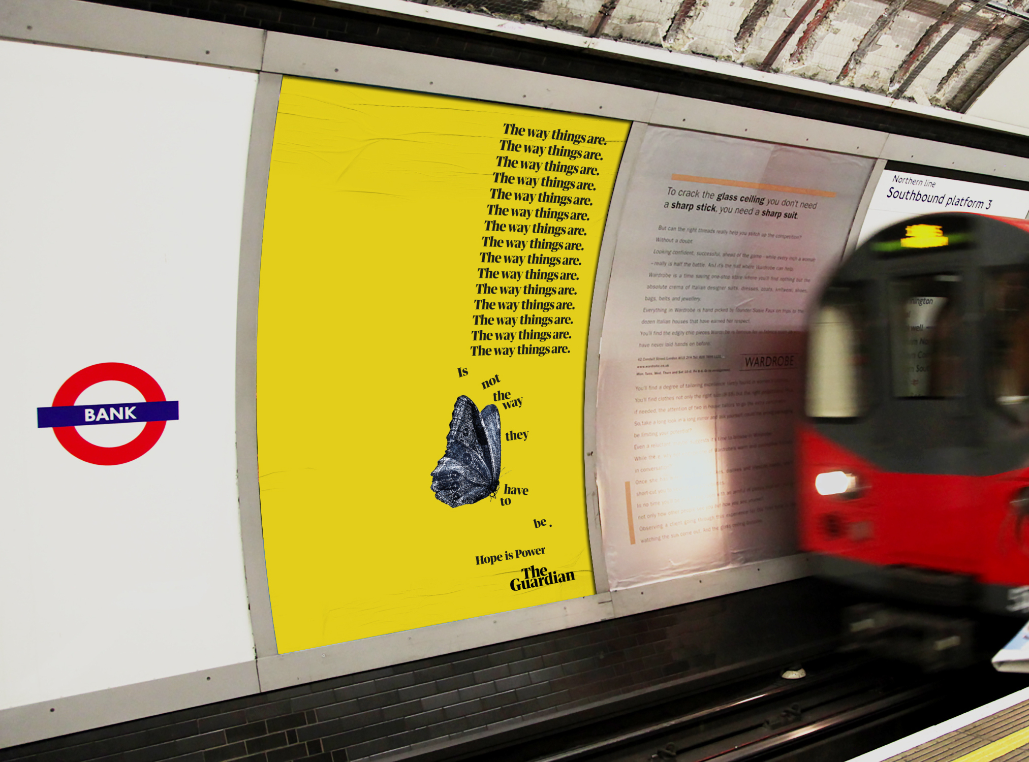
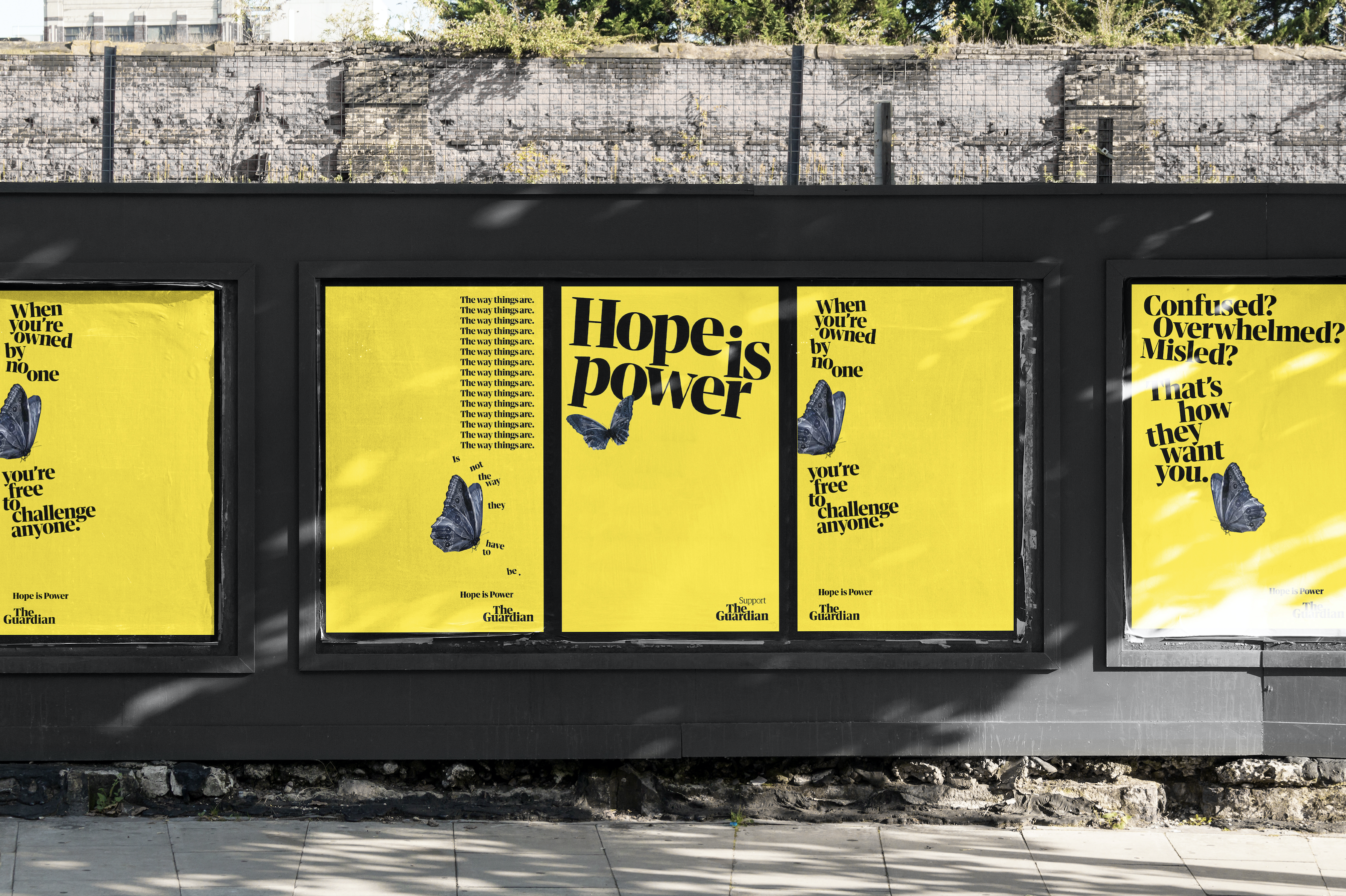
Shortlisted for Best of Show: Hope Is Power by Uncommon Creative Studio
- Shortlisted: Best of Show
- Gold Award: Publishing
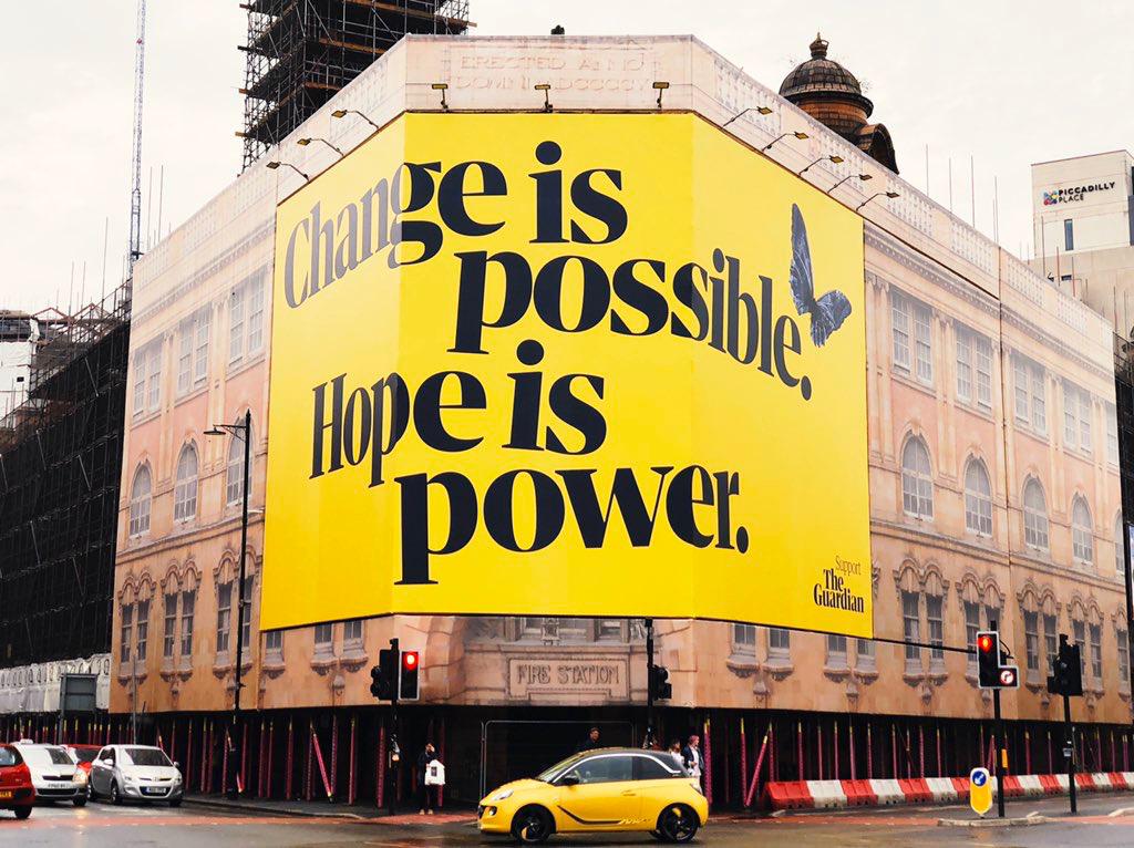
It was a stellar maiden year for Uncommon at the BIAs, with an unprecedented two projects in contention for the ultimate Best of Show accolade – the first time this has happened in seven years of the awards.
"Bold and inspiring, Hope Is Power captured the mood of the moment and encouraged us all to sit up straight and reengage with the possibility of change and activism," enthuses Dilys Maltby. "We all agreed that, as a campaign, it was visually arresting and emotionally powerful."
"Hope Is Power is exactly what it should be," adds Mike Reed. "Smart, uncompromising, witty, and unignorable."
The week that Hope Is Power launched was the biggest week of the Guardian's year to date in terms of financial contributions, with almost 400 subscriptions coming directly from the campaign landing page.
Gold Award winners
Brand Impact Awards 2020: Gold Awards
The following 7 projects all received at least one Gold Award trophy at the Brand Impact Awards 2020.
Find out more: download the full winners showcase
01. 25 Sculptures in Five Dimensions by Studio Sutherl& x Tom Sharp
- Gold Award: Copywriting
- Silver Award: Self-Branding
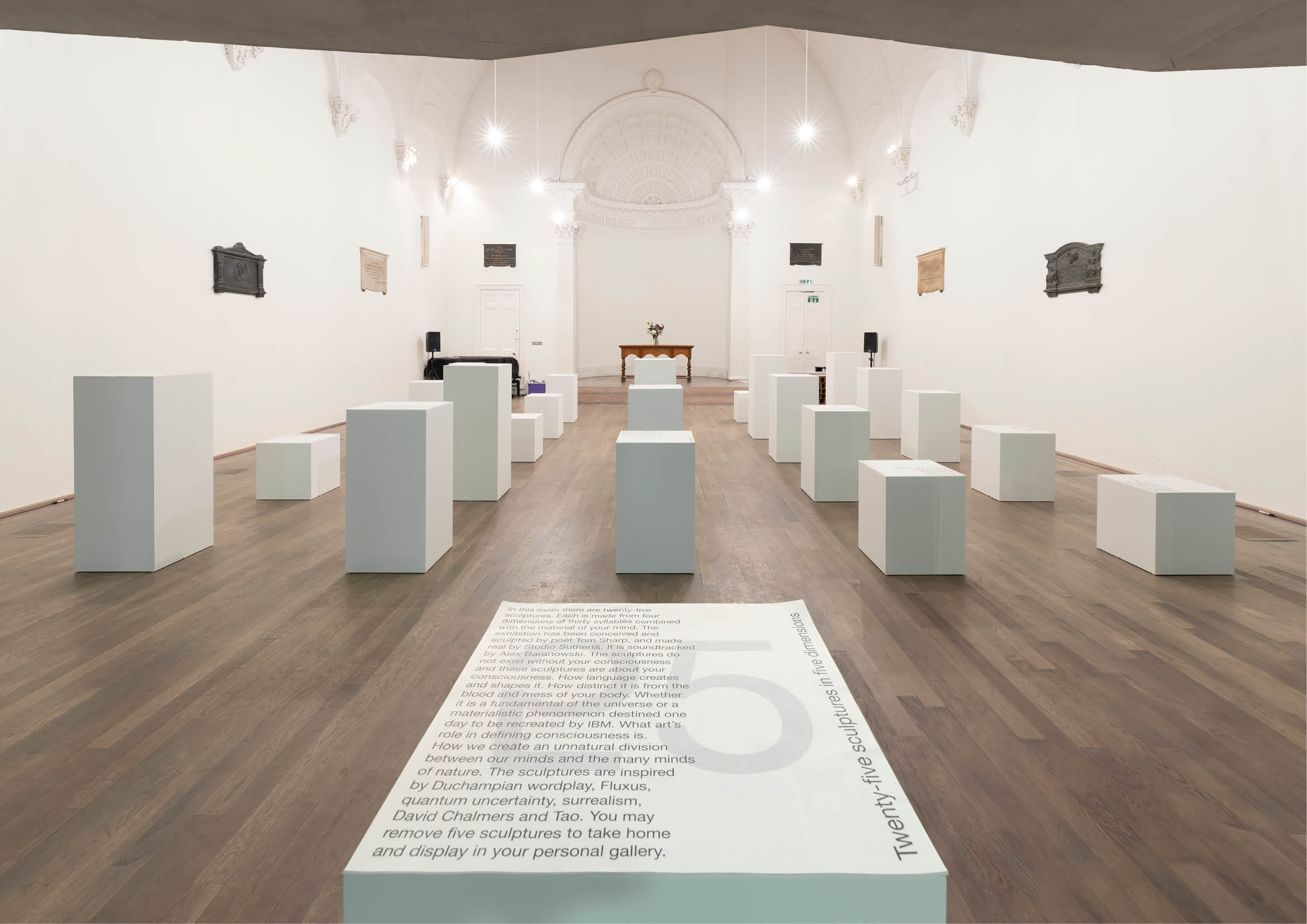
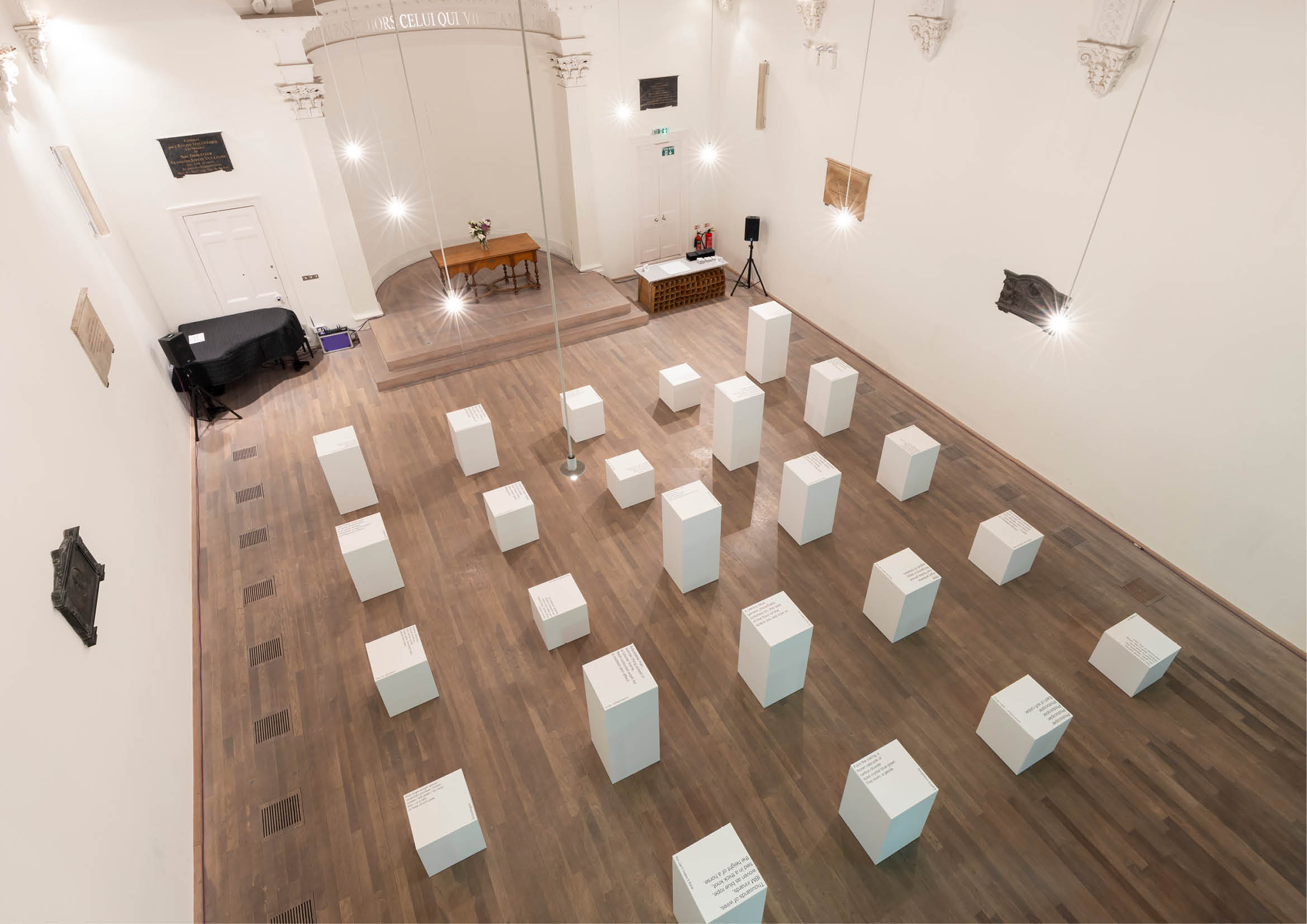
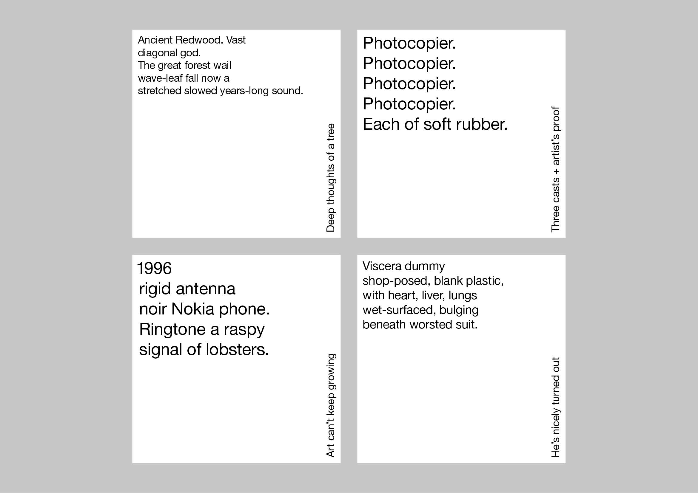
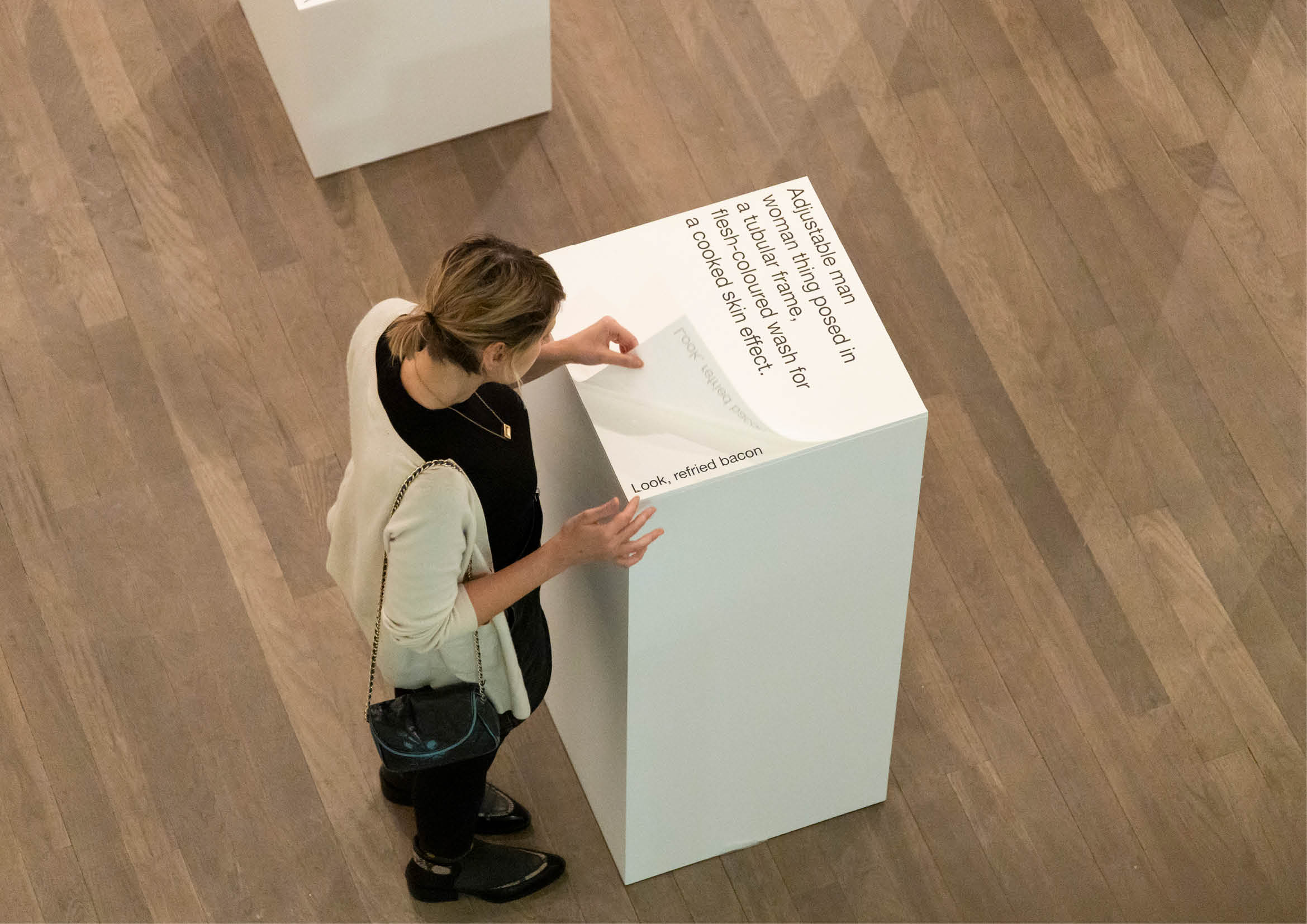
A self-promotion project for writer Tom Sharp, 25 Sculptures In Five Dimensions is a powerful demonstration of how creativity can flourish within even the strictest technical writing and design restraints.
Although the physical event was a one-night-only affair for just 200 people – "cocktails, clients and conversation" at the Swiss Church, Covent Garden – the self-promotional impact of the installation spread far beyond those who attended.
25 plinths each hosted a 'sculpture': a pad printed with a poetic description of a physical object for the reader to visualise inside their own mind. "This project raises the bar for what writers can do in the creative world, inviting people to think much bigger about the possibilities of the written word," says Nick Asbury.
02. Showtown by True North
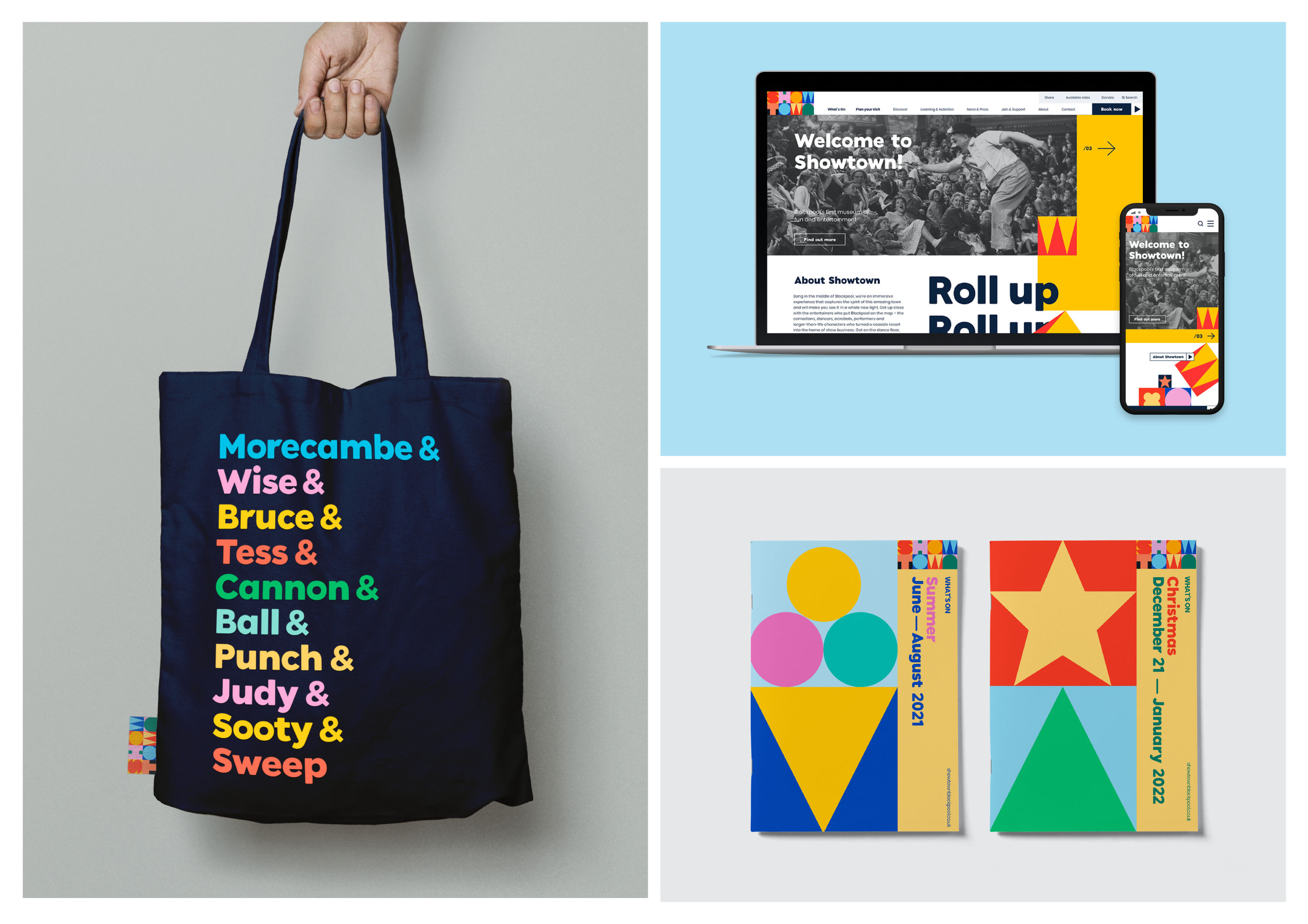
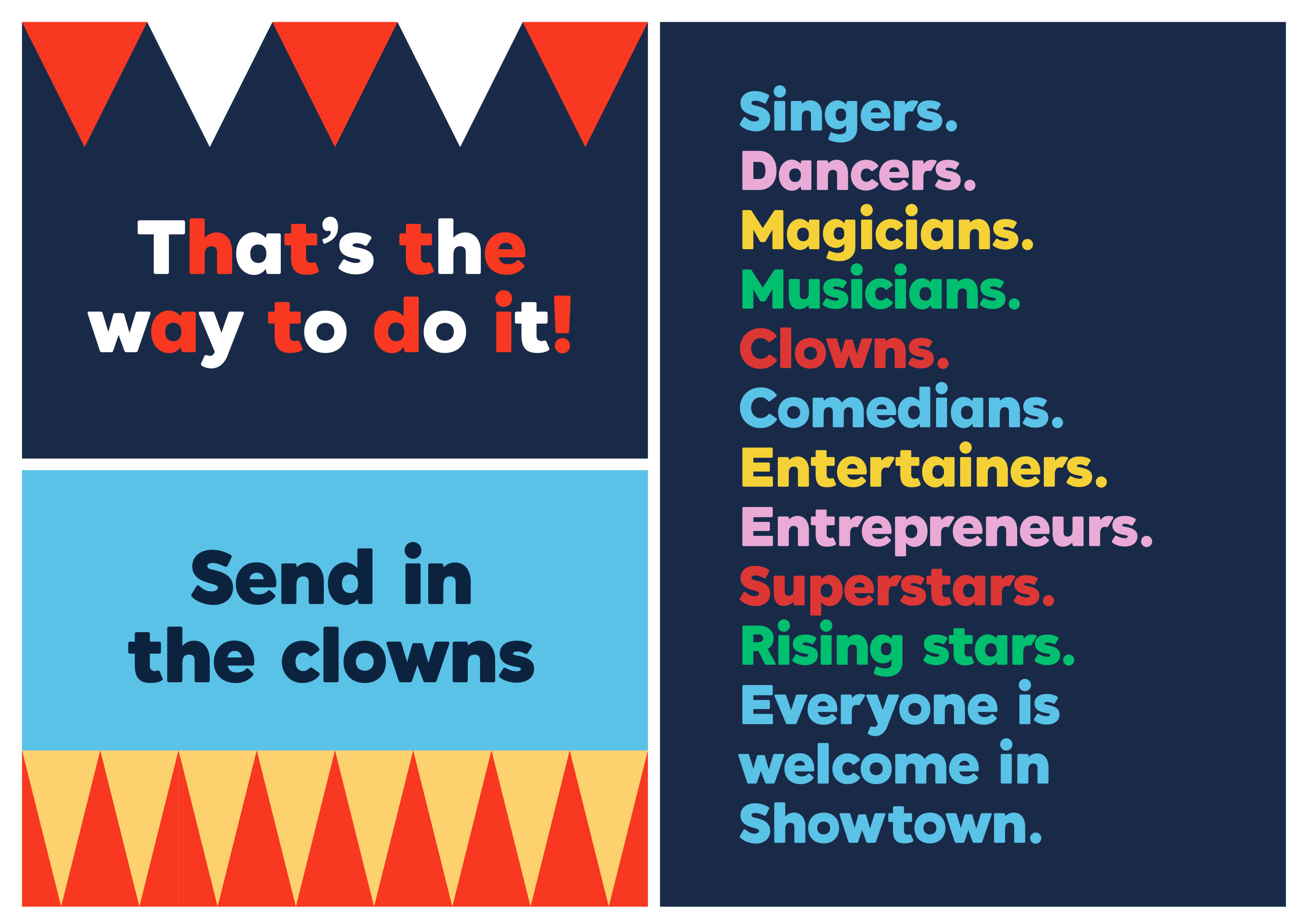
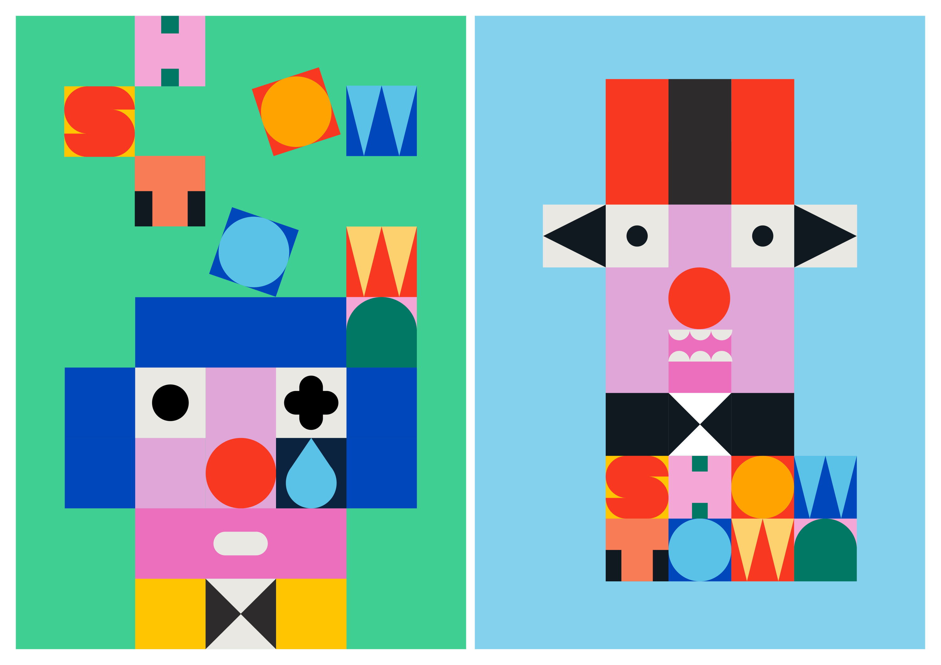
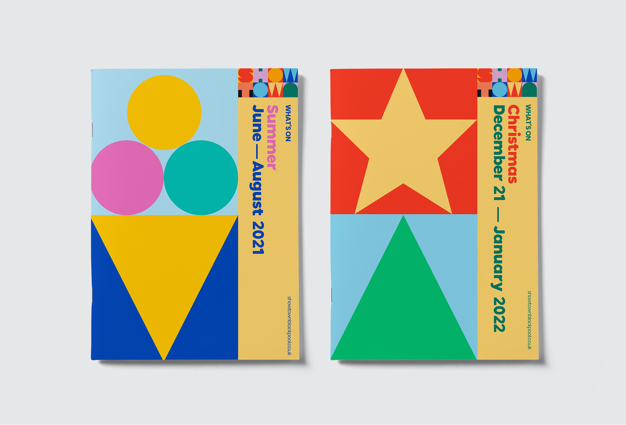
- Gold Award: Culture
- Bronze Award: Illustration
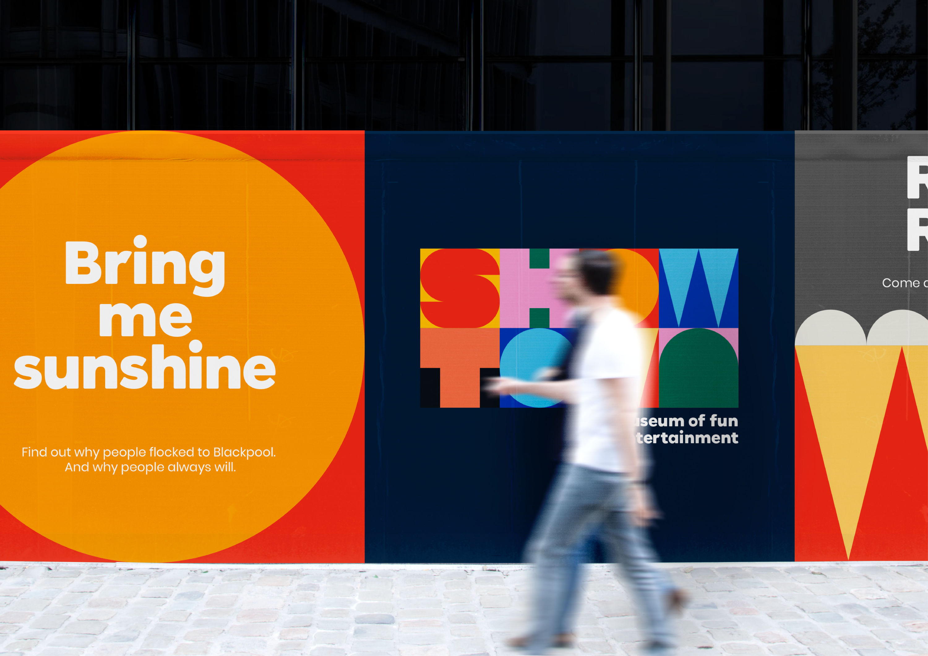
As Blackpool's first ever museum, Showtown already promised a one-of-a-kind experience in the city. However, it also needed to compete for the attention of the 18 million people who stroll the promenade each year with a plethora of other vibrant attractions to pick from.
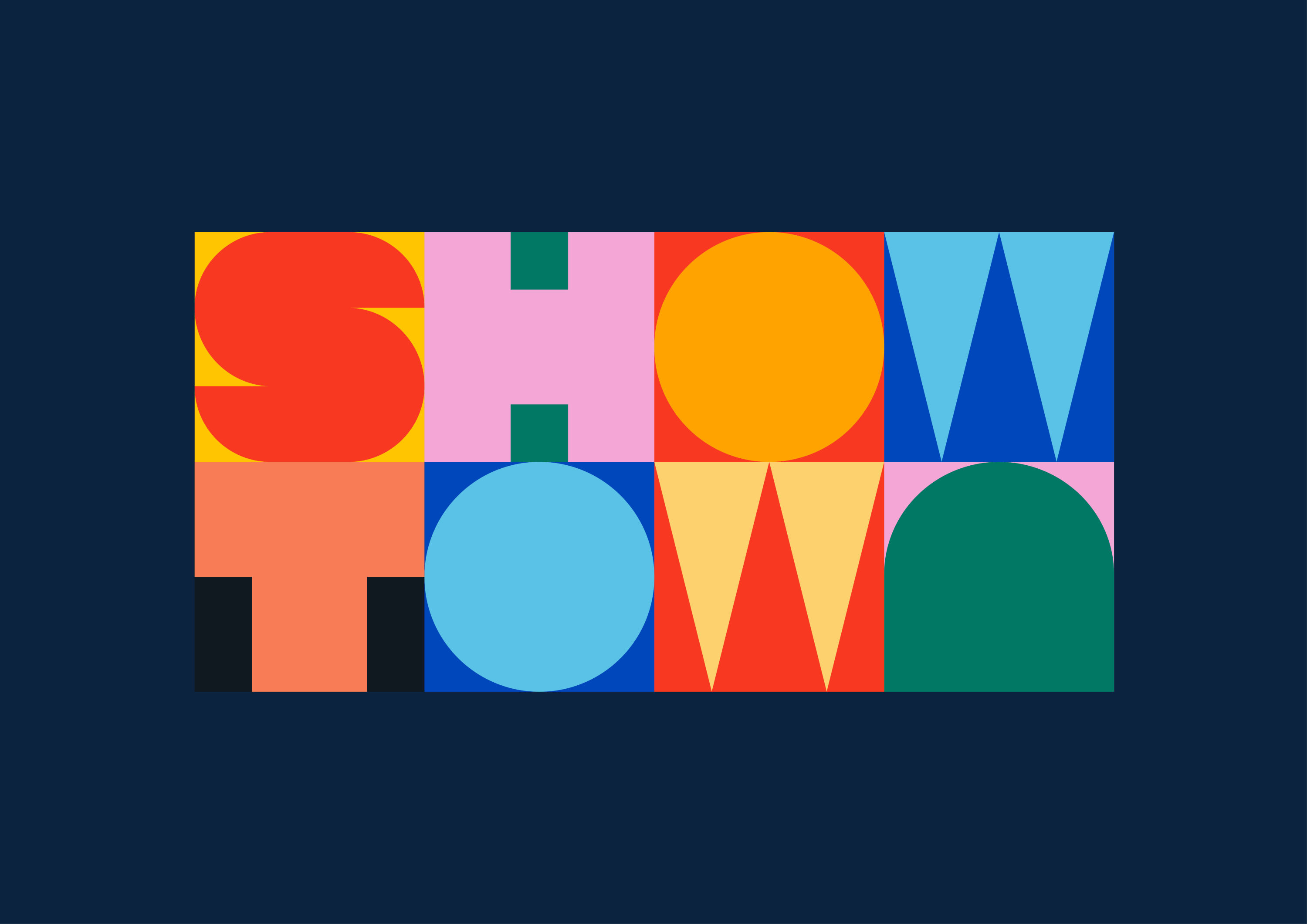
Shaking off the common perception of museums as places where history is commended in hushed whispers, True North set out to give Showtown all the charm, appeal and entertainment value of a top-bill seaside attraction.
Like an all-star cast performing on stage, Showtown’s identity is much more than the sum of its parts. It's based on a toolkit of ‘brand blocks’ – bold, simple graphic icons that tease the thrilling experiences that await inside the museum.
03. Curious Customs by NB Studio
- Gold Award: Illustration
- Bronze Award: Copywriting
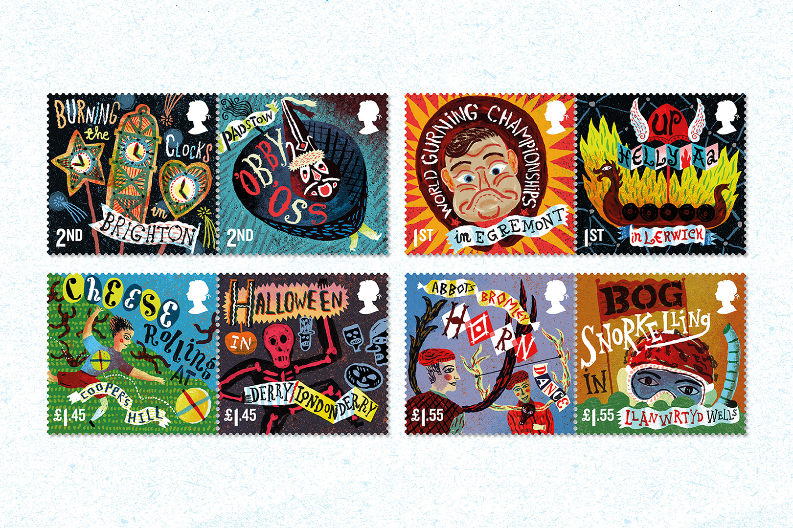
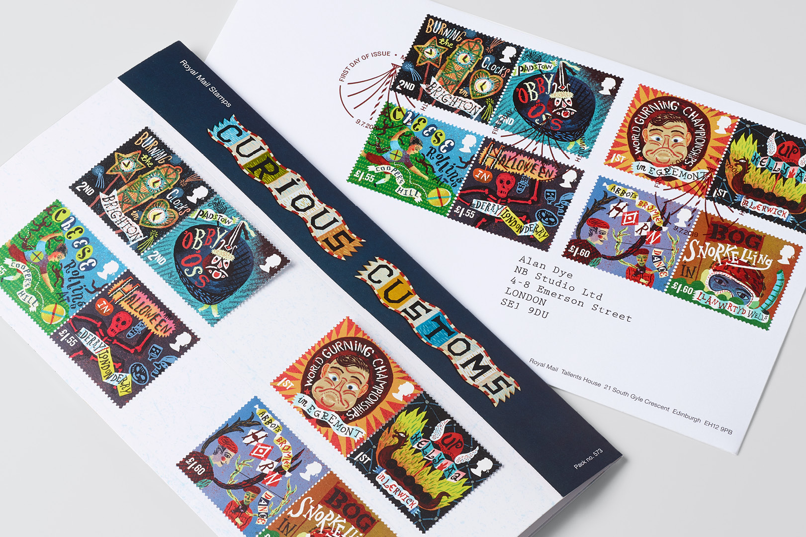
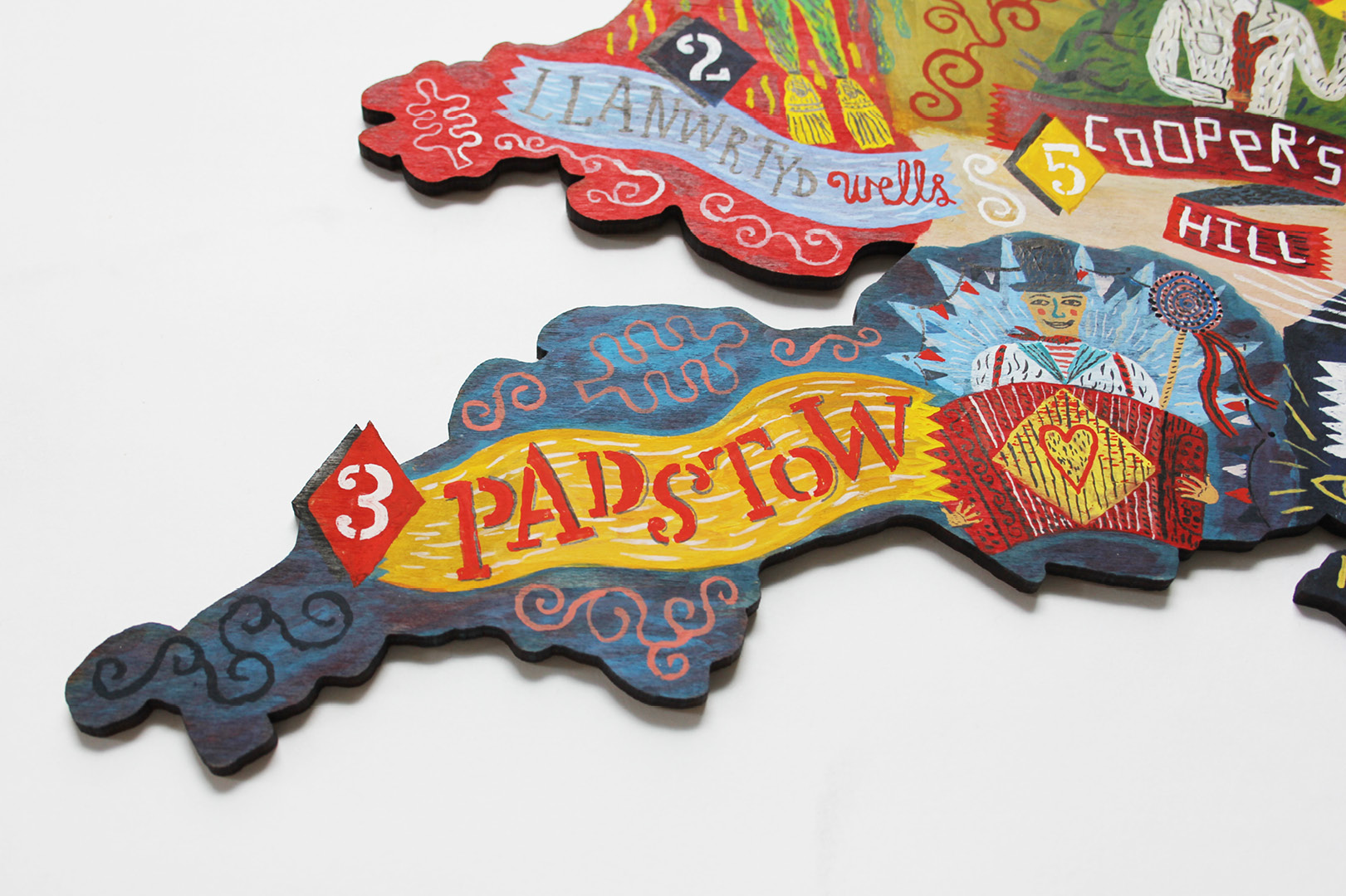
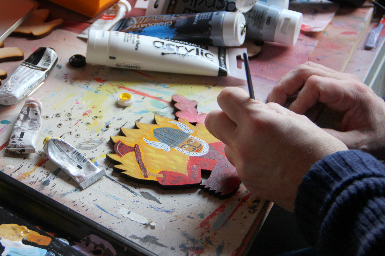
Royal Mail tasked NB Studio to develop a range of stamps based on eight eccentric British customs for its 'Curious Customs' stamp issue – which took home one of the two Gold Awards in the BIAs' inaugural Illustration category.
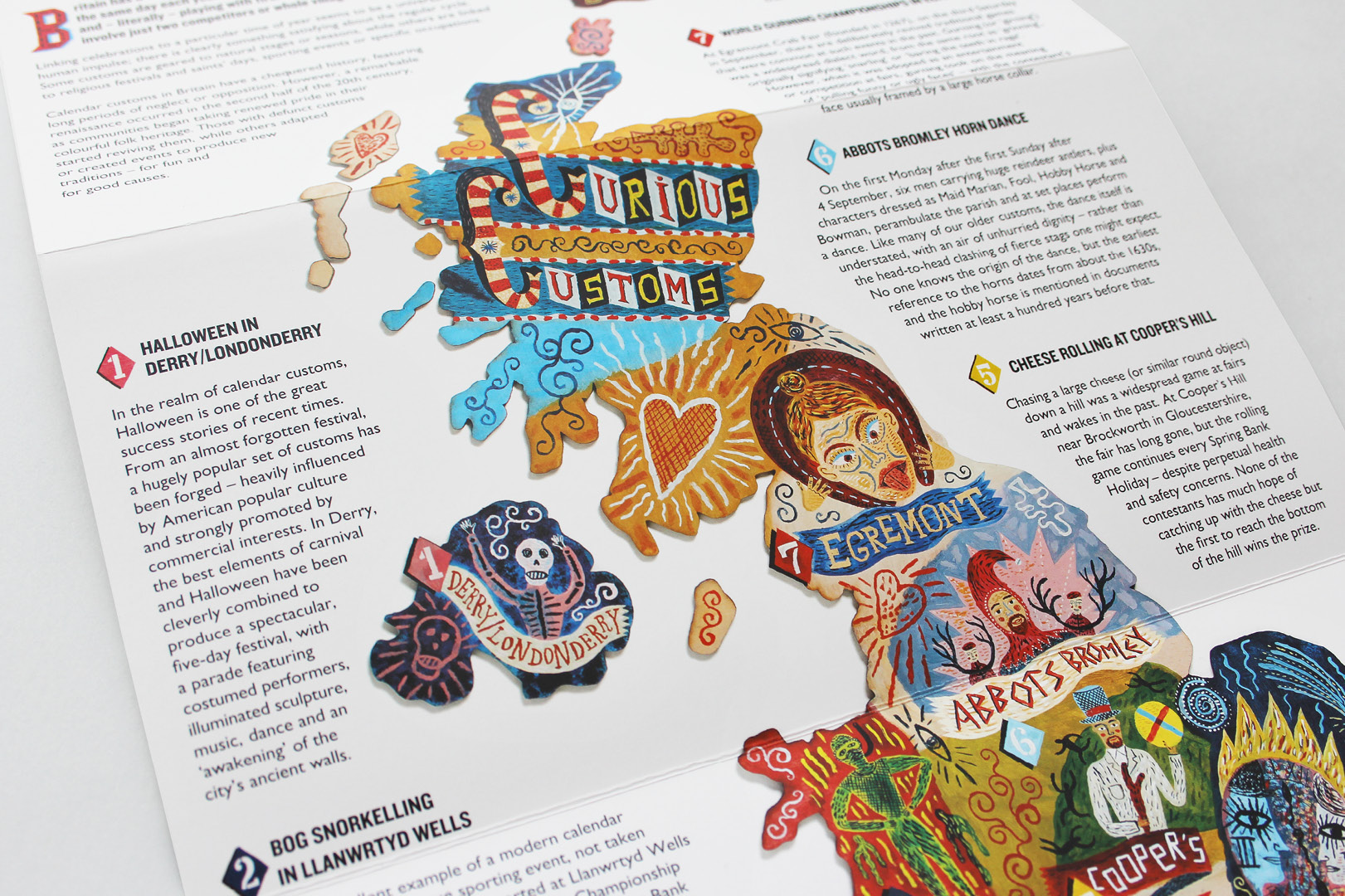
Cheese rolling, clock burning, gurning and bog snorkelling are just some of the weird and wonderful traditions from around the UK brought to life through evocative wordplay and quirky illustration by Jonny Hannah.
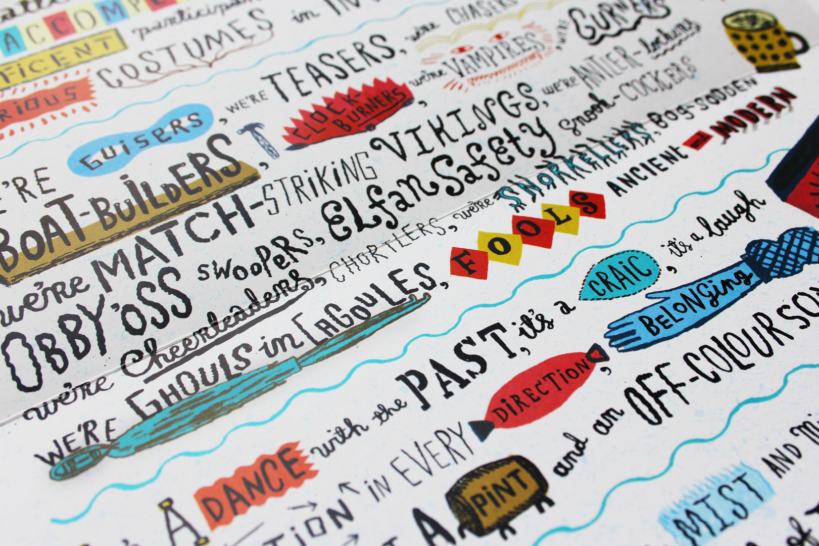
Drawing inspiration from British folk traditions, NB Studio also collaborated with performance poet Matt Harvey to incorporate spoken word into the presentation pack which accompanies the stamps.
04. Undergraduate & Postgraduate Guides to CSM by Boyle & Perks
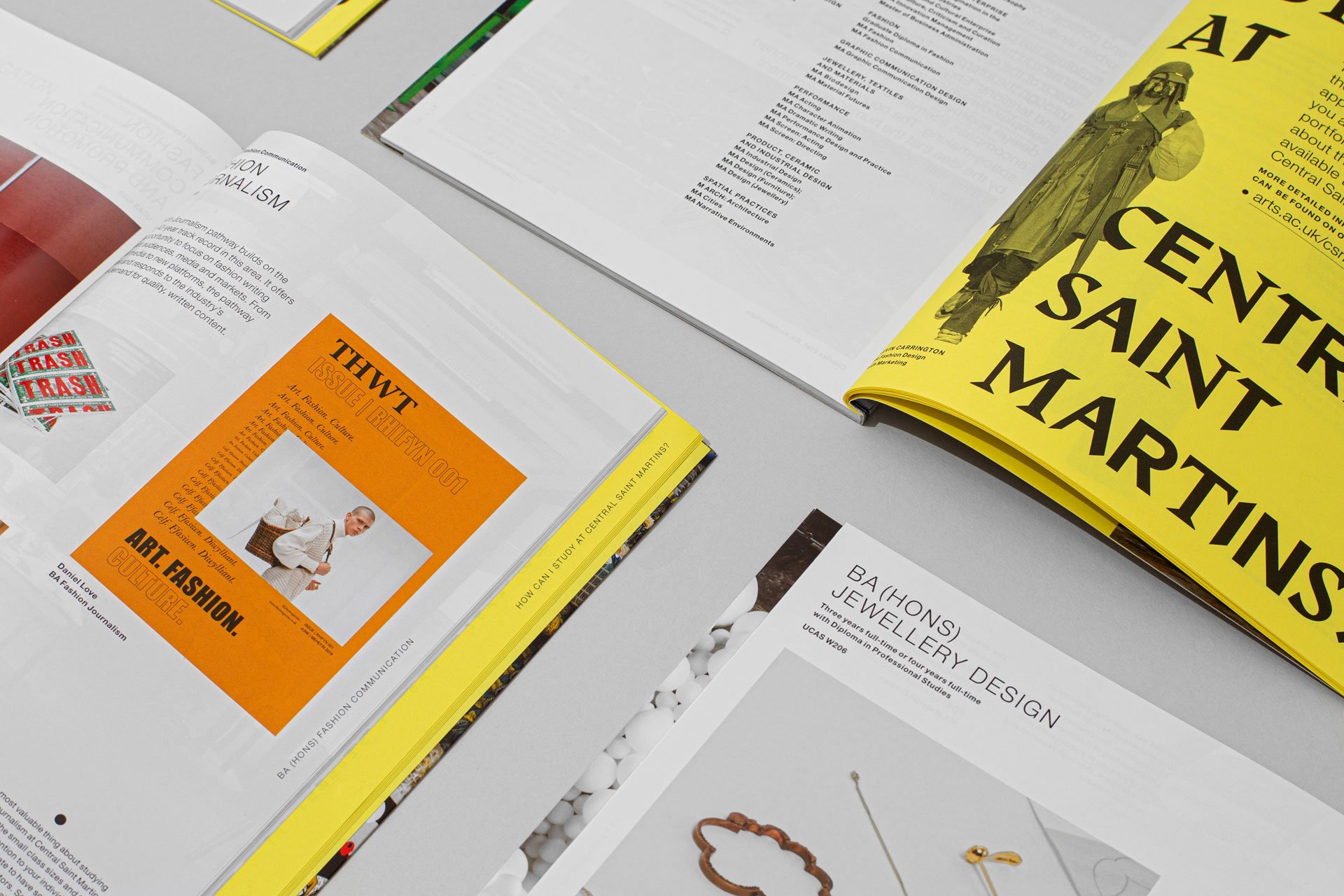
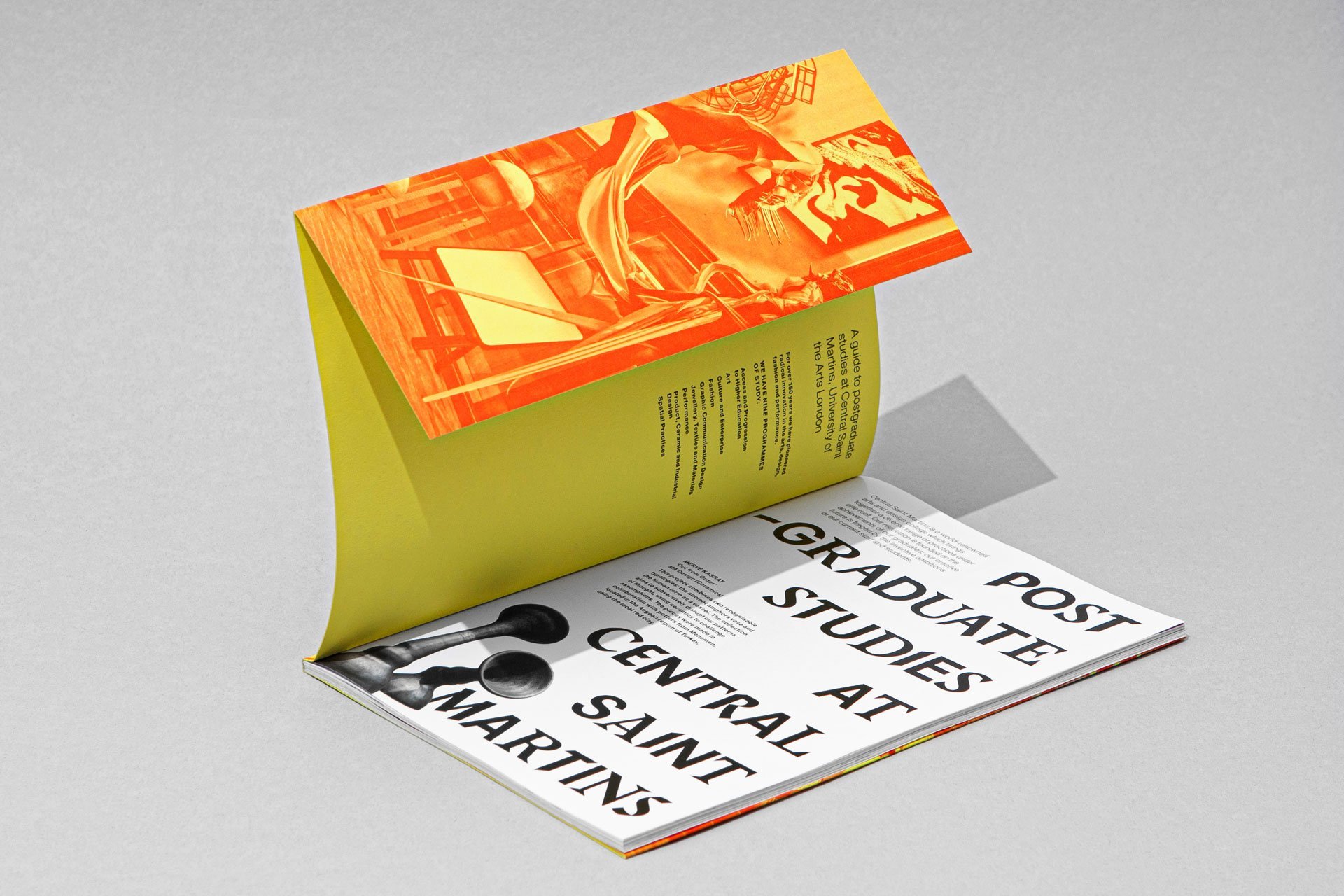
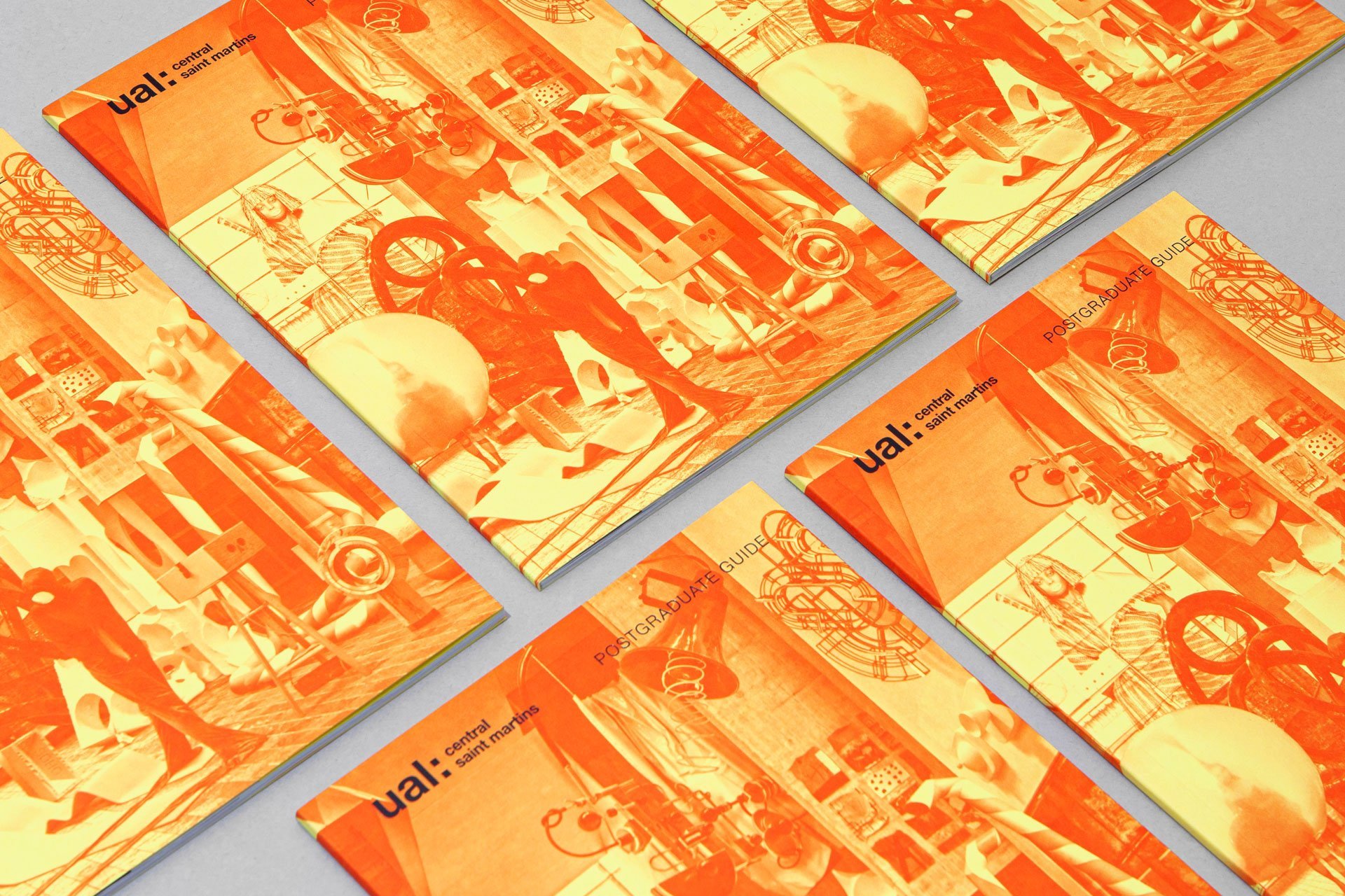
- Gold Award: Education
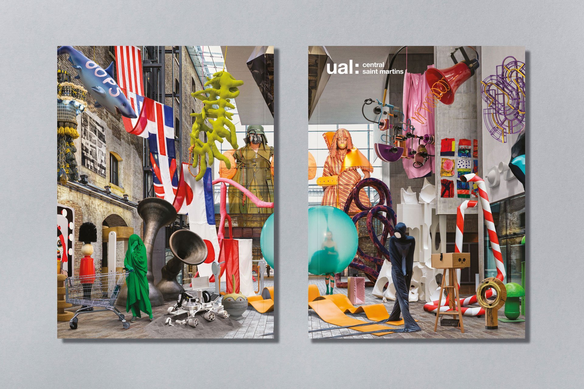
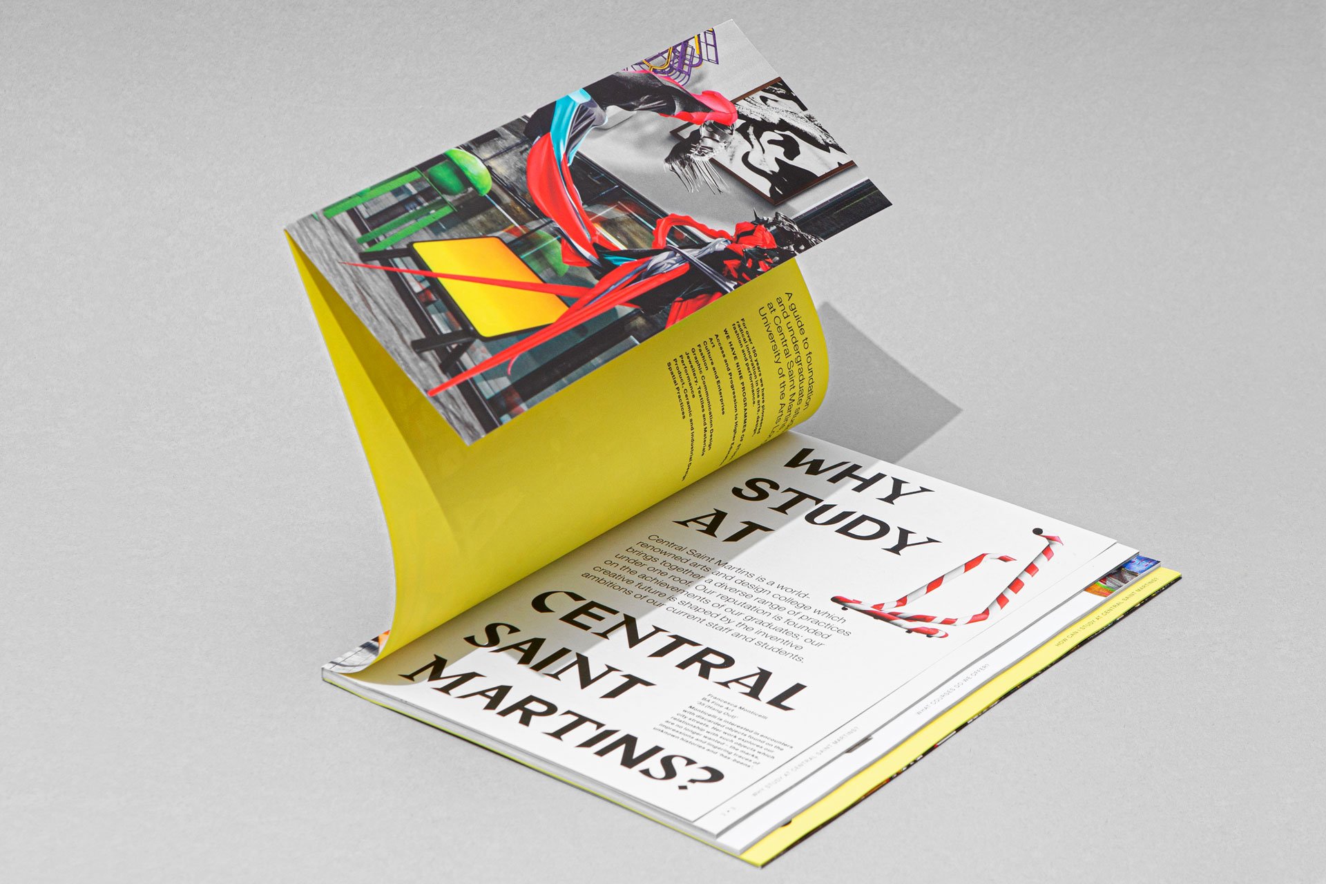
When Central St Martins commissioned a set of printed student guides, Boyle & Perks set out to "celebrate the carnival of creativity" at the heart of the college.
A single arresting image acts as the centrepiece: a photographic montage of student work from across CSM's programmes, transposed onto the college's building.
"Packed with energy, enthusiasm and experimental anarchic fun," says Chris Bradley. Max Ottignon adds: "They had us at that key visual. If you’re an aspiring art student, you see that image and you’re not going anywhere else."
05. Walworth Garden by Studio Sutherl&
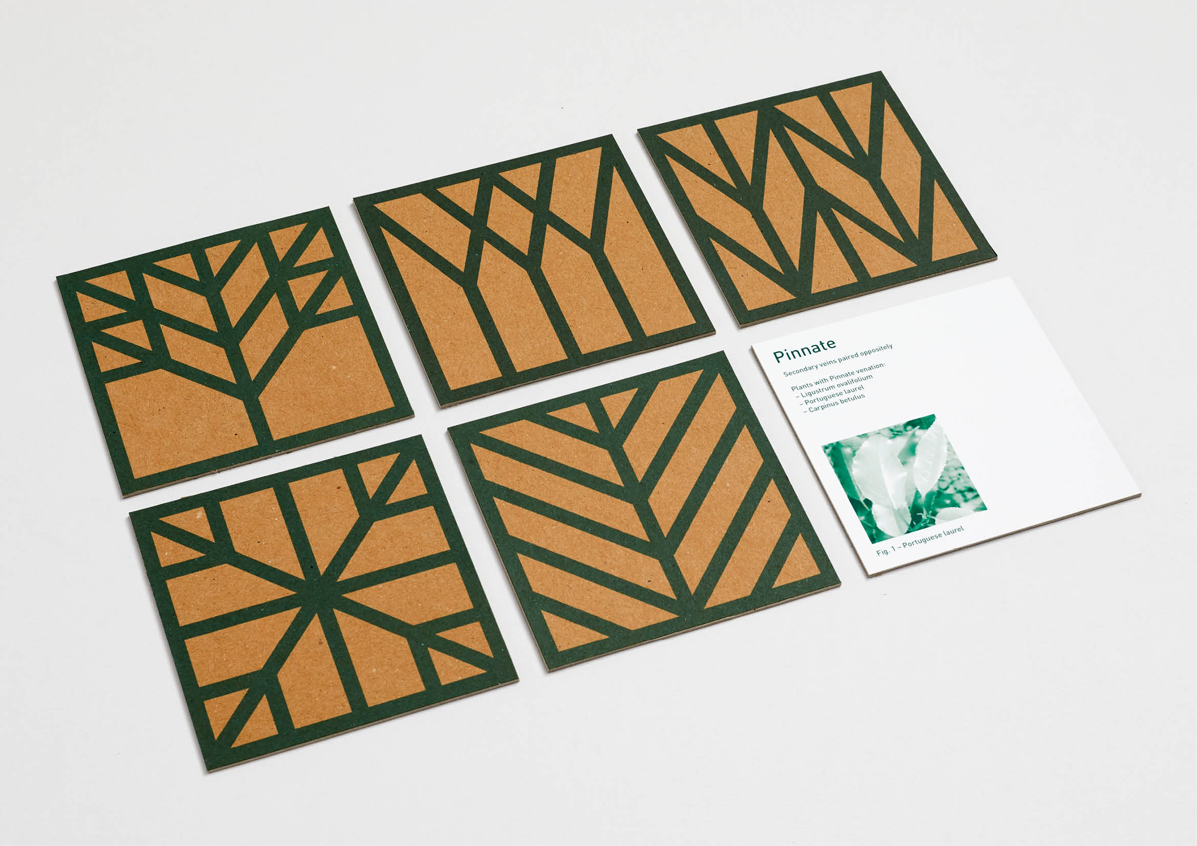
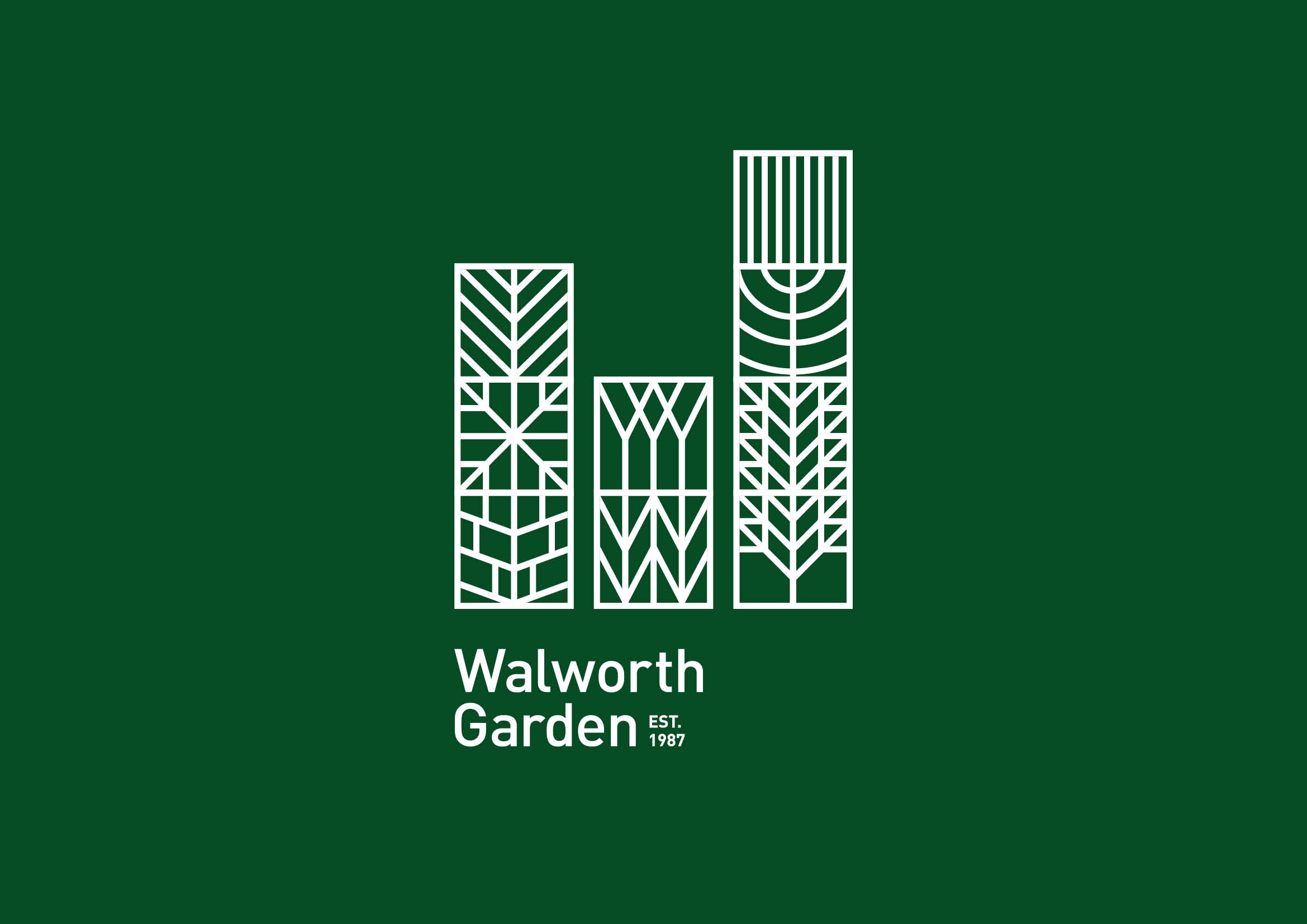
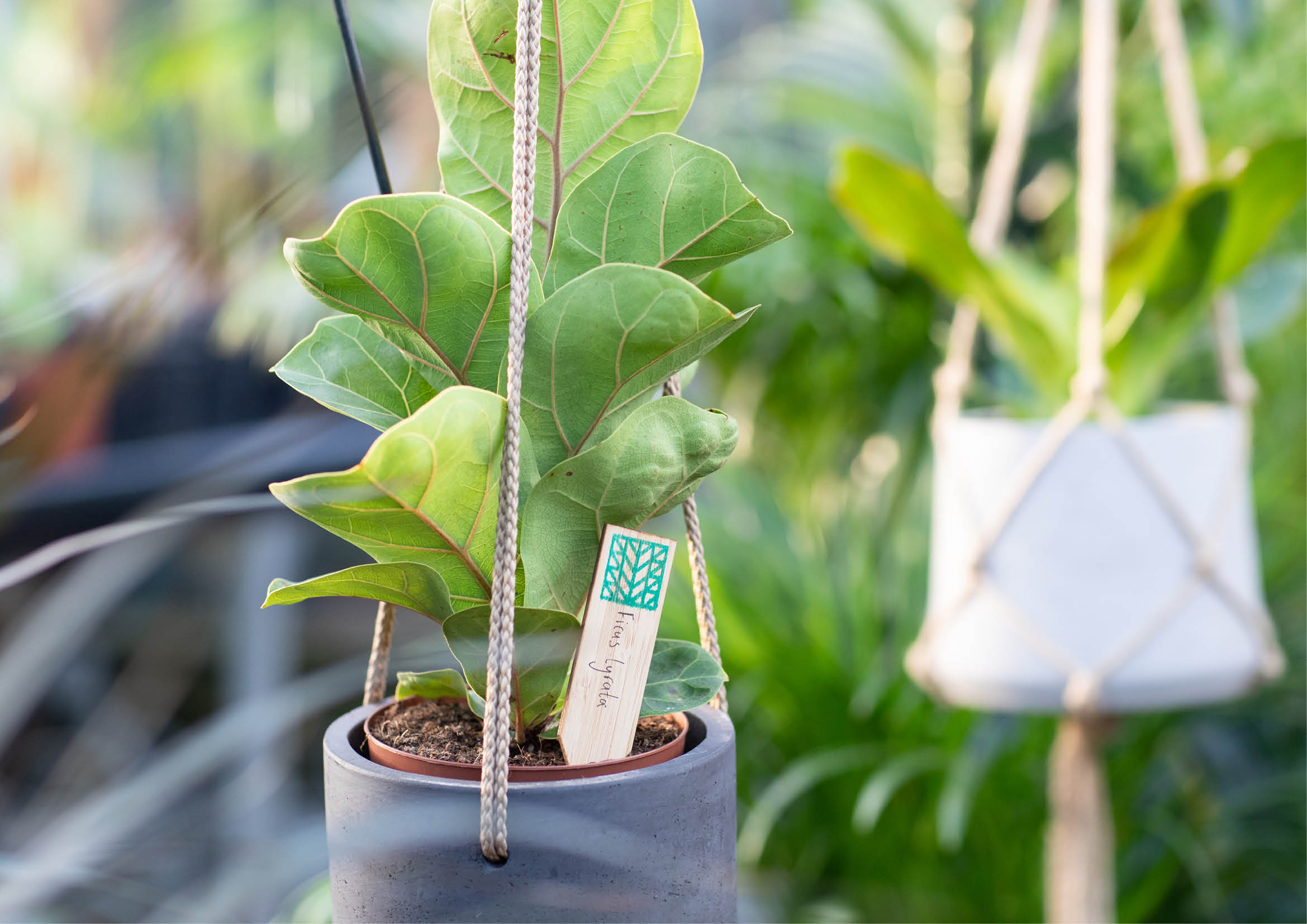
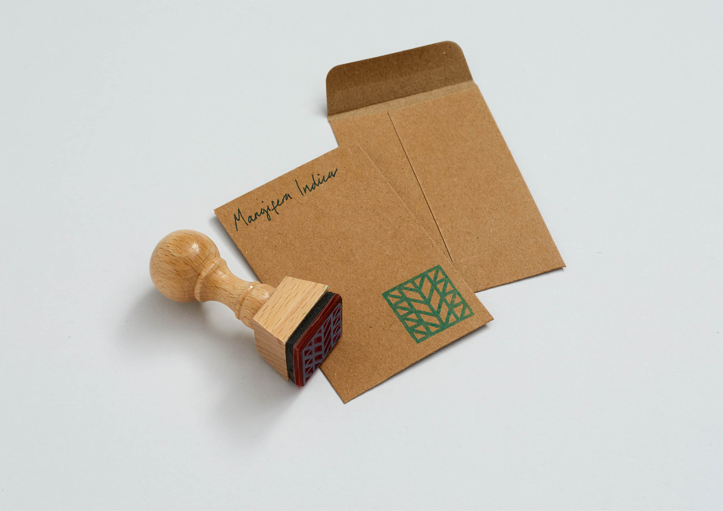
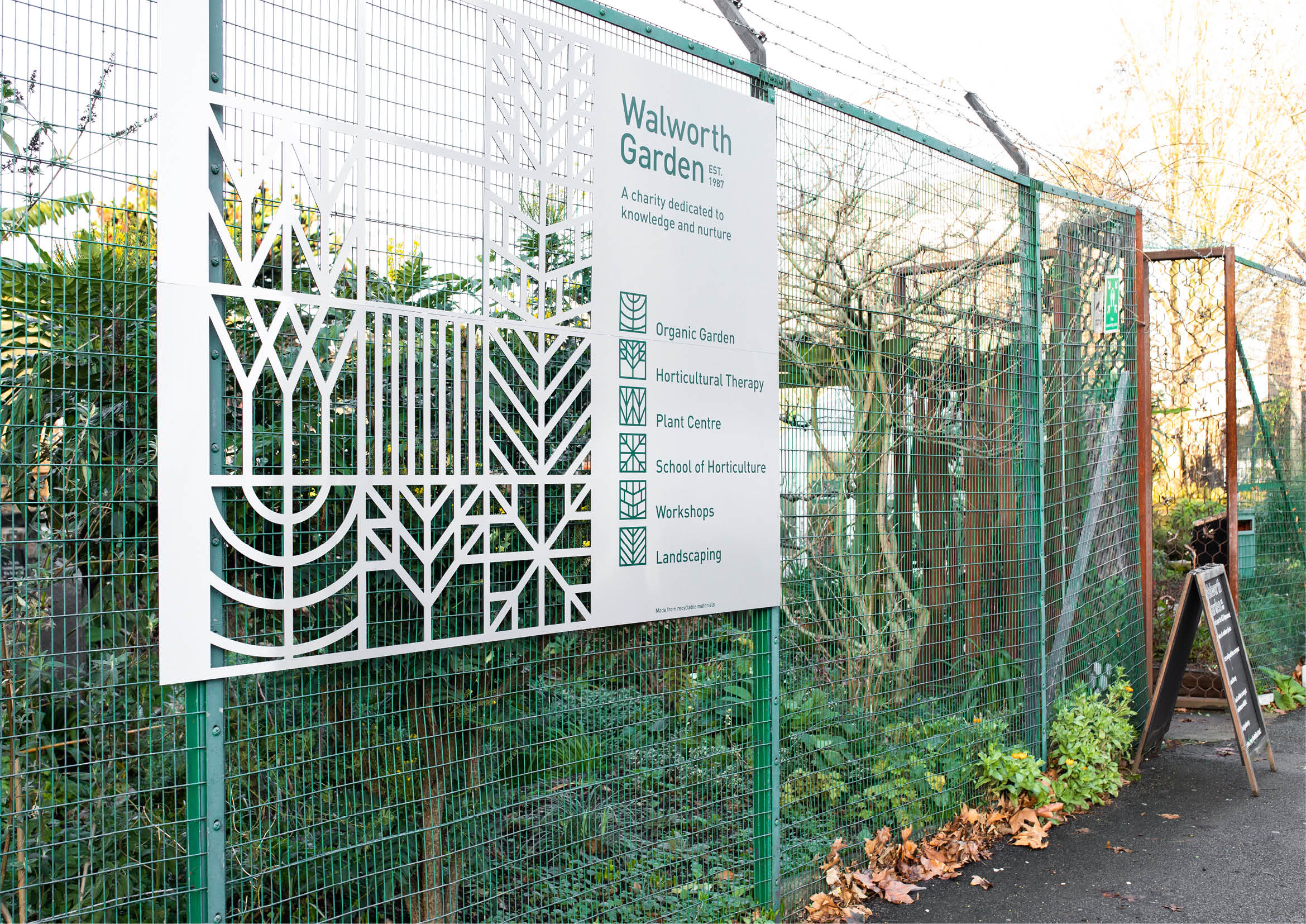
- Gold Award: Not-For-Profit
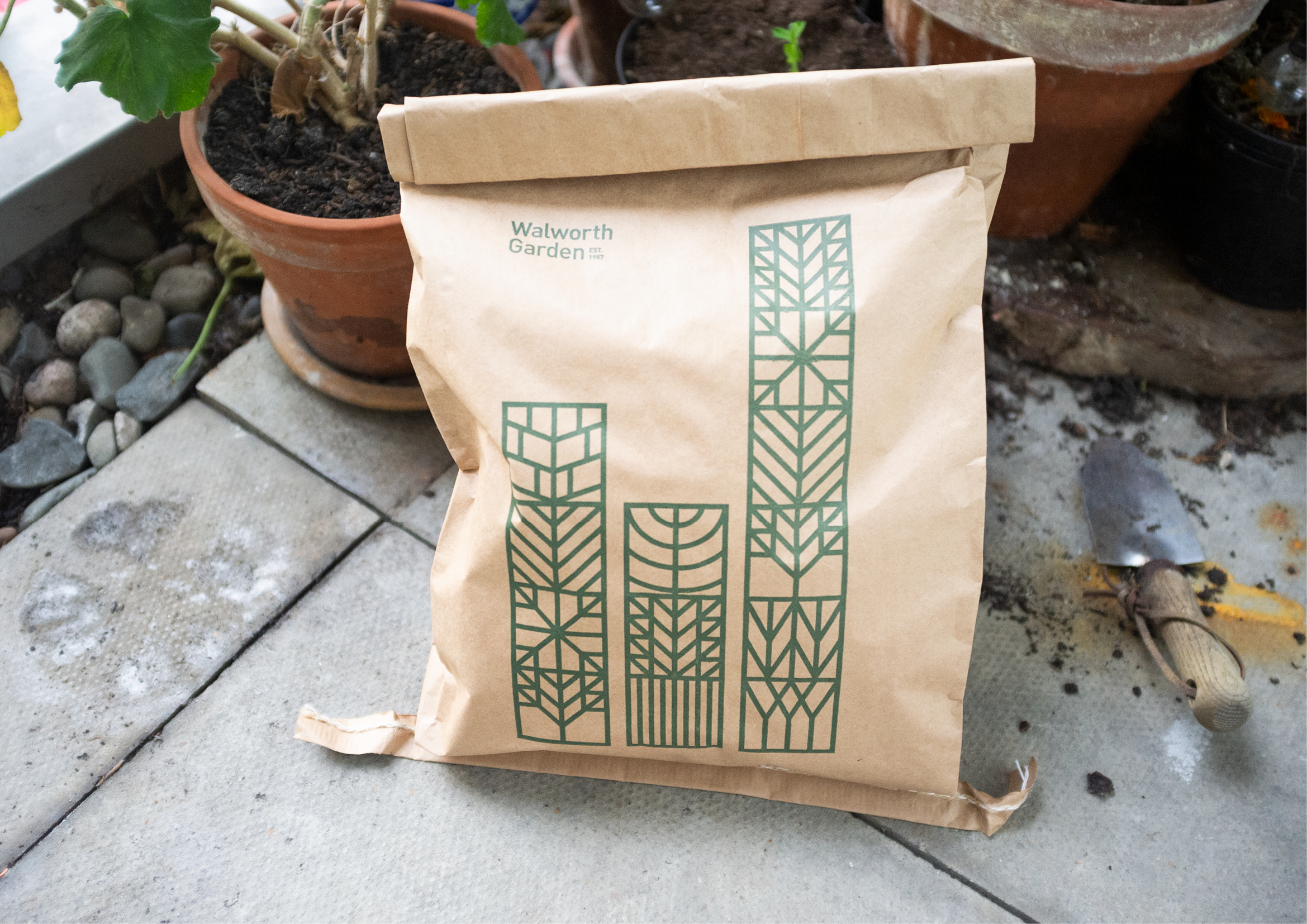
Inspired by the nine ‘venations’ intrinsic to every plant leaf, Studio Sutherl& developed a graphic system for London-based horticulture charity Walworth Garden based on tessellating shapes.
These versatile building blocks reflect the ideas of growth, support and community, and join together to create an urban skyline that subtly reflects the shape of a 'W'.
"The Walworth Garden identity is an elegant expression of the charity's role in providing a place to relax, learn and grow," says Richard Danks. "The design is peaceful, educational, and will stand the test of time – just like the garden itself."
06. Royal Astronomical Society by Johnson Banks

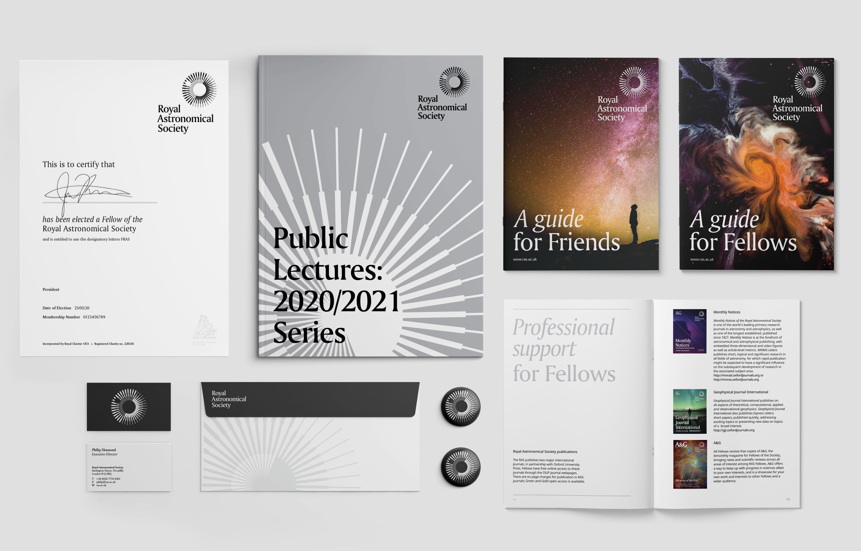
- Gold Award: Professional Services
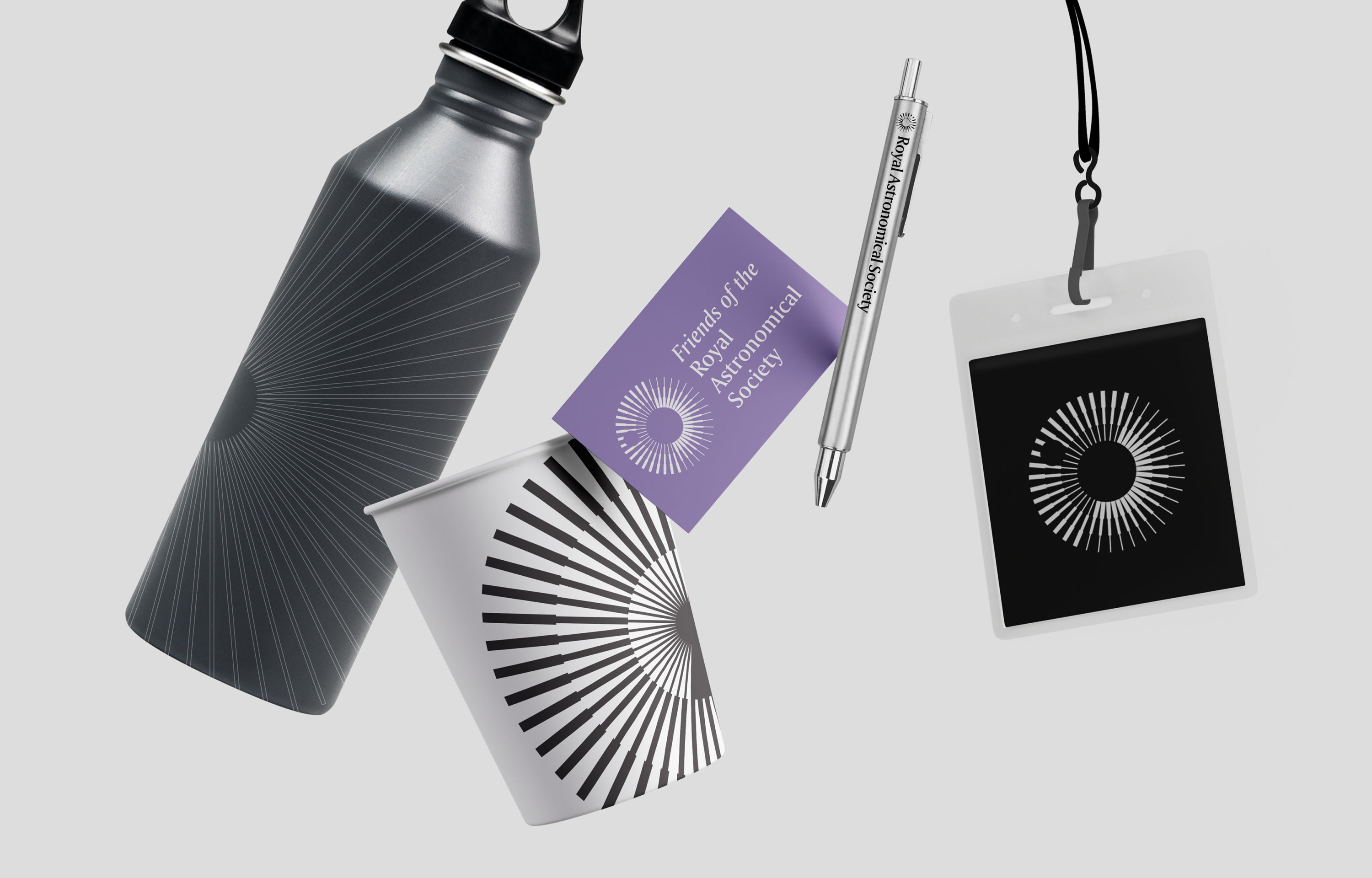
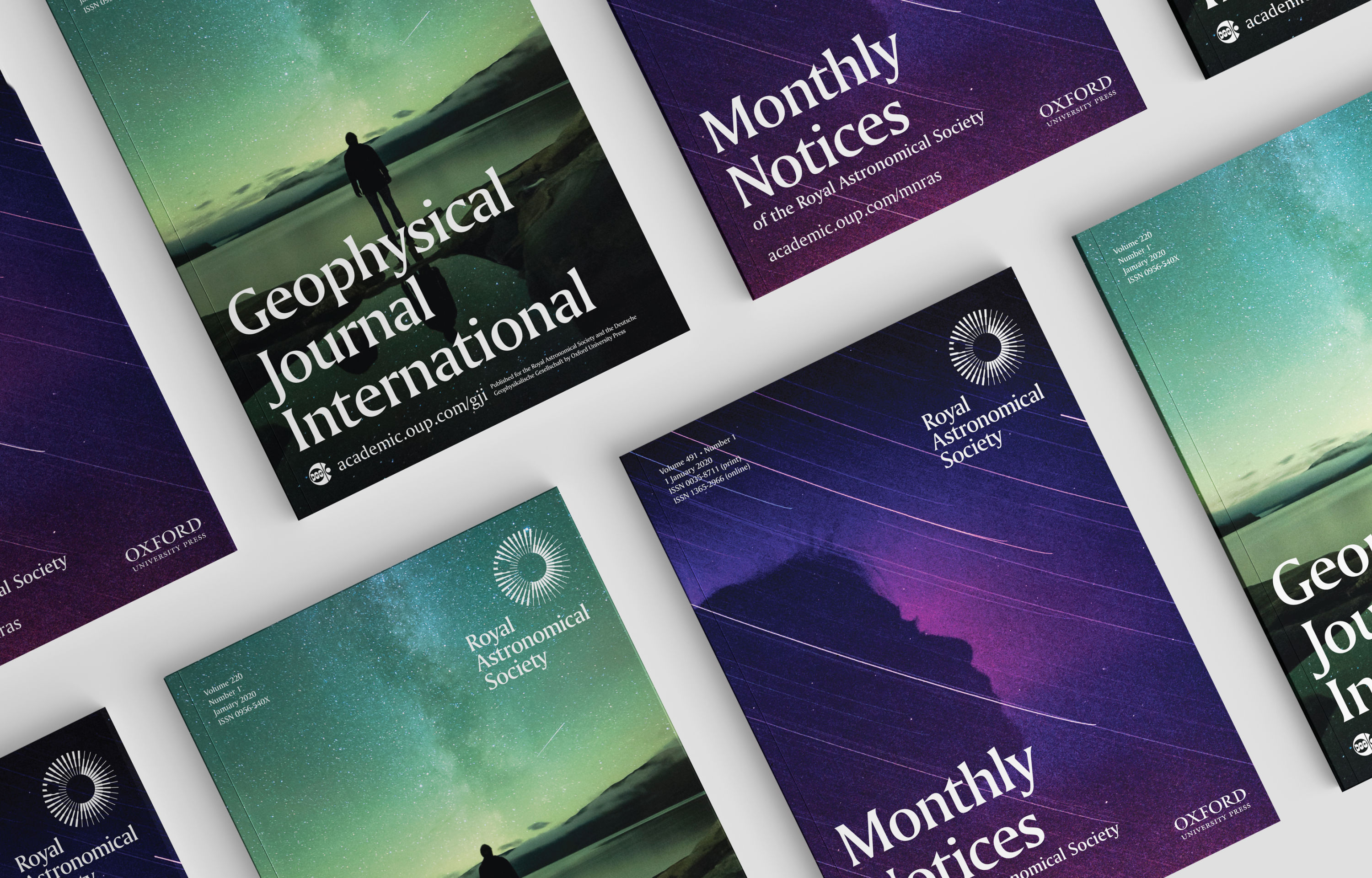
Founded in 1820 to encourage the study of astronomy, the solar system and geophysics, The Royal Astronomical Society is now using its 200th anniversary to broaden its reach.
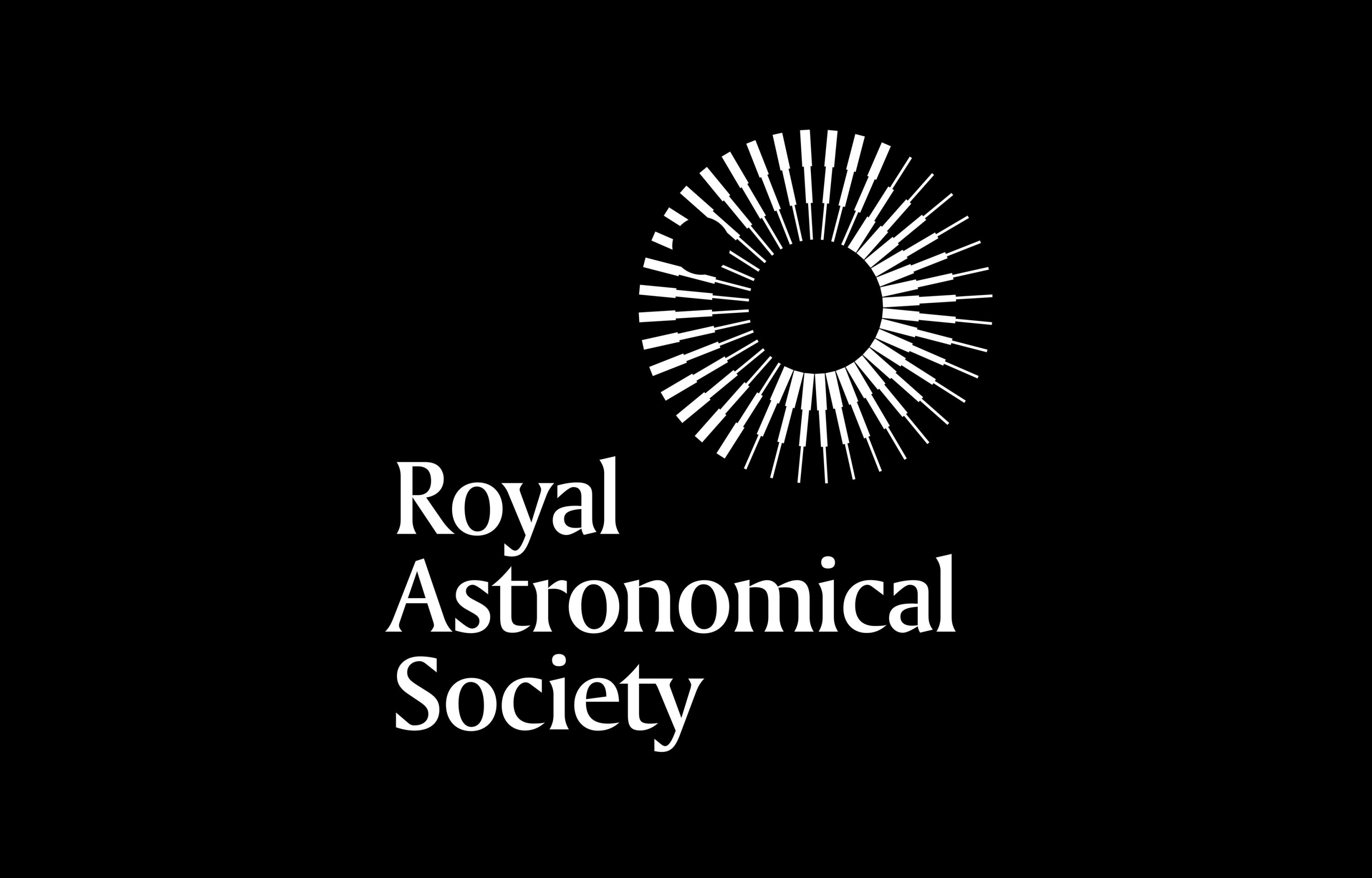
Johnson Banks' rebrand packs layers of symbolism into a deceptively simple and elegant mark that maintains the Society’s gravitas while attracting a younger, more diverse membership.
"So simple, yet so clever," says Garrick Hamm. "A master craftsperson at work."
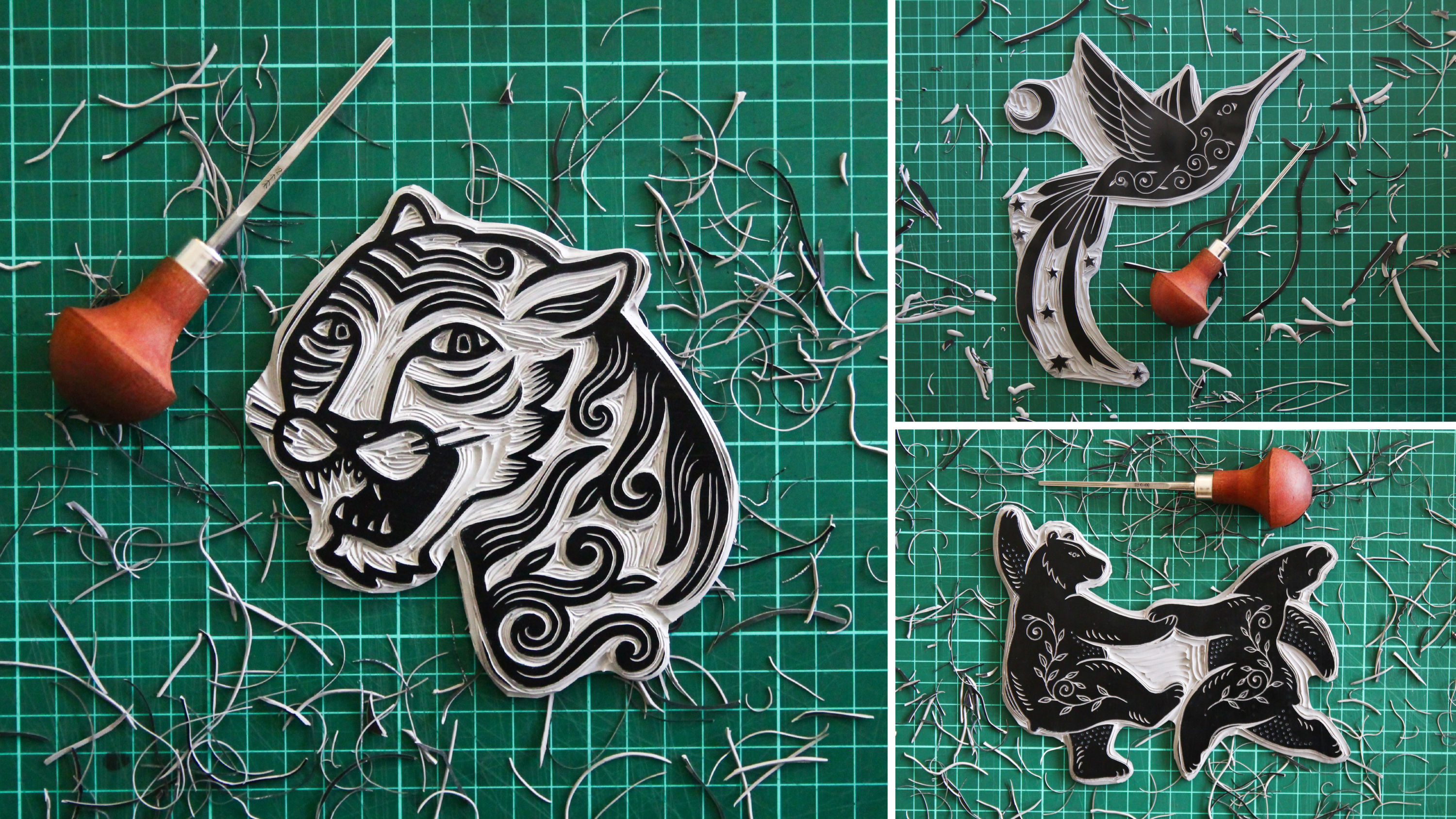
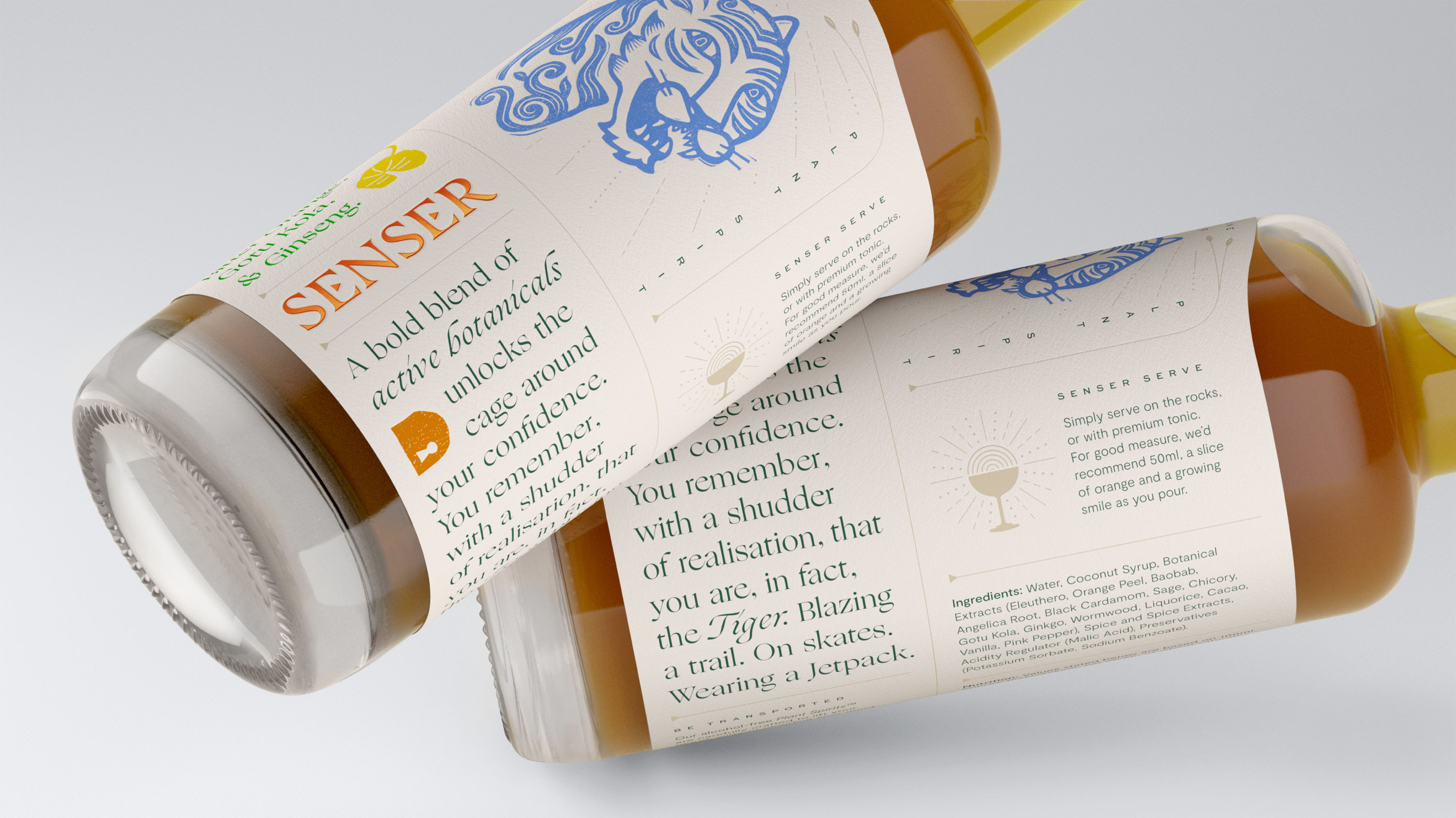
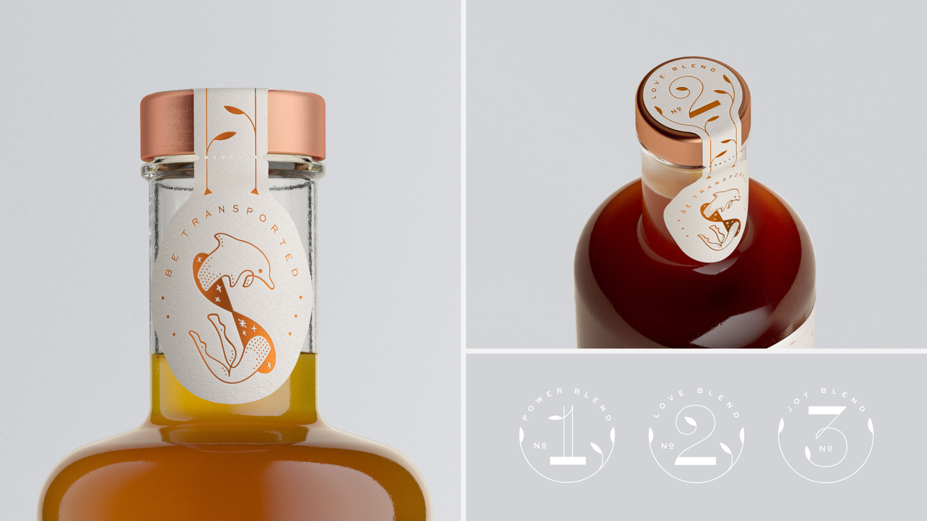
07. Senser Spirits by Magpie Studio
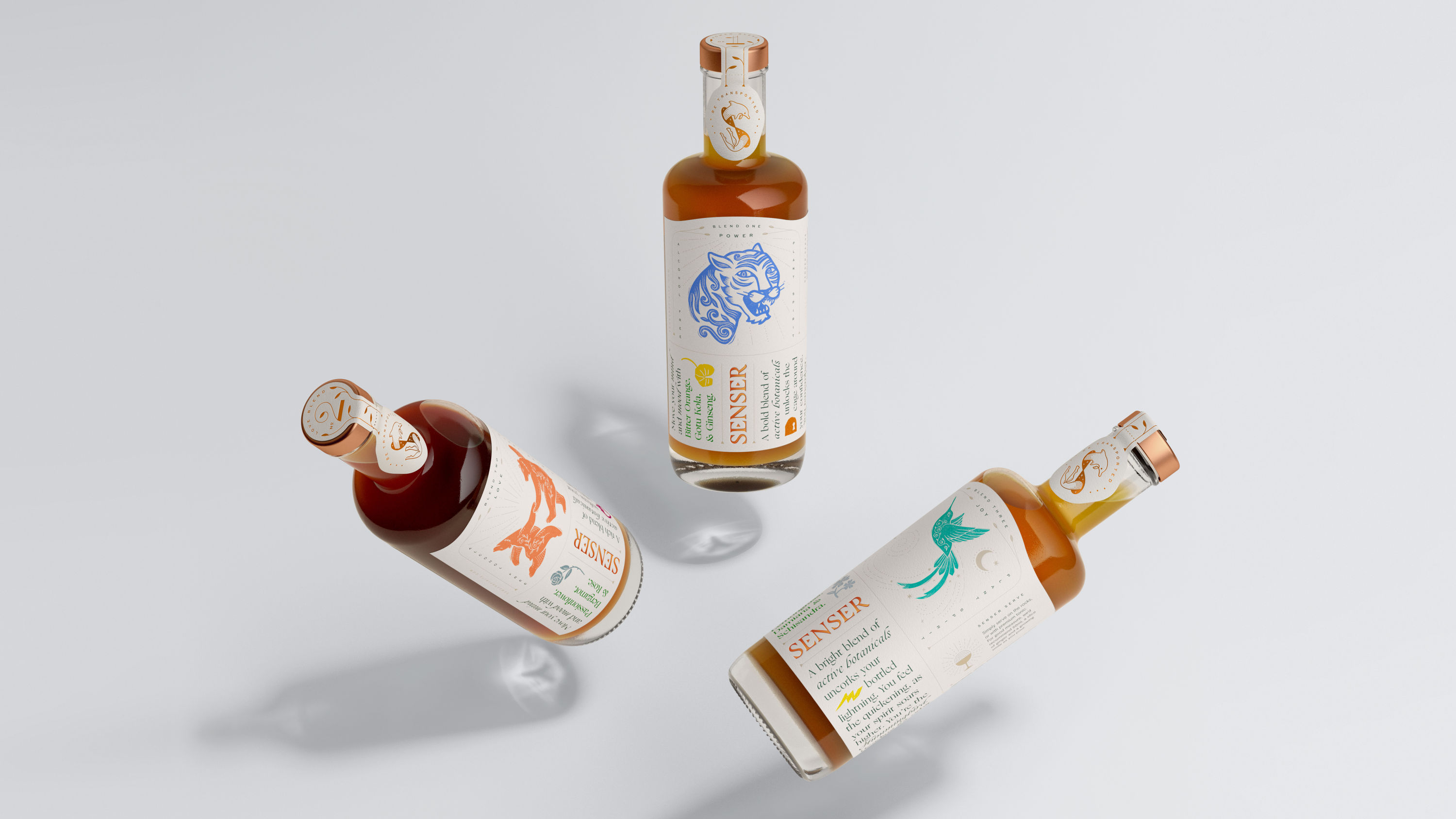
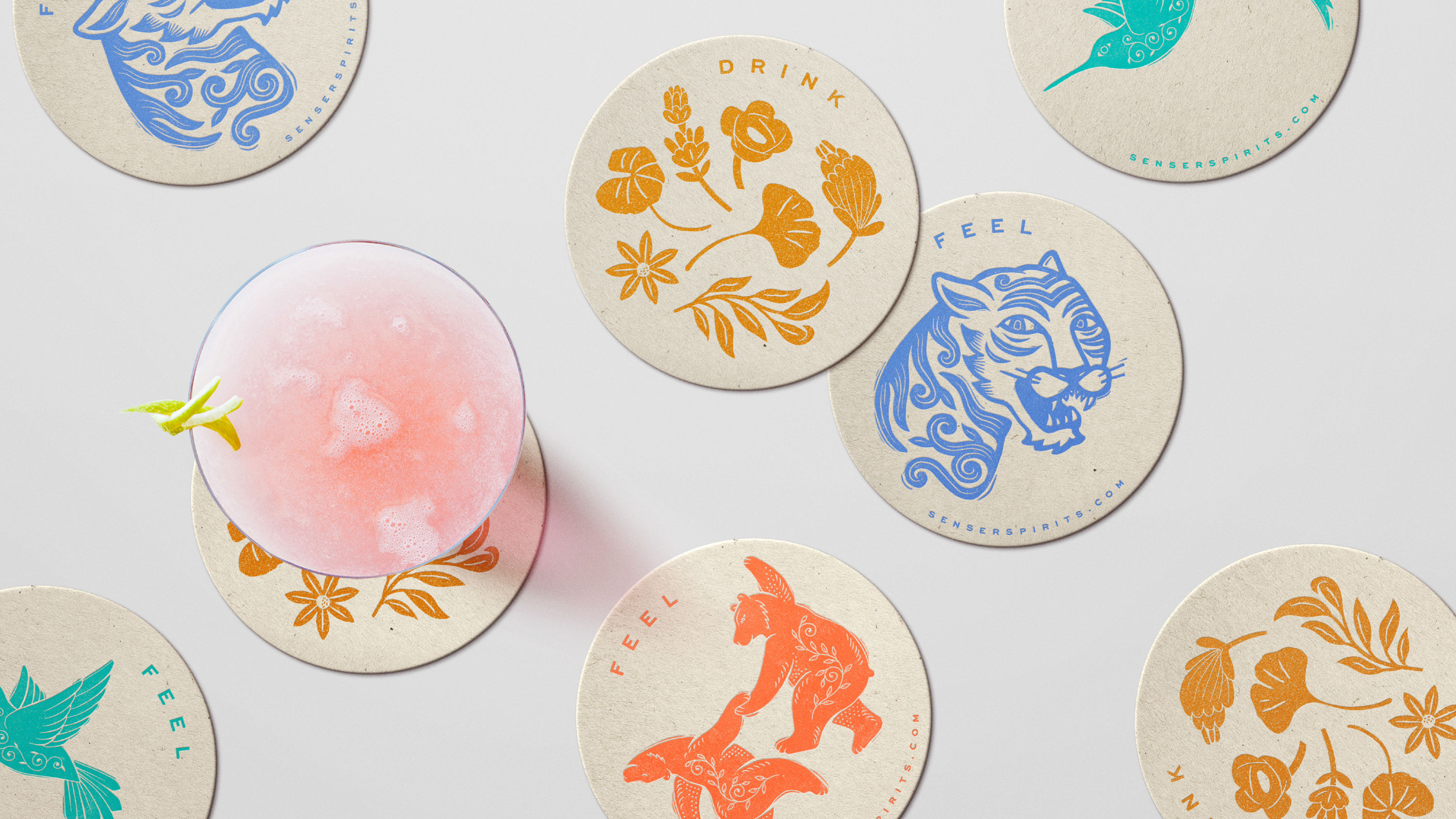
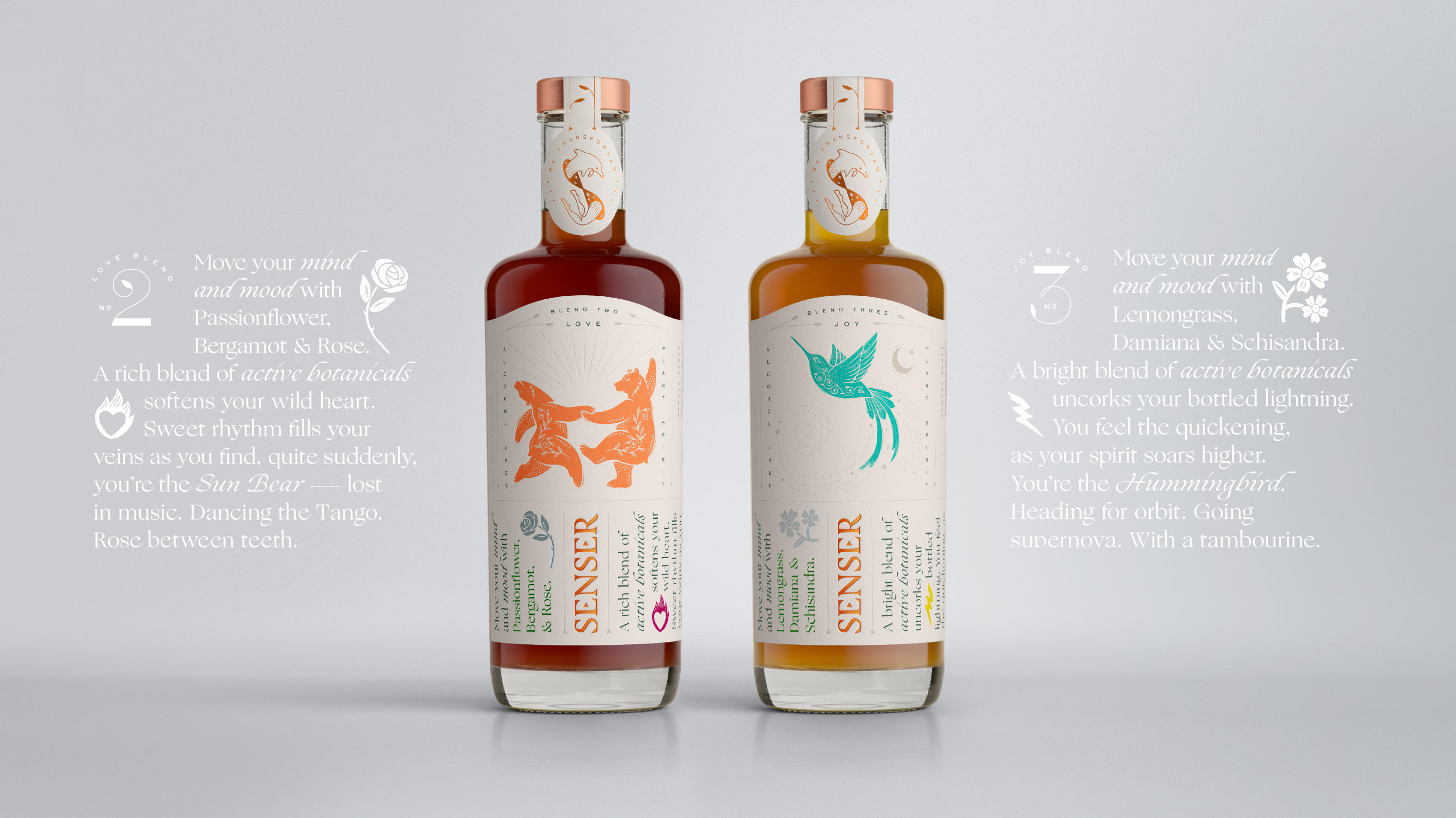
- Gold Award: Illustration
Senser is a new range of non-alcoholic spirits with mood-transforming properties, blending active botanicals to harness the transformative properties of plants.
The mood-elevating effects are captured in a playful illustrated story that introduces the key ingredients, before an unexpected reveal – the metamorphosis into a symbolic spirit animal.
"These illustrations possess a playful charm that really captures the mood of the brand," says Shaun Bowen.
Silver Award winners
Brand Impact Awards 2020: Silver Awards
The following 11 projects all received at least one Silver trophy at the Brand Impact Awards 2020.
Find out more: download the full winners showcase
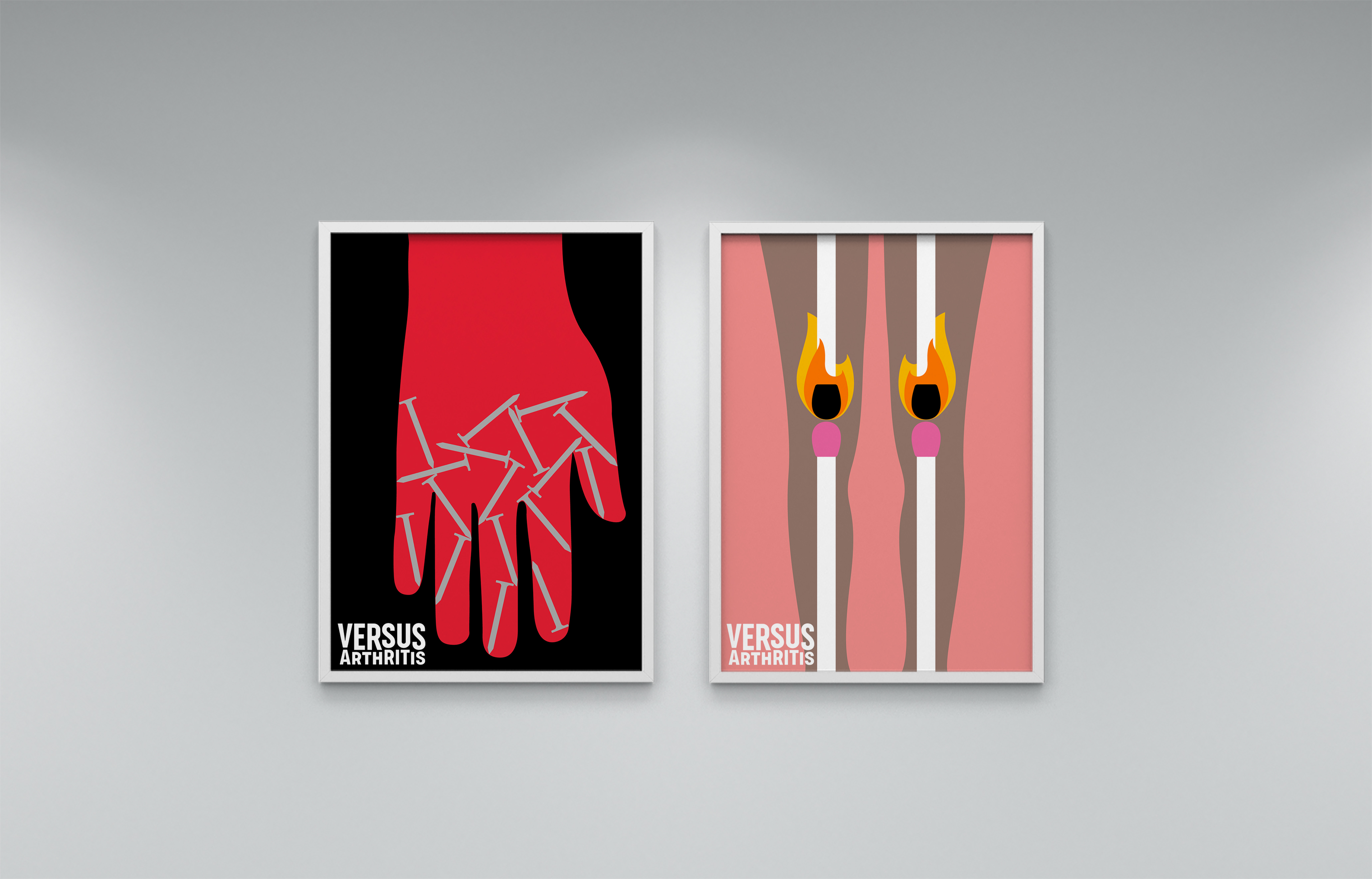
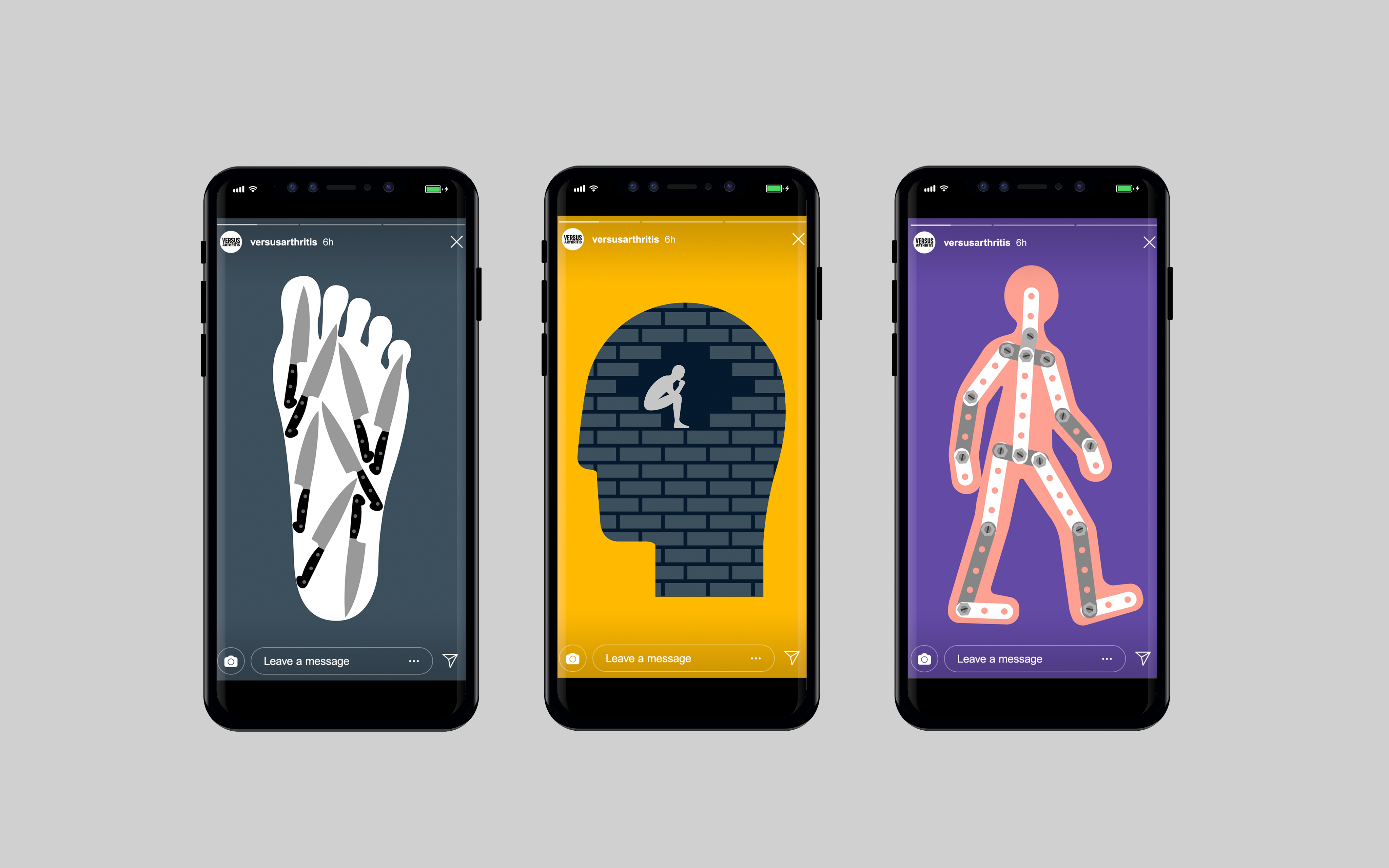
01. Versus Arthritis pain illustrations by Re
- Runner-up: Social Impact Award
- Silver Award: Illustration
Re commissioned James Joyce to create a suite of expressive illustrations depicting life with arthritis, based on first-person accounts.
Bright and fun, the illustration contrasts with the severity of the subject matter, while raising awareness of the pain, isolation and fatigue that arthritis can cause.
"These bold, memorable illustrations are spot on in communicating an abstract feeling such as pain," says Anna Charity.
02. Sculpt by Common Curiosity
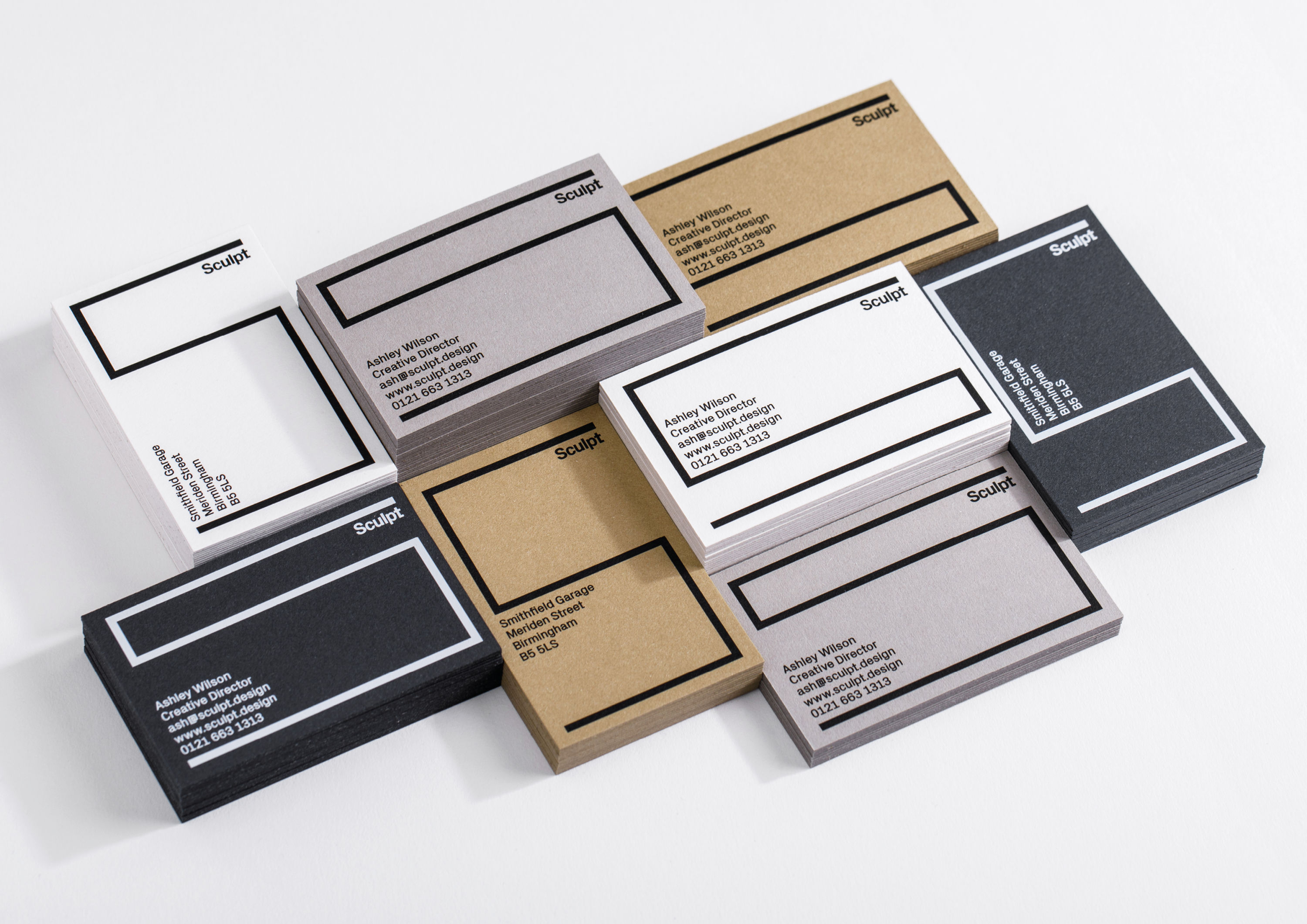
- Silver Award: Typography
- Silver Award: Professional Services
Sculpt tasked Common Curiosity with emphasising its three fundamental principles: it helps "reshape, redesign and refine" spaces.
The rebrand helped give the Sculpt brand greater visibility across the full client journey, including promo materials, proposals and plans, on-site visibility, and custom material samples.
"Fluid, modern and totally engaging," says Domenic Lippa. "I wish I'd done it."

03. Churches Conservation Trust by Studio Sutherl&
- Silver Award: Illustration
- Bronze Award: Public Sector
- Shortlisted: Social Impact Award
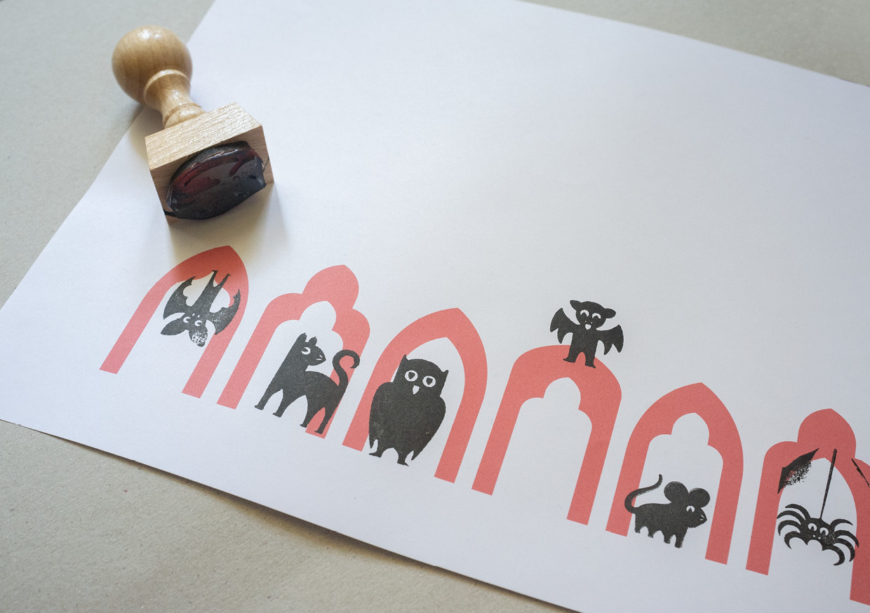
Studio Sutherl&'s identity system for The Churches Conservation Trust draws inspiration from the various shapes and sizes of arches seen in these precious listed buildings: a symbol of protection, conservation and openness.
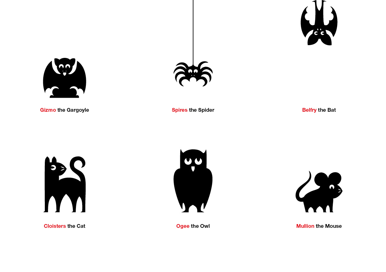
The Children's Trail is based on a menagerie of church animals, created from different combinations of the arch shapes at the core of the main identity. These quirky characters feature across a range of removable stickers, rubber stamps and notebooks to help children explore their local churches.
"A beautiful, sweet idea and a superb way to draw attention to the parts of the church that needed restoring," says Alan Dye.
04. Mouvo 2020 by Oficina Studio
- Silver Award: Culture
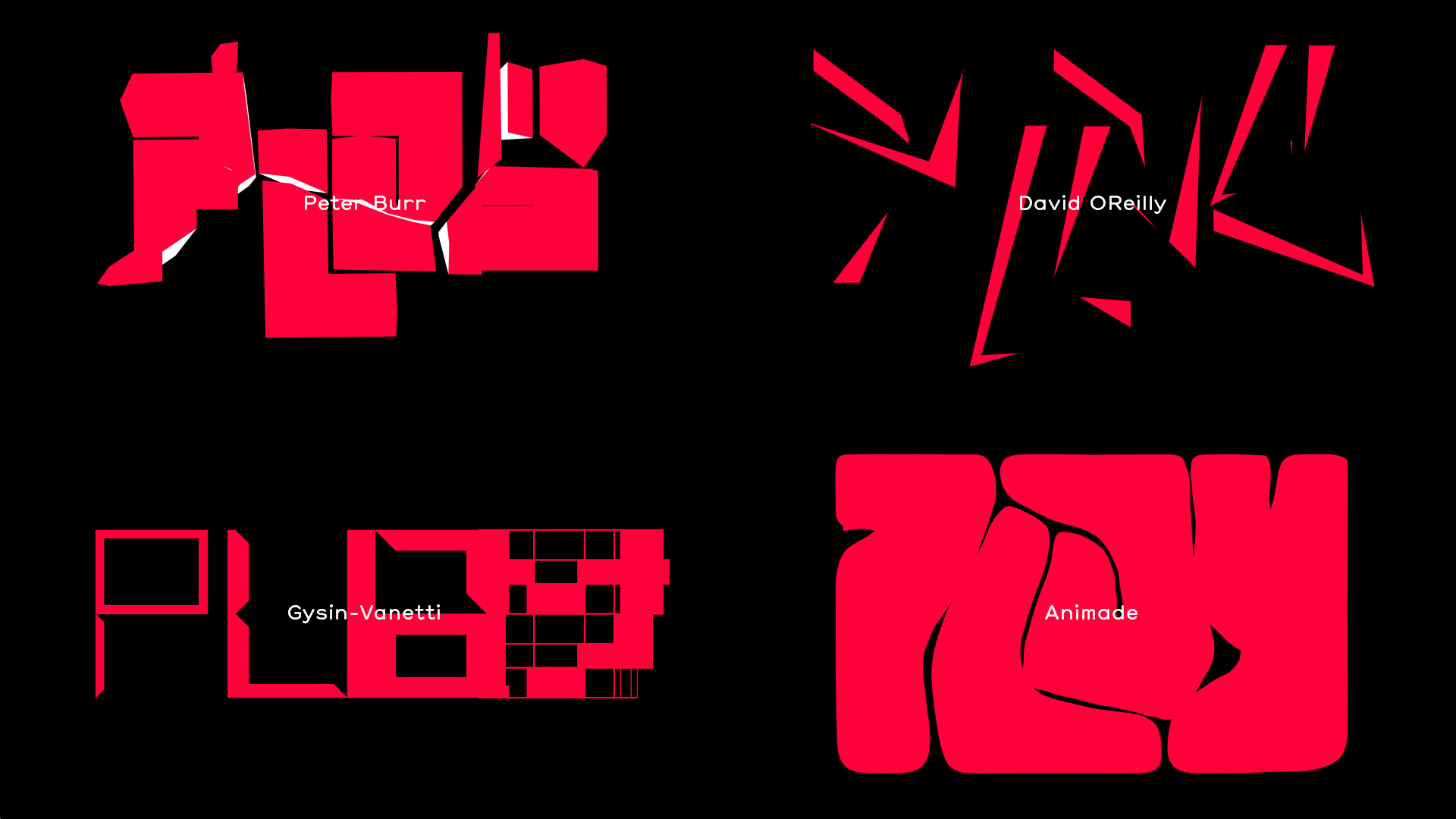
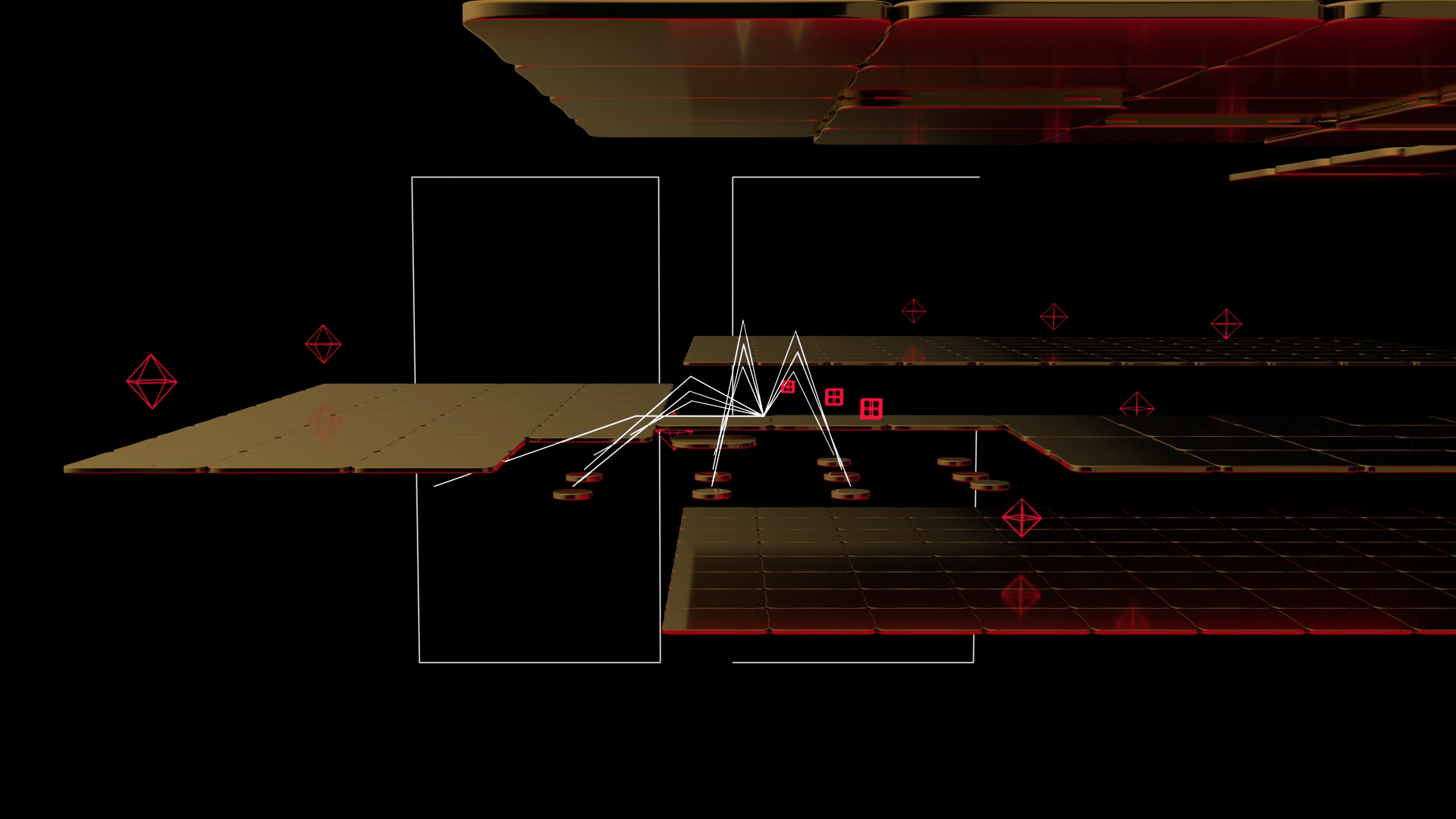
Oficina Studio embraced an ‘early videogames’ aesthetic for Mouvo 2020’s title sequence, weaved throughout character animation, experimental video art, qubit mechanics and more.
Tying it all together is the Mouvo Spider, crawling between the diverse trailers and idents and tapping on the 'bricks' that structure the banners and infographics.
"It pushes the viewer's boundaries of expectation," says Caterina Bianchini. "It's fun and playful, with some memorable moments of craziness."
05. UCL – Disruptive Thinking Since 1826 by Jack Renwick Studio
- Silver Award: Education
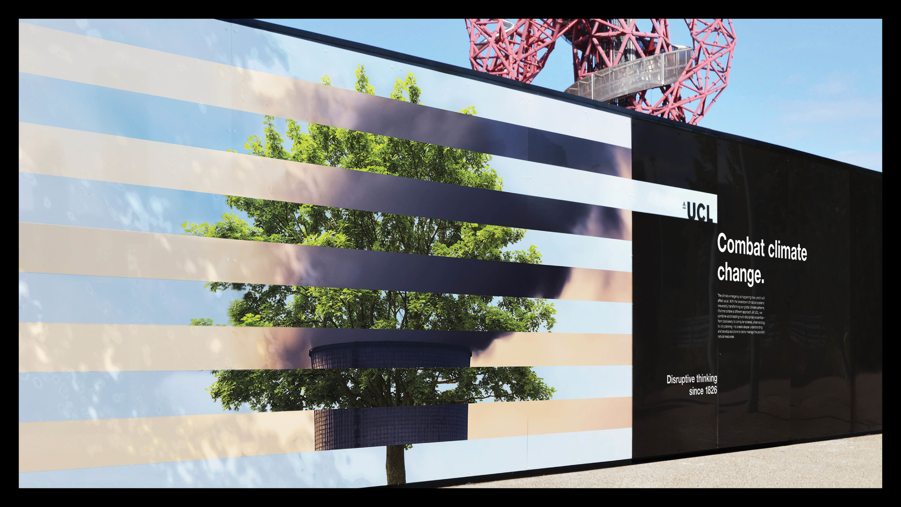
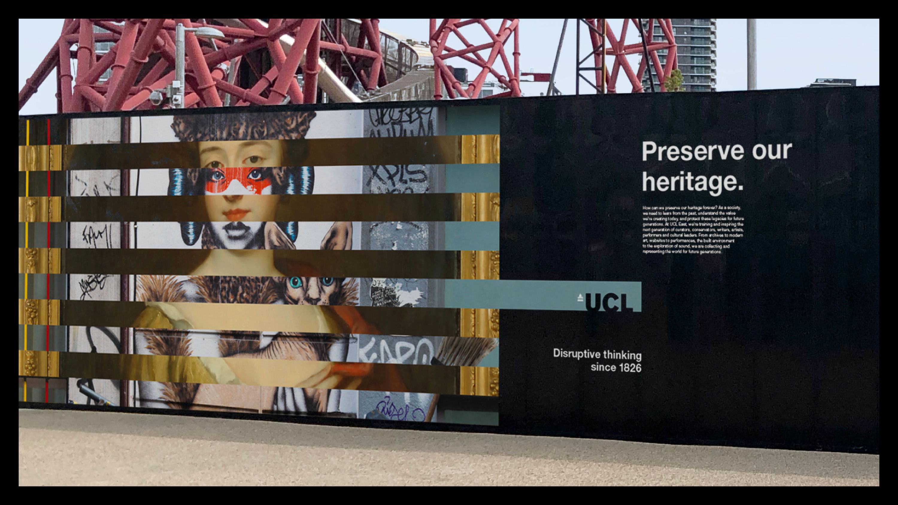
Launching UCL's new brand positioning – 'The home of brave thinkers' – Jack Renwick Studio's striking campaign highlights UCL's groundbreaking modern-day work and global influence.
Interlocking images demonstrate this visually: the first represents a current challenge that the world is facing; the second is UCL's response.
"This engaging series draws the audience in through a simple but highly effective visual technique that's hard to ignore," says Peter Knapp.
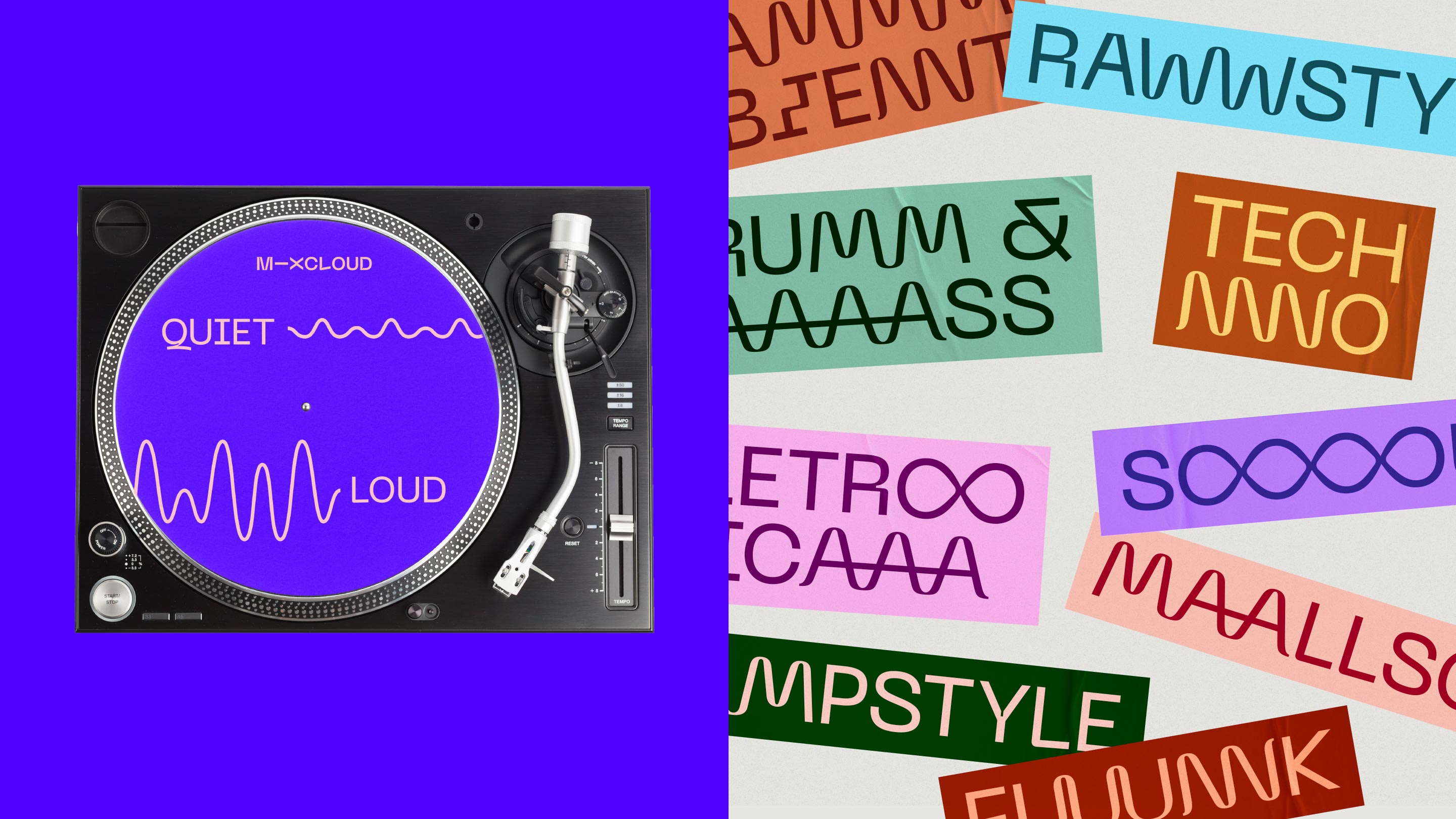
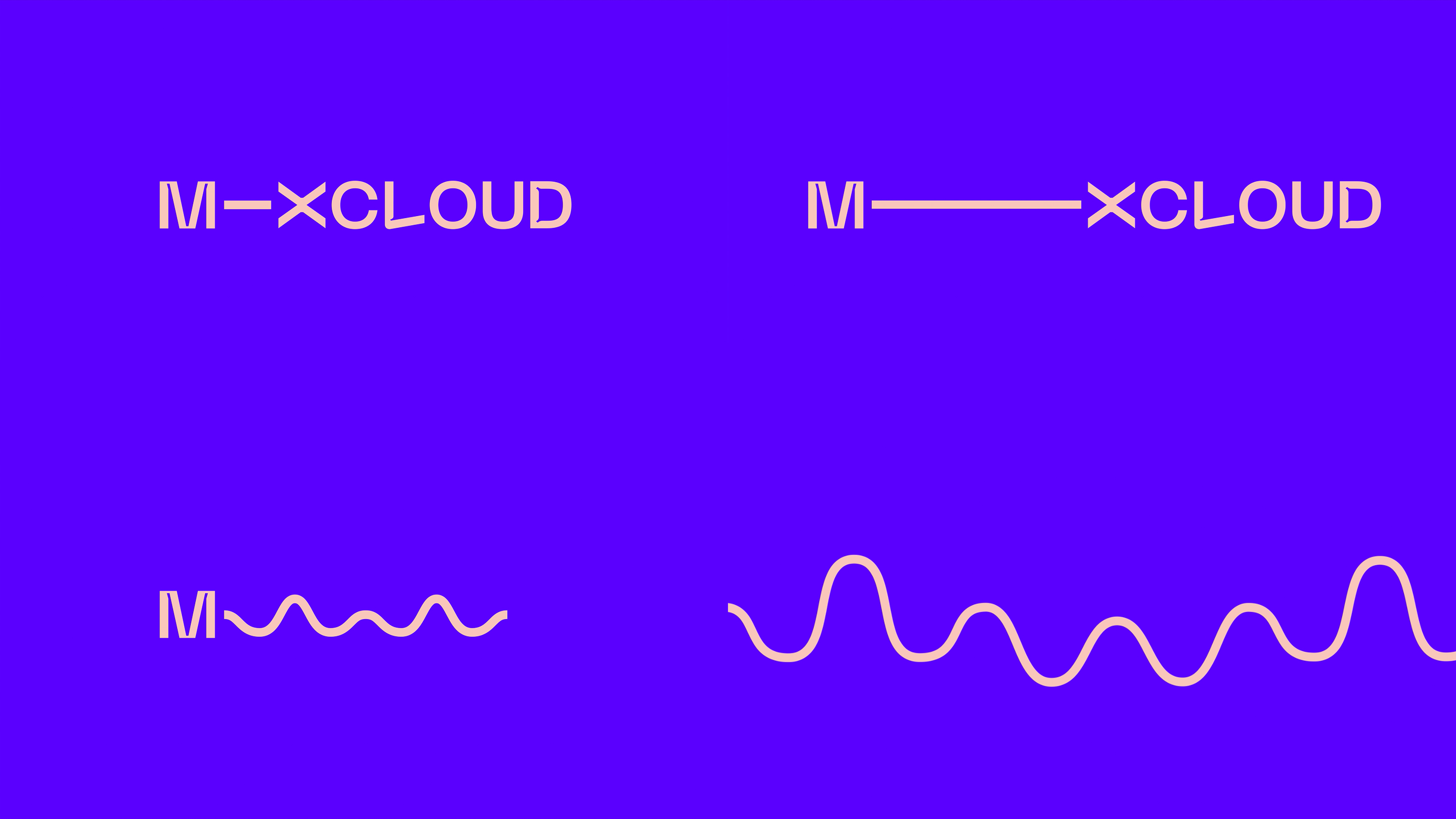
06. Mixcloud by Studio Output
- Silver Award: Entertainment
Mixcloud wanted to reposition as a different kind of streaming platform, where fans can directly support the creators and cultures they care about.
Studio Output's central creative idea is ‘the connector’, which amplifies key words and joins genres, people and locations. Its scale and rhythm varies by mood.
"The Mixcloud rebrand managed to take a well-trodden category trope – the sound wave – and make it feel fresh, distinctive and dynamic," says Richard Danks.
07. British Library – Research by Tom Sharp
- Silver Award: Copywriting
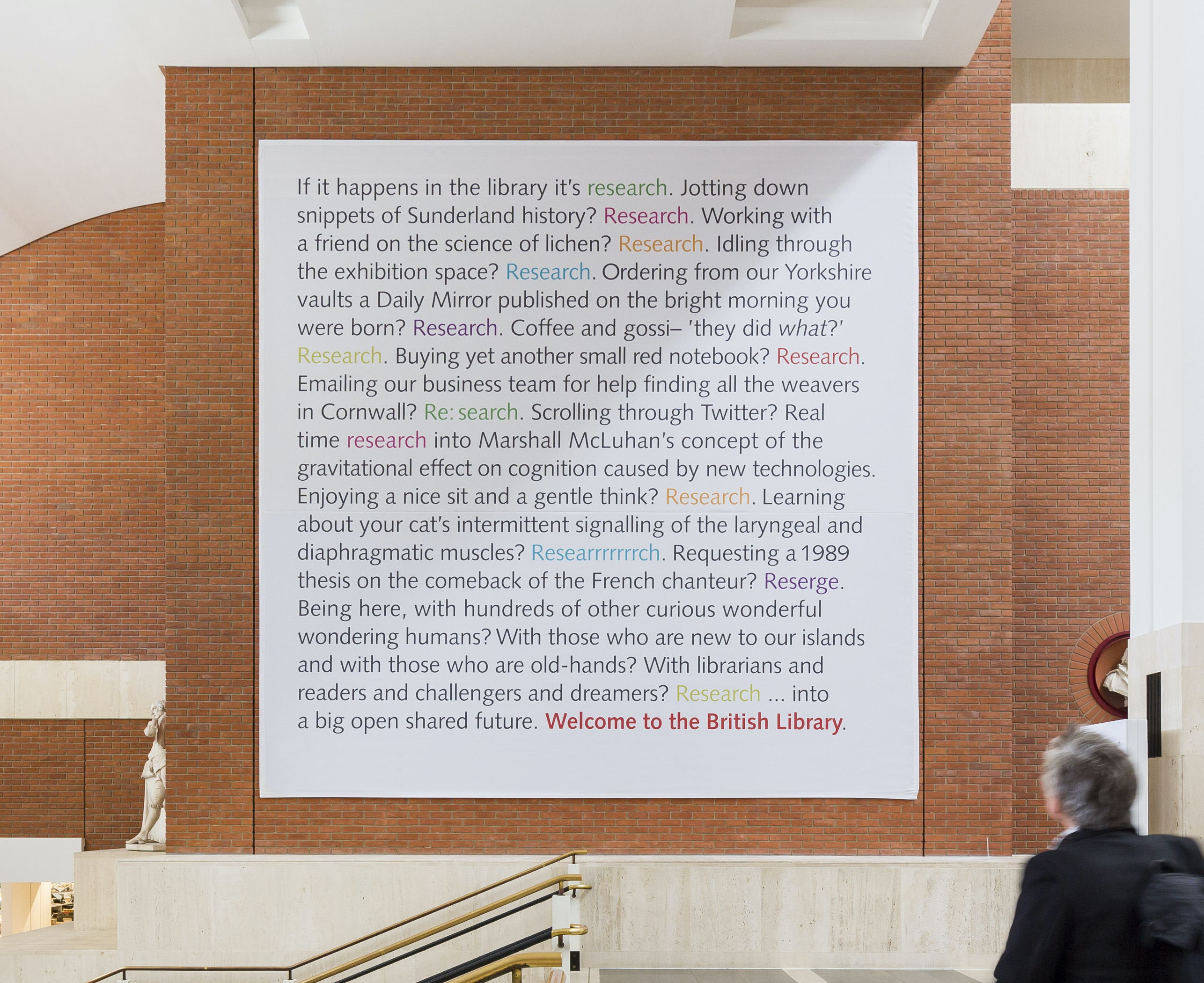
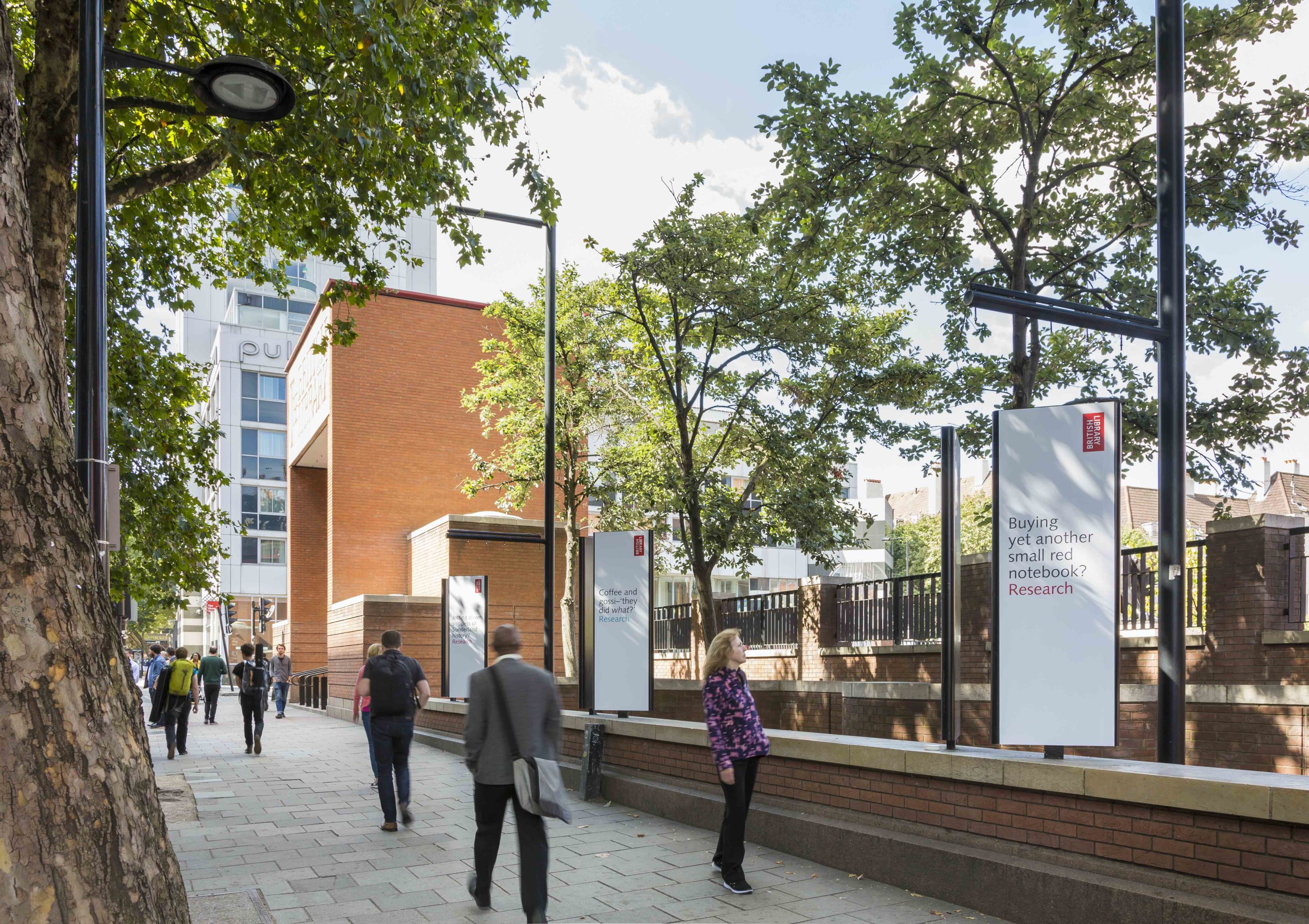
The British Library challenged Tom Sharp to follow the success of his award-winning Welcome note to visitors, which filled the large wall space in the lobby of its St Pancras building.
Sharp brought whimsy and warmth to one of the most academic aspects of the Library's mission: research. Each sentence resonates with the specific needs of a different type of visitor.
"It avoids expected cliches, picks unexpected reference points, and really ‘gets’ its audience," says Nick Asbury. "Much harder to get right than it looks."
08. Penhaligon's voice and website by Reed Words
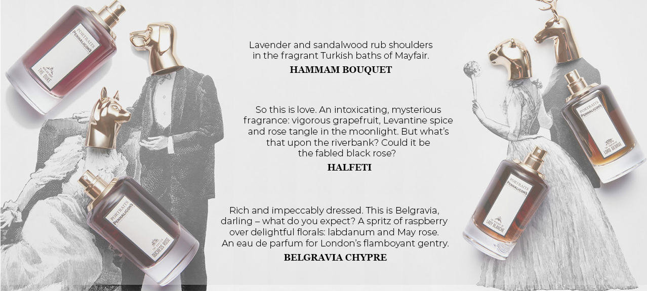
- Silver Award: Copywriting
Reed Words was tasked with crafting a new tone of voice for Penhaligon's that could encapsulate the unique character of each perfume in just a few words.
Its proudly eccentric new tone of voice translates across hundreds of products, email campaigns and social posts designed to "tease noses and open wallets".
"This copy spoils us with a lovely way with words, and it's bang on brand," says Vikki Ross. "I love seeing a copywriter appear to have fun on the job."
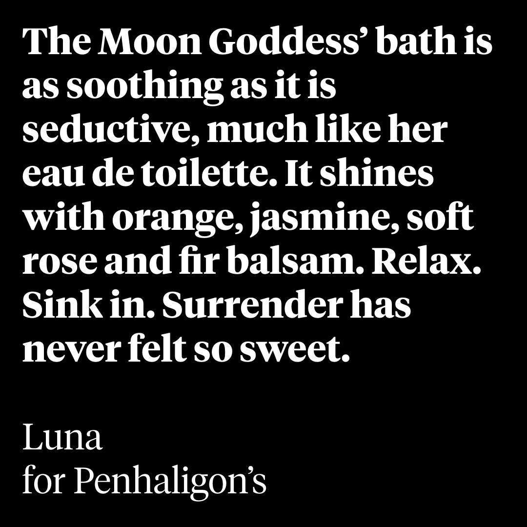
09. Woolwich Contemporary Print Fair by Johnson Banks
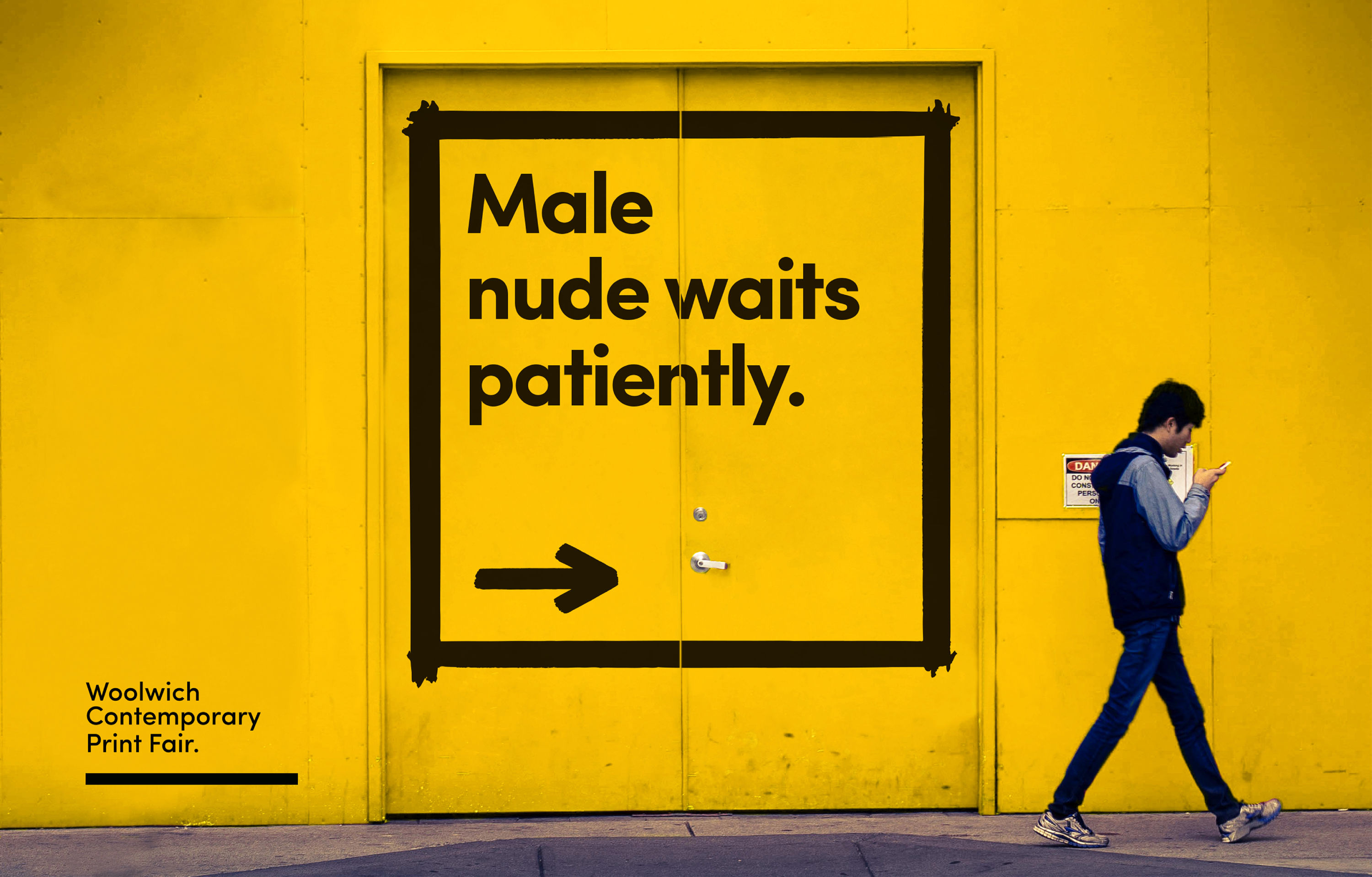
- Silver Award: Copywriting
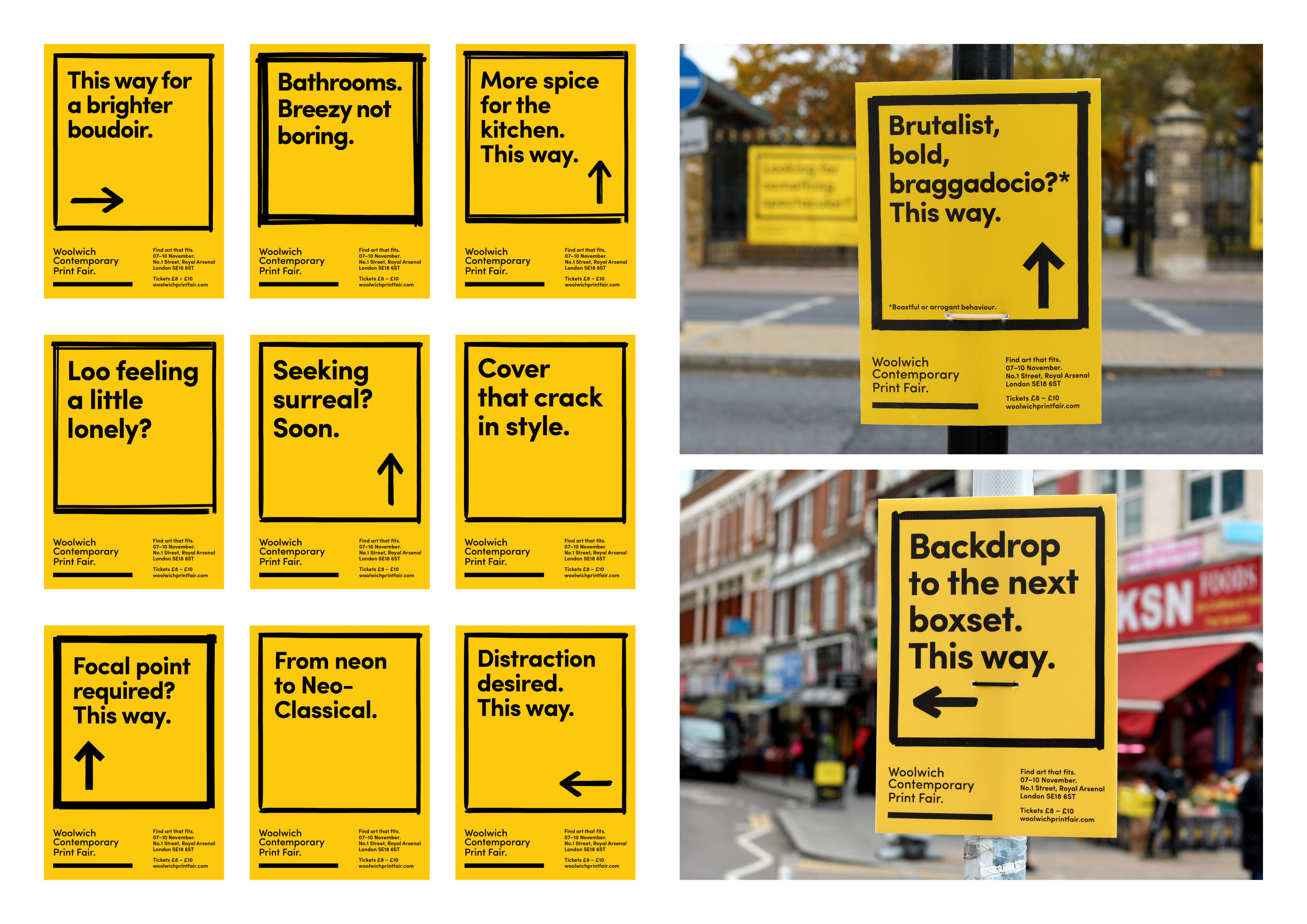
Woolwich Contemporary Print Fair needed a creative hook to attract its primary audience: people in their 30s and 40s looking for unique art for their homes.
Johnson Banks' integrated campaign combines mixed messaging, humour and eclectic interior design to mirror the fact that most art is bought with a domestic 'space' in mind.
"An endlessly playful campaign, with a wonderful central insight – sometimes the art on your walls has to be subordinate to your furniture," says Rishi Dastidar.
10. Wiener Melange by Dalton Maag
- Silver Award: Typography
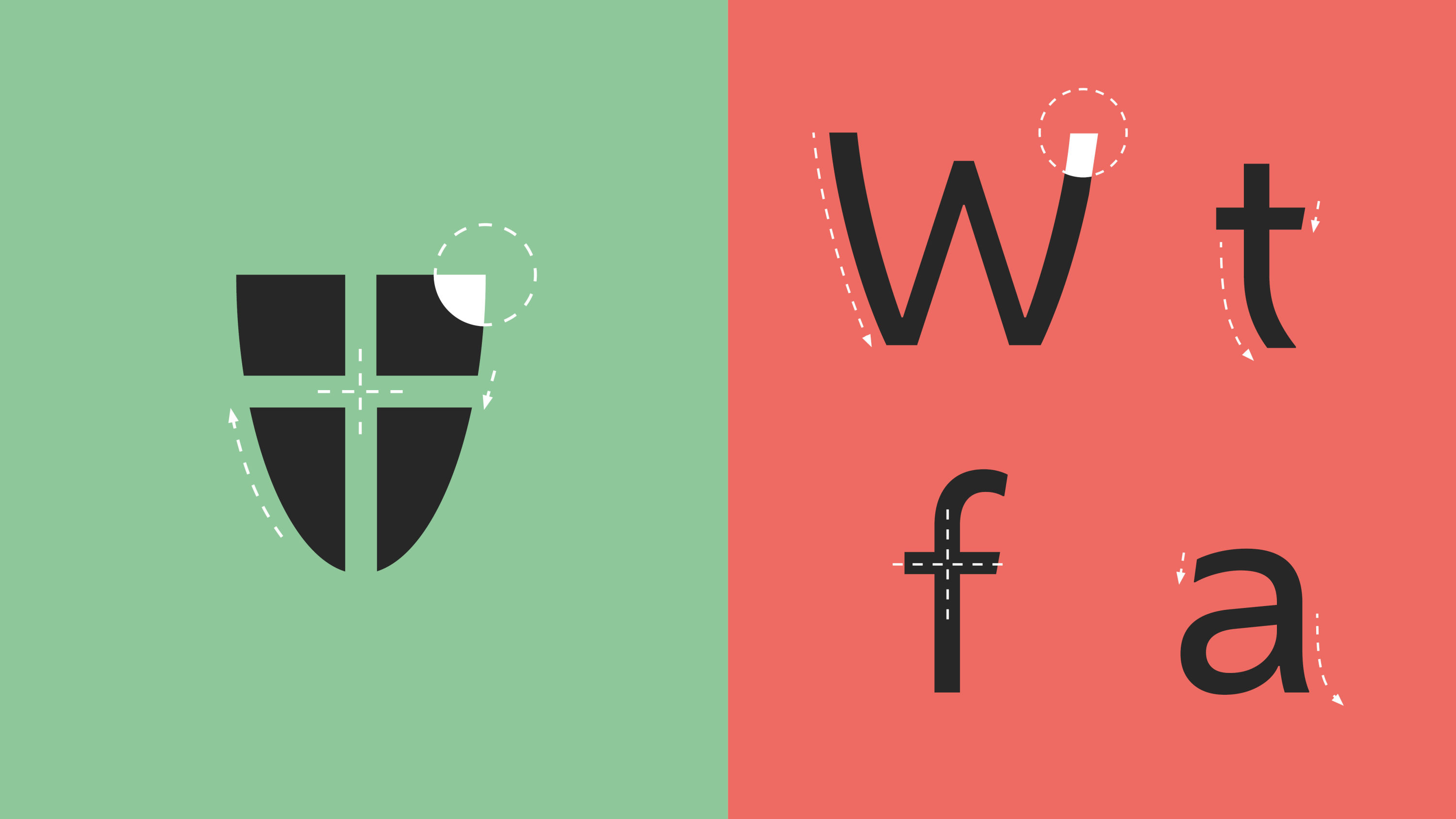
Dalton Maag developed a custom font family for Vienna as part of a larger branding exercise for the city by Saffron Brand Consultants, Instant Design GmbH and saintstephens.
Inspired by the curves of Vienna's emblematic shield, and named after its famous coffee, the font family is a contemporary sans serif that draws on the city's historic and cultural assets.
"Well-crafted and recognisable, with a restrained playfulness," says Tom Foley.
11. Sad Girls Club by Tickety Boo Creative
- Silver Award: Not-For-Profit
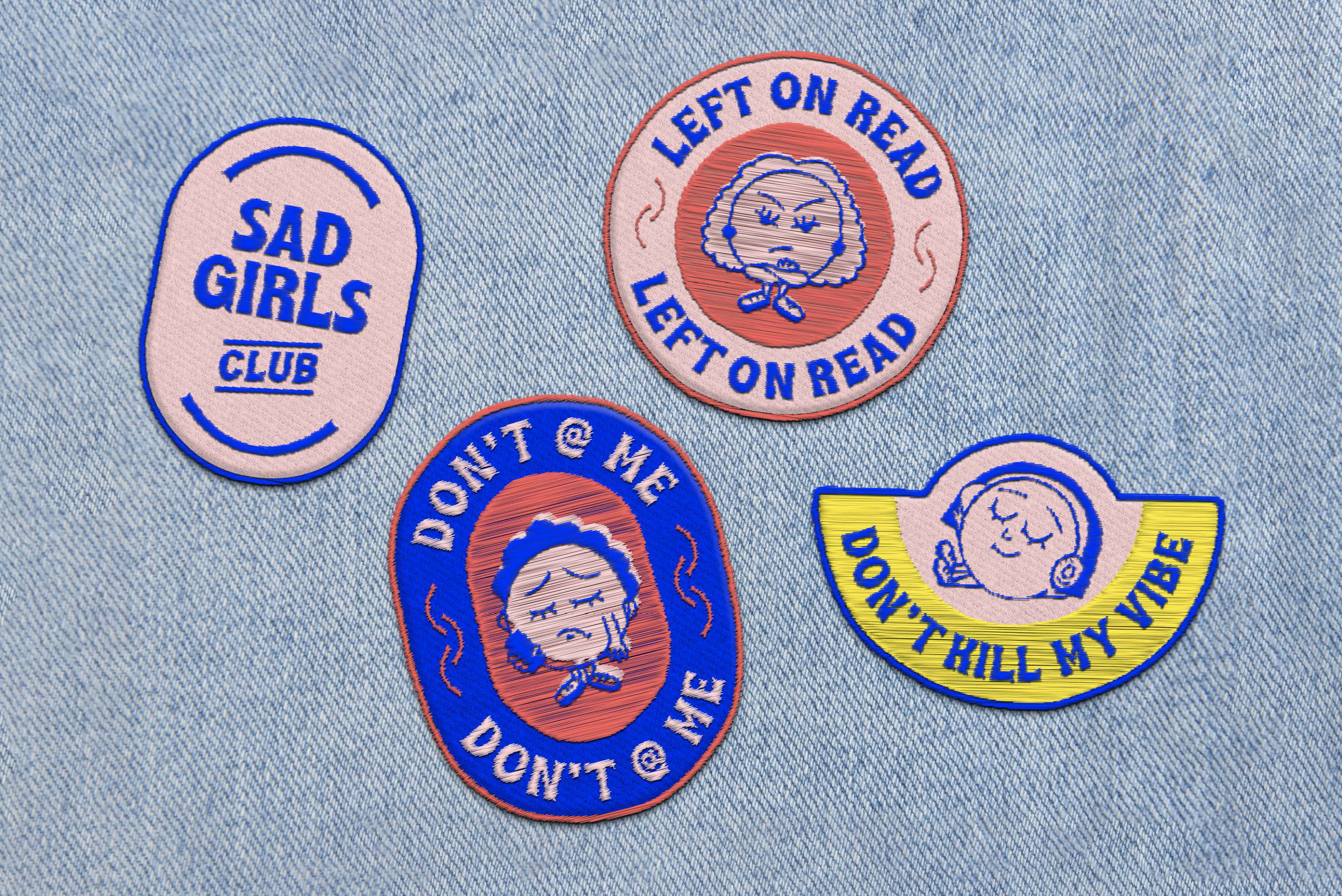
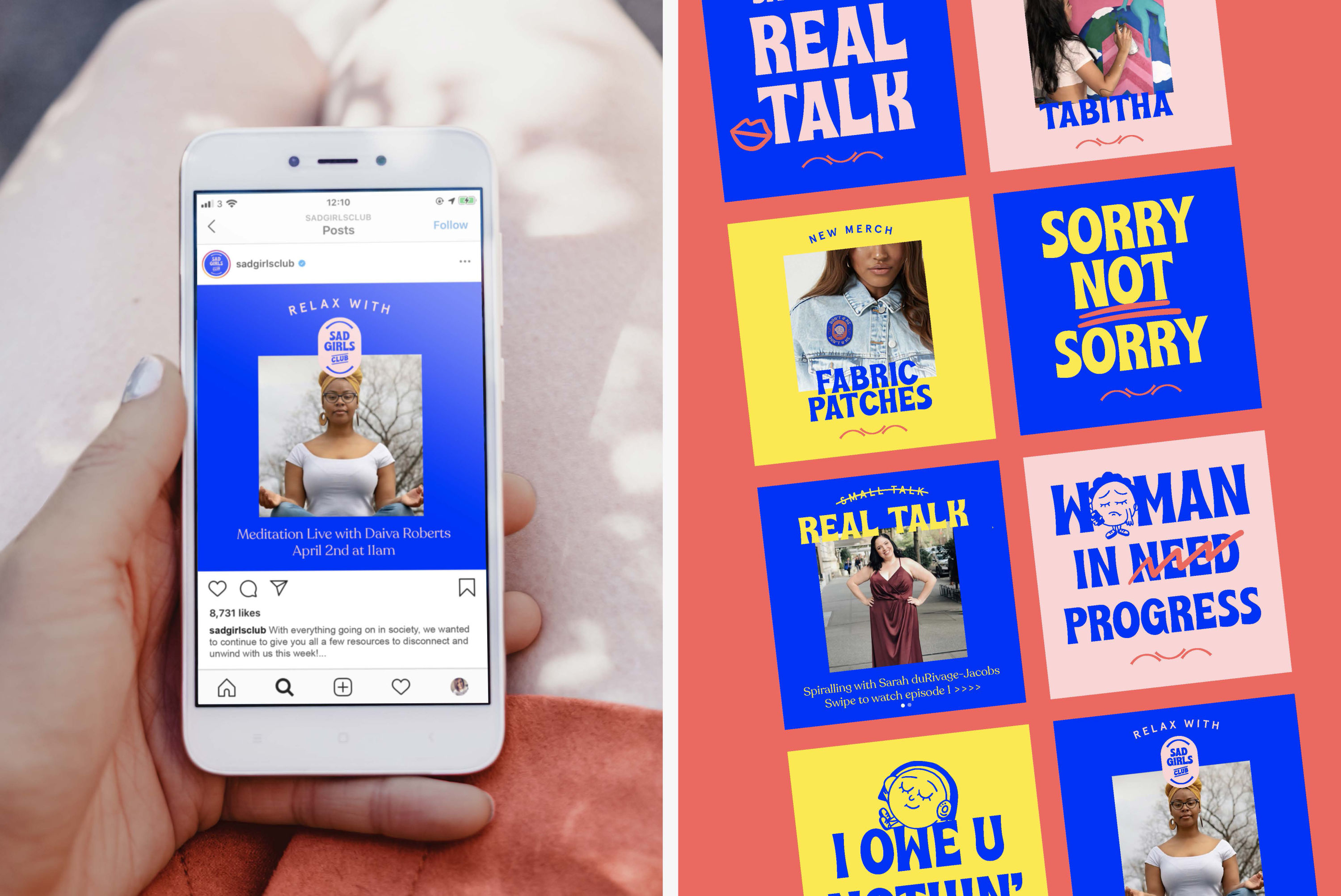
A strong community founded to diminish stigma around mental health – particularly for millennial and Gen Z women of colour – Sad Girls Club needed a rebrand to match its ambition.
Tickety Boo’s energetic 1970s aesthetic banishes any 'gloomy' associations with mental health. Phrases like "don't @ me" and "left on read" translate its attitude across shareable graphics.
Bronze Award winners
Brand Impact Awards 2020: Bronze Awards
The following 15 projects all received Bronze trophies at the Brand Impact Awards 2020. Find out more: download the full winners showcase
01. LSO – Dancing on the Edge of a Volcano by Found Studio x Superunion
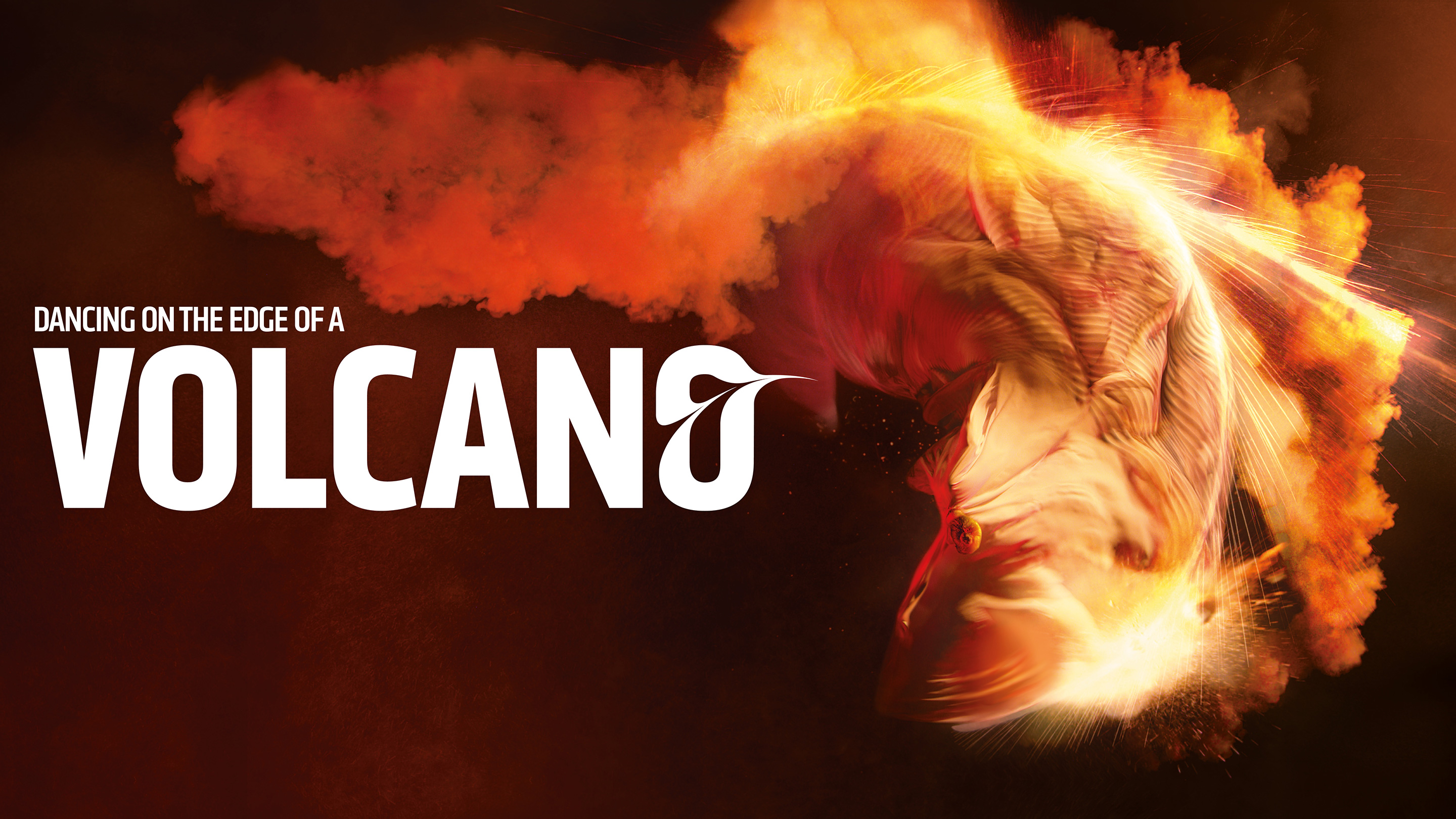
- Bronze Award: Culture
Superunion's motion-capture-led scheme for LSO, a previous Best of Show winner, was taken in new directions here in an explosive, tension-fuelled, abstract film.
19 short sequences were seamlessly composited with an array of pyrotechnics and practical effects to enhance the volcanic theme, culminating in an epic final shot.
02. Arts University Bournemouth by Bond and Coyne
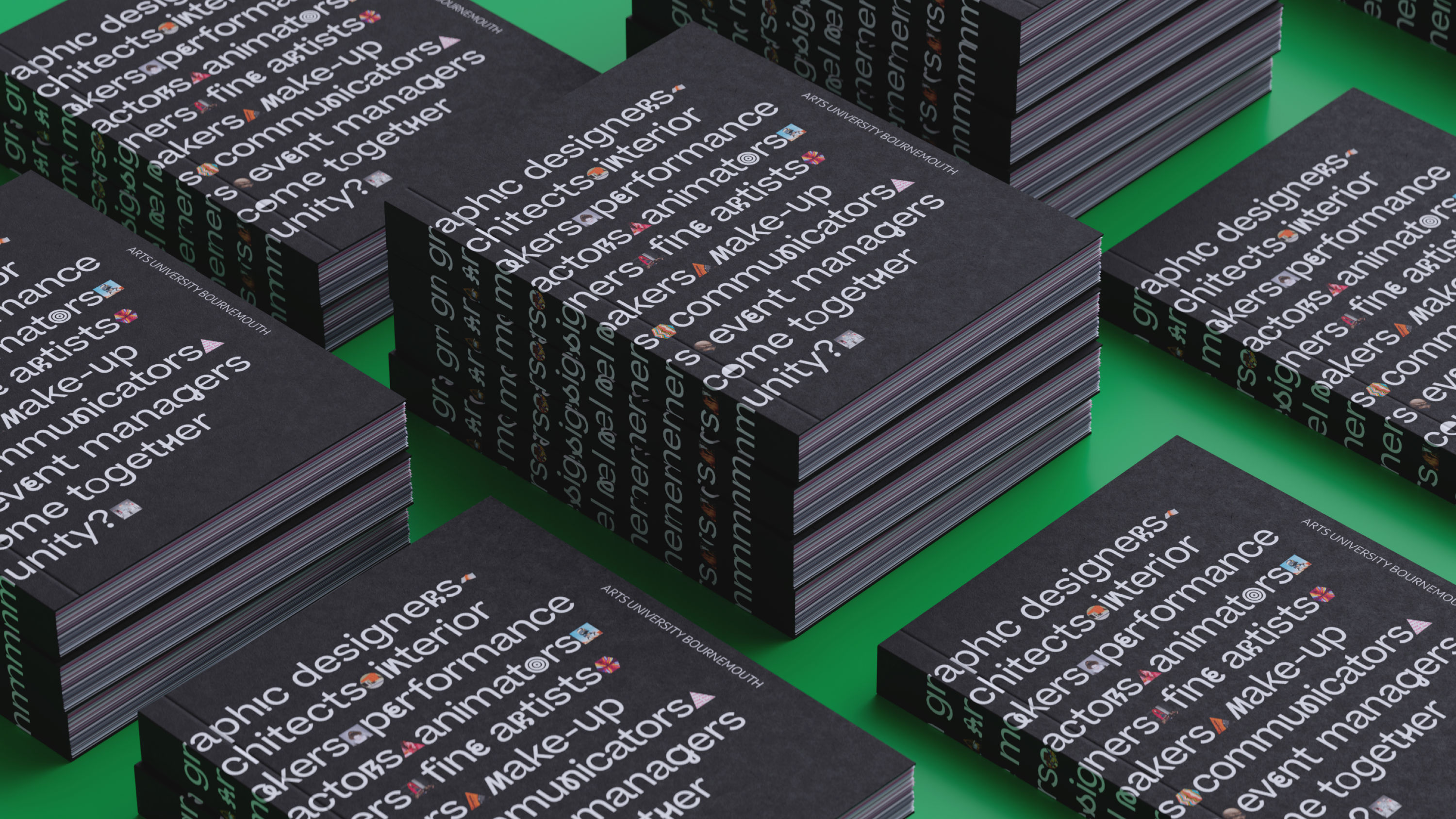
- Bronze Award: Education
AUB's new site empowers course leaders to tailor their online presence to their individual priorities – from showcasing alumni to promoting current exhibitions.
Online experiences also feed into the physical environment, integrating with voice-assistants and digital signage on campus – while a bespoke glyph typeface adds variety and personality.
03. TEDI-London by Rose
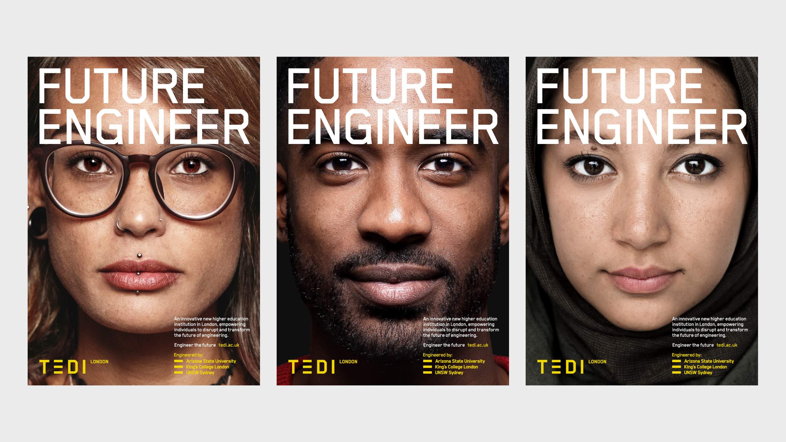
- Bronze Award: Education
TEDI aspires to encourage greater diversity in the engineering sector. Bold photographic portraits attract students that may have been previously deterred by a future in the field.
Three lines replace the conventional 'E' to represent each of TEDI’s founding universities, a motif that translates across advertising, environmental graphics, merchandise and more.
04. Channel 4: The Circle Series 2 by Turquoise Branding
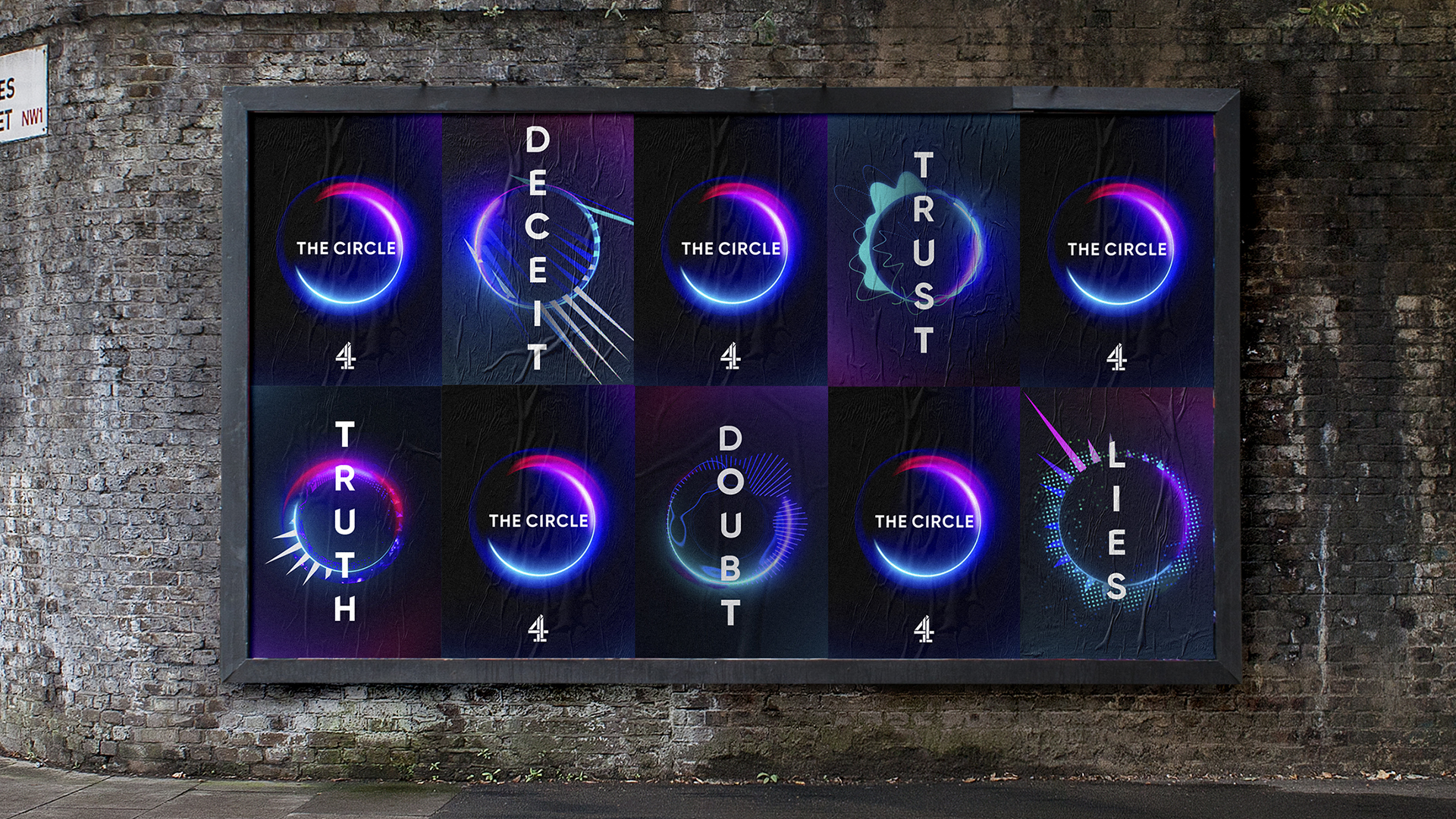
- Bronze Award: Entertainment
The Circle's social media platform had to function brilliantly – not just for contestants to engage with, but to articulate the show's brand for TV audiences.
Turquoise created sound-responsive rings that represent contestants' verbal interactions with the interface: a system that chimed with all the conflicts and dramas of the series.
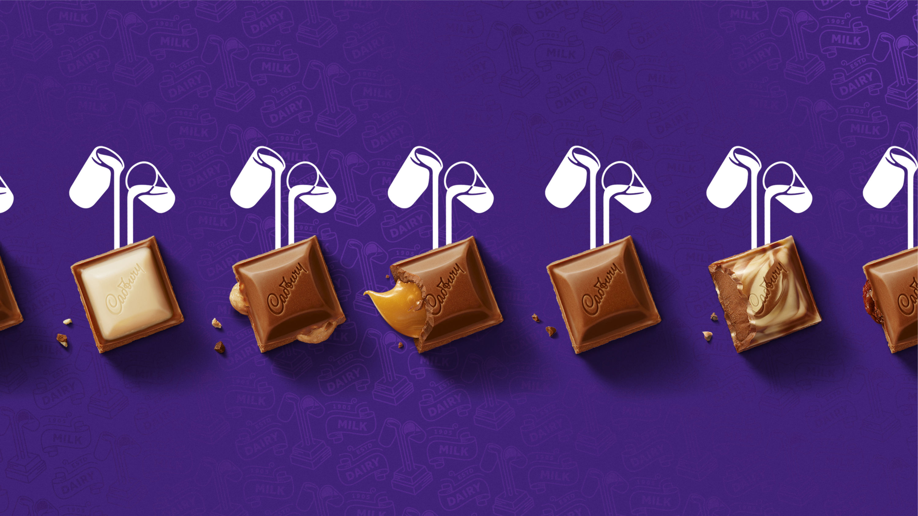
05. Cadbury by Bulletproof
- Bronze Award: FMCG
Cadbury's Bournville archives provided plenty of fuel to inspire the brand's future development: in particular, a strategic shift from artificial joy to a more meaningful world of generosity.
An extensive toolkit of brand assets – with greater focus on the 'glass and a half' as a symbol of that generosity – is designed to flex across all touchpoints.
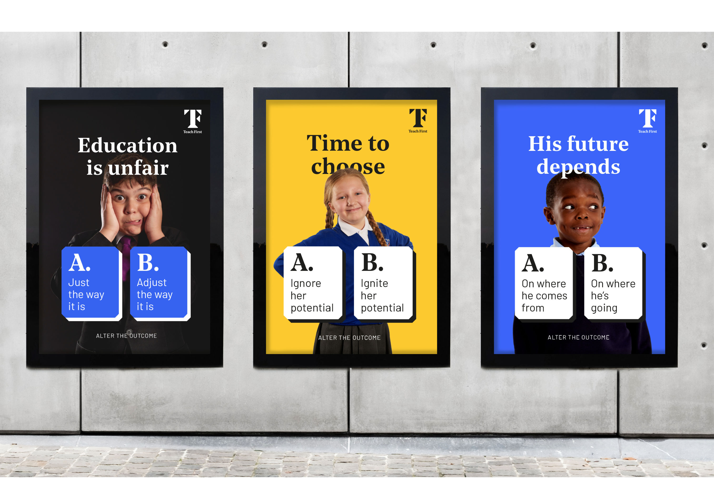
06. Teach First by Johnson Banks
- Bronze Award: Copywriting
An educational charity that works with thousands of schools, Teach First needed an overhaul to replace its corporate brand expression with something more dynamic.
Johnson Banks developed a punchy, reductionist writing style that challenges sector norms with thought-provoking binary choices for potential educators.
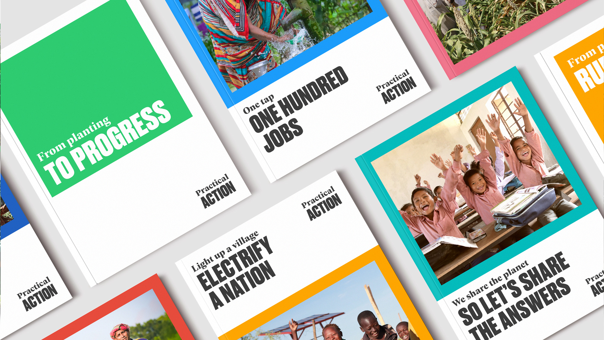
07. Practical Action by NB Studio
- Bronze Award: Not-For-Profit
Practical Action uses ingenious solutions to help people adapt and navigate the effects of climate change on their lives.
NB Studio's rebrand echoes the philosophy of Practical Action founder Fritz Schumacher, who championed a radical approach based on all of us living within the means of the planet.
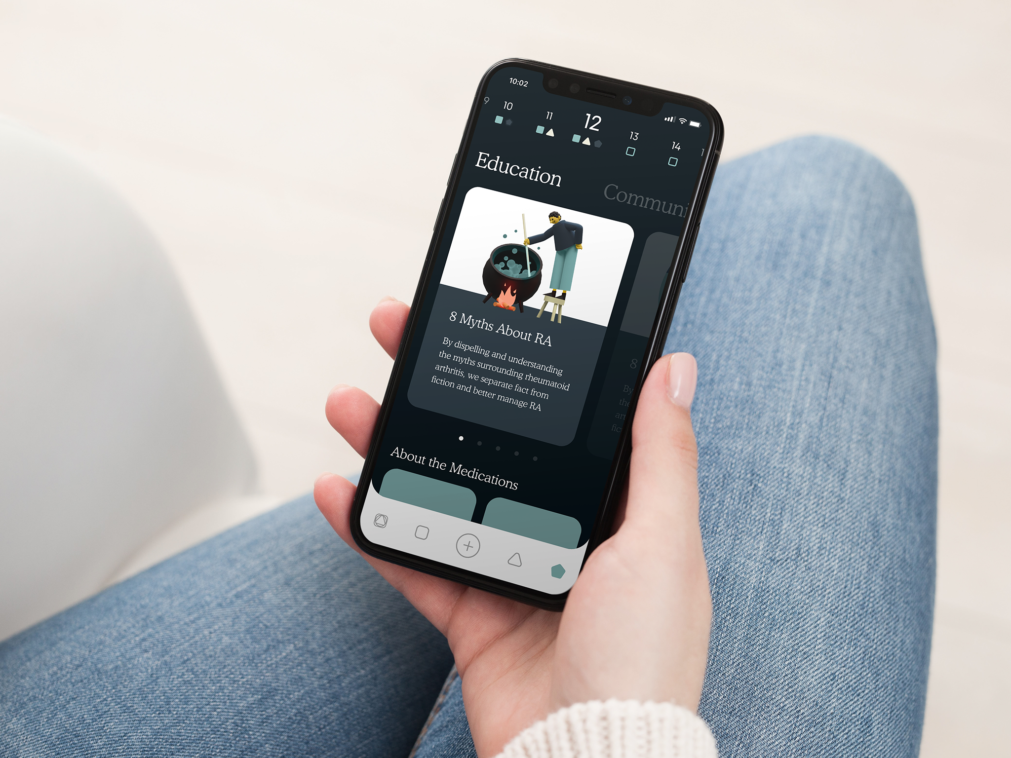
08. Amgen Enbrel by WeLoveNoise
- Bronze Award: Pharmaceuticals & Toiletries
A new drug for rheumatoid and psoriatic arthritis, Enbrel needed a brand that could work across many different touchpoints, including an app that connects with the new hardware used to administer it.
Based on rounded geometric shapes with a muted palette of cream, teal, navy and gunmetal, character illustrations give the whole system a friendly accessibility that's rare in its category.
09. Heights by Ragged Edge
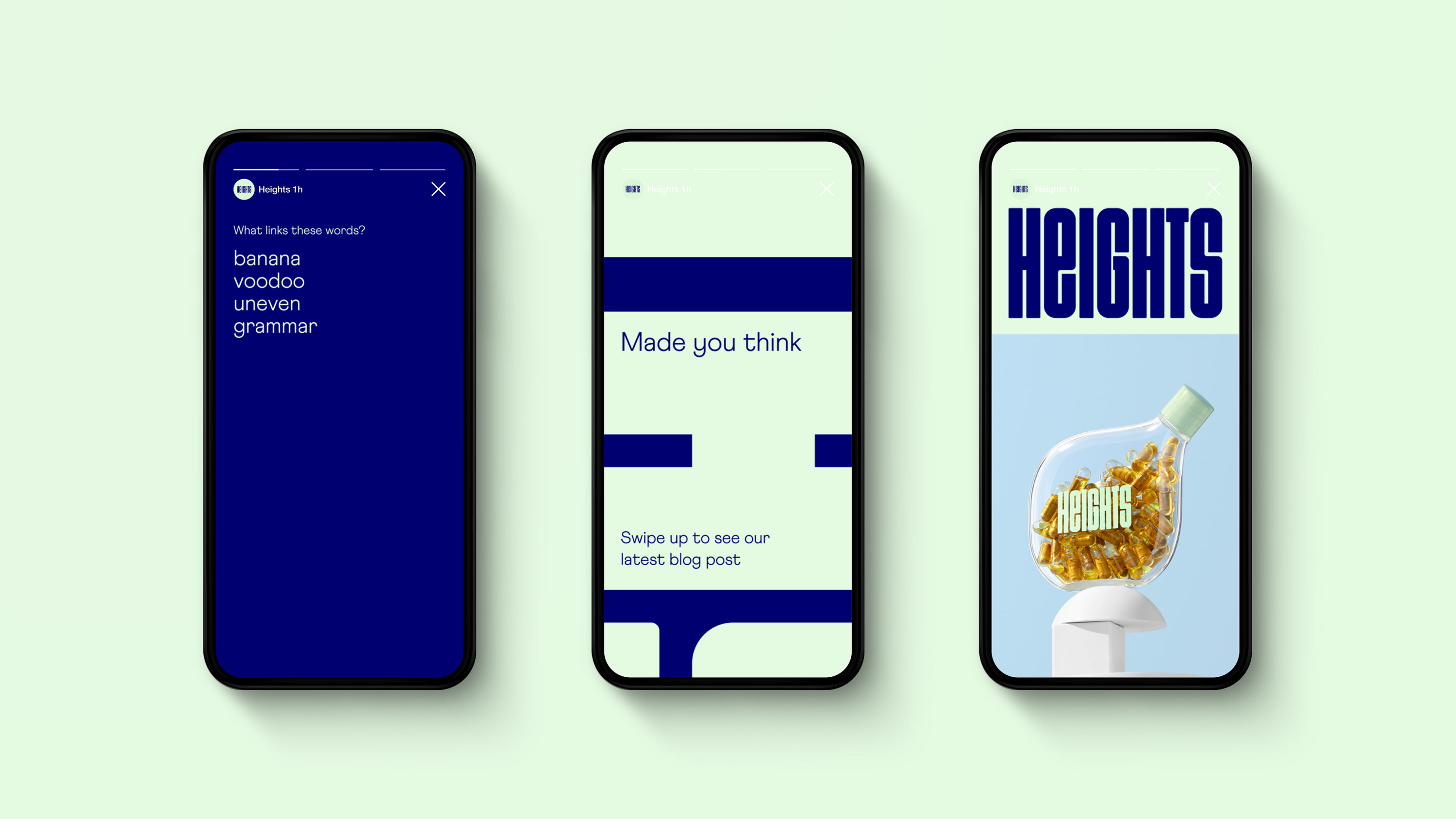
- Bronze Award: Pharmaceuticals & Toiletries
In a category filled with bold claims and quick fixes, Heights is a brain-boosting supplement that takes a refreshingly holistic approach to nutrition.
The name refers to reaching the heights of our abilities. Ragged Edge’s identity references the brainʼs neuroplasticity, with lifestyle twists on familiar medical cues.
10. Mr & Mrs Clarke by UnitedUs
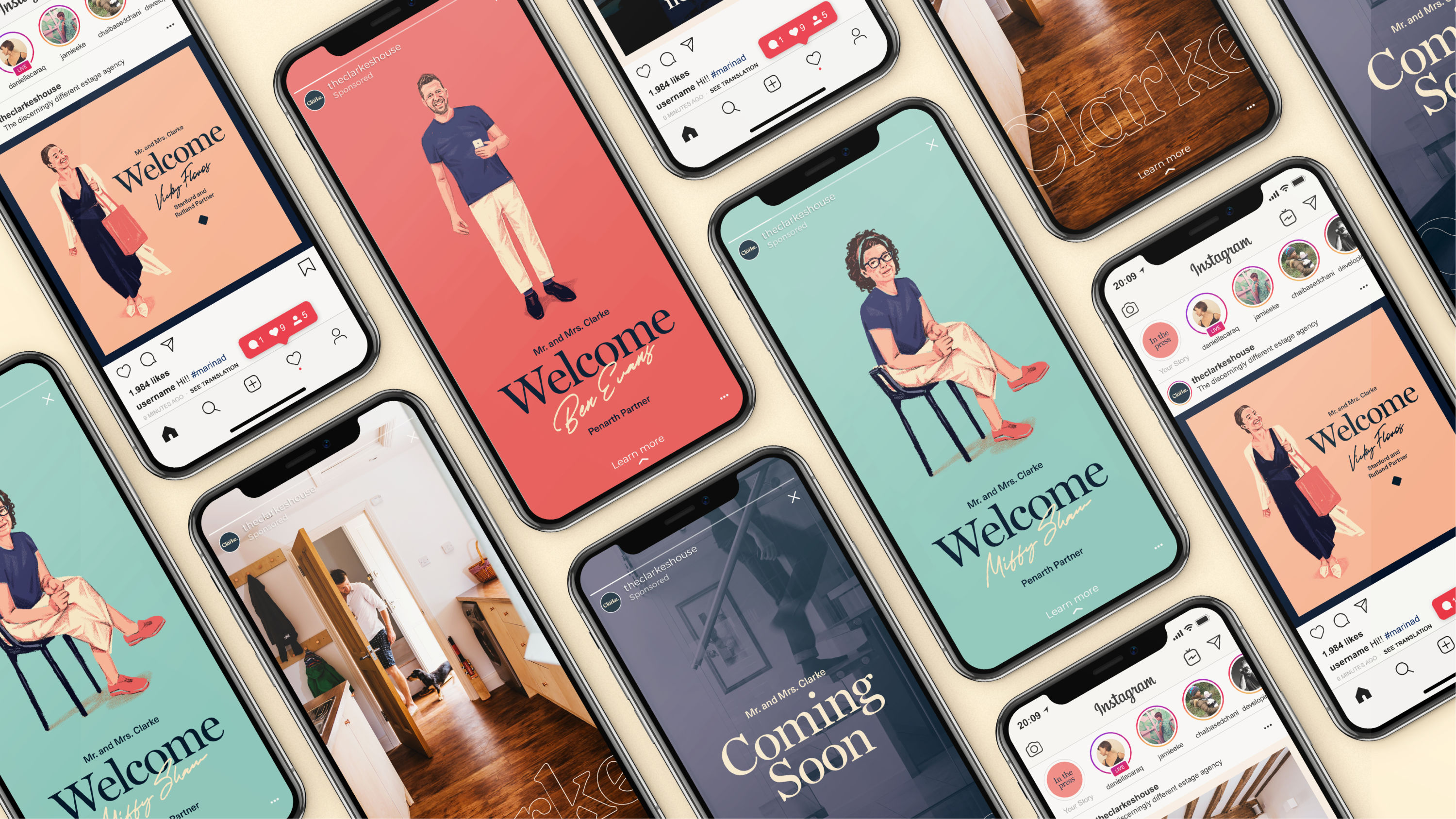
- Bronze Award: Property & Construction
A new kind of estate agent targeting an affluent audience, Mr & Mrs Clarke aspires to ‘hero the homeowner’ and ‘sell homes not houses’. Its brand had to feel authentic and personalised.
Illustrated portraits convey a softer, more considered style that refreshes the sector's typically old-fashioned tactics into a brand that oozes personality.
11. Dawn of X by helloMuller
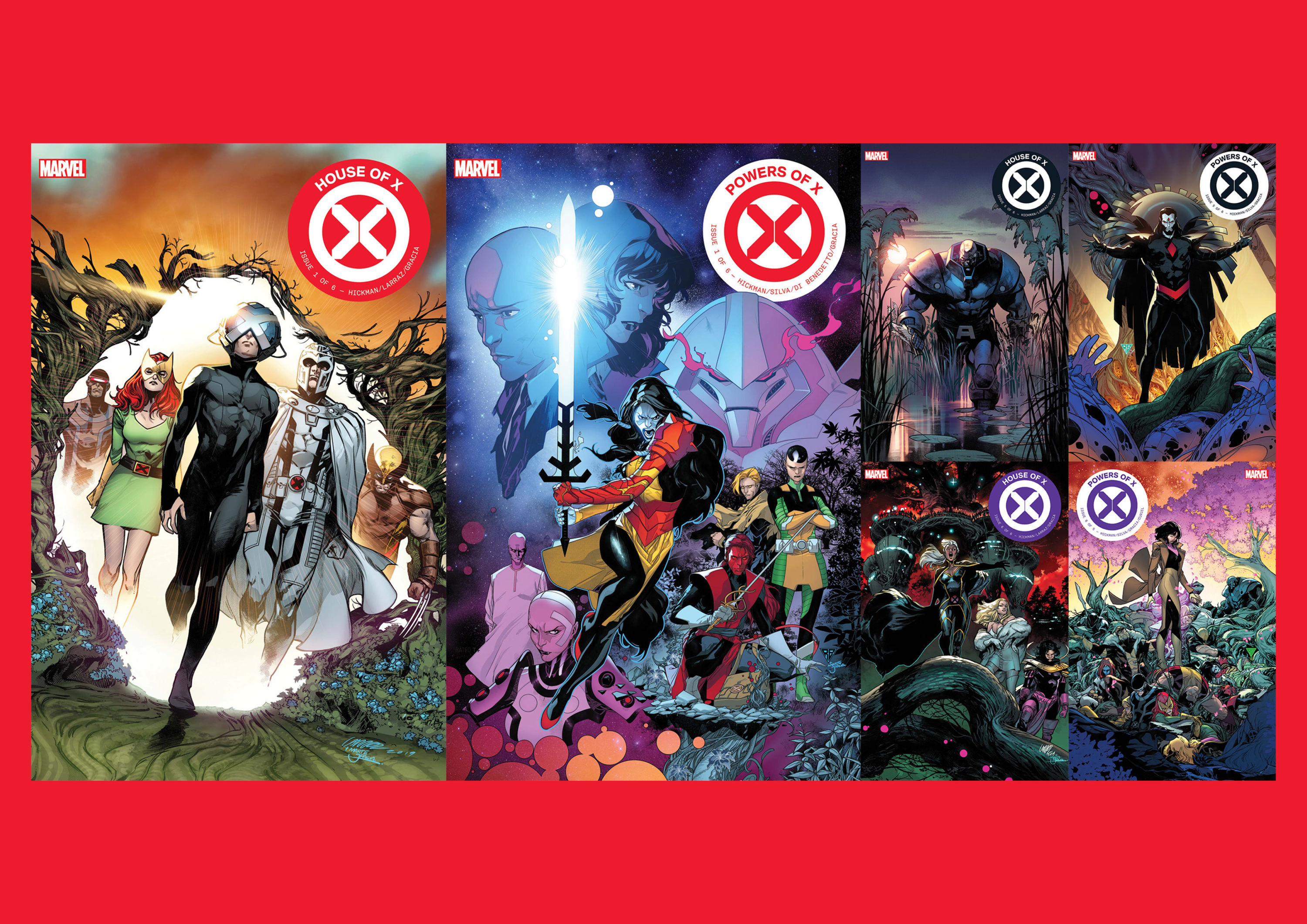
- Bronze Award: Publishing
When Marvel Comics planned a major reboot of the iconic X-Men franchise as part of its 'Dawn of X' initiative, the publisher turned to helloMuller to develop a new graphic language.
Three key story concepts – the 'X-Gene', 'Mutant Culture' and 'Mutant DNA' – were merged into a modern ‘X’ symbol. A new bespoke typeface – X-Display – helps unify the design system.
12. Kringlan – All Kinds of Everything by Kontor Reykjavik
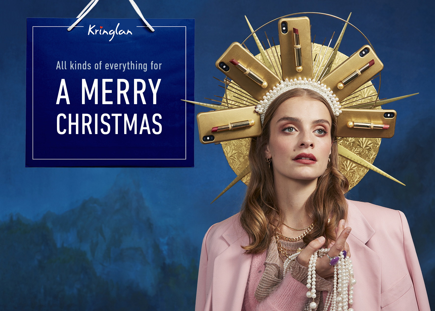
- Bronze Award: Retail
Kontor Reykjavik's 'All Kinds of Everything' campaign aims to demonstrate the huge diversity that Reykjavik’s high-end shopping mall Kringlan offers in an eye-catching, high-fashion style.
The eclectic range of products featured in each painstakingly art-directed seasonal shoot back up the premise: "Sometimes more is more."
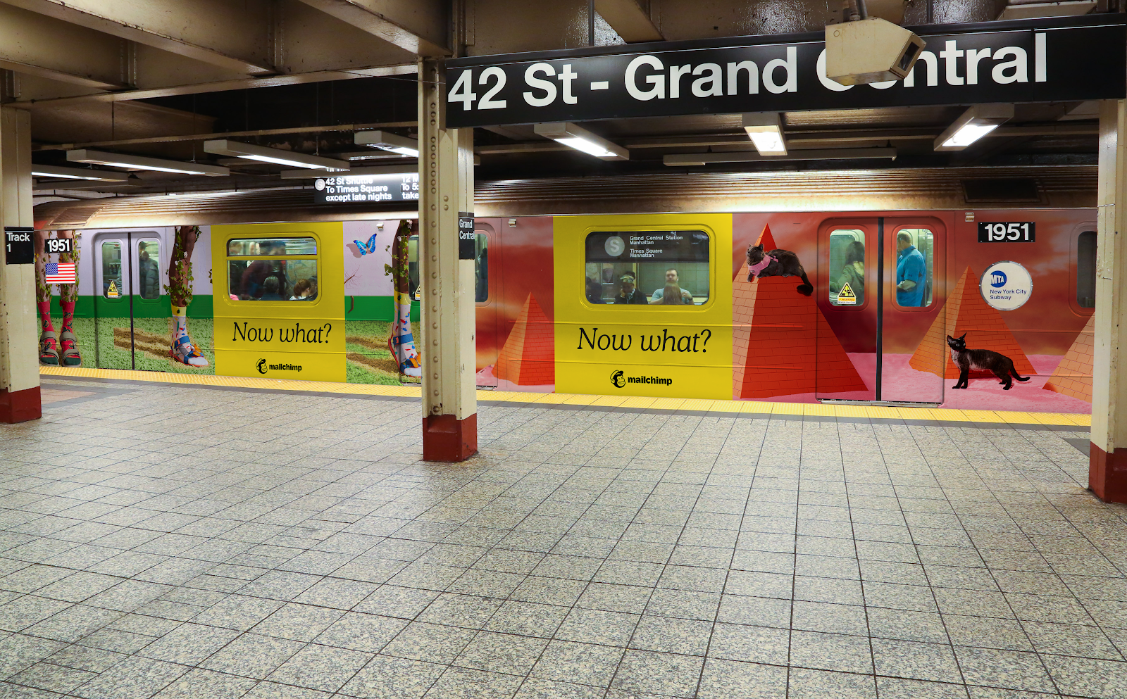
13. Now What? That’s What by Mailchimp
- Bronze Award: Technology & Telecoms
To promote the launch of its All-in-One Marketing Platform, Mailchimp practiced what it preaches with an extensive integrated campaign spanning 12 countries.
With particular focus on small to medium-sized businesses, 'Now what? That’s what' speaks to a particular mindset: you've got as far as you can, and need help taking it to the next level.
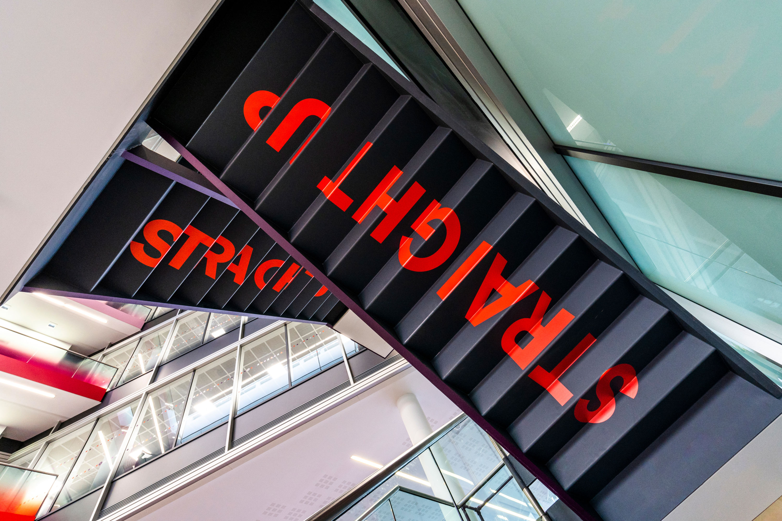
14. Virgin Media HQ by Dalziel & Pow
- Bronze Award: Technology & Telecoms
Dalziel & Pow brought Virgin Media's personality and value to life in its London HQ, creating a bold workplace experience that bursts with character and fun moments.
Fruit-shaped check-in pods replace the traditional reception. Cheeky signage adds personality in unexpected places. The restaurant has a giant disco ball, and there’s even space for yoga.
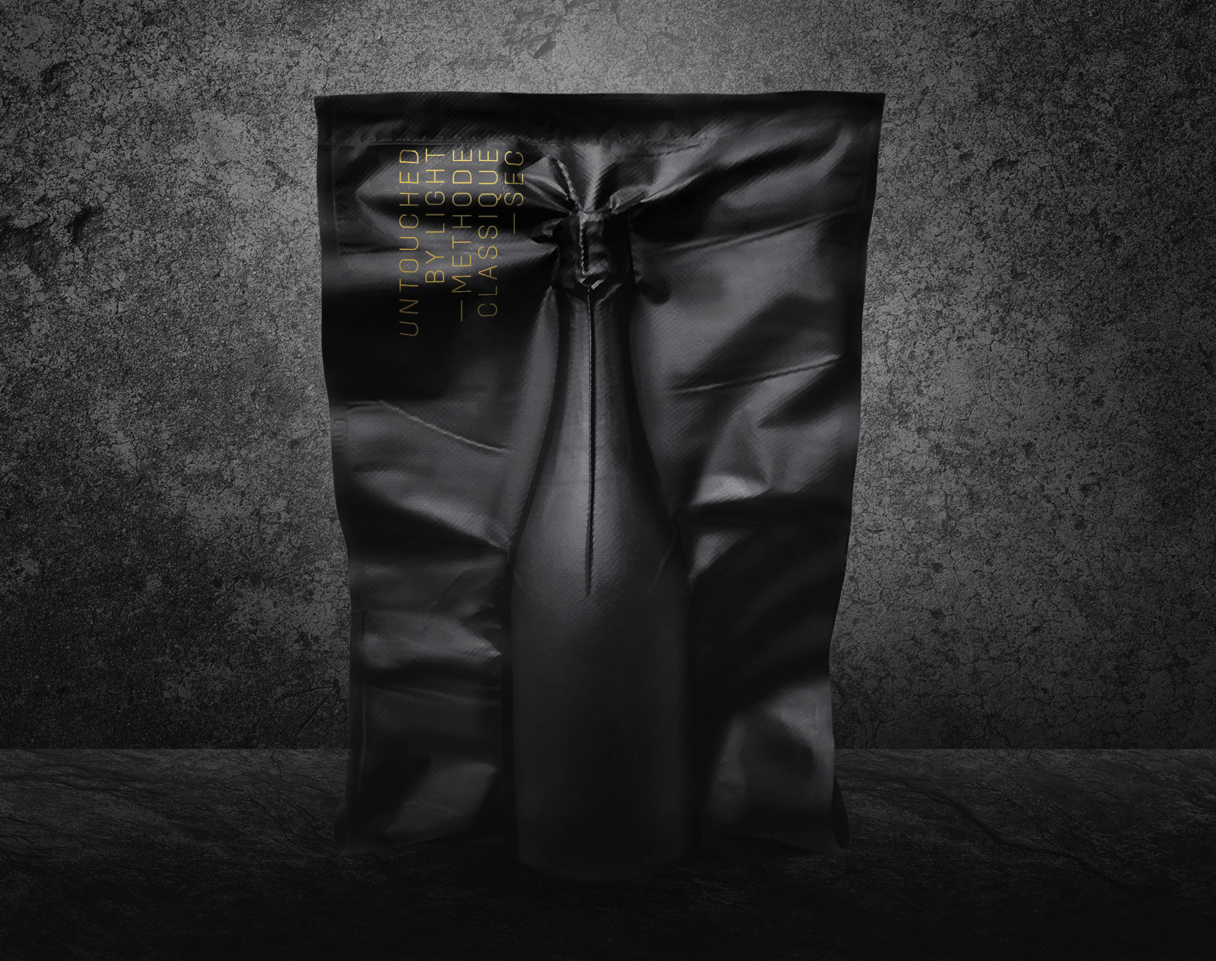
15. Untouched by Light by Bruketa&Žinić&Grey
- Bronze Award: Wine, Beer & Spirits
According to research by sensory chemist Professor Emerita Ann C. Noble, the exposure of wine to light – whether natural or artificial – affects its flavour.
Untouched by Light is made from grapes picked at night with night-vision goggles, and aged in a pitch-black cave – and its black lightproof bottle is vacuum sealed in a black lightproof bag.
Social Impact shortlist
Brand Impact Awards 2020: Social Impact shortlist
Best of Show Britain Get Talking also took home the Social Impact Award, with Silver Award winner Versus Arthritis the runner-up, and Silver/Bronze winner Churches Conservation Trust also shortlisted.
The following three projects were not shortlisted in their respective categories and therefore are not trophy winners, but were put forward for consideration based purely on their social impact credentials.
Find out more: download the full winners showcase
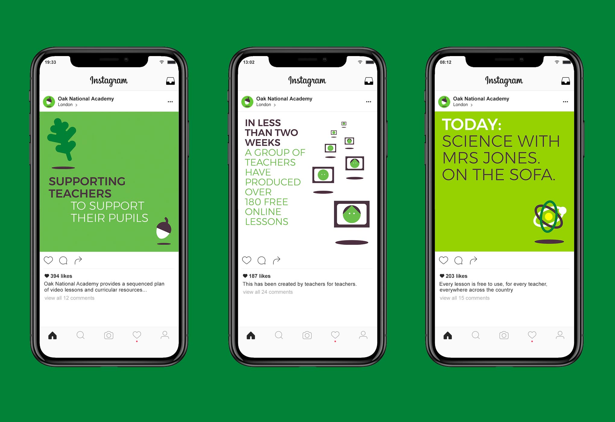
01. Oak National Academy by Johnson Banks
- Shortlisted: Social Impact Award
Johnson Banks had just a week to develop a fully-functioning brand for Oak Academy, a new bank of online resources to support the nation's teachers during the pandemic. With a clean, functional brand architecture based around a 'falling acorn' metaphor, the platform helped deliver millions of video lessons to pupils at home throughout lockdown.
02. National Autistic Society by Alphabetical
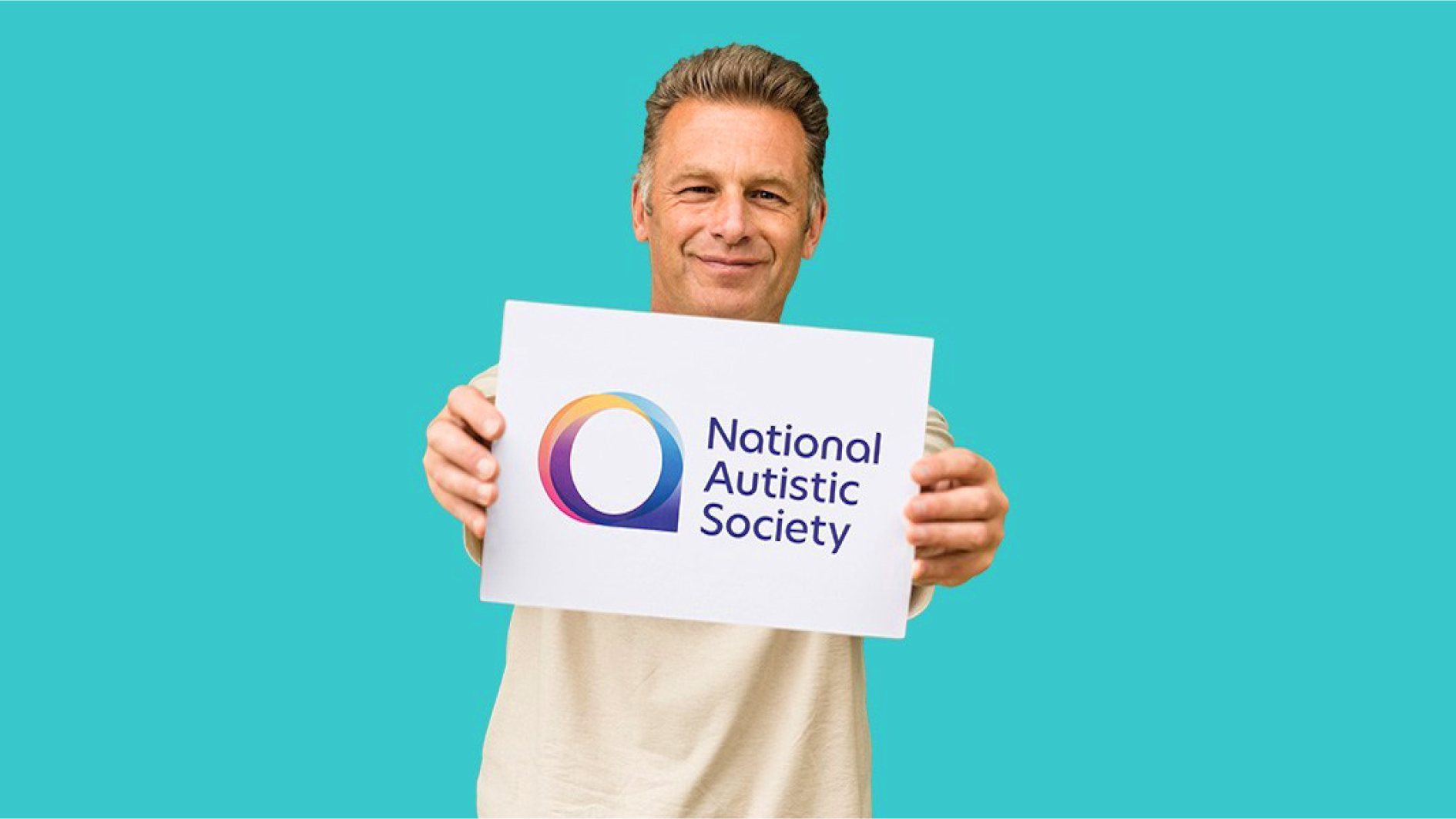
- Shortlisted: Social Impact Award
Contrary to belief, the autistic spectrum is not linear but circular, with multiple aspects combining to create a one-of-a-kind condition unique to each autistic person. At the heart of Alphabetical's new visual identity for the UK’s leading autism charity is a colourful 'a' symbol that aims to better represent the diverse range of the autistic community.
03. We Can't Wait To Tackle Climate Change by Agent
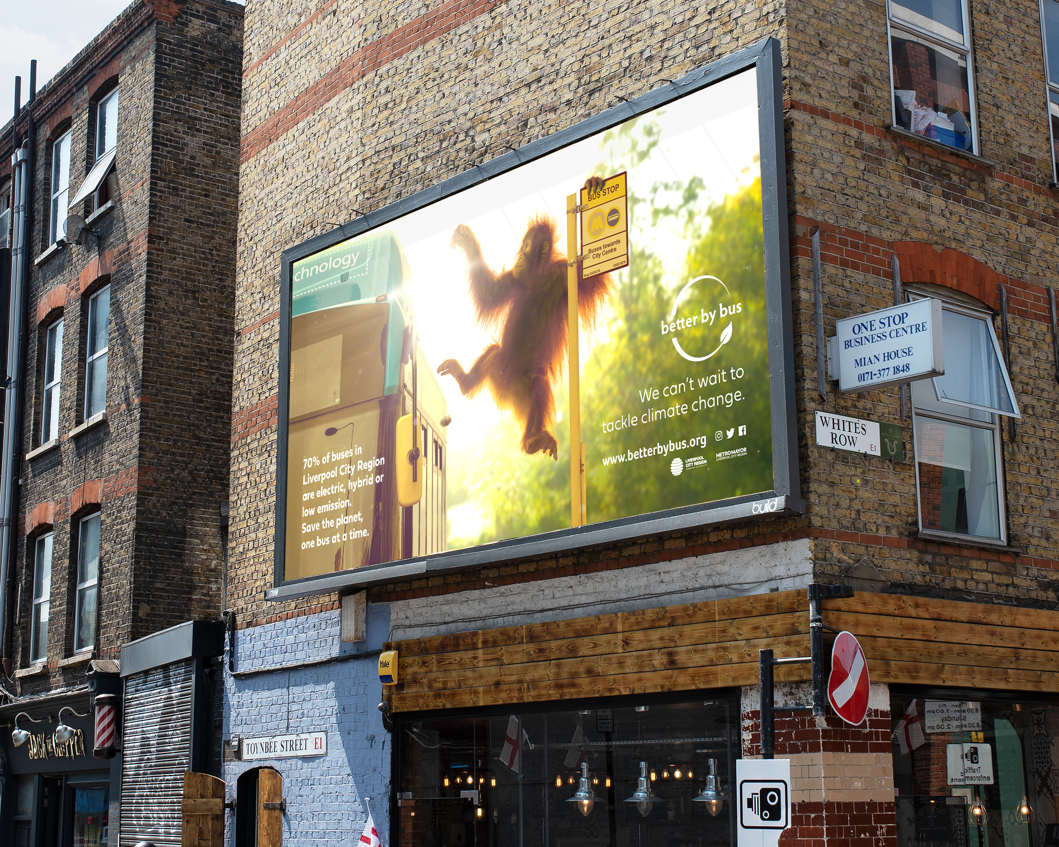
- Shortlisted: Social Impact Award
Better By Bus is a major behaviour change initiative from the Liverpool City Region Bus Alliance, which encourages travelling by bus. 'We Can't Wait To Tackle Climate Change' puts the focus on climate change. Endangered animals take centre stage on buses, bus stops, billboards and other media.
Congratulations to all winning agencies
Thank you to everyone who submitted entries during this immensely challenging period, and congratulations to all the worthy winners.
Download the full winners showcase
See you in 2021!

Nick has worked with world-class agencies including Wolff Olins, Taxi Studio and Vault49 on brand storytelling, tone of voice and verbal strategy for global brands such as Virgin, TikTok, and Bite Back 2030. Nick launched the Brand Impact Awards in 2013 while editor of Computer Arts, and remains chair of judges. He's written for Creative Bloq on design and branding matters since the site's launch.
