We love the negative space in this new logo
But some are calling copycat.

Negative space famously works well in some of the world's most well-known logos – think FedEx, NBC, Toblerone and The Guild of Food Writers. And a new rebrand from Koto has just added a new example into the mix.
Koto has rebranded ecommerce company Bolt, giving the entire brand and website a new look and feel. But as with many rebrands, it's the wordmark that has got people talking – the negative space between the 'l' and the 't' provides a clever embodiment of the brand. And that lightning shape is echoed elsewhere in the brand, including in its typography (see below). While some people seem to think it's a masterclass in how to design a logo, others are sure they've seen it before.
The name Bolt is intended to embody the brand's speedy and efficient checkout, meaning that the use of a lightning bolt makes sense. "This is an opportunity to raise the bar in this industry and move into the centre of the cultural conversation," said Koto's Arthur Foliard, who said the inspiration for the rebrand was "lightning fast".
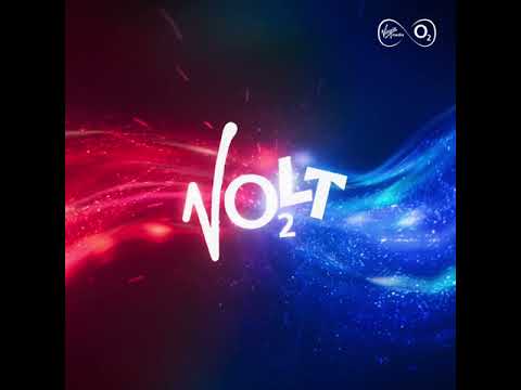
But this isn't the first brand to want to embody electricity in the sky. When Koto posted about its work, Greg Quinton, CCO at Superunion, reminded the studio about the logo for Volt, for Virgin Media.
*Cough*https://t.co/mrT8HOmyfVJanuary 20, 2023

So it's a similar idea, with a very similar execution. But I have to admit it took me longer to notice the lightning bolt hidden in Volt than it did to spot the one in Bolt. And it seems I'm not alone. Koto's James Greenfield replied to Greg's tweet with: "Sorry Greg we did it way better. You can hardly see it in yours."
It doesn't end there, either (and there we were thinking that Harry Potter 'owns' the lightning bolt). The sports brand Buzzer has also called out the similarity between Bolt and its brand.
https://t.co/gTN2PN9gLu pic.twitter.com/dJsap0WYKQJanuary 20, 2023
So where does this leave us? Do we start pointing fingers at any similarities between brands? Are studios expected to come up with wholly original ideas? Or does it come down to who does it better?
Get the Creative Bloq Newsletter
Daily design news, reviews, how-tos and more, as picked by the editors.
"The negative space between two “Z”s is one thing. To do it between a “L” and “T” is another," said one tweeter, in response to Buzzer's post.
When we asked Koto about the controversy, Foliard said: "It's about making something that works for our client, to make a great identity. We can't know every brand and every logo ever made."
We'll leave it up to you to decide which lightning bolt you prefer.
Read more:

Thank you for reading 5 articles this month* Join now for unlimited access
Enjoy your first month for just £1 / $1 / €1
*Read 5 free articles per month without a subscription

Join now for unlimited access
Try first month for just £1 / $1 / €1

Rosie Hilder is Creative Bloq's Deputy Editor. After beginning her career in journalism in Argentina – where she worked as Deputy Editor of Time Out Buenos Aires – she moved back to the UK and joined Future Plc in 2016. Since then, she's worked as Operations Editor on magazines including Computer Arts, 3D World and Paint & Draw and Mac|Life. In 2018, she joined Creative Bloq, where she now assists with the daily management of the site, including growing the site's reach, getting involved in events, such as judging the Brand Impact Awards, and helping make sure our content serves the reader as best it can.
