BMW revives 1970s logo – and it's delightfully extra
A colourful blast from the past.
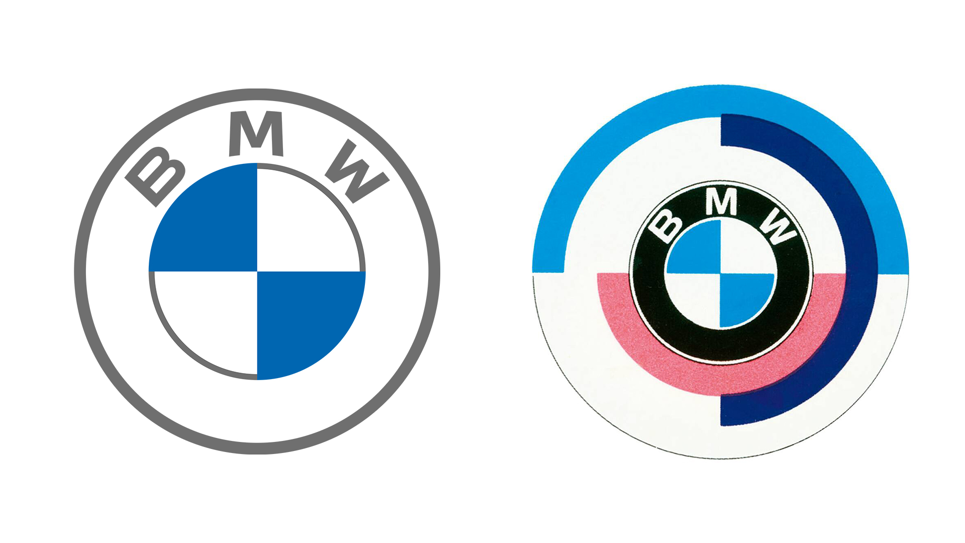
It was only last year that BMW revealed its new logo, a flat and minimal reworking of its previously 3D emblem. We loved the sleek new look, but it seems BMW isn't abandoning its design roots just yet.
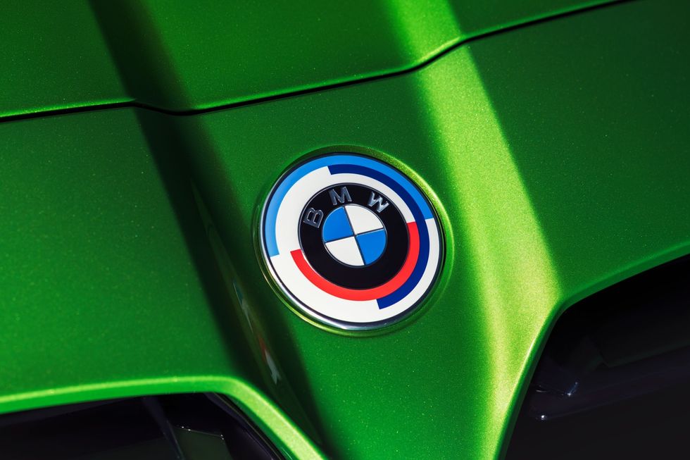
The brand has revealed that its new M division cars will feature an old racing logo from its past, as well as a series of retro paint jobs, to mark the division's 50th anniversary. The old design is an even more decorative take on the classic logo, complete with three colourful semicircles. The whole thing is delightfully flamboyant – but is it up there with the best logos of all time?

There's a lot going on in the anniversary logo – certainly more than in the minimal new BMW design. As well as the solid blue, white and black colours in a shape that may or may not depict a propeller, we have outer semicircles in blue, violet, and red. If you're not a fan of the simple new look, you're probably going to love this explosion of colour.
According to Car and Driver, BMW will make the newly announced anniversary badging "standard on its M division high-performance models including the M3 and M4, and it will be an option on M340i, M440i, and other M models." Only orders placed after January 2022 will be fitted with the classic logo.

BMW explains on its website that the 'M' logo, designed in 1972, features a carefully considered colour scheme: "Blue stands for BMW, red for motorsport and violet for the unique combination of the two."
As well as the old logo, BMW is also reviving "50 iconic and historically significant BMW M paint finishes". These include Dakar Yellow, Fire Orange, Daytona Violet, Macao Blue, Imola Red, and, perhaps our favourite in name, Frozen Marina Bay Blue.
With BMW having joined the likes of Nissan, Vauxhall and, well, pretty much every car brand out there at the flat design party, it's refreshing to see an unapologetically colourful logo given some love. If you're inspired to create your own logo, check out our guide to logo design.
Read more:

Thank you for reading 5 articles this month* Join now for unlimited access
Enjoy your first month for just £1 / $1 / €1
*Read 5 free articles per month without a subscription

Join now for unlimited access
Try first month for just £1 / $1 / €1
Get the Creative Bloq Newsletter
Daily design news, reviews, how-tos and more, as picked by the editors.

Daniel John is Design Editor at Creative Bloq. He reports on the worlds of design, branding and lifestyle tech, and has covered several industry events including Milan Design Week, OFFF Barcelona and Adobe Max in Los Angeles.
