Charity rebrand shows the simplest ideas are the best
UK charity Bloodwise has revealed a brand new name as well as a new visual identity designed by Pentagram's Marina Willer. Now known as Blood Cancer UK, the charity hopes its new, descriptive name will help it reach the people who need the people who need it most.
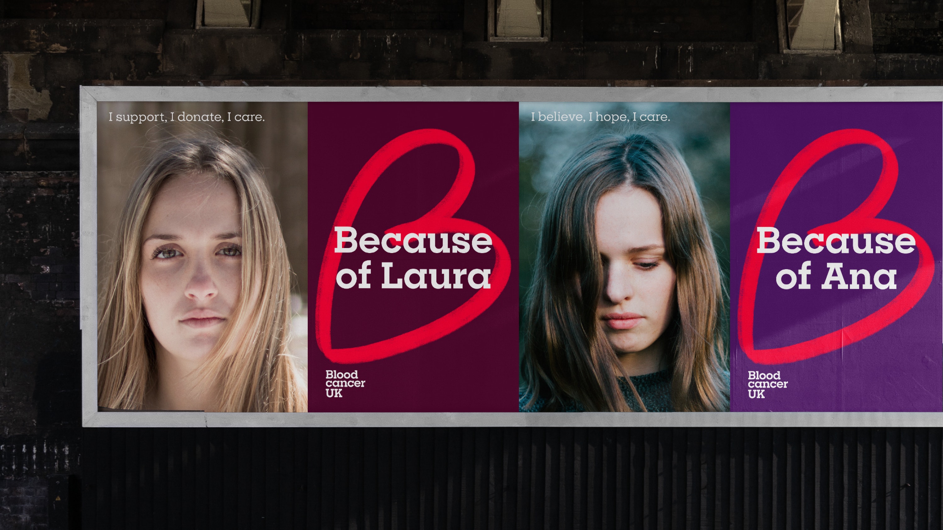
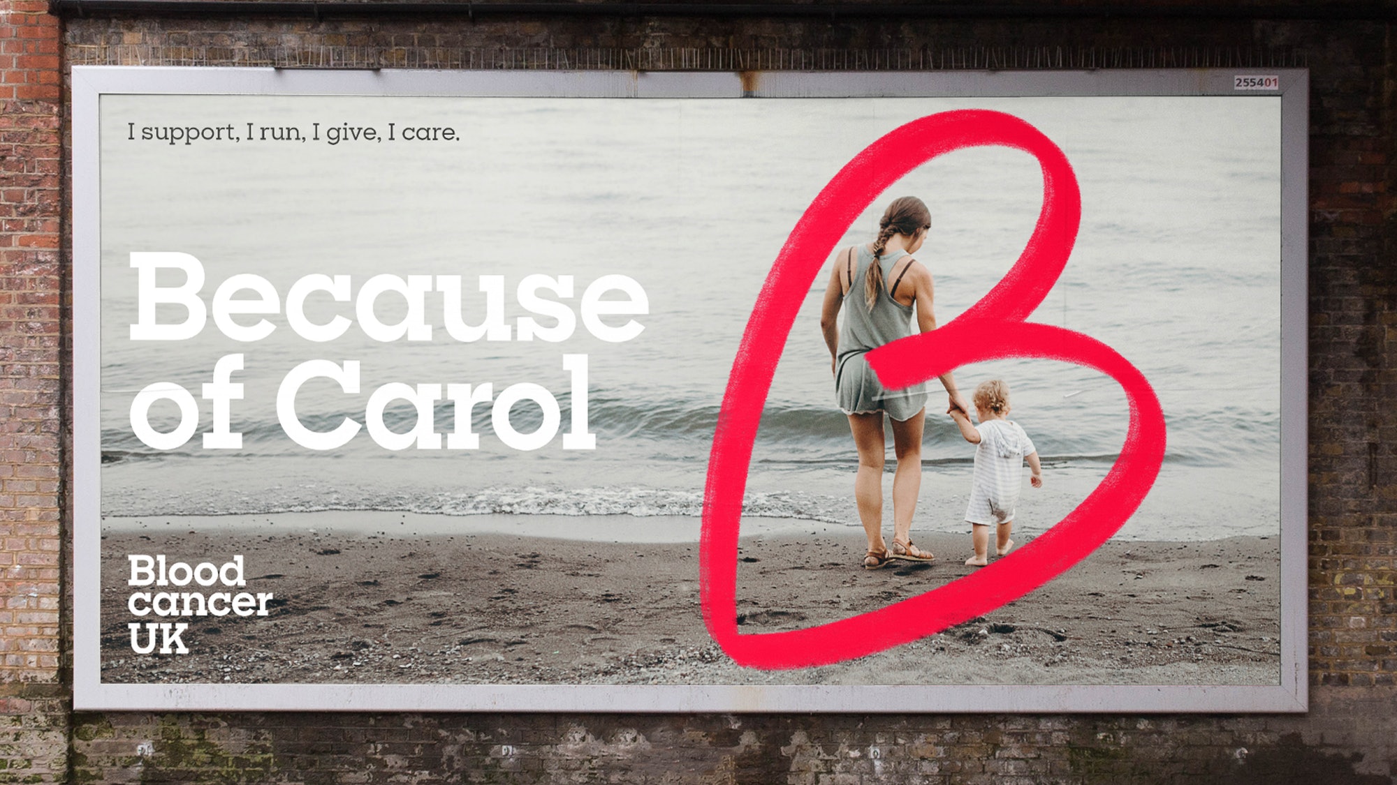
At the centre of the new visual identity is the logo: a hand-drawn heart, placed at an angle so as to also resemble the letter 'B'. It's an ingeniously simple design that not only emphasises the charity's name and focus on blood cancer, but also conveys a sense of kindness and compassion. According to Pentagram, the 'B' also stands for the word 'Because', which is the focus of the charity's latest poster campaign.
Looking for more logo design inspiration? Check out our best logos of all time.

The new posters, each containing a sentence starting with the word 'Because', highlight the charity's various activities from funding research to emotional and practical support. One reads, "Because we research, we care, we support", while others emphasise the personal impetus behind Blood Cancer UK's work by simply using names ('Because of Carol').

Founded in 1960, the charity supports those who have been affected by blood cancer, as well as funding research. While there are several charities working in this area, Blood Cancer UK is the only one that claims to provide funding and support for all the different types of blood cancer (of which there are over 100).
The charity's name change is its second in five years (before Bloodwise it was known as Leukaemia and Lymphoma Research). According to a blogpost on Blood Cancer UK's website, it realised the 'Bloodwise' name was holding it back. In contrast to other charities, the charity had recently seen its donations fall. "Many people didn’t realise we were a blood cancer charity. We wanted to make sure our name makes it as obvious as possible what we do."

"While the prognosis is positive," says Pentagram, "there is still much work to do." We're big fans of Blood Cancer UK's new identity. The new name makes its purpose much clearer, as does the logo – which even manages to use a blood-red colour in a way that doesn't make us feel squeamish. If we had one criticism, we'd say the heart symbol could potentially be confused with The British Heart Foundation's, although the hand-drawn nature certainly sets it apart. Ultimately, it's a simple yet emotive mark that conveys a sense compassion for those requiring the charity's services as it continues its vital work.
Daily design news, reviews, how-tos and more, as picked by the editors.
Related articles:

Daniel John is Design Editor at Creative Bloq. He reports on the worlds of design, branding and lifestyle tech, and has covered several industry events including Milan Design Week, OFFF Barcelona and Adobe Max in Los Angeles. He has interviewed leaders and designers at brands including Apple, Microsoft and Adobe. Daniel's debut book of short stories and poems was published in 2018, and his comedy newsletter is a Substack Bestseller.
