New Bing logo has curves in all the right places

(Image credit: Microsoft)

The past couple of years have seen Microsoft update many of its icons to bring them inline with its Fluent Design System. A process, which, in short, aims to create simplicity and coherence across its entire platform. Today, Microsoft's search engine Bing is the latest of its services to receive the Fluent design treatment, and the results are surprisingly impressive. 

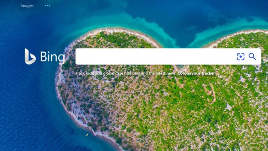
The new Bing logo keeps the immediately recognisable lowercase 'b', but loses the sharp edges in favour of a much curvier design. There are also some very subtle, gorgeous new gradients in there too. While it seems like a simple change, the effect is quite profound, with the old, quite harsh design replaced with a sleek, classy new look. Is it enough to make it on to our list of the best logos of all time? Or make people choose the service over Google? Doubtful. But it's definitely a step in the right direction.

Thank you for reading 5 articles this month* Join now for unlimited access

Enjoy your first month for just £1 / $1 / €1

*Read 5 free articles per month without a subscription

Join now for unlimited access

Try first month for just £1 / $1 / €1

Kerrie Hughes
Freelance writer

Kerrie Hughes is a frequent contributor to Creative Bloq, and was once its editor. One of the original CB crew, Kerrie joined the team back in 2013 after moving from her role as staff writer on 3D World. Since then she's written regularly for other creative publications such as ImagineFX, Computer Arts and Digital Camera World. After a stint working for the police, Kerrie is back reviewing creative tech for creative professionals. 

Latest in Logos & Icons
Microsoft To Do
People have some Very Strong Opinions on the Microsoft To Do icons
Clippers logos old vs new
New LA Clippers logo is an instant classic
WLCO logo design
This hip neighbourhood's logo is totally loopy, but I love it
The superman logo as based on a potential design from Superman: Legacy
Possible new Superman logo divides fans
Lyle's Golden Syrup and Lyles Black Treacle tins showing the lion logo
Lyle's apologises for its Golden Syrup logo redesign as even the church expresses dismay
Steve Jobs and the Google logo
Apparently Steve Jobs hated the Google logo on his iPhone
Latest in News
A billboard advert at GDC 2025 for Revenge of Savage Planet
Savage GDC 2025 billboard ad is revenge for Google Stadia layoffs
camera phone deals Best Buy
Huge Samsung, Google Pixel and Motorola deals at Best Buy right now – phones from $299.99
Umbro logo
Umbro’s logo design dispute knows no end
An image from teaser animation for ARK: Survival Ascended expansion ARK: Lost Colony
GDC 2025: Lost Colony anime teaser shows ARK: Survival Ascended is the game that has everything
Roblox Cube 3D AI 3D object generation
GDC 2025: Roblox says its new AI generator will go beyond 3D models to allow groundbreaking '4D creation'
Bambu Lab H2D announcement
Just in: The next generation Bambu Lab H2D is arriving soon