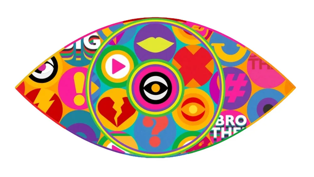
A new Big Brother logo? What? How? Why? Well, incredibly, the reality TV series that started it all is somehow still going in the age of streaming services, with a 20th season soon to start in the UK. That means that the traditional Big Brother eye logo has come in for a revamp. And fans are aghast.
The series seems to have jumped on the retro-maximalist trend but in the worst possible way. Gone is the original iconic eye logo's slightly sinister CCTV-influence, which symbolised the program's concept of all-seeing surveillance state. Instead, it's now a bit of eyesore (see our guide to how to design a logo for tips).
Ugly, bring back this style for the eye pic.twitter.com/w2HoywZi5CJuly 31, 2023
See more
Big Brother sees it all 👀 Coming soon to ITV2 and @ITVX #BBUK pic.twitter.com/GeDVzsDAWOJuly 31, 2023
See more
How do you celebrate the 20th edition of a series that transformed television? How about with a logo that leaps off the screen with a chaotic explosion of colourful icons? Five years after Channel 5 ditched the series, ITV, the third UK broadcaster to own the rights to Big Brother, is rebooting the reality TV franchise for a 20th season.
Latest Videos From Creative Bloq
The logo remains the all-seeing eye that has accompanied the series since its launch in 2000. But fans can't believe the new design is real. It features an eye within an eye and a whole bunch of garish icons. Perhaps it's intended to suggest that social media is the new surveillance, which would be kind of clever and timely, but fans aren't convinced.
The last 4 Big Brother eyes give me whiplash... from one extreme to the next every single time 😭 oh well maybe that means next years will be iconic? #BBUK pic.twitter.com/PetwDgiG8JJuly 31, 2023
See more
Haven't watched Big Brother since 2008 but looking back at the history of the logos they were great designs, iconic. Just seen the new one for ITV aaaand...not so much. #BBUK pic.twitter.com/pNc1AobXHxJuly 31, 2023
See more
"Is this the worst Big Brother eye (ever in the world)? Potentially. This whole reboot has had ITV shouting about how they’re keen to stick to the core format, and the roots of Big Brother. Every eye for 10 years was ‘cool’ - psychological and smart. This is the opposite," Super TV wrote on Twitter.
"The ITV logo is giving me ‘Love Island without the fancy location’ vibes, whereas I want to travel back to the ‘IKEA furniture in an open plan cabin in an undisclosed car park’ era," another person wrote. I have a feeling this won't be joining our list of the best TV logos.
Get the Creative Bloq Newsletter
Daily design news, reviews, how-tos and more, as picked by the editors.
Thank you for reading 5 articles this month* Join now for unlimited access
Joe is a regular freelance journalist and editor at Creative Bloq. He writes news, features and buying guides and keeps track of the best equipment and software for creatives, from video editing programs to monitors and accessories. A veteran news writer and photographer, he now works as a project manager at the London and Buenos Aires-based design, production and branding agency Hermana Creatives. There he manages a team of designers, photographers and video editors who specialise in producing visual content and design assets for the hospitality sector. He also dances Argentine tango.