YouTube logo changes for particular events seem to be becoming more regular treats on the platform. That's perhaps not surprising considering the the video sharing site and app belongs to Google, which has long been known for the Doodles on the homepage of its search engine.
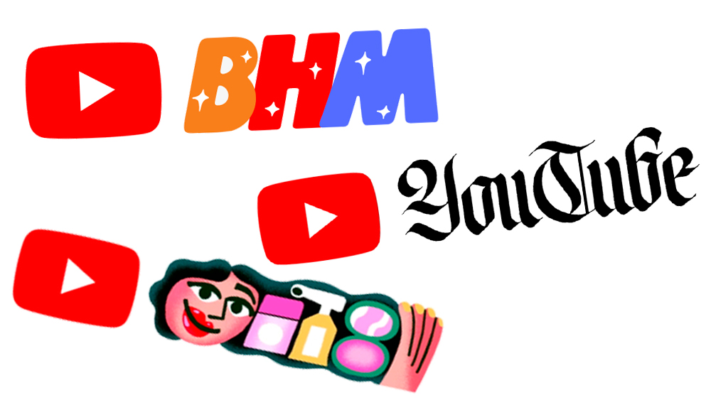
YouTube event logos follow the same concept, modifying the YouTube logo to commemorate special dates, from Black History Month to World Calligraphy Day. They're still used very infrequently, nowhere near as often as Google's doodles, but it seems YouTube might be starting to adopt the tradition. Below, we round up the YouTube logo variations that we've seen so far (see our YouTube logo history for the story of the permanent design).
The Black History Month YouTube logos
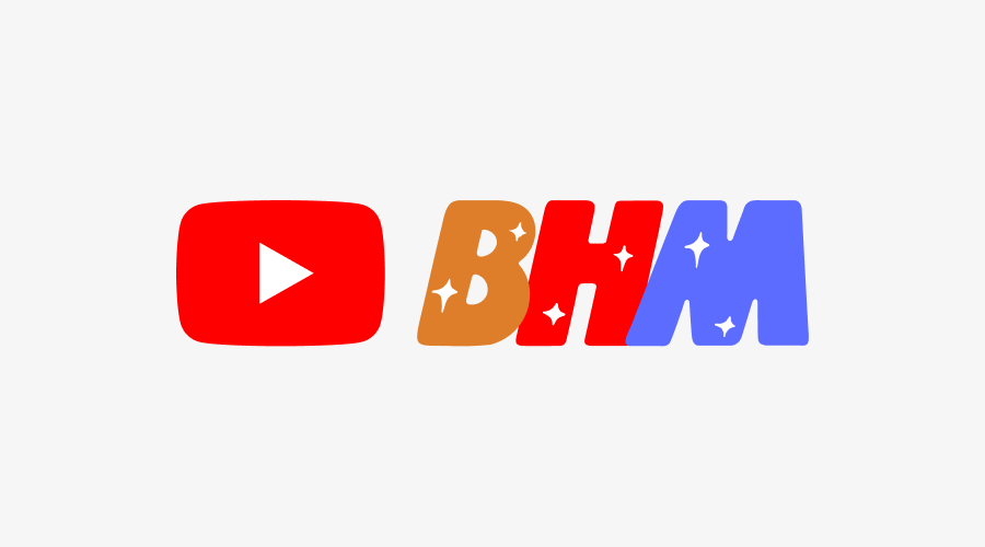
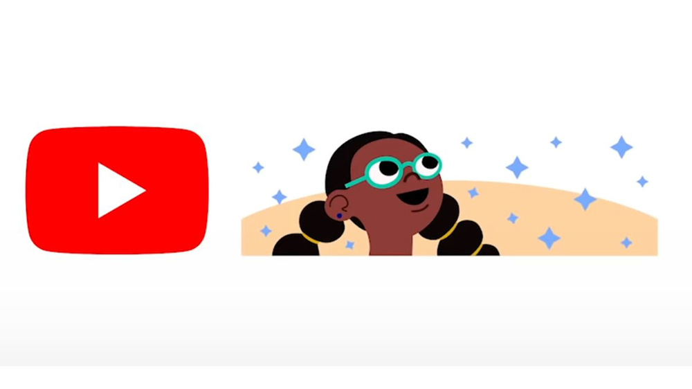
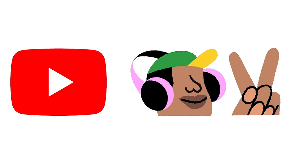
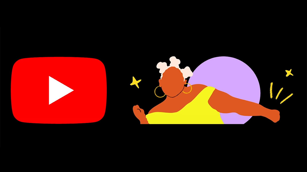
The first examples that we saw of YouTube logo variations or doodles was an initiative to commemorate Black History Month (BHM) back in February 2021. YouTube commissioned four Black artists to reimagine the platform's logo and implemented a new design each week throughout the month.
Brazilian artist Leandro Assis's contribution featured YouTube's familiar red play button but with stylised 'BHM' lettering replacing the YouTube wordmark. His logo was followed over the next three weeks with designs by North Carolina-based artist and designer Keisha Okafor, Louis-based designer and illustrator Marco Cheatham and Brooklyn-based illustrator Shanée Benjamin (see all of the YouTube Black History Month logos in the gallery above).
The initiative helped raised awareness of BHM since many YouTube users began asking what the designs were for. "What inspired me to create this piece were the Black people around me," Assis told YouTube in a blog post introducing the BHM project. "The meaning and importance of our hair, the way we dance, the rhythms we create, and the beauty of our different skin tones."
The World Calligraphy Day YouTube logo
Some of YouTube's other event logos have been more random. Viewers were surprised back in August when YouTube appeared to have gone all medieval on us. The platform was suddenly sporting a logo that looked more redolent of an 19th century newspaper masthead than a digital media outlet. It turned out to be a recognition of World Calligraphy Day, an event not massively known about among the general public.
To create the animated World Calligraphy Day YouTube logo, the platform worked with Portuguese calligrapher Hugo Moura of Xesta Studio. He reimagined the YouTube logo in the Fraktur Latin calligraphy hand that is used to create blackletter typefaces. He was able to simplify it sufficiently to make it legible at a small size while retaining the decorative flourishes that instantly identify it as a historic style. YouTube's in-house team then animated the the logo in a way that "evokes the sharp, precise tempo of Xesta’s brush strokes."
Get the Creative Bloq Newsletter
Daily design news, reviews, how-tos and more, as picked by the editors.
The GRWM YouTube logo
Hot on the heels of the YouTube calligraphy logo came a design that celebrated one of the platform's fasted growing genres of video. For the uninitiated, GRWM stands for 'Get Ready With Me' and the video literally just show people getting ready for an activity or event. Hence the YouTube GRWM logo features a face and personal grooming products.
"It’s hard to believe there was ever a time when GRWM videos didn’t exist," YouTube announced in a blog post. "In 2023 alone, there have been more than 6 billion views of videos with variations of “grwm” in the title.1 That’s why we’re taking a moment, amidst the prep for back to school, to temporarily transform YouTube’s logo and celebrate the creators who’ve invited us to join and connect with them through their daily routines."
In addition to the logo, YouTube released a video taking users on a journey from 2010 to today to see how GRWM videos have evolved in collaboration with Bailey Sarian, plus a playlist of popular GRWM videos.
For now, YouTube logo variations have been few and far between. The first were used to commemorate an important cultural and historical initiative in the US and Canada while the others were rather random. But that's perhaps for the best.
We see new Google Doodles and Google Easter eggs appear regularly, but the danger of using the resource so often is that people lost curiosity and no longer pay as much attention to them or take the time to investigate what they're about. By using YouTube event logos sparingly, the YouTube logo still gets our attention when it's changed from the usual design.

Thank you for reading 5 articles this month* Join now for unlimited access
Enjoy your first month for just £1 / $1 / €1
*Read 5 free articles per month without a subscription

Join now for unlimited access
Try first month for just £1 / $1 / €1

Joe is a regular freelance journalist and editor at Creative Bloq. He writes news, features and buying guides and keeps track of the best equipment and software for creatives, from video editing programs to monitors and accessories. A veteran news writer and photographer, he now works as a project manager at the London and Buenos Aires-based design, production and branding agency Hermana Creatives. There he manages a team of designers, photographers and video editors who specialise in producing visual content and design assets for the hospitality sector. He also dances Argentine tango.
