Behance reveals all-new look for 2019
Online portfolio platform introduces new customisable profile and project pages.
Behance has long been known as a go-to place to find the best creative work from around the world. Since its inception, the online portfolio platform has become an inspirational resource for everyone in the creative community, whether that be as an artist wanting to get their work out to the masses or an employer searching for new talent.
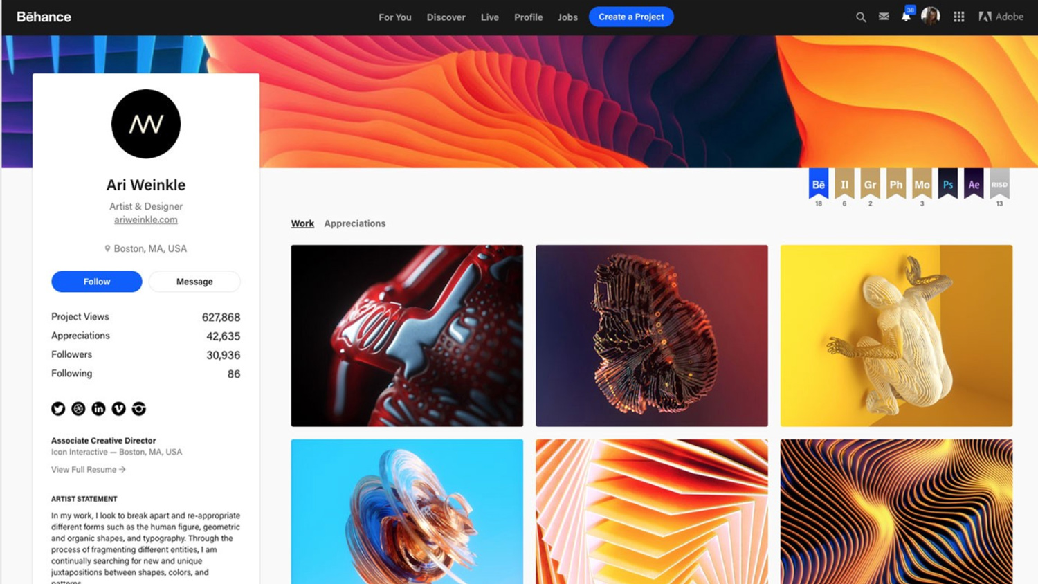
However, with the arrival of multiple no-coding-required, easy-to-use website builders in recent years, its fair to say Behance started to lose a bit of its lustre. But that all looks set to change, with the company yesterday revealing brand new Behance profile (see above) and project pages to better showcase creatives' work.
And we think it has certainly fulfilled that brief, especially when you compare the new profile page (above) to the previous version (see below).
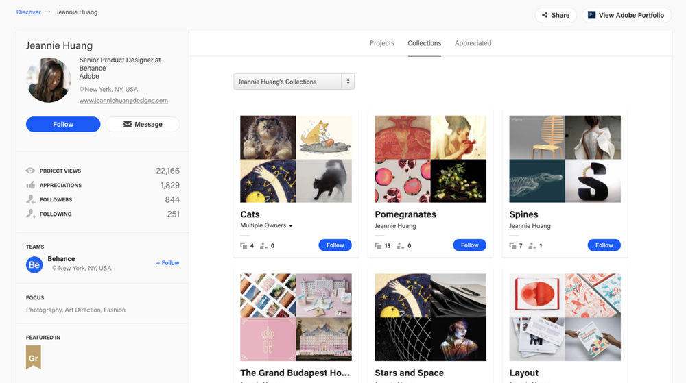
Bigger and better
The all-new Behance profile page has been updated to feature larger, single project images to really let the work do all the talking. And the text that was once displayed below the images – name of the project, likes and views – can now be seen by simply hovering over each project.
There's also now the option for creatives to upload a custom banner image to their Behance design portfolio – a subtle but hugely beneficial feature to add personality and keep a profile on brand. And it's ridiculously easy to set up, using a simple drag and drop/reposition system with a image of your choice. More information on adding Behance profile banners can be found here.
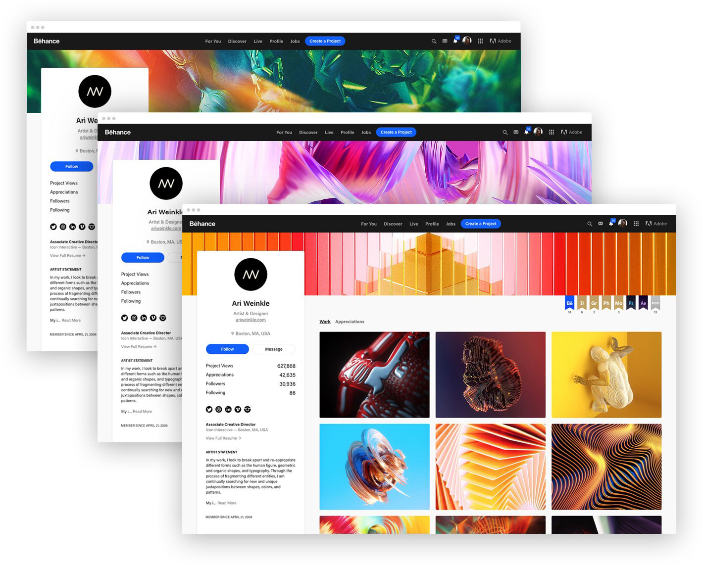
The best presentation
The updates don't stop there. The Behance team has updated the layout of individual project pages to help creatives present their work in the best possible way, and at the same time make it easier for viewers to appreciate it. Large hero images fill the screen, with project and creator information at both the top and bottom and actions including share, save, follow and appreciate present the entire time.
It's clear Behance and Adobe have pulled out all the stops for this update, bringing the site up-to-date and in line with other highly visual platforms like Pinterest. The new look has been rolled out already, and users don't need to do anything to activate the new look. Question is, will this be enough to fully put Behance back on the map? Watch this space.
Get the Creative Bloq Newsletter
Daily design news, reviews, how-tos and more, as picked by the editors.
Read more:

Thank you for reading 5 articles this month* Join now for unlimited access
Enjoy your first month for just £1 / $1 / €1
*Read 5 free articles per month without a subscription

Join now for unlimited access
Try first month for just £1 / $1 / €1
Kerrie Hughes is a frequent contributor to Creative Bloq, and was once its editor. One of the original CB crew, Kerrie joined the team back in 2013 after moving from her role as staff writer on 3D World. Since then she's written regularly for other creative publications such as ImagineFX, Computer Arts and Digital Camera World. After a stint working for the police, Kerrie is back reviewing creative tech for creative professionals.
