The BBC might have one of the most recognisable logos in the UK, with its iconic three boxes and distinct font. But the broadcasting company's "modern" rebrand has left the internet in total confusion.
The BBC has announced its new branding for a number of its channels and online apps. The broadcasting company has created new logos for BBC iPlayer, Weather, Sport, News, Bitesize and Sounds. All the new logos feature three rectangle shapes, much like the BBC's main logo. BBC has also adjusted the channel logos for BBC One, Two and Four. If you fancy having a go at giving your own logo an upgrade, then make sure you check out our 15 golden rules on logo design.
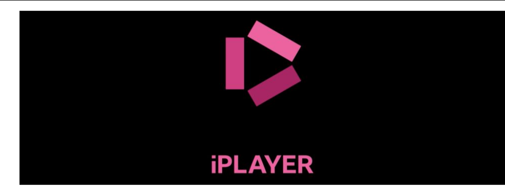
Image 1 of 6
If you look closely, you can see that the rectangles make a play sign(Image credit: BBC)
This logo looks a little bit more like a corridor than anything audio related(Image credit: BBC)
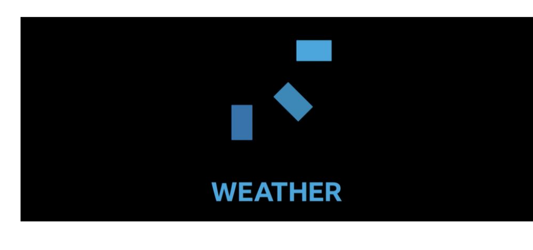
You can see the sun in this Weather logo(Image credit: BBC)
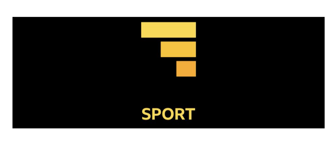
We have no idea how this logo has anything to do with sports(Image credit: BBC)
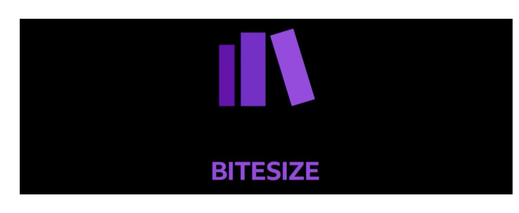
We think this logo is meant to look like books(Image credit: BBC)
(Image credit: BBC)
The BBC announced the new logos on its own news page and called the rebrand a "modern makeover," after arguing that the previous designs looked "old-fashioned" and "out-of-date". According to BBC, the new designs will make the sites like iPlayer easier to navigate.
Latest Videos From Creative Bloq
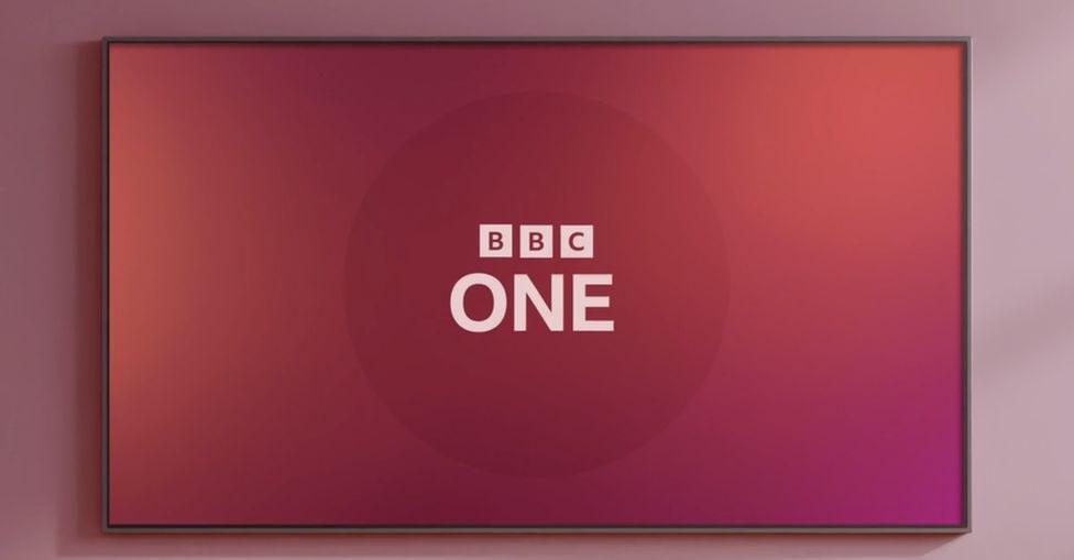
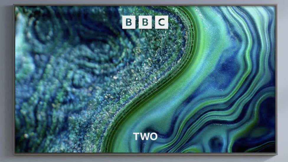
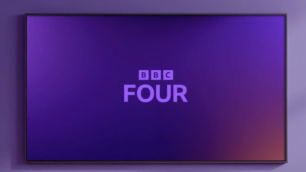
The BBC channels will also be getting a revamp, with the logos for BBC One, Two and Four getting some slight typeface adjustments made to the logos to help keep them relevant with a refreshing font. The new channel logos were soft-launched earlier this year in the US and Canada. The BBC has said that these channel rebrands will feature its own BBC typeface.
Image 1 of 3
The BBC One channel rebrand(Image credit: BBC)
The new channel branding features BBC's very own typeface(Image credit: BBC)
The new logos are being tested out in the US and Canada via a soft launch(Image credit: BBC)
Despite the BBC singing its own praises, the internet hasn't had the same reaction to the rebrand, and users have taken to Twitter and Reddit to comment on the new logos. Over on Reddit, the new designs have been added to the 'Crappy Designs' thread, and users have been sharing their thoughts on the new logos. One Redditor said, "I would not be able to identify what any of the symbols mean without the words," which we think, for a logo, is a pretty bad start. Other users called the logos things like, "awful," and, "a mess". Some are even comparing the BBC's confusing rebrand to Google Workspace's similar move when the Google icons all became seemingly unrelated to the actual product.
Quite a few people have mentioned to me the striking similarity between the new BBC Sounds logo and a W1A sketch about a new BBC logo from … 2014!https://t.co/FMLWcKs9Lv pic.twitter.com/aVYRRqURsFOctober 19, 2021
See more
Someone had to do it...Love the new BBC logo... https://t.co/egem7AIGX4 pic.twitter.com/bLq2ZLblTkOctober 20, 2021
See more
“the BBC declined to comment on how much it spent on the rebrand” pic.twitter.com/HHzl5bq460October 20, 2021
See more
Perhaps the execution wasn't quite right, but we like the idea of the new logos keeping in theme with the BBC's iconic three square logo. And while the internet isn't too keen on any of the rebrands, we think that the new typeface and channel branding is cohesive and clean.
If you reckon you can design a better logo than the BBC, then why not have a go at making your own with one of the best free logo makers from our roundup.
Get the Creative Bloq Newsletter
Daily design news, reviews, how-tos and more, as picked by the editors.
Amelia previously worked as Creative Bloq’s Staff Writer. After completing a degree in Popular Music and a Master’s in Song Writing, Amelia began designing posters, logos, album covers and websites for musicians. She covered a range of topics on Creative Bloq, including posters, optical illusions, logos (she's a particular fan of logo Easter eggs), gaming and illustration. In her free time, she relishes in the likes of art (especially the Pre-Raphaelites), photography and literature. Amelia prides herself on her unorthodox creative methods, her Animal Crossing island and her extensive music library.