The controversial new BBC logo really isn't that controversial
Why the online furore is off the mark.
Logo redesigns are rarely cheap, and they're not always guaranteed to look entirely different to their predecessor. As the saying goes, if a logo ain't broke, don't fix it (that's a saying, right?) – and it seems that's the brief the BBC was working to with its 'new' design.
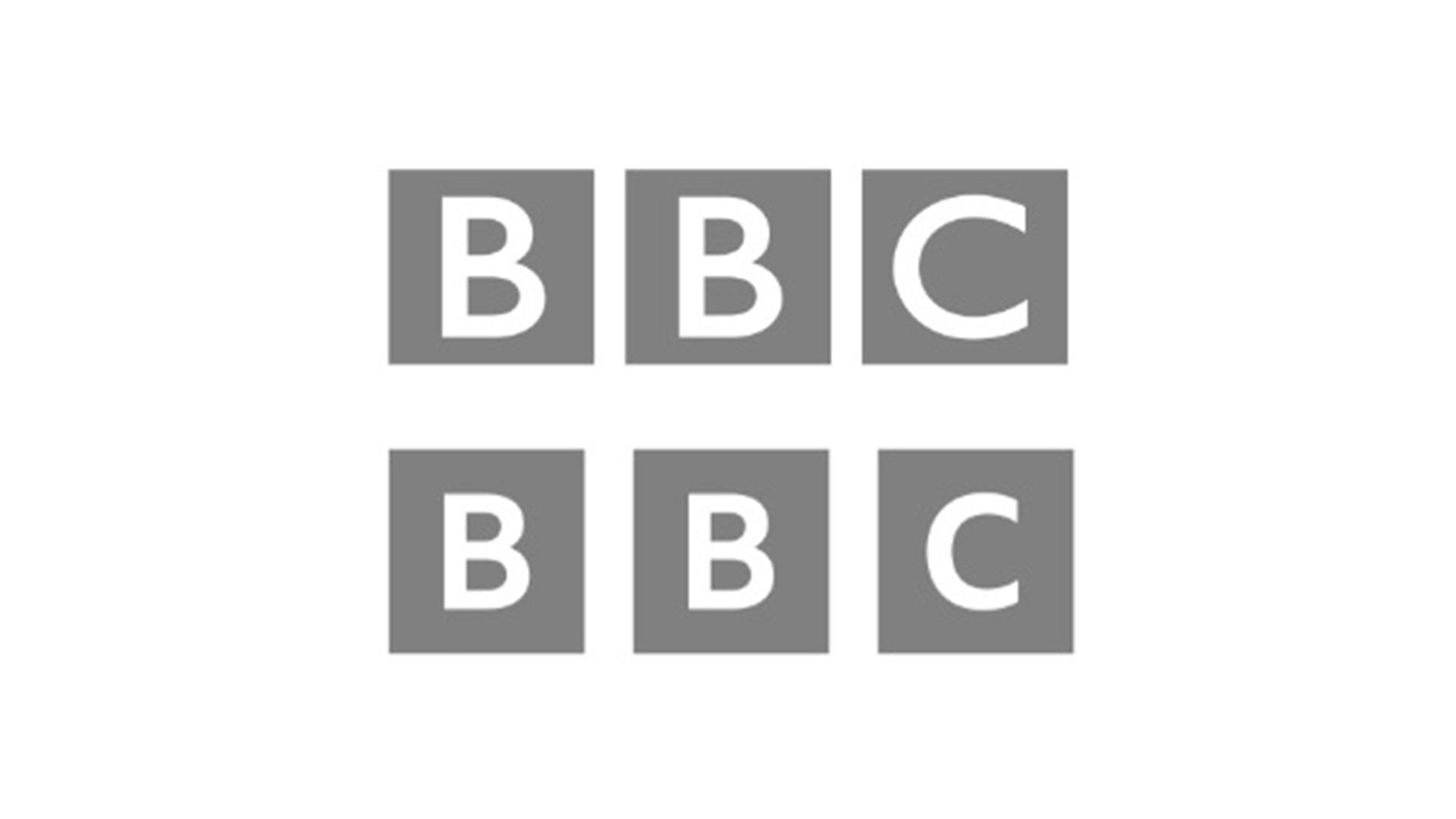
Reports suggest that the broadcaster has splashed out thousands of pounds on an updated logo that looks virtually identically to the old one, consisting of three square blocks, each containing a letter spelling out BBC. Like all of the best logos, it's an instantly recognisable design, but the latest refresh has appears to have ruffled some feathers.

The most obvious changes are the addition of extra space between the squares, while the typeface within them is now smaller and a touch more symmetrical. And that's it. It's hardly a rebrand on the scale of Burger King's new look – in fact, it's hardly a rebrand at all.
It seems people's chagrin with the inoffensive redesign is based on the alleged cost. According to an exclusive report in The Sun, "tens of thousands of pounds" of "taxpayer's money" was spent on the redesign, which was quietly revealed on the website of streaming service BBC Select this year and is expected to roll out more thoroughly in the Autumn.
The #BBC Logo change is an absolute joke & waste of License payers cash! 'Cost not significant' ? How many pensioners Licenses could have been paid for instead? Hang your heads in shame! A corppration run by out of touch fools, with no grip on reality! @bbc @BBCOne @bbcpressJuly 4, 2021
Lol 50k to change the BBC logo??? To something exactly the same as the old bloody logo! 50k of our money!?? This is where my TV licence money is going? Really??? https://t.co/lDYGr6n8nHJuly 5, 2021
But it seems the controversy might be missing the point. Rather than a redesign, the "new' logo appears to be a re-rendering of the logo in the BBC's new in-house font, Reith (named after BBC founder John Reith). And as many have pointed out Twitter, using its own font means the BBC no longer needs to pay licensing costs for Gill Sans, the typeface used in the original logo. Which means the whole thing could actually end up being a cost saving exercise. Who knew?
Sigh. The BBC logo change is so they no longer have to pay rights for the old font - the Reith font was designed in-house for just this reason - it will save money in the long run. https://t.co/KYRO71CCTrJuly 5, 2021
So there we have it. The furore over the new design is probably a load of fuss about nothing. The BBC likely didn't decide to spend a bunch of pounds on a rebrand that isn't a rebrand – it's probably just continuing to shift its brand assets over to the new in-house typeface. We can all calm down now. Speaking of typeface licensing costs, you won't encounter any such things in our roundup of the best free fonts.
Read more:
Daily design news, reviews, how-tos and more, as picked by the editors.

Thank you for reading 5 articles this month* Join now for unlimited access
Enjoy your first month for just £1 / $1 / €1
*Read 5 free articles per month without a subscription

Join now for unlimited access
Try first month for just £1 / $1 / €1

Daniel John is Design Editor at Creative Bloq. He reports on the worlds of design, branding and lifestyle tech, and has covered several industry events including Milan Design Week, OFFF Barcelona and Adobe Max in Los Angeles. He has interviewed leaders and designers at brands including Apple, Microsoft and Adobe. Daniel's debut book of short stories and poems was published in 2018, and his comedy newsletter is a Substack Bestseller.
