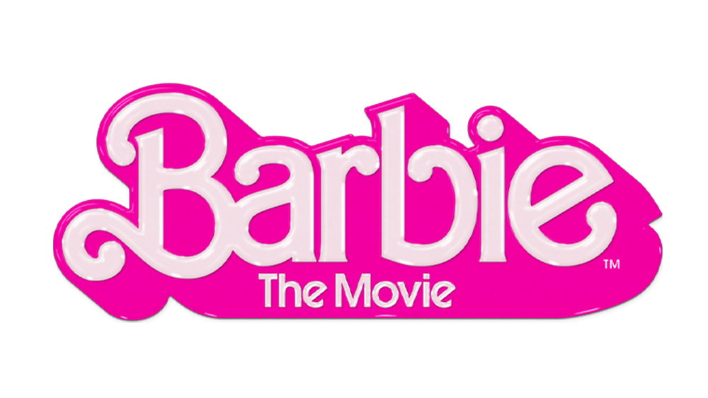
The Barbie logo is suddenly everywhere as the Barbie Movie starring Greta Gerwig takes the world by storm. Or Barbie logos that is, because you might have noticed a couple of different designs flying around. They're both pink, as you would expect, and they both go back to the history of a brand that began life over 60 years ago.
Toymaker Mattel's main Barbie logo – which made it into our pick of the best handwriting logos – is the same as its original logo design from all the way back in 1959. The Barbie Movie logo is a different design, but it turns out that it's not entirely original either. It bears a strong resemblance to the Barbie logo that was used from 1975 all the way through to 1991. Confused? As we reach peak Barbiecore, here's a recap of every official Barbie logo to date and we also consider why the Barbie Movie has the logo it does.
The original Barbie logo 1959 - 1975
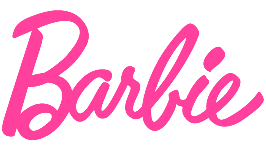
This original cursive Barbie logo probably looks very familiar. That's because it's the same as the Barbie logo today, albeit in a slightly different shade of pink. It's proved to be an enduring design, serving for Barbie's first 15 years, and also her last 14 years since it was reintroduced in 2009. You'll notice that the capped initial 'B' is lower than the rest of the word. This lack of uniformity gives the logo a carefree, playful feel that seems in keeping with the brand.
The second Barbie logo 1975 - 1991
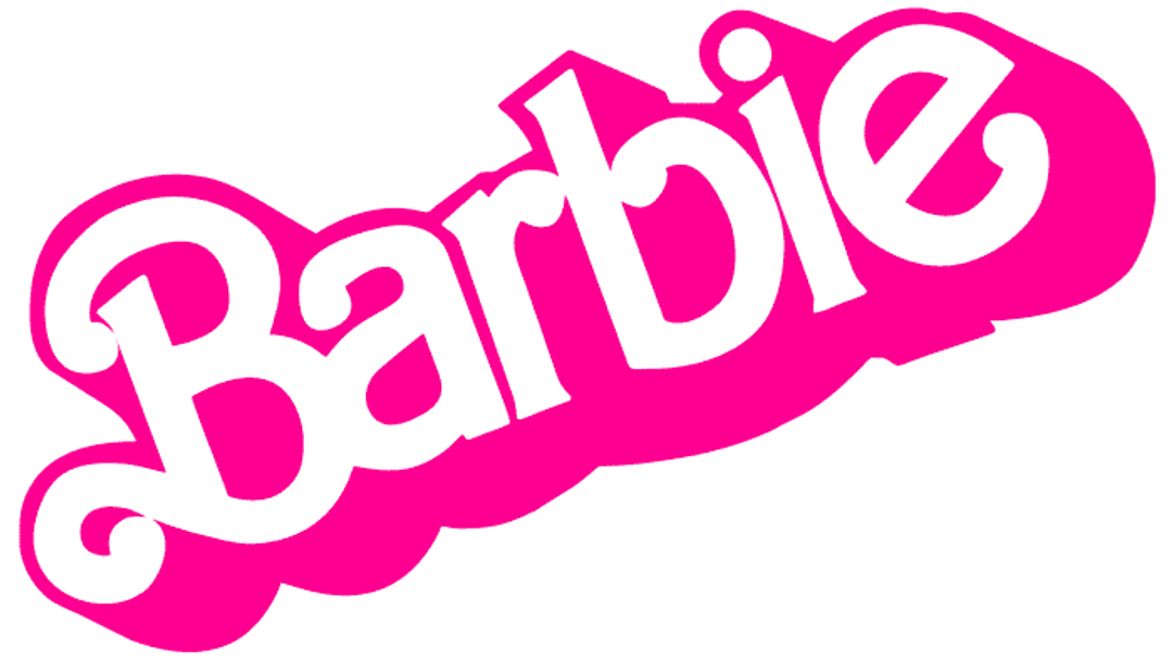
After 15 years, the Barbie logo underwent quite a transformation in 1975, getting a big drop shadow for a 3D look that chimed with the times. While the proportions of the letters became a little more uniform (although the initial B still falls lower on a line), the logo had an upwards slant, maintaining the feel of fun and frivolity of the previous design. This logo might look familiar – we'll see why in a moment.
The Barbie logo 1991 - 1999
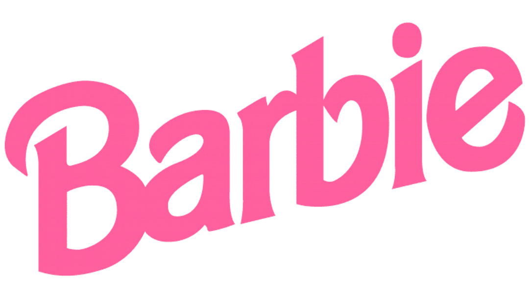
The 1990s saw Barbie drop the drop shadow and replace the ball terminals with more angular, stroke-like terminations on the letters. It kept the printed letters but the design felt almost like it was seeking a middle ground between the former cursive logo and its replacement. The shade of pink changed too, becoming more muted, perhaps in a bid to present a more refined Barbie.
The Barbie logo in the 2000s
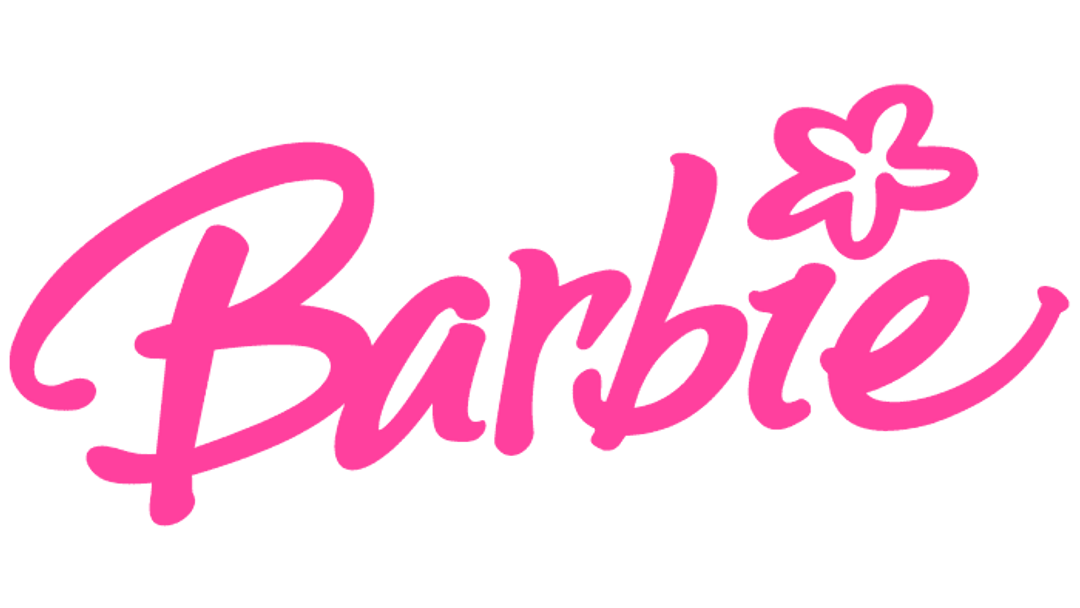
In 1999, Mattel brought back the cursive Barbie logo. It was similar to the original 1959 design but kept the slanted orientation introduced in subsequent designs. That slant became less pronounced in updates introduced in 2004 and 2005, when the logo became more Disney-like with a larger, freer script. For just one year, the Barbie logo even had a flower as the dot on the 'i'. It felt like Barbie was going through her teenage years here, changing her look three times in just six years, trying to find an identity with missteps along the way.

And in 2009, Barbie finally found her true identity... and it was the one she had been born with back in 1959. Mattel decided enough playing around with different designs and circled right back to its orignal design.
Get the Creative Bloq Newsletter
Daily design news, reviews, how-tos and more, as picked by the editors.

But the story doesn't end there. The Barbie Movie logo is not the same logo used as the main brand identity. However, it's very similar to the second Barbie logo used from 1975 to 1991, without the slant and with the addition of some extra shine and the word 'Movie'. It seems Warner Bros decided that big drop shadow was more cinematic. It may also have figured that it would have nostalgia value for those who grew up with Barbie in the 1980s, including many people who are now parents (see our guide to how to design a logo for more things to consider when choosing a design, and check out these five wild moments from the Barbie Movie marketing buildup).

Thank you for reading 5 articles this month* Join now for unlimited access
Enjoy your first month for just £1 / $1 / €1
*Read 5 free articles per month without a subscription

Join now for unlimited access
Try first month for just £1 / $1 / €1

Joe is a regular freelance journalist and editor at Creative Bloq. He writes news, features and buying guides and keeps track of the best equipment and software for creatives, from video editing programs to monitors and accessories. A veteran news writer and photographer, he now works as a project manager at the London and Buenos Aires-based design, production and branding agency Hermana Creatives. There he manages a team of designers, photographers and video editors who specialise in producing visual content and design assets for the hospitality sector. He also dances Argentine tango.
