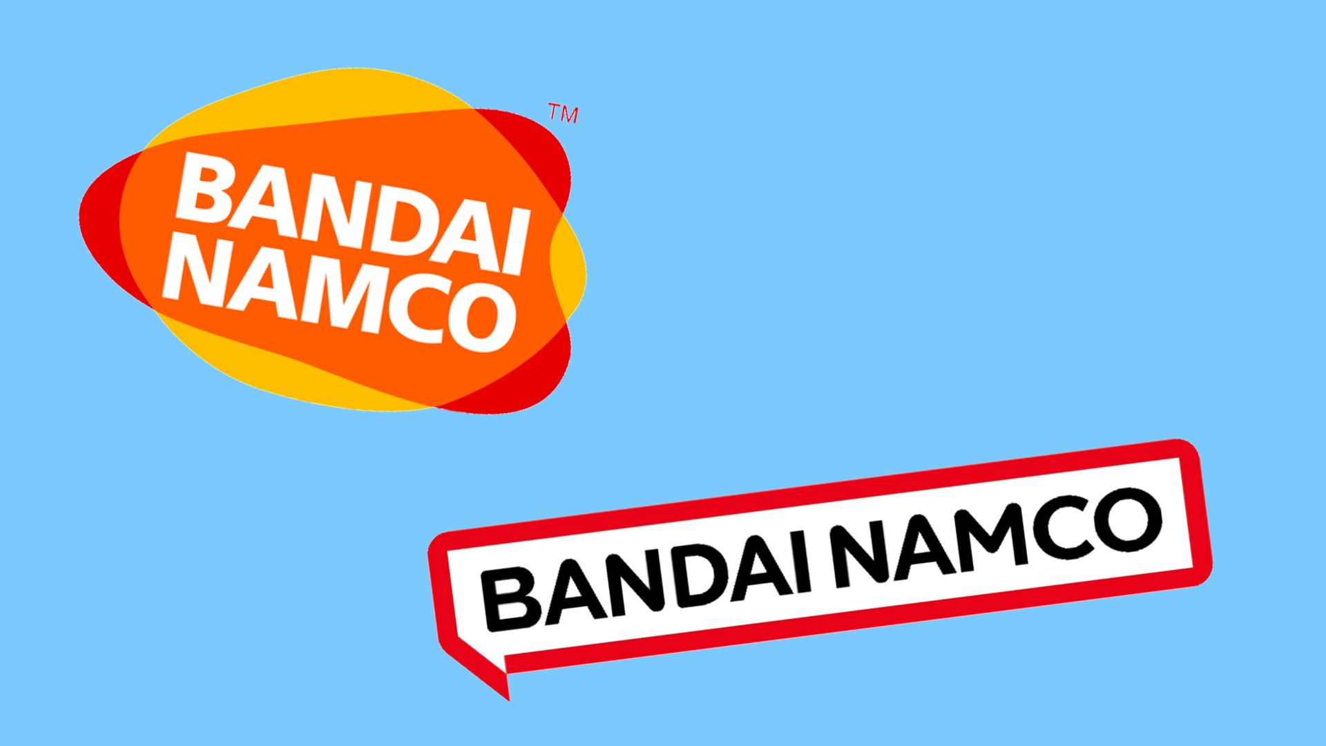
The internet really doesn't like the new Bandai Namco logo
Does this scream 'fun' to you?
You'd expect the developer behind iconic video game franchises like Pac-Man to have a suitably fun logo, right? Up until last month, Bandai Namco's logo was, if not the most exciting design in the world, at least somewhat characterful. But the internet isn't loving its bland redesign.
The company revealed its new logo to much Twitter slander back in October. It's since given the look the odd tweak, including changing the red frame around the wordmark from magenta to... red. It finally went live this week, and, spoiler alert, it won't be hitting our best logos roundup any time soon.

Now that the design is appearing in front of more and more gamers, on box art and start-up screens, Twitter is ablaze with criticism of the new look. Many feel that it's just too minimal for a supposedly fun game company – and the previous design, with its round, squishy shapes and multiple colours, was a lot less corporate-looking.
dude whenever I see bandai namco’s new logo on my timeline I keep thinking it’s a promoted tweet from some pharmacy. y’all need to switch backApril 5, 2022
"Ironic that the new logo has "Fun for all" in it when it looks completely devoid of fun and any sort of creativity," one user tweets (some versions of the design feature the not-very-catchy tagline 'Fun for all into the future' below the logo), while another adds, "R.I.P. old, fun Bandai Namco Logo thank god you made it into Elden ring before your death."
When Bandai Namco tweets and I see their new logo pic.twitter.com/roXykXvZxTApril 5, 2022
According to NintendoLife, the company has swapped the magenta for a red shade after sending questionnaires out to employees. Bandai Namco explained, "For the motif colour, we sent questionnaires to employees around the world to gather their thoughts about words that express images associated with the aims of the Group." And with those results, Bandai Namco chose the new red shade that supposedly is "enthusiastic, fun, active, and bold". But as many have pointed out, the red version does look rather similar to the Nintendo logo.
Still, while it might be a pretty full design, it's by no means the worst logo we've ever soon, or indeed the most offensive. Want to have a go at designing your own? Check out our guide on how to design a logo.
Read More:
Get the Creative Bloq Newsletter
Daily design news, reviews, how-tos and more, as picked by the editors.

Thank you for reading 5 articles this month* Join now for unlimited access
Enjoy your first month for just £1 / $1 / €1
*Read 5 free articles per month without a subscription

Join now for unlimited access
Try first month for just £1 / $1 / €1

Daniel John is Design Editor at Creative Bloq. He reports on the worlds of design, branding and lifestyle tech, and has covered several industry events including Milan Design Week, OFFF Barcelona and Adobe Max in Los Angeles.
- Amelia BamseyFormer staff Writer
