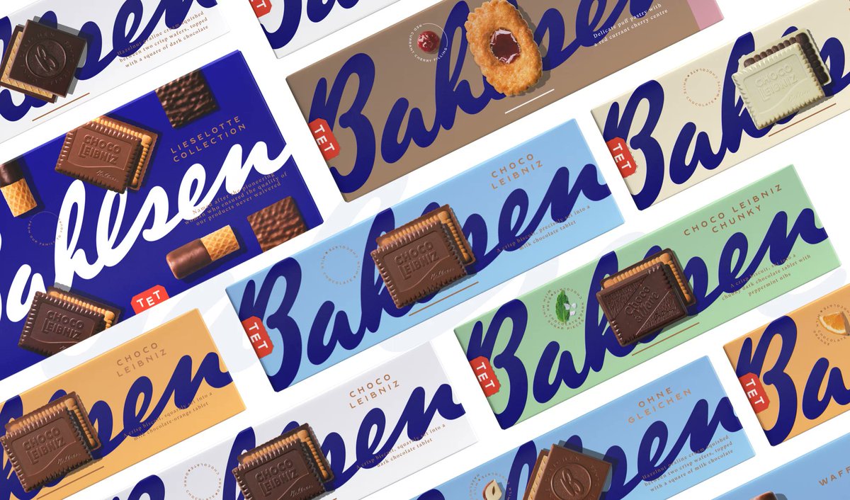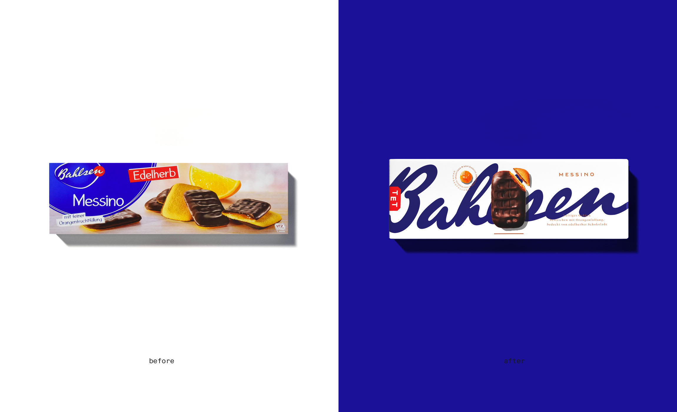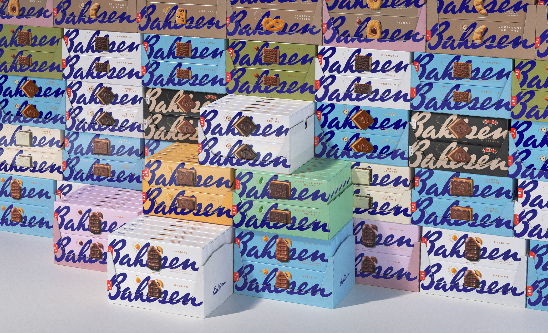
Back in 2021, Choco Leibniz maker Bahlsen carried out a rebrand that won huge plaudits from the design community. The new look was clean, bold and modern. It even won a D&AD award. There didn't seem to be anything not to like. So it raised eyebrows this week when German media reported that Bahlsen is planning another rebrand after just two years.
Sales have dropped, and the company thinks the rebranding is to blame. It seems that for all its appeal to designers, the new look didn't sit quite so well with the brand's actual customers (see our pick of the best packaging design for inspiration)
After just two years, @Bahlsen_Family's branding, celebrated by the design scene, is already being scrapped after they sold 11.8% fewer products and lost their market leadA prime example of designing for designers and not for target groups and their needs#branding #packaging pic.twitter.com/PvhpM1FLCdOctober 3, 2023
The German/Spanish design agency Ruska Martin Associates highlighted the news on Twitter. It suggests that the Bahlsen rebrand is an example of the danger of designing for designers rather than for a brand's target audience.
According to Lebensmittelzeitung.net, Bahlsen's CEO Alexander Kühne plans to a new rebranding to try to save things after sales fell by 11.8 per cent for the first five months of this year. “We probably should have focused more on proximity to the consumer as part of the design revision,” he told the specialist site, adding that the German company is now working with market research companies and conducting its own surveys in supermarkets to inform the rebrand's direction.

In the conversation over on Twitter, Ruska Martin suggests that a lack of product differentiation was one of the mistakes with the rebrand, noting that Bahlsen's products appear on shelves alongside cheaper alternatives. It also suggested that "killing the striking blue and the appetizing presentation of the content" was a big wrong turn.
Others have commented on the potential impact of the packaging redesign on customers. "You’re in the supermarket. You reach for your fave biscuits. Always in the same spot. You think about it for <1s. 'Hang on. They’ve been replaced.' With a new box you don’t recognise. You don’t care enough to figure it out. You buy the cheapest. They don’t taste that different."

Some aren't sure that the decline in sales can be entirely blamed on the rebrand. After all, inflation and the cost of living crisis has provided a strong motivation to seek cheaper brands. "Designers designing for designers is a problem, but designers vastly overestimating their impact is another one," the designer Tim Höfer wrote.
Get the Creative Bloq Newsletter
Daily design news, reviews, how-tos and more, as picked by the editors.
That said, the crucial fact that designers are not the target audience for most brands is something that probably needs to be kept in mind more often, especially for mature heritage brands like Bahlsen. The rebrand was particularly radical, dropping a traditional but dated-looking packaging design that put the main focus on the product image for a design that emphasised the brand logo over everything else.
To be fair to Auge, the agency that did the work, they note in their portfolio that "Bahlsen asked us for a revolution", and that's what they delivered. Perhaps the client also needs to be more careful about what they ask for. See our round up of subtle logo changes that made a big difference for examples of how a redesigns don't always need to be radical.

Thank you for reading 5 articles this month* Join now for unlimited access
Enjoy your first month for just £1 / $1 / €1
*Read 5 free articles per month without a subscription

Join now for unlimited access
Try first month for just £1 / $1 / €1

Joe is a regular freelance journalist and editor at Creative Bloq. He writes news, features and buying guides and keeps track of the best equipment and software for creatives, from video editing programs to monitors and accessories. A veteran news writer and photographer, he now works as a project manager at the London and Buenos Aires-based design, production and branding agency Hermana Creatives. There he manages a team of designers, photographers and video editors who specialise in producing visual content and design assets for the hospitality sector. He also dances Argentine tango.
