Baby Yoda was nearly a lot less cute (and a lot more horrifying)
Unsettling, he is.

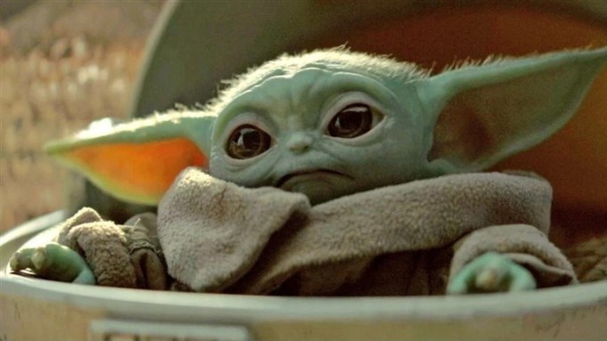
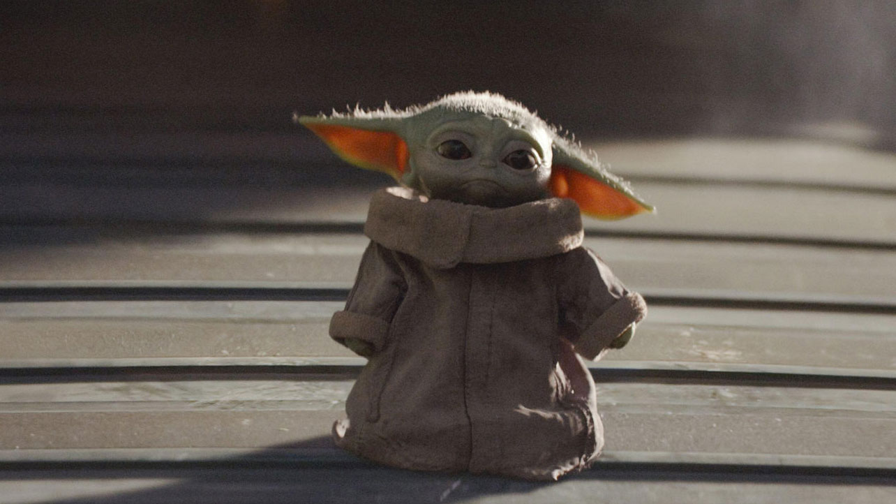
Artists certainly nailed what the world wanted from a toddler-sized Yoda when they created Baby Yoda for The Mandalorian last year. We, and the rest of the galaxy, can't get enough of those endearing eyes, super-long ears and oversized space jacket. But newly-released concept art reveals that the mini-Yoda wasn't always intended to capture our hearts with sheer adorability.
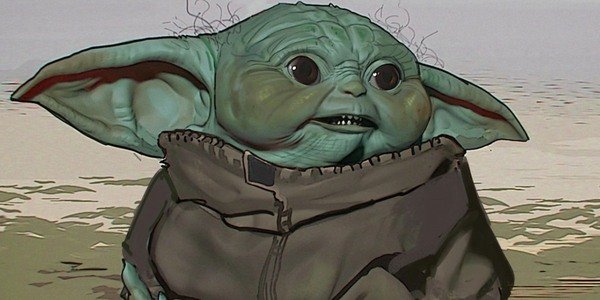
In fact, one early mock up of Baby Yoda shows that Disney could have gone in quite a different direction, leading us to believe that in an alternate universe there lies a Baby Yoda who is, in short, TERRIFYING. Let's take a closer look at the design, which definitely wouldn't make our list of top 3D art...

It was vital the character of Baby Yoda was perfect (see him above) – they were dealing with one of the most iconic characters in film history, after all. And, as John Favreau discloses during the newest episode of Disney Gallery: The Mandalorian (try Disney Plus for free to get involved), getting the final design just right – cute, but not too cute – was a long process that involved viewing hundreds of concept drawings.
These drawings swung wildly, one way or the other: too cute or too ugly. And the version below gives the final character a totally different feel. A pretty horrifying one, actually.

Though there are echoes of the final Baby Yoda within this design, the small and rounded eyes, cavernous ears and stomach-turning curly hair are at odds with the enchanting depiction that made it out of the studio. Though the face is squidgier, the toddler actually looks older, and those plump cheeks are not ones we want to squeeze. Unlike the final version, the features don't pull us in and we find ourselves wanting to look away – not a great feeling to have when faced with the coolest small being in the universe.
Danny Yo-vito pic.twitter.com/7aG1WD0pYdMay 30, 2020
Seeing the different renditions together as above feels like spending time with a bunch of Yoda's siblings – all of which have wildly different personalities. (Including Danny Yo-Vito, according to Twitter user Blanked_Space.)
Fans everywhere are overwhelmingly appalled at what could have been, with expressions of gratitude pouring in for the appearance of the final render. Judging by the response to Sonic the Hedgehog's design misfire last year, Disney did well to get it right.
Get the Creative Bloq Newsletter
Daily design news, reviews, how-tos and more, as picked by the editors.

Thank you for reading 5 articles this month* Join now for unlimited access
Enjoy your first month for just £1 / $1 / €1
*Read 5 free articles per month without a subscription

Join now for unlimited access
Try first month for just £1 / $1 / €1

Georgia has worked on Creative Bloq since 2018, and has been the site's Editor since 2022. With a specialism in branding and design, Georgia is also Programme Director of CB's award scheme – the Brand Impact Awards. As well as immersing herself with the industry through attending events like Adobe Max and the D&AD Awards and steering the site's content streams, Georgia has an eye on new commercial opportunities and ensuring they reflect the needs and interests of creatives.
