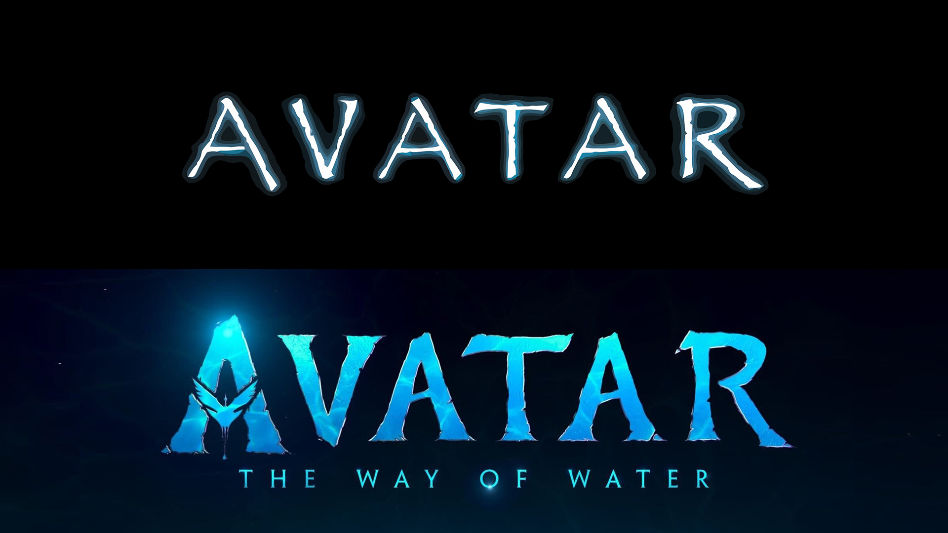
The new Avatar logo is almost as infuriating as the old one
But at least Papyrus is gone.
The logo for 2009's AVATAR has been a figure of fun for years, mostly thanks to a famous SNL sketch which parodied the design's use of the typeface Papyrus (update: SNL has delivered a sequel, Papyrus 2, for 2024). To much fanfare, the logo and title for the sequel were revealed this week – and while the infamous font is gone, designers are still finding fault with it.
The logo for Avatar: The Way of Water does away with Papyrus in favour of an admittedly similar, but slightly more decorative, typeface. But it seems the designers spent so much time deciding on a font that wouldn't upset the entire graphic design community, that it forgot about that other all-important typographical touch – kerning. (Looking for inspiration? Check out our best free fonts.)

Many are rejoicing (or mock mourning) the loss of Papyrus, which famously tortured Ryan Gosling in the 2017 comedy sketch (below). "I wonder how many fistfights were involved between Cameron and Disney’s marketing people who insisted that they couldn’t distribute a Papyrus movie logo in 2022," one user Tweets, while another adds, "Give us the logo in Papyrus, you cowards."
But it seems there's another, more subtle problem. Designers have pointed out that something about the kerning seems a little off, with the distance between the final two letters creating the impression that the film is titled 'AVATA R'. It's hardly as illegible as the new Ninja logo, but once you see it, it's hard to unsee.
Well, they didn't use Papyrus, but they DID still forget to kern. Come on, y'all - these are billion dollar movies! https://t.co/MaemvHc8yeApril 28, 2022
Avata R https://t.co/H7uKZuPQEuApril 28, 2022
We need @RyanGosling to reprise his brilliant, type-obsessed SNL role. This time…on kerning. #avata #r https://t.co/QIaiWZhMdYApril 28, 2022
While some have speculated that it's the way we perceive the space between the diagonal 'A' and straight 'R', the sheer amount of 'AVATA R' tweets out there two days after the logo was revealed suggests something isn't quite right here.
So, there we have it – the Avatar franchise is doomed to continue infuriating designers and typography nerds alike with its imperfect branding. If only someone at 20th Century Fox had taken a look at our guide on how to design a logo at some point in the last 10 years.
Read more:
Get the Creative Bloq Newsletter
Daily design news, reviews, how-tos and more, as picked by the editors.

Thank you for reading 5 articles this month* Join now for unlimited access
Enjoy your first month for just £1 / $1 / €1
*Read 5 free articles per month without a subscription

Join now for unlimited access
Try first month for just £1 / $1 / €1

Daniel John is Design Editor at Creative Bloq. He reports on the worlds of design, branding and lifestyle tech, and has covered several industry events including Milan Design Week, OFFF Barcelona and Adobe Max in Los Angeles.
