How&How's design showcases "humanity's spiritual connection to nature".
(Image credit: How&How)
The Aruba Conservation Foundation (ACF) has undergone a stunning metamorphosis, debuting a stylish new brand identity that encompasses its dedication to preserving nature. When a national park undergoes a transformative rebrand, it's natural to assume that the sole aim is to increase footfall – for the Aruba Conservation Foundation, it's a matter of pride.
The best rebrands have a strong ethos at their core that guides the design process from conception to its debut. Positioning itself as the 'Voice of Nature', the ACF embodies a sense of duty to the natural landscape – a theme that echoes through the design, from the organic logo to the earthy colour palette.
Working with branding agency How&How, the ACF rebrand began by uncovering the core of its identity. To establish the brand as a conservation authority, How&How set about creating a refreshed brand that spoke to the Aruban community, prompting them "to remember their oneness with the natural world."
Latest Videos From Creative Bloq
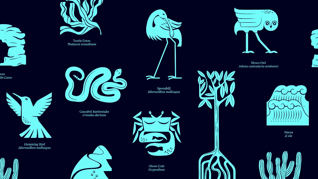
“This metaphor also laid the groundwork for our visual identity,” explains Cat How, founder and creative director of How&How. The design "showcases humanity’s spiritual connection to nature in its logo while drawing on iconography to bring focus to specific species and ecosystems," she adds.
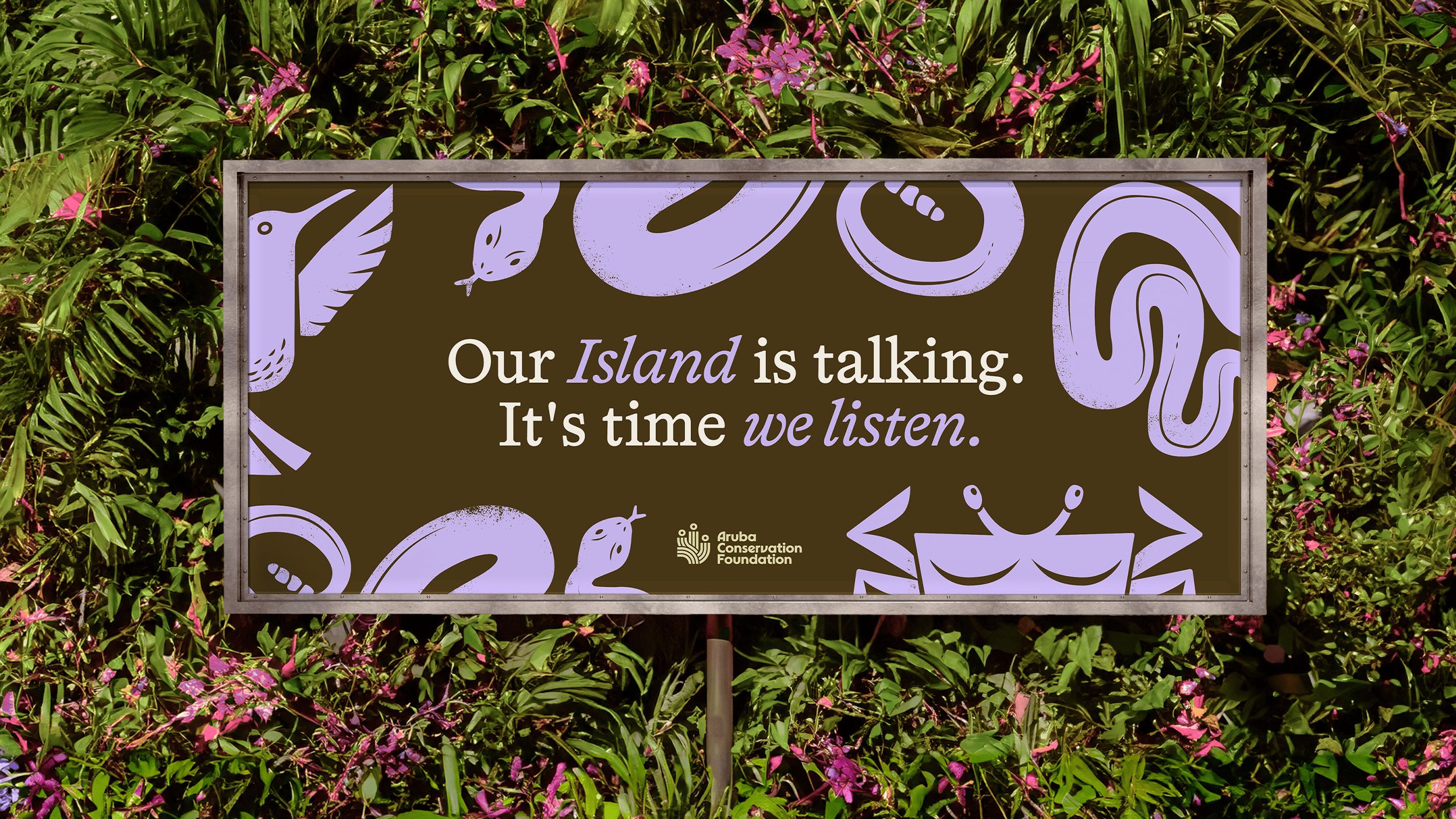
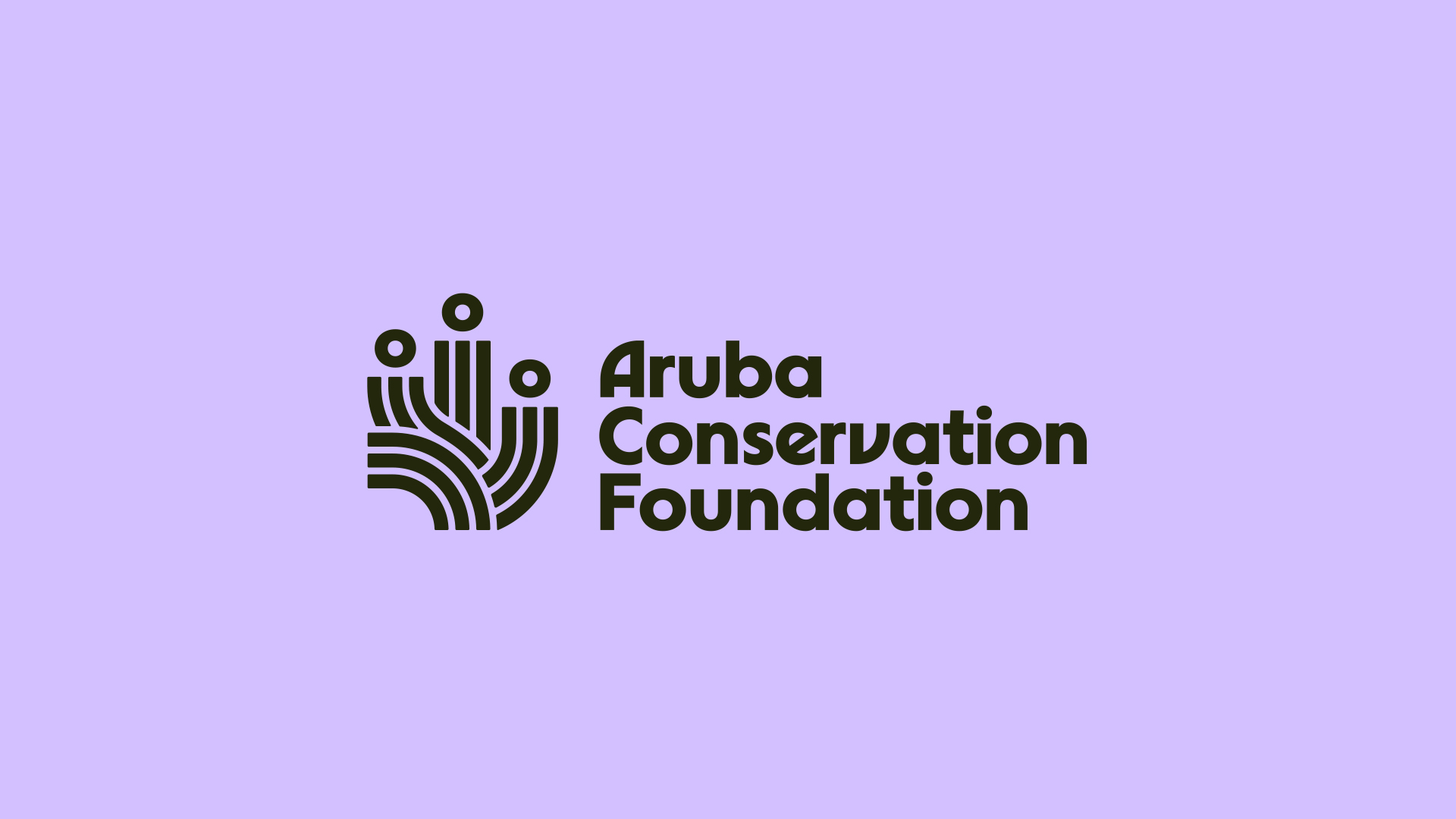
The logo represents key features of Aruba's diverse landscape (Image credit: How&How)
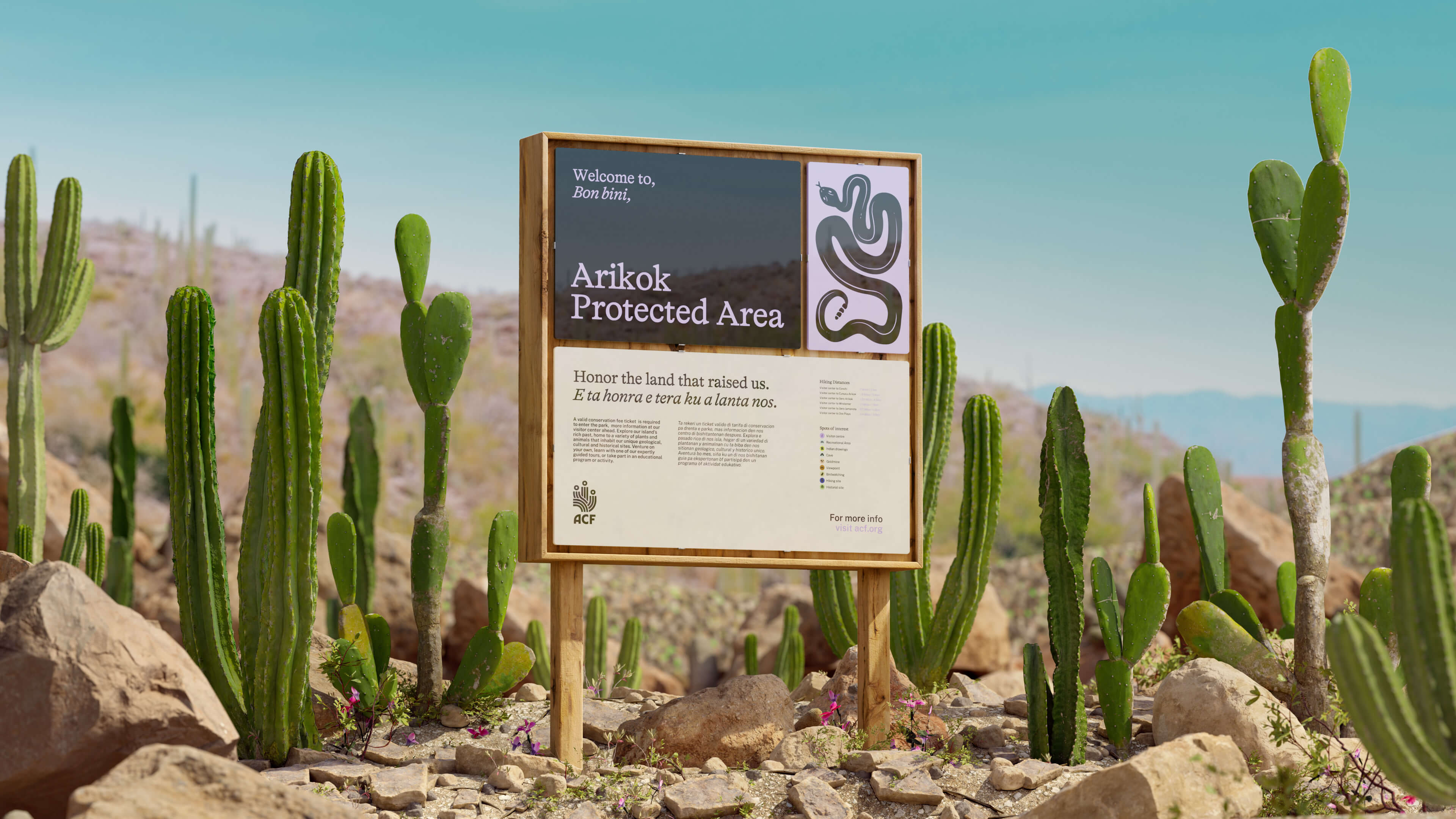
At the centre of the ACF's new brand identity is an innovative logo design that blends the three core components that bring Aruba to life. "The ACF team wanted a strong symbol - different to other parks and unique in the sector – that also represented elements of the park itself: namely waves (for marine), cacti (for terrestrial) and then three heads which could be seen as cacti flowers, but also humans - in order to represent collective action," Cat tells Creative Bloq.
It wasn't a project without hurdles, as Cat shared the challenge of fitting so many diverse elements into a neat and refined brand identity. According to Cat, "the symbol took a few rounds to crack," due to ACF's focus on representing the themes of land, sea and people under one logo design.
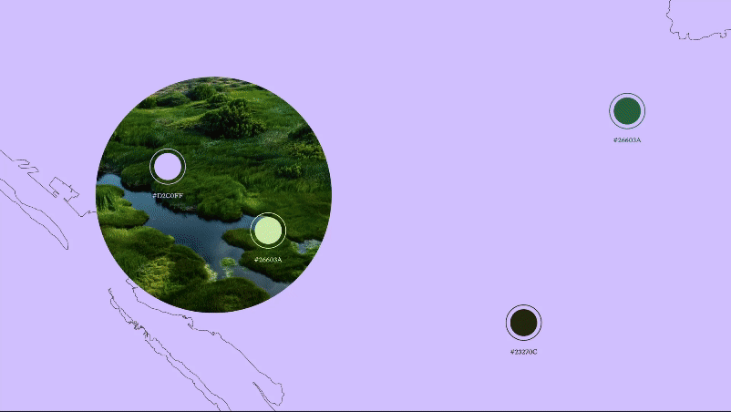
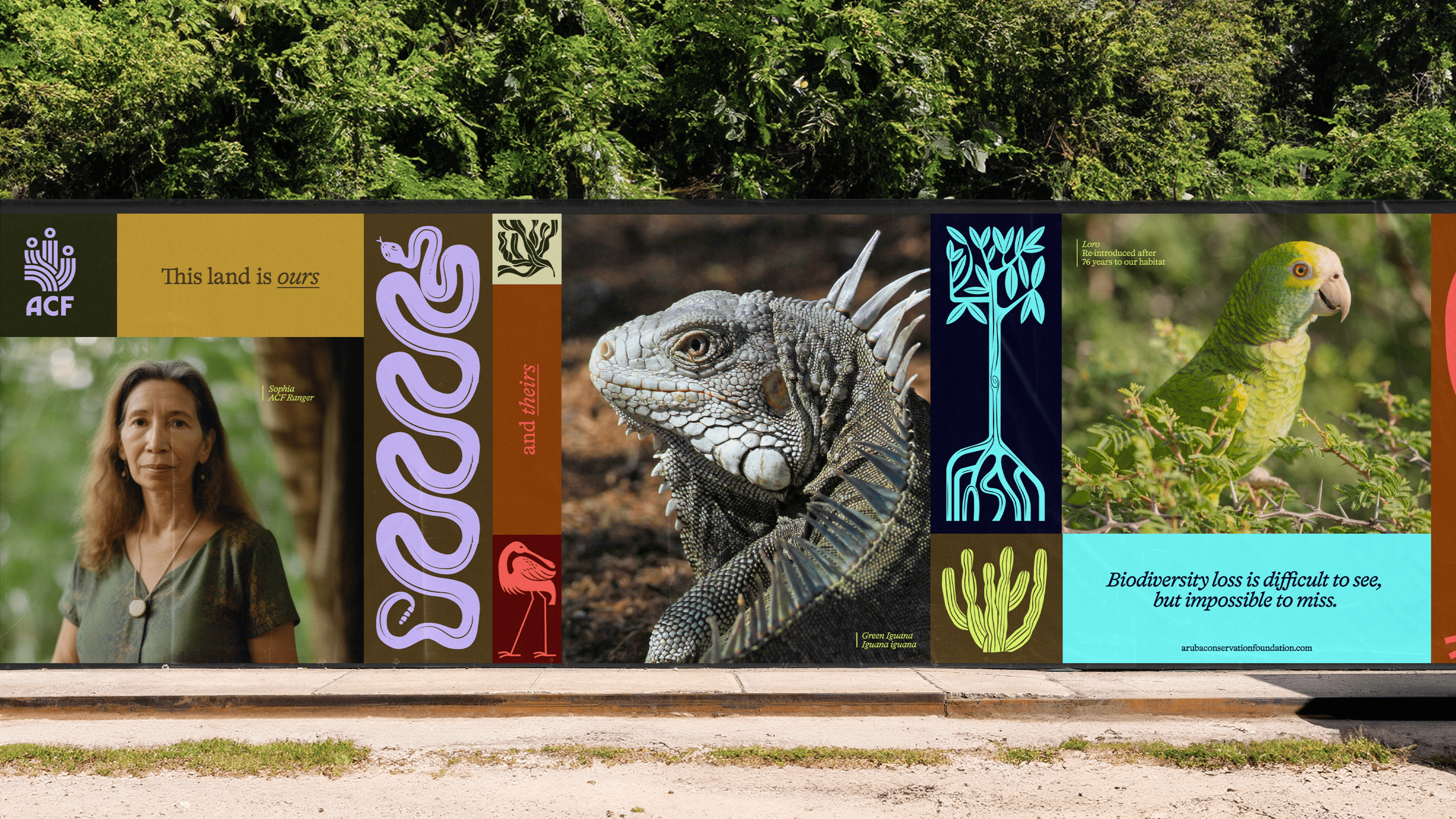
The colour palette takes inspiration from Aruba's rich organic landscape. (Image credit: How&How)
Taking inspiration from the rich geographical location, the new look features a colour palette of rich earth tones, offset by bright motifs that represent the diversity of the land. "The complex colour palette was designed to match the different geographical areas of the National Park – dunes, marshes, the ocean and scrubland," says Cat. "Each one had a brighter accent colour, and was padded out with a few more neutrals. This was used alongside a modular illustration system where plants and animals are able to ‘grow’ to fit whatever size of layout they need," she adds.
Get the Creative Bloq Newsletter
Daily design news, reviews, how-tos and more, as picked by the editors.
Cat thanks the ACF team for their collaboration, sharing that the new brand identity is a "testament to how having brave and kind clients who trust what we do, leads to great results." What stands is a sophisticated and contemporary brand identity that serves as a reminder of the innate beauty of nature. Educating, empowering and exemplifying classy, considered design, it's a masterclass in how a simple concept can be transformed into a timeless and meaningful identity.
Image 1 of 4
(Image credit: How&How)
(Image credit: How&How)
(Image credit: How&How)
(Image credit: How&How)
For more design inspiration, check out the story behind the RSPCA's 50-year rebrand. If you're after more nature-inspired branding, check out the National Landscapes rebrand that embraces imperfection for all the right reasons.
Thank you for reading 5 articles this month* Join now for unlimited access
Natalie Fear is Creative Bloq's staff writer. With an eye for trending topics and a passion for internet culture, she brings you the latest in art and design news. Natalie also runs Creative Bloq’s Day in the Life series, spotlighting diverse talent across the creative industries. Outside of work, she loves all things literature and music (although she’s partial to a spot of TikTok brain rot).