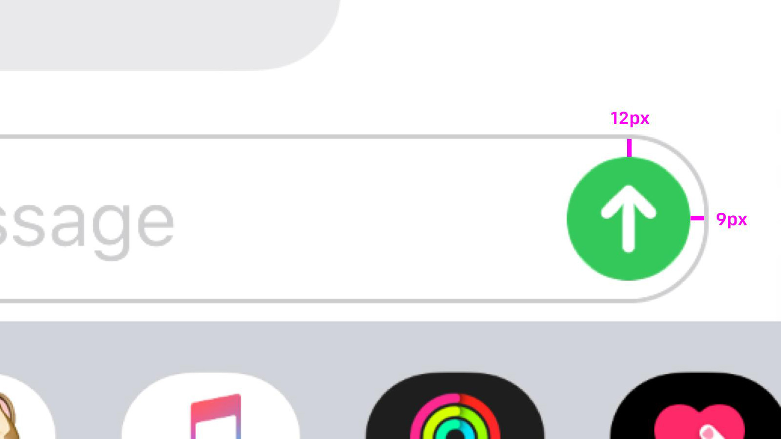
So sorry, but Apple's Send button is slightly wonky
Designer points out UI flaw and ruins everyone's day.
Sign up to Creative Bloq's daily newsletter, which brings you the latest news and inspiration from the worlds of art, design and technology.
You are now subscribed
Your newsletter sign-up was successful
Want to add more newsletters?
Some design flaws are obvious. They smack you in the face immediately; everyone tears down the designer, and the project either gets redesigned or fades into oblivion. Other mistakes are just small enough for most people not to even notice, but once pointed out they can't be unseen. It's like have a tiny pebble in your shoe you can never get rid of.
What's the point of this long-winded introduction? Someone has spotted that the Send button in Apple's Messages iPhone app is very slightly wonky. Behold:
The thoroughly unwanted PSA came from Anh, and it will surprise precisely no one to hear he's an interface designer. Having announced it on Twitter, he unwittingly opened the door to other designers pointing out myriad other tiny flaws in iOS app icons.
Bjorn commented that the Play button circle in Spotify isn't really a circle at all, but an oval.

Noel Cornell flagged up this glaring error:
The Twitter web spinner is off kilter. Been this way for many months (over a year?). It’s all I can see when it’s on screen. pic.twitter.com/GYgmmgSpkLApril 16, 2019
Product designer Donnie Suazo shared this blue-on-black monstrosity within the Maps app.

Ugh. Take a look at the full thread here, if you're feeling brave. Of course, some are making the point that optical illusions are often used in design – and sometimes a technically 'perfect' design looks wrong to the eye. Case in point, this massive debate surrounding Google's 'incorrect' logo. It doesn't make it any less irritating once you've spotted the inconsistency though, does it?
Sign up to Creative Bloq's daily newsletter, which brings you the latest news and inspiration from the worlds of art, design and technology.
If this hasn't put you off Apple products forever, take a look at our guide to making the most of the Apple Black Friday sale.
Read more:

Ruth spent a couple of years as Deputy Editor of Creative Bloq, and has also either worked on or written for almost all of the site's former and current design print titles, from Computer Arts to ImagineFX. She now spends her days reviewing small appliances as the Homes Editor at TechRadar, but still occasionally writes about design on a freelance basis in her spare time.

