Is this Apple Watch Ultra mod really better looking than the original?
User claims to have 'de-uglified' the design.

The design of the Apple Watch Ultra was always going to be divisive. Rather than a slick, subtle device, this is an outdoor powerhouse – and the gargantuan screen and chonky body suitably reflects that.
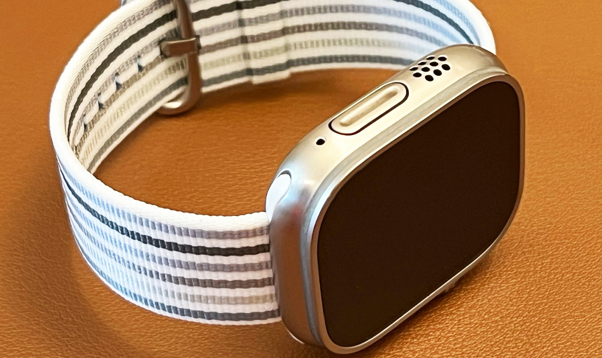
Just a few weeks into the Ultra's life, one user has already decided to mod (or in their words, 'deuglify') the smartwatch. Armed with just a Dremel power tool, they've removed the bright orange Action button, and given the whole thing a brand new brushed titanium look. But does it actually look any better? (Check out the best Apple deals if you're in the market for new gear.)

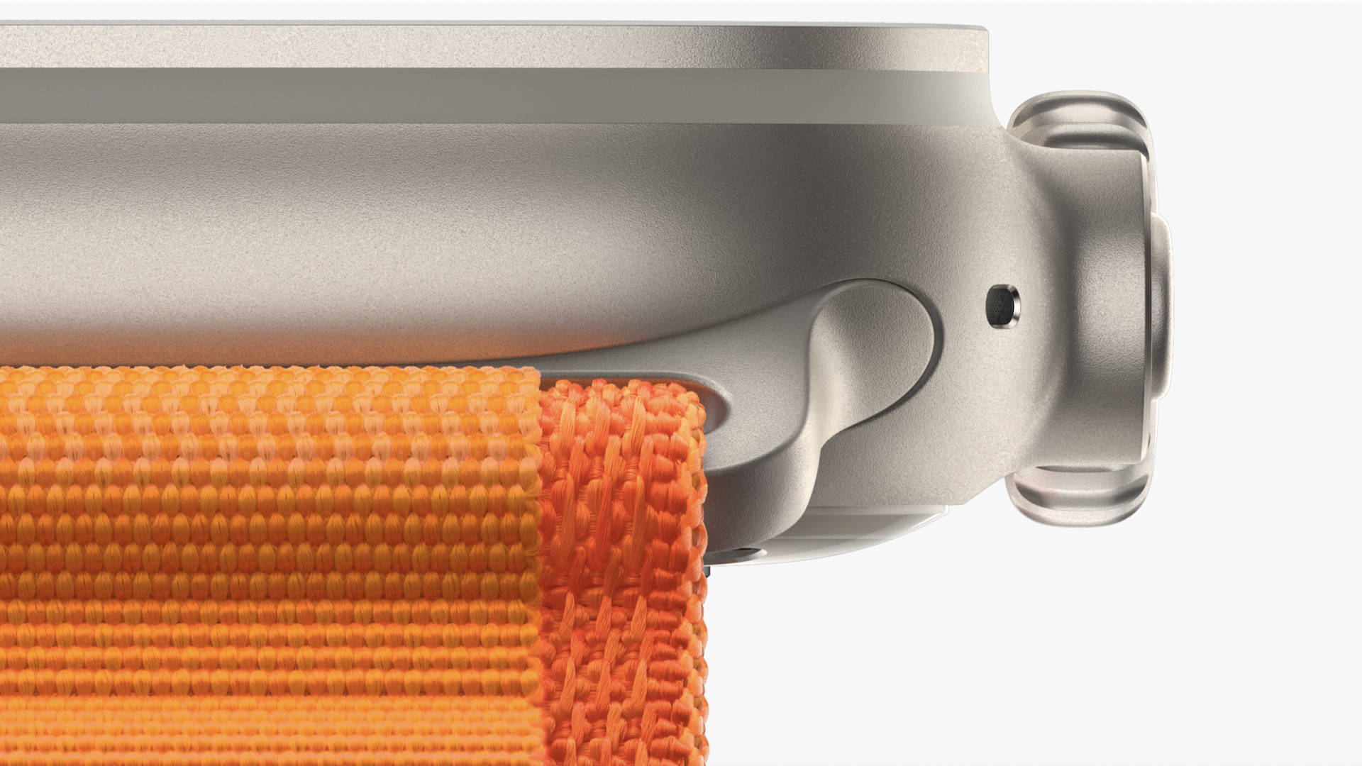
Over on the MacRumors forums, user perezr10 describes how the original Apple Watch Ultra design isn't for them. "There are five things I hate about the design when I consider wearing it as a normal everyday watch. The tallness, the hunchback which is the crown guard, the holes everywhere, the orange button, and the finish which looked like Starlight aluminum. There is nothing that can be done about the first three but the last two are solvable."
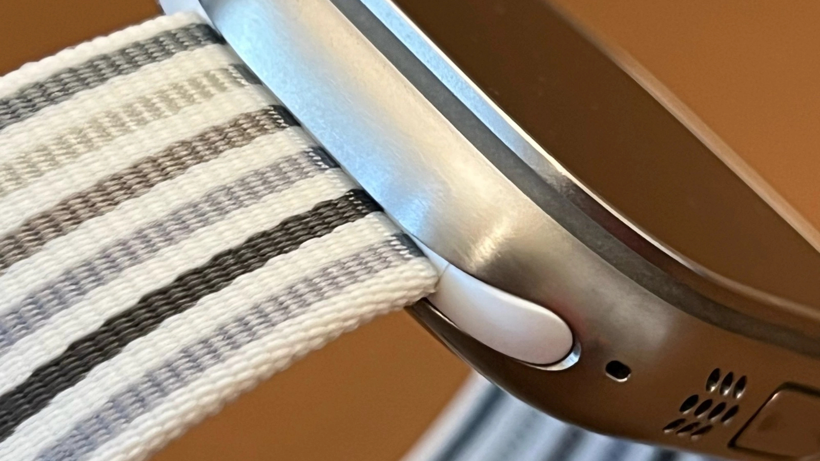
And solve them perezr10 did. Gone is the high contrast orange button, which now matches the colour of the rest of the body (much like the standard Apple Watch Series 8), and the entire texture of the body and bezels is now a rougher, textured matte effect.

Leaving aside the question of why this particular user decided to drop $799 on a watch they hate the design of, is the new look any good? It's certainly a classier affair, and the brushed titanium looks pleasingly premium. But it's also still huge. And of course, this thing is designed to be worn as an activity companion – is turning it into a 'dress' watch always going to be a losing battle? And it goes without saying that taking a power tool to your Apple Watch will void its warranty – let's hope perezr10 doesn't need to return it for any reason over the next year.
"I prefer the original design. Nice work by the modder though," one user comments, while another adds, "To be honest I prefer it with the orange button, it gives it a little "character" on an otherwise fairly visually dull material. The brushed look is great though, would definitely prefer that over the standard finish."
It's always fun to see fans put their own creative stamp on their gear. From this 2cm thin PS5 to that caveman-chic Nintendo Switch, we've seen a weird and wonderful examples in our time. But the less said about that prehistoric iPhone 13, the better.
Get the Creative Bloq Newsletter
Daily design news, reviews, how-tos and more, as picked by the editors.
Read more:
- Apple Watch SE (2022) review
- Apple Watch SE vs 7: Which is for you?
- Apple Watch vs Garmin: which is for you?

Thank you for reading 5 articles this month* Join now for unlimited access
Enjoy your first month for just £1 / $1 / €1
*Read 5 free articles per month without a subscription

Join now for unlimited access
Try first month for just £1 / $1 / €1

Daniel John is Design Editor at Creative Bloq. He reports on the worlds of design, branding and lifestyle tech, and has covered several industry events including Milan Design Week, OFFF Barcelona and Adobe Max in Los Angeles. He has interviewed leaders and designers at brands including Apple, Microsoft and Adobe. Daniel's debut book of short stories and poems was published in 2018, and his comedy newsletter is a Substack Bestseller.
