Apple tweaks its famous logo (and people are unhappy)
Here's why.
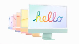
Apple's most recent product launch event was a colourful one. Available in seven shades, the new iMac is arguably the company's boldest and brightest new machine in a long time. And in an ad for the updated all-in-one, Apple has revived its beloved rainbow logo. But as some have spotted, it isn't quite the design we know and love.
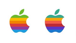
Designed in 1975, Apple's is one of the best logos of all time – and the colourful original is perhaps the most iconic of them all. Many were delighted to spot it flash up at the end of the new iMac ad (below). But on closer inspection, the colours don't quite match up with the original.

The colours in the new 2021 version are darker and duller than those of the 1975 original, something that's particularly noticeable when it comes to the top green and bottom blue shades. When placed side-by-side with its predecessor, the 'colourful' new logo looks much more muted. And not everyone is loving it.
NEW: Apple has ruined the rainbow Apple logo. pic.twitter.com/gMZkKGhKT1April 23, 2021
"The 1977 version looks way more fresh and appealing," one Redditor comments. "The 2021 version looks like someone tried to do something different with an uncalibrated monitor.” Another adds, "Personally I prefer old version, the new version is uninviting."
But it turns out there's a reason for the altered appearance. As many other users have pointed out, the colours in the new logo correspond exactly to the colours of the new iMac. With that in mind, this is much more likely to be a one-off logo for the iMac launch rather than a retroactive edit of the existing rainbow logo (which, by the way, we'd love to see make its often rumoured comeback).

If you're looking for more news from last week's product launch, check out the 5 biggest surprises from Apple's event last week. And you'll find all the best offers on all manner of Apple products over on our main Apple deals page.
Read more:
Get the Creative Bloq Newsletter
Daily design news, reviews, how-tos and more, as picked by the editors.

Thank you for reading 5 articles this month* Join now for unlimited access
Enjoy your first month for just £1 / $1 / €1
*Read 5 free articles per month without a subscription

Join now for unlimited access
Try first month for just £1 / $1 / €1

Daniel John is Design Editor at Creative Bloq. He reports on the worlds of design, branding and lifestyle tech, and has covered several industry events including Milan Design Week, OFFF Barcelona and Adobe Max in Los Angeles.


