Apple ruthlessly targets small business with 'similar' logo design
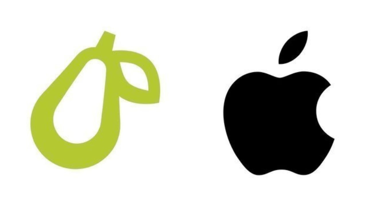
Can you spot the difference?
In a move that seems to signal Apple's intention to own the rights to the entire fruit bowl, the tech giant has begun legal proceedings against a small business for its logo design. So what's the logo? A pear. (Yes, you read that right.)
Prepear is a meal planning app, with a logo in the form of the green outline of a pear, tilted to the right. Apple says the logo is too similar to its own iconic bitten apple (voted one of our best logos ever), and that the logo design will "cause dilution of the distinctiveness" of the Apple logo.
Super Healthy Kids (Prepear's parent company) highlighted its situation on Instagram, also sharing a petition (which currently has almost 30,000 signatures supporting its cause). The company says it "feel[s] a moral obligation to take a stand against Apple’s aggressive legal action against small businesses and fight for the right to keep our logo."
So what's the problem? Well, according to Apple's filing, the "Applicant’s Mark consists of a minimalistic fruit design with a right-angled leaf, which readily calls to mind Apple’s famous Apple Logo and creates a similar commercial impression."
But there are clear differences there, too. For example, the pear's leaf is attached and pointing downwards, whereas the apple's leaf is tilted diagonally upwards. The entire pear is also tilted, whereas Apple's design is straight. The apple is filled in with colour, the pear is transparent in the middle. Plus, of course, the pear doesn't have a bite taken out of it. And, you know, it's a pear.

Apple also believes that the app is "within Apple’s natural zone of expansion for Apple’s Apple Marks". So, because Apple thinks the app is within an area it might expand into in the future, it could be a source of confusion within the sector if it decides to do so.
Whether or not that is all true, the central fact remains the same: the design is a pear. It's hard to imagine anyone really thinking that Apple had decided to use the icon of an entirely different fruit for one of its products, even if it has made some ludicrous moves lately.
Get the Creative Bloq Newsletter
Daily design news, reviews, how-tos and more, as picked by the editors.
Read more:

Thank you for reading 5 articles this month* Join now for unlimited access
Enjoy your first month for just £1 / $1 / €1
*Read 5 free articles per month without a subscription

Join now for unlimited access
Try first month for just £1 / $1 / €1

Georgia is lucky enough to be Creative Bloq's Editor. She has been working for Creative Bloq since 2018, starting out as a freelancer writing about all things branding, design, art, tech and creativity – as well as sniffing out genuinely good deals on creative technology. Since becoming Editor, she has been managing the site and its long term strategy, helping to shape the diverse content streams CB is known for and leading the team in their own creativity.
