Apple just launched yet another logo dispute
(But it might have a point this time.)
Another day, another Apple logo dispute. The company has form when it comes to cracking down on supposed trademark infringements, and as recent cases have proved, it has no qualms about going after small companies – even if their logos aren't that similar to its own. But this time around, Apple might actually have a point.
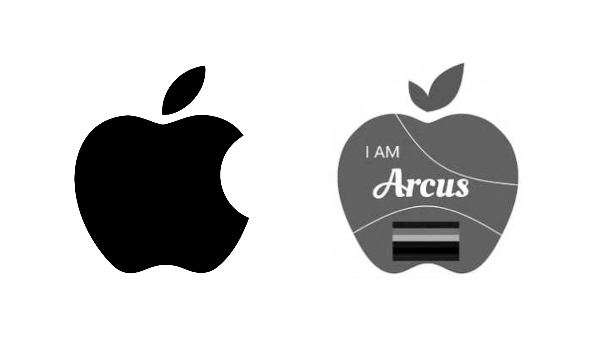
The company is attempting to block bottled water brand Georgette LLC's logo, which it argues can easily be mistaken for its own. And since it features an almost identical apple, we can certainly see the case bearing fruit this time. Sure, it's okay to take inspiration from one of the best logos of all time – but perhaps not this much inspiration.

Unlike Apple's most recent high-profile case, which saw it take on recipe app Prepear, Georgette LLC's actually features the same fruit as Apple's. And with both logos overlaid on top of one-another in Apple's filing (below), it's clear that they have pretty much the exact same proportions. Sure, Georgette LLC's apple features an extra leaf, and the words 'I am Arcus' splashed across it (it's unclear exactly what these words mean), but the similarities are clear.
"Consumers encountering Applicant's mark are likely to associate the mark with Apple," the filing reads. "It features a stylised apple design with a right-angled, detached leaf, rendering it visually similar to Apple’s famous Apple mark. Indeed, the overall shape of Applicant's apple design is nearly identical to the shape of the Apple Logo."

While Apple's case against Prepear felt a little unjust (seeing as that logo was, you know, a pear), it's hard not to agree that both logos look very similar here. We wouldn't be surprised if Georgette LLC is forced to go back to the drawing board – but if that's the case, there's always our guide to finding logo inspiration. If you fancy creating a design of your own, check out today's best Adobe Creative Cloud deals below.
Read more:
- Apple's new 2021 iMac design is going to be HUGE
- Is the new Apple Music icon our first glimpse of iOS 15?
- Bold new 2026 Winter Olympics logo is the first of its kind
Get the Creative Bloq Newsletter
Daily design news, reviews, how-tos and more, as picked by the editors.

Thank you for reading 5 articles this month* Join now for unlimited access
Enjoy your first month for just £1 / $1 / €1
*Read 5 free articles per month without a subscription

Join now for unlimited access
Try first month for just £1 / $1 / €1

Daniel John is Design Editor at Creative Bloq. He reports on the worlds of design, branding and lifestyle tech, and has covered several industry events including Milan Design Week, OFFF Barcelona and Adobe Max in Los Angeles.
