Ugh, Apple still refuses to fix its most infuriating design
But hey, it now comes in a new colour!
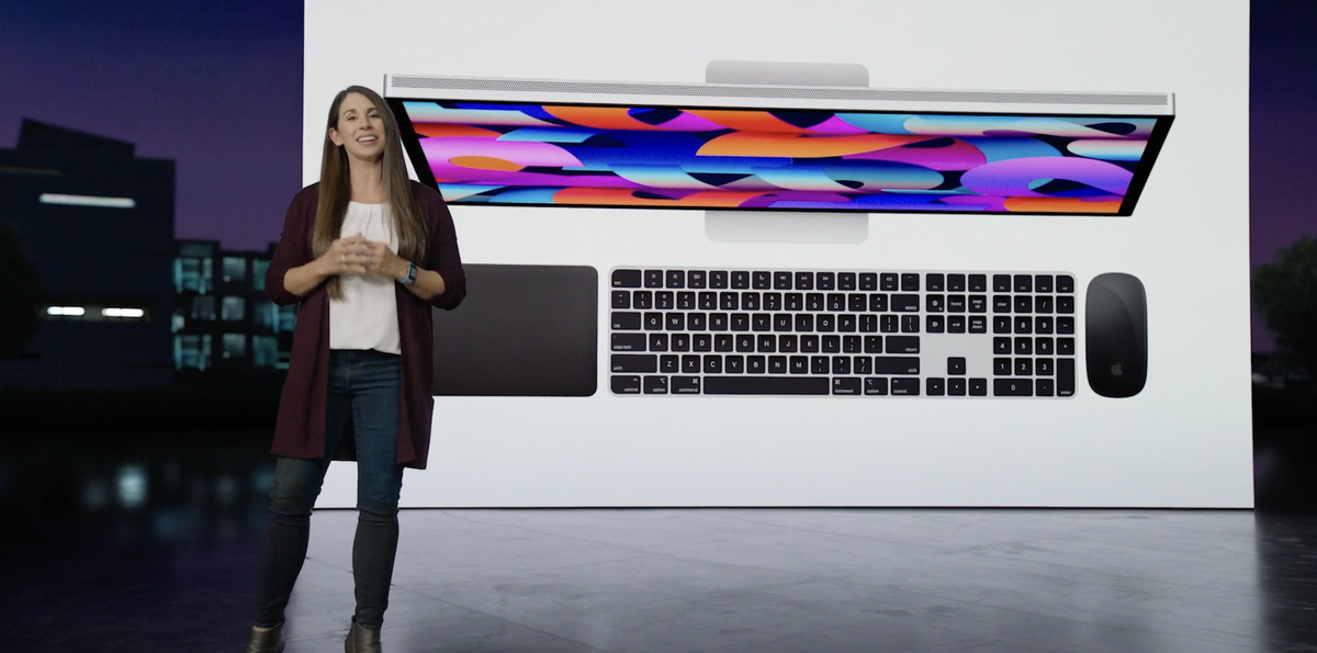
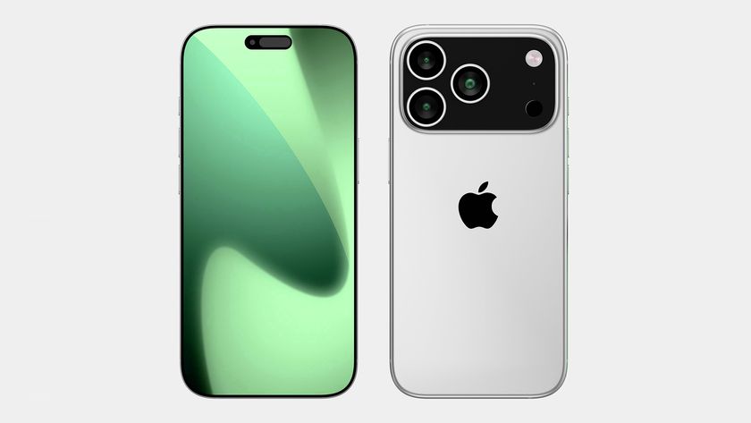
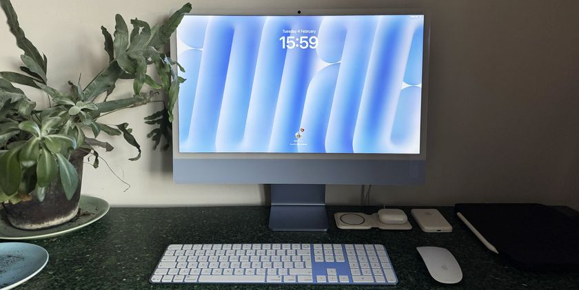
As usual, Apple revealed new goodies across its entire product spectrum last night, from the headline-grabbing Mac Studio to a new green hue for the iPhone 13. Perhaps the least notable of the lot was the new colour options for the Magic Keyboard and Magic Mouse 2 – but the latter has managed to rile up the internet.
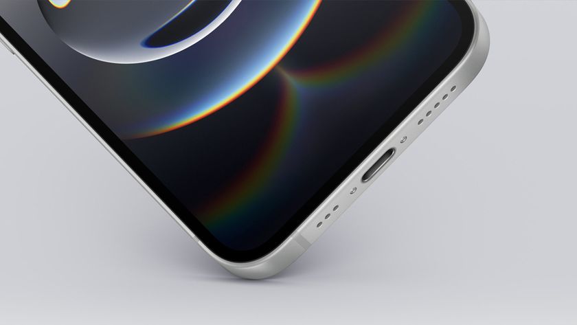
As any Magic Mouse user will tell you, the accessory's charging process is, er, less than ideal. In possibly Apple's most mind-boggling design decision ever, it placed the lightning port on the bottom of the mouse, rendering it utterly unusable while being charged. Yesterday Apple announced a new black colour designed to sit alongside the Mac Studio and Studio Display – but that port is still in exactly the same place.
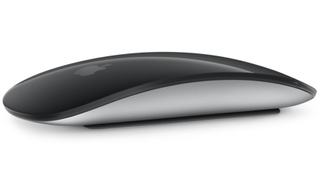
Seriously, it's starting to feel like Apple is taking the mick now. The mouse is seven years old, but the company keeps on releasing new colours – last spring it revealed no less than six hues designed to complement the beautiful 2021 iMac. And yep, they all feature the same stupid, ridiculous, annoying, frustrating, silly, daft, foolish, unintelligent, dull-witted, empty-headed, imbecilic charging solution.
A simple search for 'worst Apple design' on Twitter proves that this is perhaps Apple's worst ever design crime. The platform is littered with posts complaining about the awkward port placement, and a few naive hopefuls wondering whether yesterday would be the day it was finally fixed (it wasn't).
What if Apple releases a mouse today that doesn’t require me to do this? pic.twitter.com/75ICr8wevVMarch 8, 2022
The dead cockroach charging of the Magic Mouse is one thing that Apple have refused to fix.March 8, 2022
2022 and yet we still have to turn the Magic Mouse upside down to charge. pic.twitter.com/14VeH5Rl6TMarch 9, 2022
There's no denying that the Magic Mouse 2 is a case of form over function – but hey, at least it looks good. While that's the case with most of its products, Apple has let out a few aesthetic monstrosities over the years, from the iPhone 6 Smart Battery Case to the 2003 iMac Keyboard. Here are the 10 most beautiful Apple products – and the 5 ugliest. And be sure to check out our best MacBook deals below. (You don't have to turn them upside-down to charge them.)
Read more:
Get the Creative Bloq Newsletter
Daily design news, reviews, how-tos and more, as picked by the editors.

Thank you for reading 5 articles this month* Join now for unlimited access
Enjoy your first month for just £1 / $1 / €1
*Read 5 free articles per month without a subscription

Join now for unlimited access
Try first month for just £1 / $1 / €1

Daniel John is Design Editor at Creative Bloq. He reports on the worlds of design, branding and lifestyle tech, and has covered several industry events including Milan Design Week, OFFF Barcelona and Adobe Max in Los Angeles.
