Apple's most infamous design crime is still infuriating users
Not so magic.

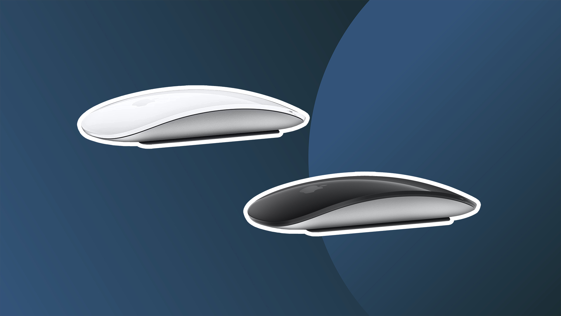
If there's one company known for its design nous, it's Apple. From the iPhone to the iPad, everything just works. Well, almost everything. Curpertino's finest has been known to make the odd design mistake – but none seem to infuriate the internet quite as much as the Magic Mouse 2's mind-bogglingly poor charging solution (solution being a strong word).
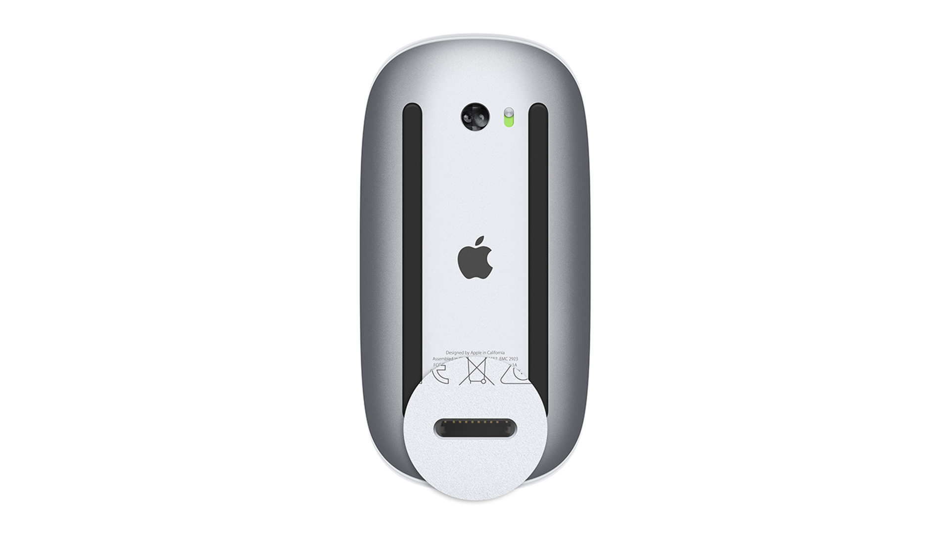
It's a typically sleek-looking Apple peripheral, and even made our best mouse for Mac list. But as soon as you need to charge it, the product instantly becomes useless. In possibly Apple's most mind-boggling design decision ever, it placed the lightning port on the bottom of the mouse, rendering it utterly unusable while being charged. And judging by the endless torrent of tweets about it, this one trips up Apple users every single day. Once again it's at the top of Reddit's MildyInfuriating page, and daily tweets continue to bemoan the inelegant design.

who designed this apple mouse and why is this the only way to charge it pic.twitter.com/h6wSqcqwuMJune 15, 2023
every time i have to charge my apple mouse, my faith in humanity crumbles pic.twitter.com/P2MfJ0tPvEJune 7, 2023
Yep, it's one of the most infuriating design quirks ever – and as any Magic Mouse users will attest, this thing always manages to run out of battery just as you're making headway on an incredibly important and time-sensitive task. Just search 'worst Apple design' on Twitter, and you'll be met with countless photos of upside-down Magic Mice.
There's no denying that the Magic Mouse 2 is a case of form over function – but hey, at least it looks good. While that's the case with most of its products, Apple has let out a few aesthetic monstrosities over the years, from the iPhone 6 Smart Battery Case to the 2003 iMac Keyboard. Here are the 10 most beautiful Apple products – and the 5 ugliest. And be sure to check out our best MacBook Pro deals below – with a massive, built-in trackpad, a separate mouse is very much an optional extra.
Get the Creative Bloq Newsletter
Daily design news, reviews, how-tos and more, as picked by the editors.

Thank you for reading 5 articles this month* Join now for unlimited access
Enjoy your first month for just £1 / $1 / €1
*Read 5 free articles per month without a subscription

Join now for unlimited access
Try first month for just £1 / $1 / €1

Daniel John is Design Editor at Creative Bloq. He reports on the worlds of design, branding and lifestyle tech, and has covered several industry events including Milan Design Week, OFFF Barcelona and Adobe Max in Los Angeles. He has interviewed leaders and designers at brands including Apple, Microsoft and Adobe. Daniel's debut book of short stories and poems was published in 2018, and his comedy newsletter is a Substack Bestseller.
