This angle meme is driving designers wild (in a bad way)
Perfectionists, look away now.

Here at Creative Bloq, we always like to find the right angle for a story. With that in mind, here's a classic from a few months back to ruin your weekend. You're welcome.
There's nothing like a good meme to get people raging. And while most are concerned with the latest developments in politics, it seems there'll always be room for some anger about an angle.
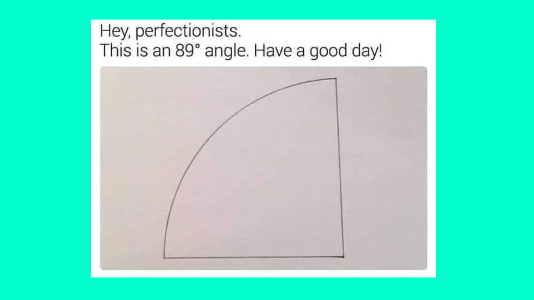
The latest graphic design meme to do the rounds on Twitter and Reddit is a pencil drawing of an 89° angle, with the text 'Hey perfectionists. This is an 89° angle. Have a good day!' And judging by the response online, the angle is just right (by which, we mean, wrong) – no need for the "artist" to check out out how to draw tutorials.
Not surprisingly, given the highly distressing nature of the post, it all kicked off pretty quickly. When Tobias Van Schneider posted the meme on Twitter, he said: "I can barely look at this".
Others were similarly affected:
This will haunt me.September 4, 2019
My eyes are burning now 🤣🤣🤣September 4, 2019
While others took a more technical angle:
Agree. The arc length also appears to exceed the angle.September 4, 2019
Over on Reddit, users were infuriated by the post itself, with user RoeHogan saying: "The amount of times this has been posted is mildly infuriating."
Get the Creative Bloq Newsletter
Daily design news, reviews, how-tos and more, as picked by the editors.
While there was some good old-fashioned debate of (ahem) varying degrees of pedantry:
Nooneisanonymous said: "Looks more like 95 degrees to me. I thought we measured from right to left. Even if it measured from left to right it looks more like 85 degrees."
While Haribo112 replied: "No it is 89. The straight bit and the curve indicate it is to be measured from left to right. The reason it looks more like 85 to you I because of the height. A 1 degree change at the base of the angle will lead to a very noticeable deviation at the top."
More angles, are, of course, developing all the time.
Read more:

Thank you for reading 5 articles this month* Join now for unlimited access
Enjoy your first month for just £1 / $1 / €1
*Read 5 free articles per month without a subscription

Join now for unlimited access
Try first month for just £1 / $1 / €1

Rosie Hilder is Creative Bloq's Deputy Editor. After beginning her career in journalism in Argentina – where she worked as Deputy Editor of Time Out Buenos Aires – she moved back to the UK and joined Future Plc in 2016. Since then, she's worked as Operations Editor on magazines including Computer Arts, 3D World and Paint & Draw and Mac|Life. In 2018, she joined Creative Bloq, where she now assists with the daily management of the site, including growing the site's reach, getting involved in events, such as judging the Brand Impact Awards, and helping make sure our content serves the reader as best it can.
