New &Walsh logo pushes typography to the limits
Jessica Walsh's new studio identity includes 50 distorted ampersands.

Sagmeister & Walsh partner Jessica Walsh has left the famous design firm to start her own agency. As of now, Sagmeister & Walsh is no more, instead Walsh's new studio will go by the name &Walsh. And, being such a prominent feature of the Sagmeister & Walsh logo design, it comes as no surprise that Walsh's new identity places a major focus on the ampersand.
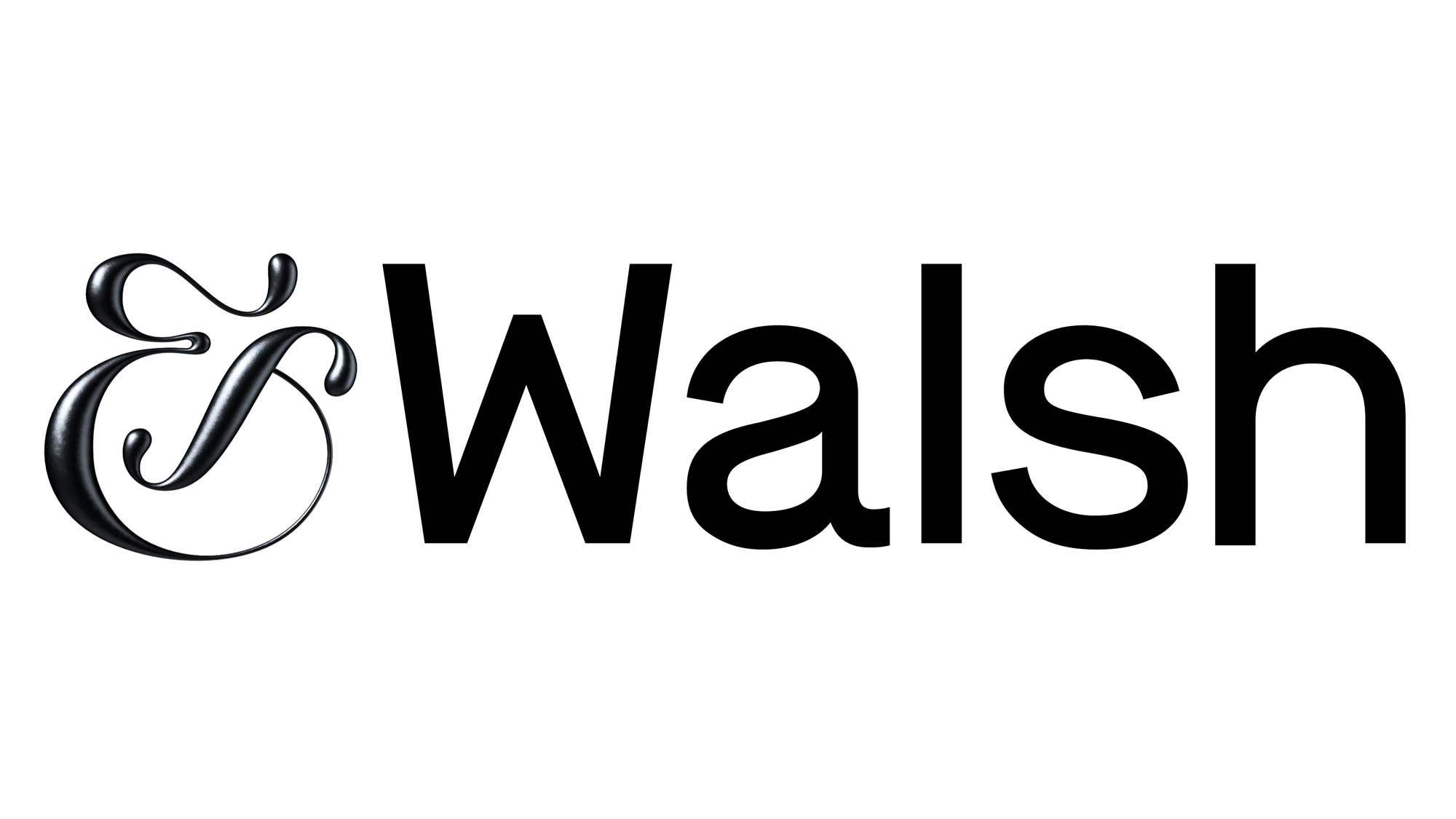
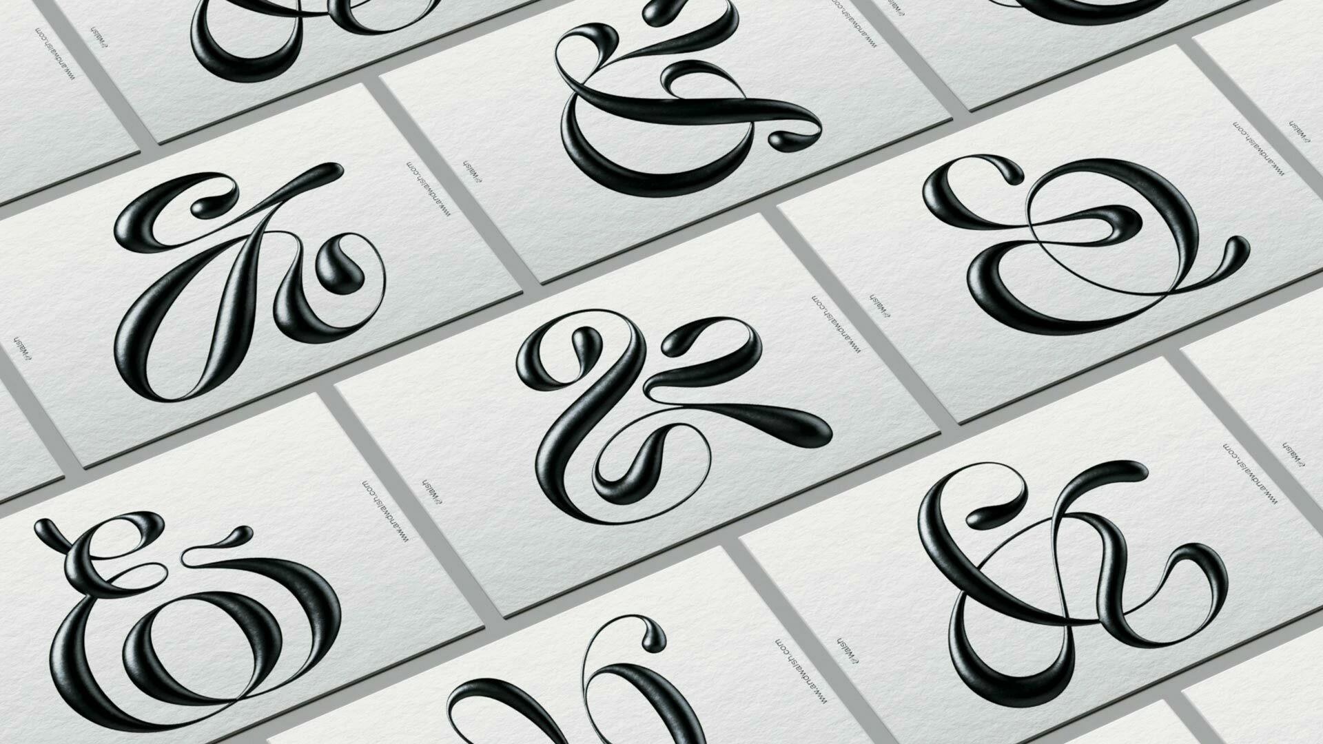
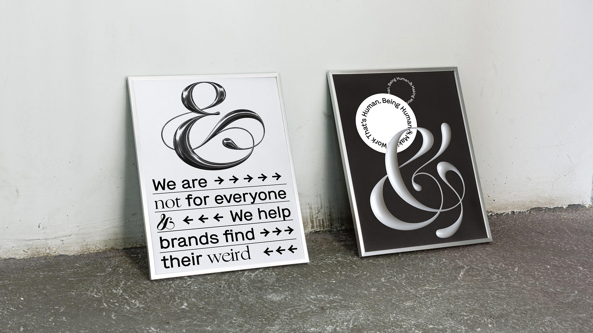
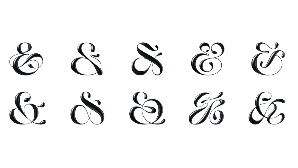
The new firm's logo (above), features a fluid, curvy ampersand shape that stands in contrast to 'Walsh', which is displayed in Milieu Grotesque’s Maison. Pushing the art of typography to new limits, the design is supported by 50 secondary ampersands, all of which will appear as bizarre, distorted versions of the logogram. The idea being to clearly and effectively communicate Walsh's goal to help brands "find their weird".
Her previous agency's logo (below) was a clever way to communicate the partnership between Sagmeister and Walsh. Foregrounding the ampersand addressed Sagmeister's head-turning decision to offer Walsh a partnership position in 2012 when she was 25. It's a powerful example of a typography-based identity, see more examples of this in our guide to logo design.

On the &Walsh branding page, the studio adds: "Our branding uses an ampersand for both the visual identity and tonal expression. This typographic system includes our clients, projects, collaborators, experiments & endeavors: hence the (Blank) & Walsh."
"We’ve drawn 50 final ampersands in our style and will draw a custom ampersand for every new project or team member. The ampersand is one of the most beautiful typographic characters and will challenge ourselves to continuously reinvent its form."
Check out how these iterations appear in the gallery below.


There's been some confusion as to how the new studio will work, given that Walsh wrote in a blog post that "this isn't the end of Sagmeister & Walsh". It looks like Sagmeister has done a bit of a Jony Ive, in that he's left, but will still collaborate on art projects, just not commercial ones.
Get the Creative Bloq Newsletter
Daily design news, reviews, how-tos and more, as picked by the editors.
In terms of operations, &Walsh will still maintain the 25 people who already work for the firm. It's an exciting development for Walsh, who points out that: "Only 0.1% of creative agencies are women-owned. POINT. ONE. PERCENT. How does this make any sense when women drive about 80% of consumer purchasing?"
Related articles:

Thank you for reading 5 articles this month* Join now for unlimited access
Enjoy your first month for just £1 / $1 / €1
*Read 5 free articles per month without a subscription

Join now for unlimited access
Try first month for just £1 / $1 / €1

Dom Carter is a freelance writer who specialises in art and design. Formerly a staff writer for Creative Bloq, his work has also appeared on Creative Boom and in the pages of ImagineFX, Computer Arts, 3D World, and .net. He has been a D&AD New Blood judge, and has a particular interest in picture books.
