The anatomy of Nike's most famous sneaker is weirdly fascinating
See the Air Force 1 in a new light.

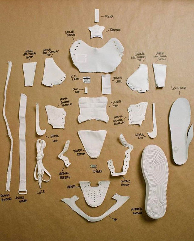
We all love getting to the nitty-gritty details of a design, whether it's the VW logo specifications, which were later thrown out the window, or in this case, the components of a very famous shoe: the Nike Air Force 1.
So this week, when Reddit user Shields Matt posted an image showing the anatomy of the Air Force 1, it caused quite a stir. And they weren't all just talking about that famous swoosh, or that Nike has one of the best logos ever made.
We'll be honest, many of the comments didn't exactly focus on the design. They were more concerned with whether the elements look like bones if you scroll past them, or with taking a swipe at Nike's manufacturing methods.
But as DaxDiMario said: "People who talk trash about shoe designs need to see this. Love the shoe or hate it there’s so much that goes into all of them." And we're inclined to agree.

This design is worth taking a second to ponder, if only to marvel at how these small elements come together to create the iconic sneaker. It also shows that the elements that make up a beautiful or functional product (or a beautiful, functional product) are often in themselves not really that sexy.
Take that Nike swoosh, for example. Does it look like a much-coveted item or logo that you need on your clothes in this picture? Not really. Yet when you add it as the final touch to a gorgeously created trainer, it becomes something else, and adds an extra element.
So if you take anything from this sneaker breakdown, it's that if you're despairing over something that looks a bit rubbish in its component parts, then do not panic. Add the right swoosh, stitch it all together, and it might just become legendary.
Get the Creative Bloq Newsletter
Daily design news, reviews, how-tos and more, as picked by the editors.
You can see the original post on Reddit here.
Read more:

Thank you for reading 5 articles this month* Join now for unlimited access
Enjoy your first month for just £1 / $1 / €1
*Read 5 free articles per month without a subscription

Join now for unlimited access
Try first month for just £1 / $1 / €1

Rosie Hilder is Creative Bloq's Deputy Editor. After beginning her career in journalism in Argentina – where she worked as Deputy Editor of Time Out Buenos Aires – she moved back to the UK and joined Future Plc in 2016. Since then, she's worked as Operations Editor on magazines including Computer Arts, 3D World and Paint & Draw and Mac|Life. In 2018, she joined Creative Bloq, where she now assists with the daily management of the site, including growing the site's reach, getting involved in events, such as judging the Brand Impact Awards, and helping make sure our content serves the reader as best it can.
