Amazon's controversial new star system is getting bad reviews
One of the weirder web design choices we've seen.

As any web designer will attest, tiny design choices have a huge impact on usability and accessibility. A pixel out of place or, more realistically, a button out of place, can transform the viewer's experience. Which might explain why Amazon's new star rating design is causing such controversy.
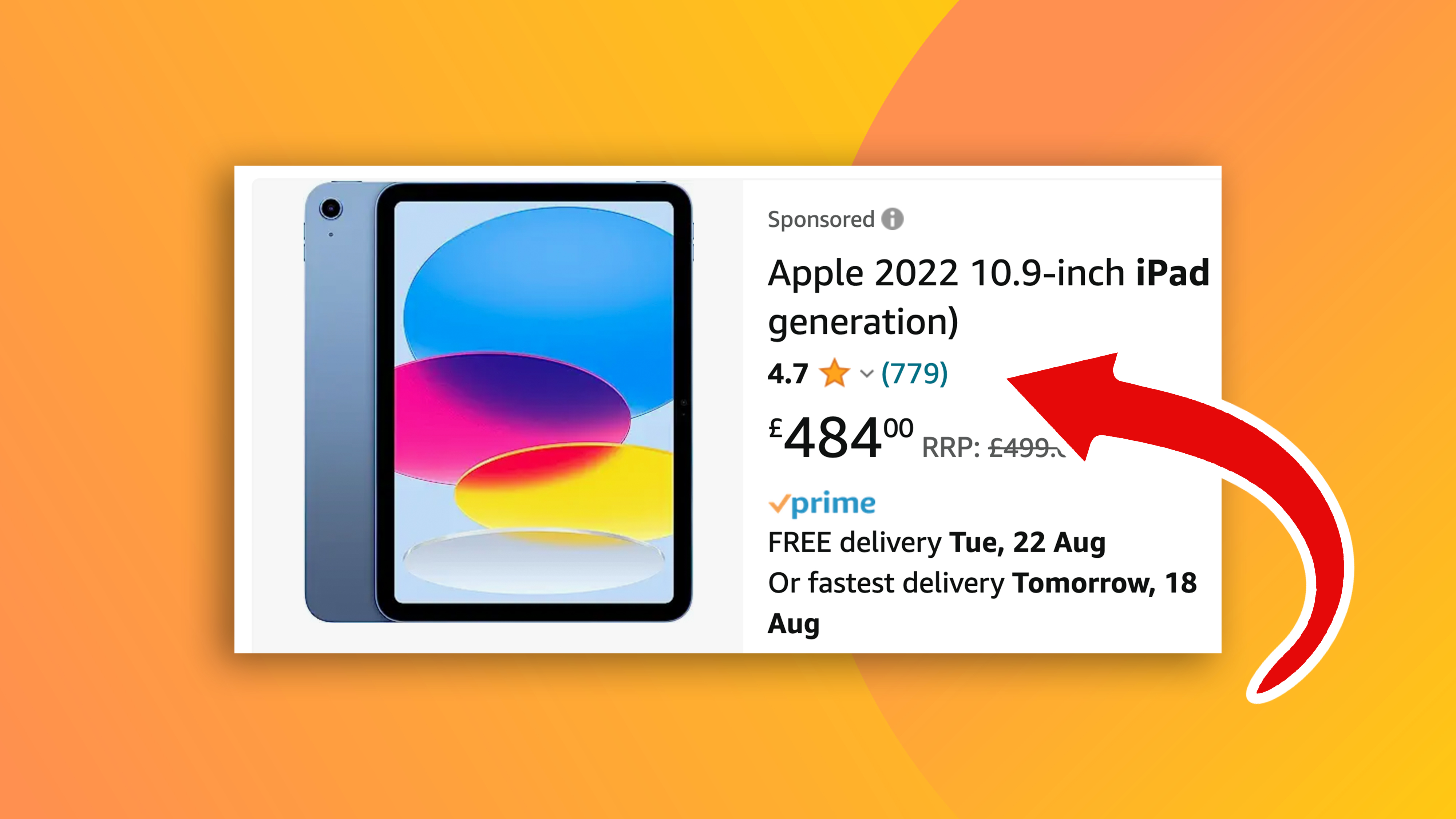
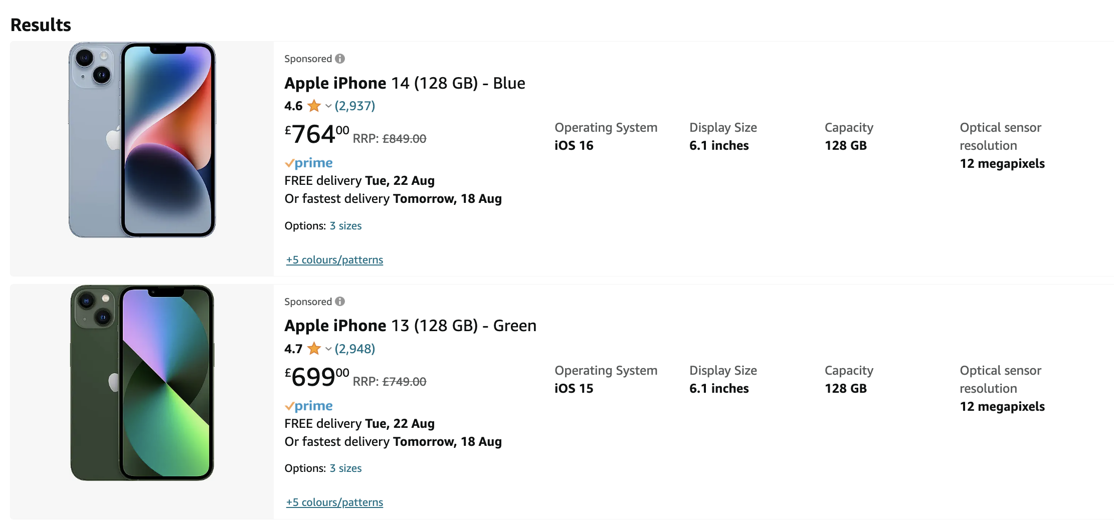
If you've searched for something to buy on Amazon lately, you might have noticed that the site no longer displays up to five consecutive stars to denote the current product rating. Instead, it now shows a single star, along with a number to show the average rating. (Looking for inspiration? Check out the top web design trends to look out for this year.)

The most obvious confusion here is that, at first glance, it suddenly looks like every single item on Amazon has a one-star rating. Sure, the number's there – but the muscle memory of counting the number of yellow stars is going to take a long time to shake off.
But believe it or not, what we're seeing right now appears to be an improved version of the new system. According to reports, Amazon has also been testing a version that, instead of an average rating next to that lone star, displays the percentage of 5 star reviews. So, an item might claim to have "50% 5-star" reviews, but there's no way of knowing if that other 50% is 4-stars, or 1-star. In other words, it's not very intuitive. Needless to say, the whole thing has caused quite a ruckus on Twitter:
I know Amazon's trying to drive engagement, but all I see now is "one star" lol pic.twitter.com/5U5eAgX8SpAugust 15, 2023
What on earth has @AmazonUK and @amazon done to their presentation of the rating system? On first look, it now looks like everything you look at has one star. Who came up with this brainwave? Note: if it ain't broke, don't fix it! pic.twitter.com/WHTLsAn9RWAugust 15, 2023
See Amazon’s new star rating system? I hate this so much. I’m so focused on the stars and ratings that now there’s so much more thought processing that has to go into to picking the right product. It’s not easy anymore.This will definitely get me to stop buying. #AmazonAugust 15, 2023
Amazon is clearly being reactive here, with the percentage listing quickly being rolled back in favour of the average rating. Still, with the amount of naysaying online about the new system, we wouldn't be surprised to see the return of all 5 stars eventually. Indeed, Amazon has form when it comes to reversing its design choices in response to controversy.
Get the Creative Bloq Newsletter
Daily design news, reviews, how-tos and more, as picked by the editors.

Thank you for reading 5 articles this month* Join now for unlimited access
Enjoy your first month for just £1 / $1 / €1
*Read 5 free articles per month without a subscription

Join now for unlimited access
Try first month for just £1 / $1 / €1

Daniel John is Design Editor at Creative Bloq. He reports on the worlds of design, branding and lifestyle tech, and has covered several industry events including Milan Design Week, OFFF Barcelona and Adobe Max in Los Angeles. He has interviewed leaders and designers at brands including Apple, Microsoft and Adobe. Daniel's debut book of short stories and poems was published in 2018, and his comedy newsletter is a Substack Bestseller.
