Amazon's first-ever grocery ad is a retro delight
Proving that sometimes simplicity is key.

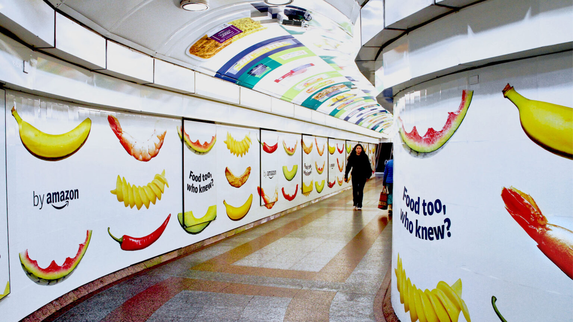
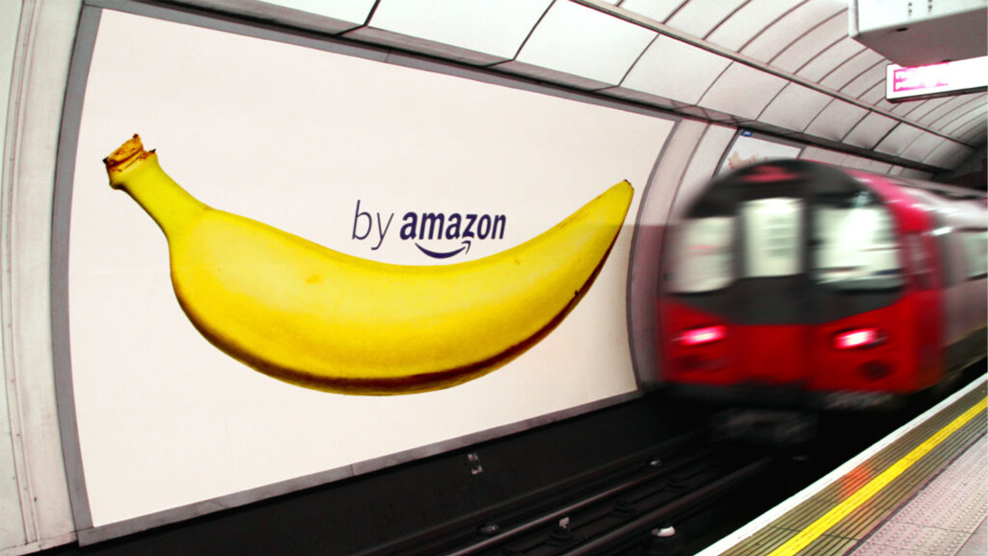
Amazon UK has debuted its byAmazon food range with a new ad campaign that brings you service with a smile. The colourful campaign features fresh produce transformed into Amazon's smile motif logo, in promotion of the company's new own-brand grocery range available directly from its website.
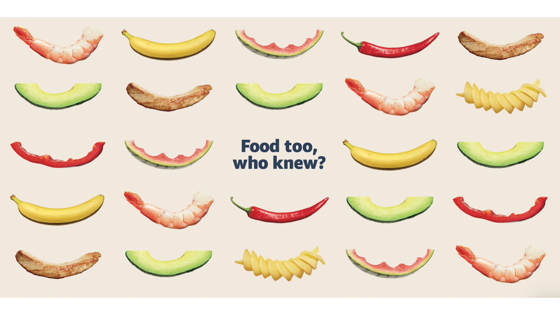
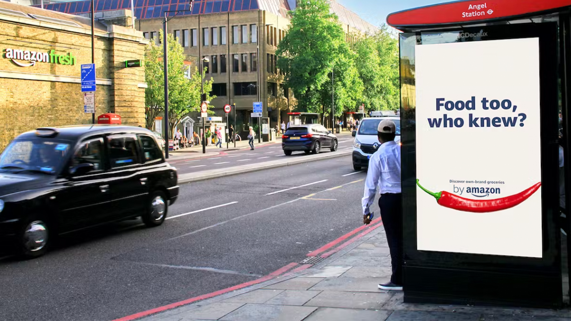
The campaign comes with a new slogan: "Food too, who knew?" cleverly gesturing towards the brand's already diverse array of products, giving us yet another reason to never leave the house. (If you're after more brilliant branding, check out our collection of the best billboard advertising examples).

Created by design agency Red Brick Road, the campaign features a series of bespoke billboards for traditional and digital advertising. The ads feature a diverse array of curved foods that emulate a smile, such as an avocado slice, a chilli, prawns and perhaps less appetisingly, a watermelon slice that's clearly already been enjoyed (hopefully not a reflection of Amazon's new produce).
The campaign makes its debut in a full media take-over of London's Angel tube station, featuring colourful ads on escalator panels, platforms and even plastered across the walls of tunnel walkways. Following the launch, the campaign will undergo a two-week digital display campaign that will be seen across London.

The campaign was directed by Nathalie Thery and Richard Megson at Red Brick Road, while the vivid visuals were captured by food photographer Robert Billington. The prime promotional poster features a muted off-white background, giving the design an almost retro feel while contrasting the bright and enticing appearance of the food products – a delightfully simple yet effective design.
The retro feel, combined with the overall simplicity of the ads is a smart move from the brand, giving the campaign a trustworthy feel by playing on nostalgic motifs. While Amazon features such as Prime and Alexa tend to focus on more modern on-demand convenience, it's good to see the company embracing simple graphics without fussy, overbearing colours and slogans, truly letting the food 'speak' for itself.

If you're after more inspiring advertising, check out Müller's Magic Eye optical illusion campaign that also revived some retro vibes, or take a look at McDonald's latest ad that's going heavy on the nostalgia.
Get the Creative Bloq Newsletter
Daily design news, reviews, how-tos and more, as picked by the editors.

Thank you for reading 5 articles this month* Join now for unlimited access
Enjoy your first month for just £1 / $1 / €1
*Read 5 free articles per month without a subscription

Join now for unlimited access
Try first month for just £1 / $1 / €1

Natalie Fear is Creative Bloq's staff writer. With an eye for trending topics and a passion for internet culture, she brings you the latest in art and design news. Natalie also runs Creative Bloq’s Day in the Life series, spotlighting diverse talent across the creative industries. Outside of work, she loves all things literature and music (although she’s partial to a spot of TikTok brain rot).
