Amazon Prime Video has got rid of its ugly interface
It's been a long time coming.
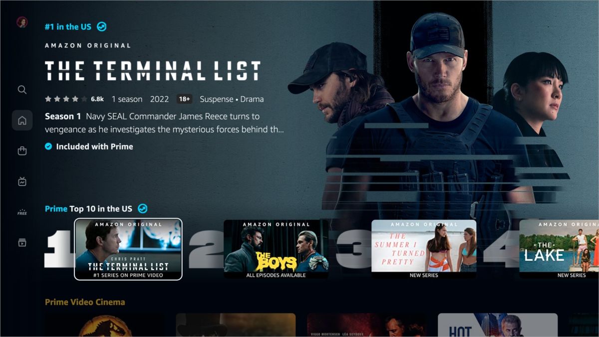
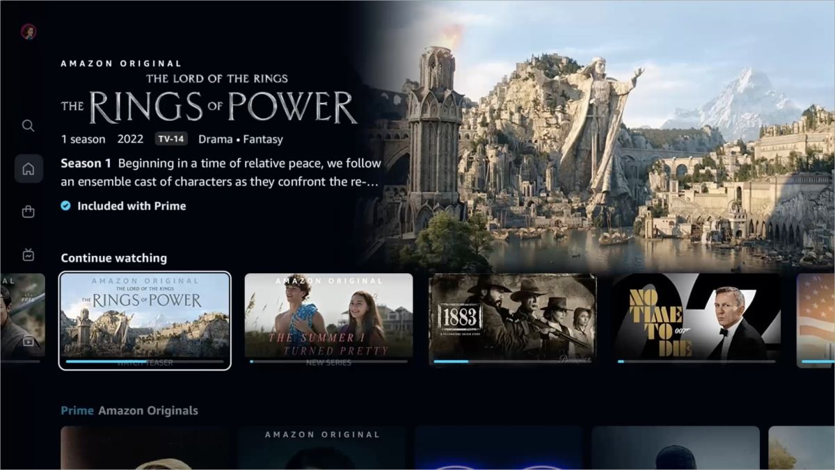
Amazon has finally given its over-cluttered and, frankly, ugly streaming platform a much-needed makeover – and it's one we've all been waiting for. After 18 months in the making, the revamped Prime Video UI is being launched and features cleaner carousels, a delectable new colour palette and a simplified navigation system (thank goodness).
The new app will also sport a number of new and useful features, like top 10 lists as well as detailed search filters for users (but more on that in a minute). If you need a platform to watch your Prime, then make sure you check out our roundup of the best TVs.

The updated UI will feature new icons, search and tabs to make it easier to find your way around the platform. Amazon has introduced a clean blue tick to show if content is included on Prime, and the streaming service will also have new filters added to the search, so users have more control when searching for their favourites. You will be able to search for titles, collections and genres, in both standard and 4K UHD video quality.
Plus, the home screen will now feature new side tabs that make it easier to find your way around. The new tabs included are Home, Store, Live TV, Free with ads and My Stuff (which I presume is where you'll find your watchlists and 'continue watching' section). There will also be a 'My Subscriptions' section where you can find all the titles available to you, meaning you no longer have to frantically scroll looking for what to watch next.
Some new functionality will be familiar to users of other streaming platforms. For example, hovering over the 'super carousel' displays poster-style art, which then turns into a video preview (we've definitely seen that idea somewhere before).

The new update will start rolling out across living room and Android devices this week, with Apple and Desktop soon to follow after. I'm looking forward to having a play around on the streaming platform's new interface, but I'm not convinced it will operate better than the likes of Netflix and Disney Plus considering how many kinks there were to iron out in the first place (like the hard-to-navigate platform and overwhelmingly busy home screen).
With that being said, it looks like Amazon has done a good job at decluttering and simplifying the platform - I'm actually pretty impressed. And of course, if you haven't subscribed to Amazon Prime yet, then don't worry, you can test the waters with a free Amazon Prime trial.
Get the Creative Bloq Newsletter
Daily design news, reviews, how-tos and more, as picked by the editors.
Read More:

Thank you for reading 5 articles this month* Join now for unlimited access
Enjoy your first month for just £1 / $1 / €1
*Read 5 free articles per month without a subscription

Join now for unlimited access
Try first month for just £1 / $1 / €1

Amelia previously worked as Creative Bloq’s Staff Writer. After completing a degree in Popular Music and a Master’s in Song Writing, Amelia began designing posters, logos, album covers and websites for musicians. She covered a range of topics on Creative Bloq, including posters, optical illusions, logos (she's a particular fan of logo Easter eggs), gaming and illustration. In her free time, she relishes in the likes of art (especially the Pre-Raphaelites), photography and literature. Amelia prides herself on her unorthodox creative methods, her Animal Crossing island and her extensive music library.
