Amazon just fixed its controversial new app icon
There was a rather unfortunate design flaw.
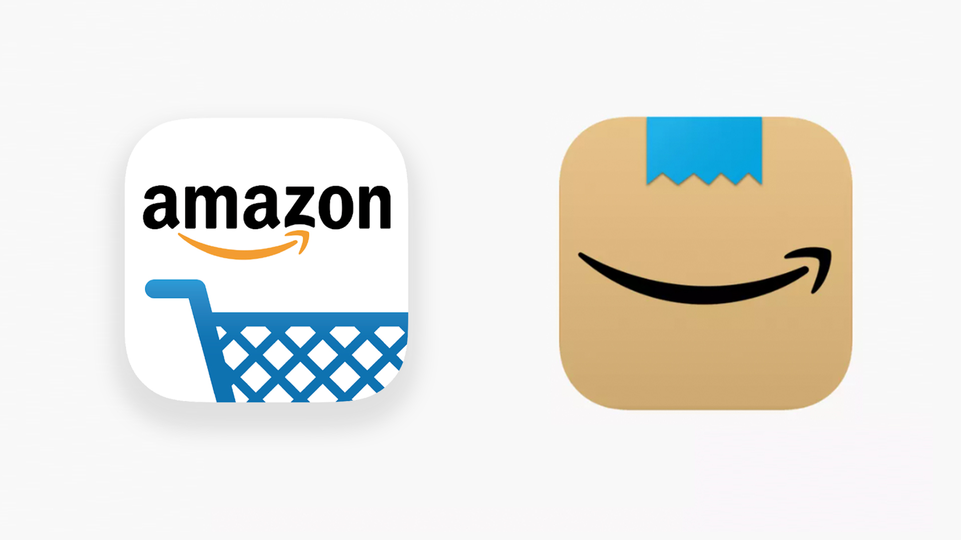
Amazon has never been particularly synonymous with stylish design. From its homepage to its packaging, the company's aesthetic is perhaps best described as 'functional'. But last month's new Amazon's app icon felt like a rare foray into sleek and striking minimalism – until users spotted the rather unfortunate design fail. And now, mere weeks later, Amazon has already fixed it.
Appearing on several regional app stores, the new icon (below) features Amazon's signature arrow/smile on a brown background (presumably based on its cardboard boxes), along with a hint of the company's bright blue parcel tape. (Check out our logo design guide if you're looking for more inspiration.)

At first glance, there's lots to like about the new icon. By placing the smile, perhaps Amazon's most recognisable visual asset, front and centre, it comes across as a simple yet confident design. It's also bound to stand out on your homescreen. In a sea of overly-minimal logos on white backgrounds (yes, Google, we're talking about you), Amazon's effort is likely to draw your attention. Indeed, none of our best iOS app icons are also based on cardboard.
But while some corners of the internet love the new icon, others spotted a somewhat unfortunate design flaw – and once you see it, it can never be unseen. It's all about that tiny strip of blue tape. When placed above the 'smile', it looks a little like a moustache. And not just any moustache, but, according to Twitter, a rather familiar one.
Someone should tell @amazon that a mouth with a little moustache is a big no-go... https://t.co/bqQSDFYhHmJanuary 26, 2021
My parents use Amazon nearly every day. They’re going to be lost for the next few days. When they ask where Amazon’s gone, I’ll tell them to look for the cardboard Hitler… https://t.co/u1YcJUBNSNJanuary 26, 2021
New Amazon icon is 😍 https://t.co/FkoWSfaDy6January 25, 2021
God dammit. I really liked this icon design, but now I’m cursed with this interpretation. https://t.co/8g7TTcQQ5IJanuary 26, 2021
New icon for the Amazon app? This is infinitely more elegant, and a little playful. I love it! pic.twitter.com/gJChQxsDCNJanuary 25, 2021
Amazons new App logo Does not remind me of Hitler... Amazons new App logo Does not remind me of Hitler... Amazons new App logo Does not remind me of Hitler... pic.twitter.com/CAx0kWKeDmJanuary 26, 2021
I see Hitler smirking https://t.co/rQvLVWYkCZJanuary 26, 2021
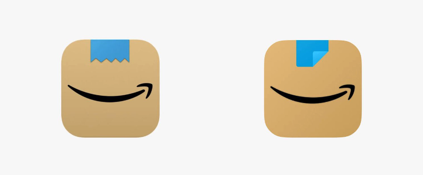
And it seems Amazon has taken note. Over the last week, company has quietly rolled another new app icon featuring a subtle tweak to that parcel tape moustache. Gone is the jagged edge in favour of a straighter (read: less hairy) cut, while a peeled back corner screams: 'guys, this is tape. It's definitely not moustache. Okay?'

If we're honest, we'd have preferred to see Amazon do away with the distracting blue tape altogether, leaving just the minimal arrow/smile atop the cardboard brown. But hey, at least the new version looks a lot less like you-know-who.
As these 12 infamous design fails show, Amazon is no means the first company to get into hairy situation, design-wise. And if you fancy changing Amazon's icon yourself, you can – here's how to customise your iOS 14 homescreen icons.
Get the Creative Bloq Newsletter
Daily design news, reviews, how-tos and more, as picked by the editors.
Read more:

Thank you for reading 5 articles this month* Join now for unlimited access
Enjoy your first month for just £1 / $1 / €1
*Read 5 free articles per month without a subscription

Join now for unlimited access
Try first month for just £1 / $1 / €1

Daniel John is Design Editor at Creative Bloq. He reports on the worlds of design, branding and lifestyle tech, and has covered several industry events including Milan Design Week, OFFF Barcelona and Adobe Max in Los Angeles.
