This genius airline ad soars above the competition
Who knew flags were so much fun?
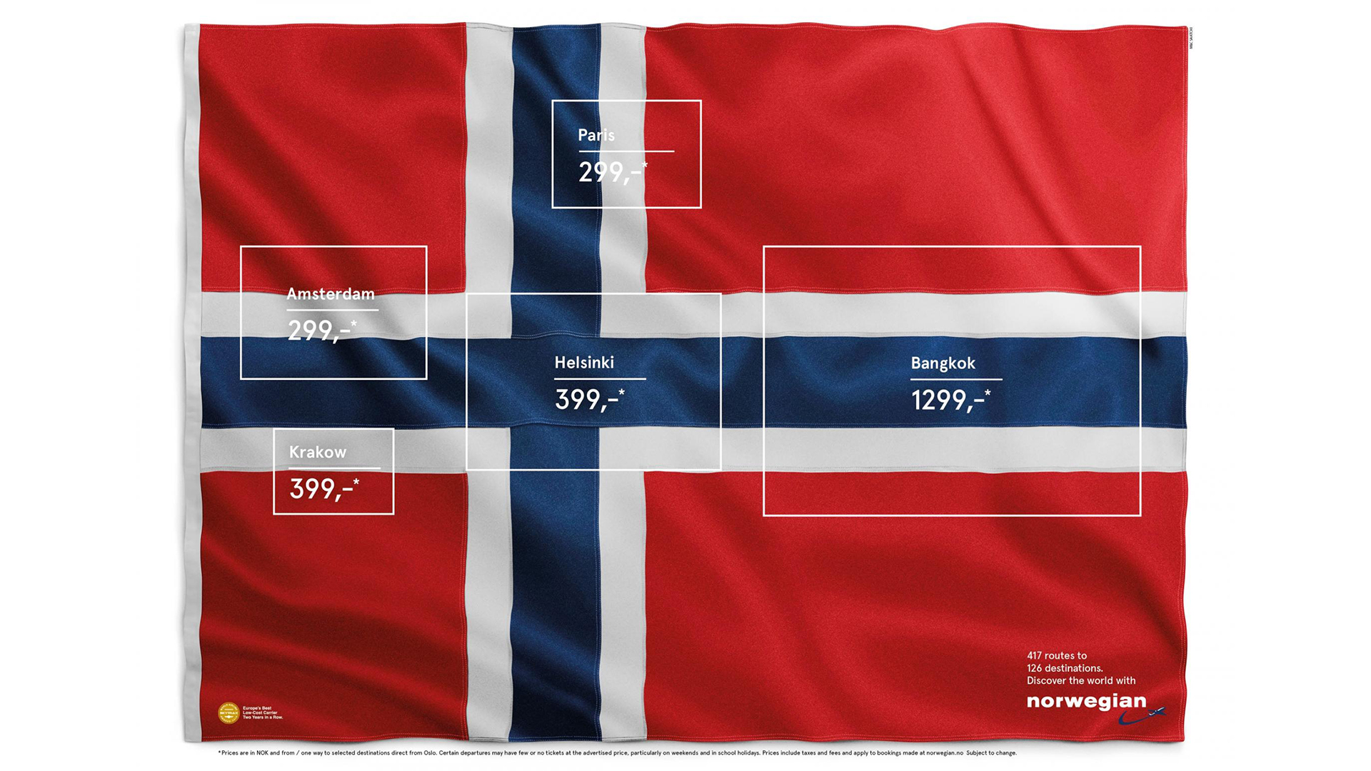
The concept of travel might be a distant memory for many right now, but while we're all waiting for the world to return to normal, one ingenious airline poster has recently resurfaced online. The internet is currently going wild for Norwegian Airlines' clever way of communicating its various destinations, and we're loving the smart and simple execution.
The ad features the flag of Norway, along with various rectangular boxes highlighting details which, on close inspection, resemble other countries' flags (including France, the Netherlands and Finland). Like all the best print ads, it's guaranteed to raise a smile – although in this case, one tinged with an unmistakeable hint of nostalgia.

Originally created in 2015 by Stockholm-based agency M&C Saatchi, the ad, titled Flag of Flags, highlights five hidden flags inside Norway's. The destinations (and, of course, prices) are listed inside the rectangles in a pleasingly clean sans-serif typeface (check out our best free fonts if you're looking for more great examples).
The ad appeared on Reddit today, and users were quick to heap praise on the clever concept. "That’s one of the smartest ads I’ve seen on here," one user comments, while another adds, somewhat succinctly, "clever bastards". The ad has also been flagged on Twitter, with vexillologists (flag fans) going wild for the design.
This is such clever design. As a flag nerd I love it! Norwegian Airlines showing how they fly to different places by creating flags on the Norwegian flag (Reddit: portals27) pic.twitter.com/blyfJyNpD2February 18, 2021
Very clever this. https://t.co/p0Aa490IFlFebruary 18, 2021
Can this not get a prize or something? So clever. https://t.co/IIWJAmLWphFebruary 18, 2021
I love subtle shit like this so damn much. LOVE a cheeky ad. https://t.co/d9gKCHLcSbFebruary 18, 2021
While it's bittersweet to marvel at an airline poster in the age of coronavirus, we'll always have room in our lives for a creative print ad. Indeed, it'll be difficult to look at Norway's flag in future without also spotting the other, hidden designs. And as several Twitter users have pointed out (below), there are even more to be found. It seems Norway's is very much the Swiss army knife of flags.
and MaltaFebruary 18, 2021
When jet-setting is well and truly back on the agenda, we hope to see more airlines find creative ways of listing their destinations. That said, there are worse things than a plain old list – as Ryanair's disastrous (and now banned) 'Jab & Go' ad recently proved.
Read more:
Get the Creative Bloq Newsletter
Daily design news, reviews, how-tos and more, as picked by the editors.

Thank you for reading 5 articles this month* Join now for unlimited access
Enjoy your first month for just £1 / $1 / €1
*Read 5 free articles per month without a subscription

Join now for unlimited access
Try first month for just £1 / $1 / €1

Daniel John is Design Editor at Creative Bloq. He reports on the worlds of design, branding and lifestyle tech, and has covered several industry events including Milan Design Week, OFFF Barcelona and Adobe Max in Los Angeles.
