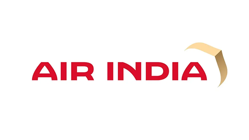
The jury is out on the new Air India logo, it seems. Some think it's a sleek execution of a clever concept, some think it looks bland and some people are just confused.
Is that a bird or a plane flying alongside the wordmark? A hang-glider maybe? Nope, it's none of those. It's a gold window. Or at least part of a window viewed at an unusual angle. But you would kind of have to be told that to know. Somehow, I don't think this new design is going to make our pick of the best airline logos.
The old design (left) and the new Air India logo (right) (Image credit: Air India)
Air India, the former Indian national airline now owned by Tata Group, is calling its new logo called "The Vista". Created with branding firm FutureBrand, it retains the red and white colours of the previous 2014 design, which comprises a swan and Konark Chakra, but adds a touch of gold.
Latest Videos From Creative Bloq
The shaded gold mark that's getting most of the attention was inspired by the peak of traditional Indian window frames, which in the past have been painted on the outside of the windows on Air India planes. It's intended to symbolise a "window of possibilities" and "new hope and ambition".
Revealing the bold new look of Air India.Our new livery and design features a palette of deep red, aubergine, gold highlights and a chakra-inspired pattern.Travellers will begin to see the new logo and design starting December 2023.#FlyAI #NewAirIndia*Aircraft shown are… pic.twitter.com/KHXbpp0sSJAugust 10, 2023
See more
The animation in the presentation of the new logo and livery above makes the window reference clearer, but some people are still confused. "Nice logo for paragliding company," one person responded on Twitter. "That paper plane in the wind gives me even less confidence in the airline!," someone else wrote.
Other people just think the design is "plain" and "banal". One person says it "has a bit of a clip art-meets-unlicensed video game look to it."
It would have cost $0 to create this logo on an online site by some uneducated IT celliya and this crap becomes the logo for a major carrier with a glorious history?? Pathetic @RNTata2000 and god wish Air India some luck with this kind of horrible logo. They will need it!!! pic.twitter.com/9mx8WgLHq2August 10, 2023
See more
Has a bit of a ClipArt-meets-unlicensed video game look to itAugust 10, 2023
See more
It would have cost $0 to create this logo on an online site by some uneducated IT celliya and this crap becomes the logo for a major carrier with a glorious history?? Pathetic @RNTata2000 and god wish Air India some luck with this kind of horrible logo. They will need it!!! pic.twitter.com/9mx8WgLHq2August 10, 2023
See more
New @airindia logo perfectly captures our country's continued illiteracy towards good design 👏🏼👏🏼 pic.twitter.com/coRvvg5sGAAugust 10, 2023
See more
One tweeter gave a more detailed review of the design: "Typeface: well intended to perhaps resemble jharokhas but looks outdated, even though it's custom made I think. Gold-colored design element: Pre Y2L clip art. Color: Indian color palette, nothing wrong but no effort or imagination to use it uniquely."
Get the Creative Bloq Newsletter
Daily design news, reviews, how-tos and more, as picked by the editors.
People aren't sure about the new livery either. "What is that on the tail, a sofa section?" one person asked. There have also been concerns about the fate of the airline's much-loved Maharaja mascot, but the company has said that he will still feature, but will a new look, including the addition of purple and gold colours.
Others have spoken more positively of the new logo design, predicting that it will grow on them. It's certainly refreshing to see an Airline break the mould and go with a different approach to logo design, with a deeper concept behind it, but given the context, it seems inevitable that people who don't know what it's supposed to represent will presume it's intended to be a bird or a plane.
For an airline logo that passed public approval with flying colours, see the Jetsmart logo, even if its hidden secret feels a little familiar. And for another logo controversy of the week, don't miss the debate about the Canberra Raiders rugby team's logo redesign.
Thank you for reading 5 articles this month* Join now for unlimited access
Joe is a regular freelance journalist and editor at Creative Bloq. He writes news, features and buying guides and keeps track of the best equipment and software for creatives, from video editing programs to monitors and accessories. A veteran news writer and photographer, he now works as a project manager at the London and Buenos Aires-based design, production and branding agency Hermana Creatives. There he manages a team of designers, photographers and video editors who specialise in producing visual content and design assets for the hospitality sector. He also dances Argentine tango.