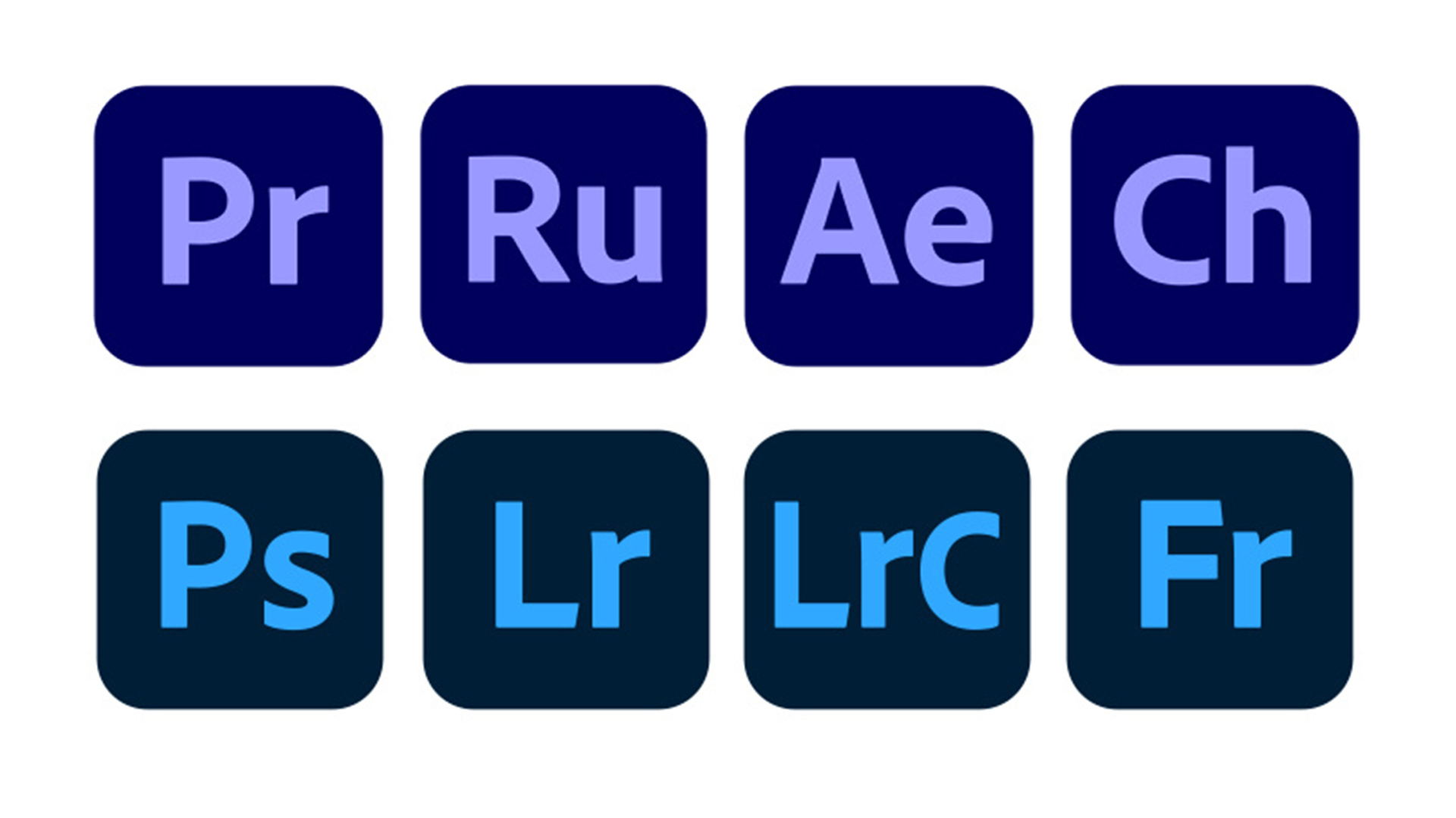
Designers are fuming about Adobe's new Creative Cloud icons
Are they all supposed to look the same?

When Adobe announced an update to its brand identity last month, it claimed to be making the Creative Cloud suite more consistent in appearance, and easier to navigate. But several users have taken to Twitter to vent their frustration that the apps' icons now are little too consistent.
It seems Adobe has decided to group its icons together by colour – video apps (such as After Effects and Premiere Pro) are now dark blue/purple, while photo apps (such as Photoshop and Lightroom) are now, er, a slightly lighter blue. Rather than easier to navigate, many users now feel that the apps are even harder to distinguish (dare we suggest Adobe take a look at one of our brilliant Photoshop tutorials?).
Thank you @Adobe for basically making all the icons the same colour - super easy to distinguish🙃 pic.twitter.com/NOcdAsA3PFJune 22, 2020
going to go out of my way to ensure i never update my adobe apps now because of this boneheaded icon redesign. who thought it was a good idea to remove the color differences between each program, now it's an indistinguishable mess pic.twitter.com/jh9WZ2QqizJune 16, 2020
Exclusive sneak peak at Adobe's 2021 suite icons. pic.twitter.com/4dnaOPU5RuJune 18, 2020
It isn't just the identical colours that users are unhappy about. Many have noticed that the logos within the icons themselves aren't consistently sized or aligned – not quite what you'd expect from the company behind arguably the world's most famous creative software.
...at Adobe and then have something like misaligned text on every icon? Like, no joke, none of your app icons are aligned if you look carefully, y’all should care abt this. Please, if you’re not going to bring the rainbow back, at least align text properly pic.twitter.com/GAnzPWJCx4June 16, 2020
I wasn't going to comment on the updated Adobe icons ... but what the bloody hell is this? WHY are After Effects and Premiere the same colour? WHY is the XD icon bigger than the rest? @Adobe are pioneers of the creative industry producing these remember. pic.twitter.com/Oq1IoID144June 17, 2020
While we applaud Adobe for seeking to clarify which apps belong to the same software family (as this video shows, there are over 50 apps to differentiate), we can't help but wonder if it could have achieved it without making the icons practically identical. In a blog post explaining the updates, Adobe explained that it removed icon borders in the pursuit of consistency – but perhaps identical borders would have been enough to bring related apps together.
By adding too much consistency to the icon colours and too little to the logo alignment, the company seems to have got its brand refresh a little muddled up. Perhaps Adobe can take some solace from the fact that it's not the only one with icon problems – Apple is also drawing heat for its "horrific" new MacOS Big Sur icons.
Still, whatever the icons look like, Creative Cloud features some of the best software for digital art around (just as long as you can find the right app to open). Check out the best Creative Cloud plans below.
Read more:
Get the Creative Bloq Newsletter
Daily design news, reviews, how-tos and more, as picked by the editors.

Thank you for reading 5 articles this month* Join now for unlimited access
Enjoy your first month for just £1 / $1 / €1
*Read 5 free articles per month without a subscription

Join now for unlimited access
Try first month for just £1 / $1 / €1

Daniel John is Design Editor at Creative Bloq. He reports on the worlds of design, branding and lifestyle tech, and has covered several industry events including Milan Design Week, OFFF Barcelona and Adobe Max in Los Angeles.
