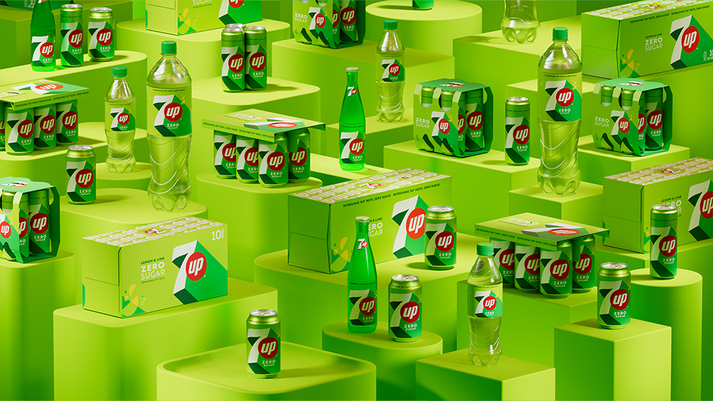
Rebrands are so difficult to get right, but here's one that was well worth the effort. 7Up has just revealed a new look, and it's got things just right with a punchy, 'UPlifting' design.
The brand's first big international revamp in seven years looks simple enough at first glance, and it certainly feels familiar. But the changes reinvigorate 7UP with fresh punchiness – and just check out those drop shadows (see our pick of the best branding books for more inspiration).
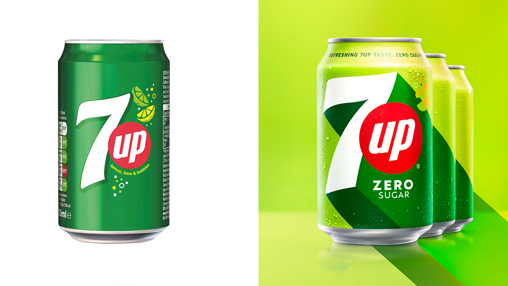
7UP, which belongs to Keurig-Dr. Pepper but is distributed by Pepsi internationally, is the main lemon-lime rival to Coca-Cola's Sprite outside the US. In this punchy rebrand for use outside the US, obviously the signature green colour remains and the 'up' continues to demand attention in its red circle. But the colours have received a refresh, now better reflecting both the lemon and the lime both in the overall palette and the circular shapes resembling bubbles and citrus wedges.
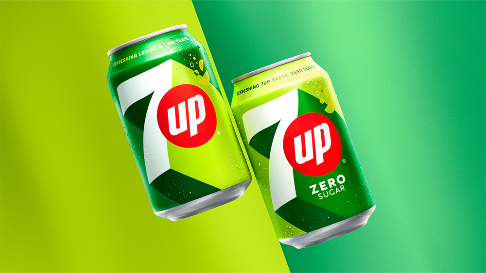
Best of all, the huge drop shadow on the '7' makes packaging and other pieces look a lot more exciting than before. It's also possible to simplify the design for other uses without losing its depth. The objective, according to Pepsi, was to create a "bright and confident visual identity system that will echo across cultures, regions, and languages" and to generate "UPliftment".
“UPliftment is a concept that resonates with people globally," the company's senior vice president and chief design officer says in the press release, adding that the new visual identity was inspired by the brand’s "creation of moments of UPliftment throughout its history" (sounds like the brief was more complex than the Coca-Cola design brief).
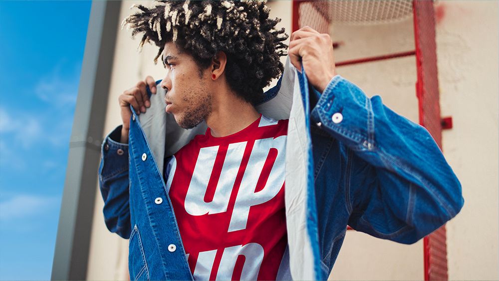
Just what is UPliftment exactly? I assume it's the creation of feel-good moments, but the press release goes on to make a promise to bring comedy to people's lives. "To celebrate its vibrant new look and distinctively zesty taste, 7UP will embody the universal language of comedy to bring moments of UPliftment to people's lives in unexpected ways," it says. A little mystifying, but I'm sure it will all make sense. The brand says it will roll out its first 'consumer engagement platform' in Spring 2023 to bring 'unique experiences to people.'
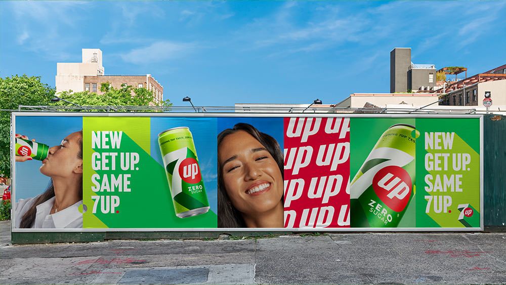
The 7UP rebranding is being launched with the slogan 'New Get Up, Same 7UP', essentially a more clever way of the classic, 'new look, same great taste' kind of message. It does sometimes make you wonder why the rebrand if they have to explain to people that it's just the same product, but I'm happy to admire the design. It's one of the freshest rebrands we've seen yet this year, up there with the National Portrait Gallery rebrand and the new Burberry logo.
Get the Creative Bloq Newsletter
Daily design news, reviews, how-tos and more, as picked by the editors.
Read more:

Thank you for reading 5 articles this month* Join now for unlimited access
Enjoy your first month for just £1 / $1 / €1
*Read 5 free articles per month without a subscription

Join now for unlimited access
Try first month for just £1 / $1 / €1

Joe is a regular freelance journalist and editor at Creative Bloq. He writes news, features and buying guides and keeps track of the best equipment and software for creatives, from video editing programs to monitors and accessories. A veteran news writer and photographer, he now works as a project manager at the London and Buenos Aires-based design, production and branding agency Hermana Creatives. There he manages a team of designers, photographers and video editors who specialise in producing visual content and design assets for the hospitality sector. He also dances Argentine tango.
