5 steps to diversify your UX design
How to show more diversity and inclusiveness in the user experience.

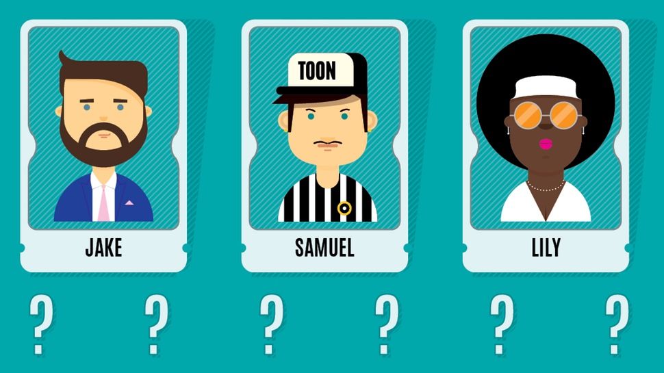
Diversity, like accessibility, is a huge topic in UX – and indeed in all areas of design right now. If you need a little help increasing the inclusivity of your user experiences, then check out these 5 tips.
01. Understand it’s the right thing to do
This one’s short, but simple. Before any other reason, decide that being more inclusive in your work is absolutely the right thing to do. Sure, there’s plenty of rational, strategic business decisions behind targeting a more diverse audience for your product or brand, but you need to decide that it’s important to you.
We have the power as designers, art directors and developers to redefine what’s normal. There’s a long history in our profession to use design as a tool to affect perspectives on race, gender, sexual orientation and culture. No-one’s asking you to make a direct political statement or be inauthentic. Just be self-aware. Don’t just talk about it, do something about it.
02. Show diversity in visuals

When generating content or visuals for your site, you may have the opportunity to shoot custom film or photography. If filming, be sure to incorporate diverse representation early on in the storyboarding/concepting process.
People will naturally follow the boards as they are approved; it’s the path of least resistance. Laying the groundwork now makes justifying your casting decisions later a bit easier.
03. Be sensitive in copywriting and content
Don’t neglect chemistry. Diversity works best when it feels real instead of feeling staged. Try to find natural pairings or groups of people who seem like they could relate to each other, and maybe actually hang out together.”
Tish Loh @ Publicis Hawkeye
Words matter. Cultural sensitivity in your brand’s social media, website, or app’s content should not be dismissed as bland political correctness. Be careful in how you describe groups.
Consider using more considered language instead of potentially derogatory terms. For example, say ‘women in poverty’ versus ‘poor women’
Get the Creative Bloq Newsletter
Daily design news, reviews, how-tos and more, as picked by the editors.
04. Use strategic UX
Empathy is an easy emotion to find within yourself (unless you’re a sociopath). That’s a big part of experience design. But how do you effectively channel your own empathy to truly understand your user? Start by re-evaluating the methodologies you are likely to use.
05. Be careful with personas and assumptions
Avoid making assumptions about your audience. Try to find alternative perspectives in your research before narrowing your personas down. Okay, maybe you do represent ‘diversity’ in them, but is that diversity based on stereotypes?
Being culturally sensitive is not necessarily the same as being overly politically correct. In this more socially conscious era we live in, perpetuating stereotypes at the foundation of your project is an easy way to create negative associations with your brand.
Learn how big brands design

Daniel Schutzsmith is the digital technology manager/senior web developer for Amnesty International USA. His job is to create websites and mobile apps that engage supporters through great user experience design to advance human rights.
Let him tell you more in his talk 'How the largest human rights organisation in the world uses design systems to win on the web' at Generate New York from 25-27 April 2018 – Get your ticket now.
Related articles:

Thank you for reading 5 articles this month* Join now for unlimited access
Enjoy your first month for just £1 / $1 / €1
*Read 5 free articles per month without a subscription

Join now for unlimited access
Try first month for just £1 / $1 / €1


