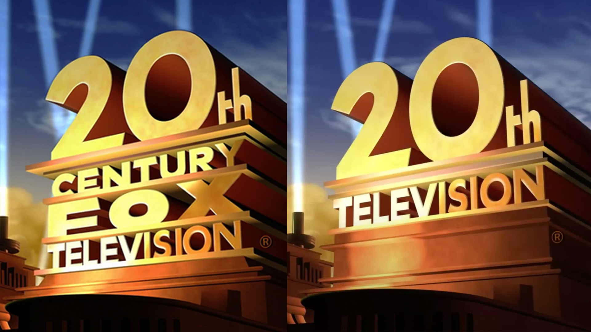
Disney's new 20th Century Fox TV logo is a real head-scratcher
The mouse has dropped the fox.
It's one of the most famous logo/fanfare combinations in the world, but the 20th Century Fox Television logo just became a lot shorter – in name, at least. The studio is the latest to lose its 'Fox' branding after being acquired by Disney last year, and is now simply known as 20th Television.
As far as the logo itself is concerned, rather than design a new logo, Disney has opted to shorten the existing one. Like a sandwich without a filling, the new logo is basically the old one with 'Century Fox' removed, bringing '20th' and 'Television' together. The original logo was instantly recognisable (a feature of the best logos of all time), but how does this new version fare?

The change feels similarly obtuse to this January's 20th Century Fox rebrand (now 20th Century Studios), but by hacking words away from the name instead of changing them, this one seems even more strange. Without the word 'Century', that '20th' makes little sense. Instead of the historical gravitas of an entire century, we're now imagining a room full of televisions (and wondering what's so special about the 20th one). Could Disney not have gone for 20th Century Television instead – or even, seeing as it's the century we're in now, 21st?
Design-wise, however, the new logo thankfully maintains the iconic look of the original (complete with searchlights) and should remain instantly recognisable – especially when paired with that famous fanfare. The new logo will appear at the end of various TV shows this year, including The Simpsons, Family Guy, American Dad and more.
What a bad name. Sure drop “Fox” from it, but why not keep it as “20th Century Television”? https://t.co/0TT6Us39drAugust 10, 2020
Disney Television Studios has announced three rebrands this week. Along with 20th Television, Fox 21 Television Studios is also losing its fox to becoming Touchstone Television. ABC Studios and ABC Signature, meanwhile, are merging under the ABC Signature name.
Introducing the official Twitter of Disney Television Studios! Our three studios @20thTelevision, @ABCSignature & @TouchstoneTV make your favorite TV shows! Be sure to follow all of us for updates! pic.twitter.com/PaCPCSm0NmAugust 10, 2020
It makes sense for Disney to want to keep its portfolio Fox-free seeing as the latter is now newly independent (and revealed its own new logo last year). And while 20th Century Fox Television's new name is a bit of a head-scratcher, at least its less of a mouthful, with a logo that holds onto its iconic heritage. If you're keen to get your Disney TV fix, here's how to get 15% off Disney+.
Read more:
Get the Creative Bloq Newsletter
Daily design news, reviews, how-tos and more, as picked by the editors.

Thank you for reading 5 articles this month* Join now for unlimited access
Enjoy your first month for just £1 / $1 / €1
*Read 5 free articles per month without a subscription

Join now for unlimited access
Try first month for just £1 / $1 / €1

Daniel John is Design Editor at Creative Bloq. He reports on the worlds of design, branding and lifestyle tech, and has covered several industry events including Milan Design Week, OFFF Barcelona and Adobe Max in Los Angeles.
