New 2028 Olympic logo tries to please everyone (and fails)
The LA28 logo is ever-evolving, but some people aren't happy.

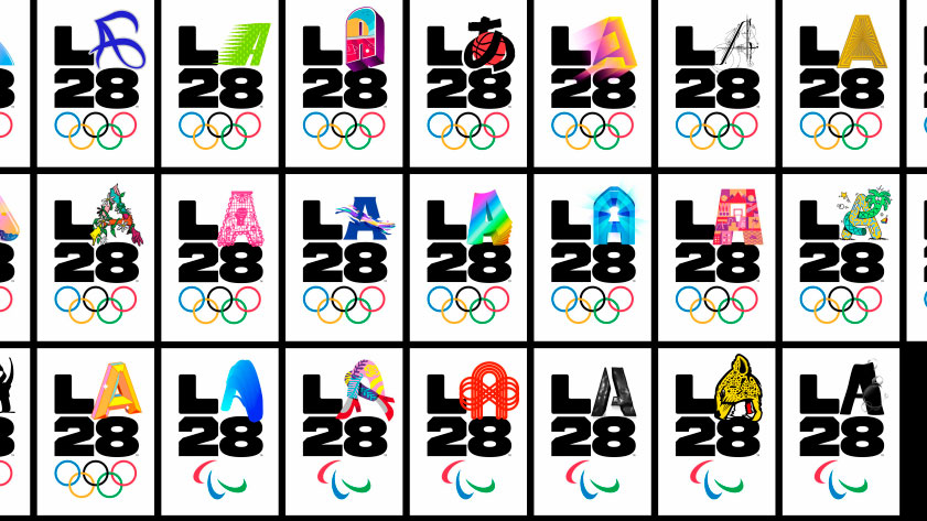
For those not in the know, the 2028 Olympic and Paralympic Games will be held in Los Angeles, and will be called LA28 for short. Yesterday, the games' organising committee released a dynamic animated emblem for LA28, created for the digital age. It's a constantly changing logo, designed to evolve over time to reflect the city's diverse spirit and represent a spectrum of the city's stories, which have come from over 20 residents of LA.
Showcasing the sort of graphic design innovation that goes into the best logos, the mark's 'L', '2' and '8' are static elements, but the shapeshifting 'A' is the star of the show. The 'A' morphs into 26 different forms as diverse as a pair of dancing legs and a cheetah, which represent different elements of the city and its population.
We are a community of inspired individuals and fearless dreamers. It’s time we made our mark. #LA28 #LA28Creator pic.twitter.com/XagKkA5d9aSeptember 1, 2020
The Los Angeles Organising Committee for the 2028 games released the above video on Twitter, with a snapshot of just a few of the 26 logo designs, which were designed by a troupe of artists, celebrities and athletes, including actor Reese Witherspoon, tattoo artist Dr Woo and figure skater Andrew Rippon. Further designs will be added in the run up to the games, to showcase more of LA's stories. (We would've thought at least two more, to make it up to 28, would tie things up nicely.)
"Los Angeles defies a singular identity, and there's not one way to represent LA," said LA28 Chief Athlete Officer, who is also a five-time Olympic gold medallist. "LA is what it is because of the people and the LA28 Games should represent that."
Creatives' reactions to the logo have been mixed, with some applauding the design:
Am digging the interchangeable 'A' used within the LA28 Olympics logo, especially this one. pic.twitter.com/WMHYWzC3teSeptember 1, 2020
One preferred the incarnation designed for the bid, which is markedly different and, dare we say, more polished.
That's just the logo for their olympic bid.September 2, 2020
Perhaps the problem with having so many logos is that no one is going to like them all, and some people who dislike one or two will be inclined to discard the whole concept. There's already been plenty of criticism of the LA28 logos, with comments ranging from the main font being 'childish', and it looking bland, to the logos being "straight up terrible".
Get the Creative Bloq Newsletter
Daily design news, reviews, how-tos and more, as picked by the editors.
One creative, though, was so inspired, he designed his own version of the 'A':
my addition to @LA28’s new logo… pic.twitter.com/rLQ3BgoJpJSeptember 1, 2020
Of course, Olympic logos always spark discussion and are often derided at first, remember the Tokyo 2020 design confusion and how the Paris logo was mercilessly mocked? And, of course, the London logo wasn't widely appreciated when it was released. We're looking forward to seeing how the logo continues to evolve before 2028 and keeping our fingers crossed that public events will be back on track by then.
Read more:

Thank you for reading 5 articles this month* Join now for unlimited access
Enjoy your first month for just £1 / $1 / €1
*Read 5 free articles per month without a subscription

Join now for unlimited access
Try first month for just £1 / $1 / €1

Georgia is lucky enough to be Creative Bloq's Editor. She has been working for Creative Bloq since 2018, starting out as a freelancer writing about all things branding, design, art, tech and creativity – as well as sniffing out genuinely good deals on creative technology. Since becoming Editor, she has been managing the site and its long term strategy, helping to shape the diverse content streams CB is known for and leading the team in their own creativity.
