10 iconic logos hilariously drawn from memory
How accurately can you remember these famous symbols?

This article was originally published in September 2017.
The world’s most famous logos are designed to be memorable. From Apple to McDonald's, the logo designs of the biggest companies across the globe are meticulously crafted to conjure instant brand association.
So how ingrained are these logos in our minds? To find out, custom signage firm Signs.com asked over 150 Americans to draw 10 famous logos from memory as accurately as they could in half an hour.
The results range from close to comically skewed, with brand elements repositioned, re-angled and reimagined with fabulous freedom.

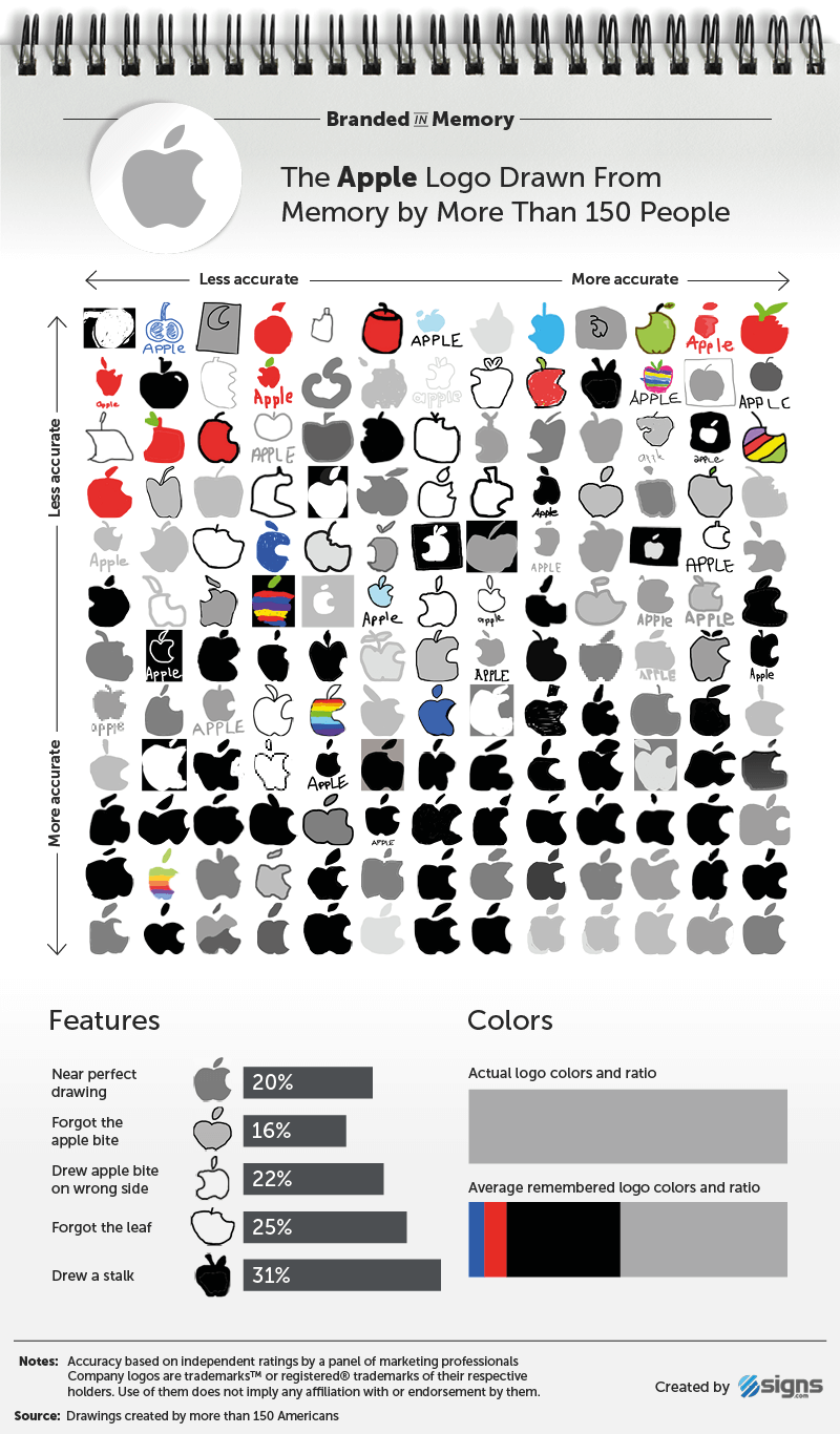
Nearly one in three people gave the Apple logo a stalk (it doesn’t have one), and 22 per cent put the bite on the wrong side; while one in 10 people drew the adidas trefoil logo – which was introduced in 1971 and still in use – instead of the three stripes version, which was launched in 1997.
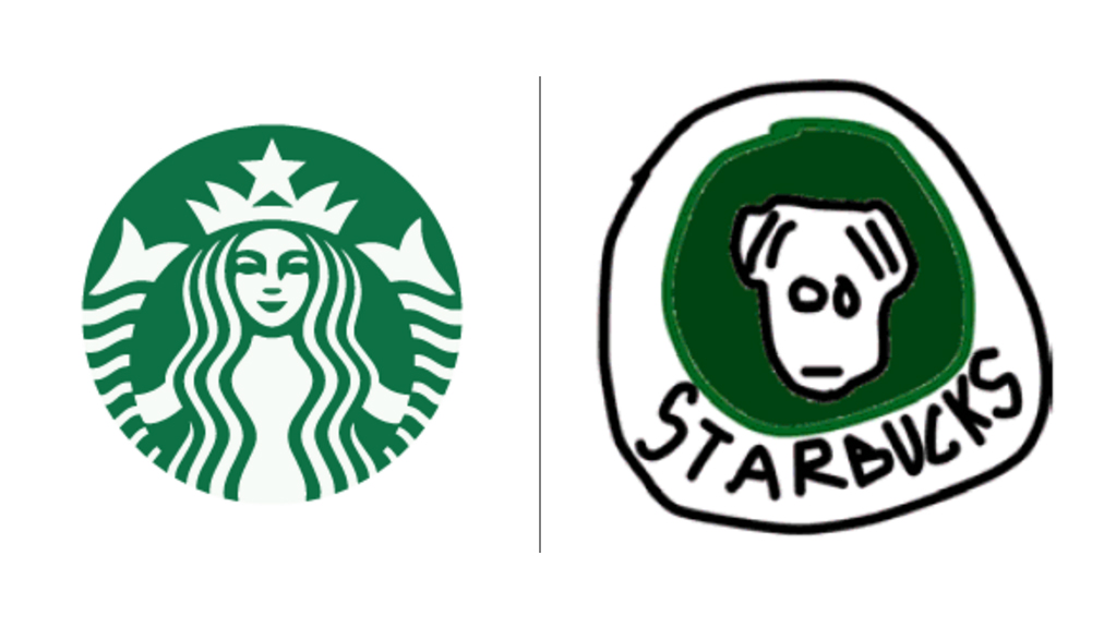
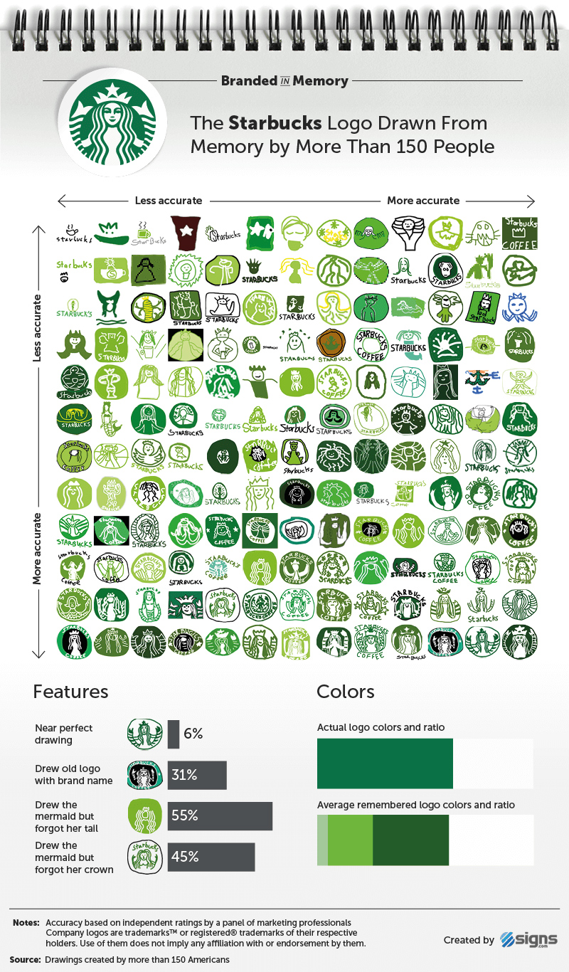
And nearly half the people tested thought the Starbucks mermaid doesn’t wear a crown (she does).

So what can we learn from this exercise? Primarily that brand colours are easier to remember than shape – more people correctly identified the colour palette than any other element. And that the most successful logos use colour (and colour theory) to differentiate from their competitors.
Get the Creative Bloq Newsletter
Daily design news, reviews, how-tos and more, as picked by the editors.
Importance of brand colour
Karen Haller, a leading authority in the field of applied colour psychology, highlights the challenge facing logo designers in our article The designer’s guide to using colour in branding:
“People have an emotional connection with colour first. Then we take in the shapes, the logo, and we read the words,” says Haller. “If we sense a mismatch, it’s the colour we don’t believe, despite the beautifully crafted words.”
So could you do any better? You can see some of the drawings below for each logo. And if you fancy having a go yourself, head over to Signs.com to take the quiz yourself (you’ll find it at the bottom of the page).
Via LogoDesignLove.
Related articles:

Thank you for reading 5 articles this month* Join now for unlimited access
Enjoy your first month for just £1 / $1 / €1
*Read 5 free articles per month without a subscription

Join now for unlimited access
Try first month for just £1 / $1 / €1

Julia is editor-in-chief, retail at Future Ltd, where she works in e-commerce across a number of consumer lifestyle brands. A former editor of design website Creative Bloq, she’s also worked on a variety of print titles, and was part of the team that launched consumer tech website TechRadar. She's been writing about art, design and technology for over 15 years.
