Twitter gets a grungy new rebrand, but has it messed things up?
Only the bird remains unruffled.

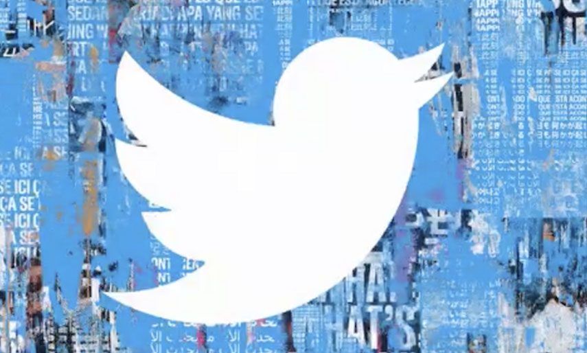
Twitter has ruffled its own feathers in a rebrand designed to reflect the 'living, breathing' nature of the conversations happening on the platform. The renowned bird vector remains the same, but instead of sitting on a plain blue background, Twitter has gone decidedly grunge by creating a collage-like canvas interspersed with faces and words.
Apparently, its users are the inspiration for the new look, and after a turbulent year full of diverse issues – which were undoubtedly discussed on Twitter – we can see how the messy texture is an apt choice. If you're rebranding, try playing around with designs using these top Illustrator tutorials.
The conversations on Twitter are messy and complex, intense and inspiring, hilarious and ridiculous, weird and ugly, shocking and beautiful, disturbing and moving. They’re raw and they’re real. pic.twitter.com/9Q05SymB6sJanuary 27, 2021
Twitter's CMO Leslie Bertrand revealed the rebrand in the above tweet, and went on to explain the process that went into the redesign. The new design includes a brand new typeface, called 'Chirp' (get it?), with the collage effect created by tearing materials apart, layering over them, adding paint and scratching it off again.
Along with the collage background is a bunch of new gifs, videos and images – all equally as bold and vibrant, and shouting out messages taken from tweets from users past. Find out more in Bertrand's tweets below (and explore Bertand's 17-tweet long thread here).
As always, we started with Tweets at the center. We then tore stuff apart and layered over again. We threw paint on photos, ripped posters, scratched out words, and faded images. We added textures and pixels, movement and memes. pic.twitter.com/VygJaLmniOJanuary 27, 2021
Here are more examples of the work👇 We’re excited to hear your thoughts and share more as this evolves over time reflecting the beautiful, bold, complex conversations that shape Twitter, our lives and the world. pic.twitter.com/AOEMZU6jkTJanuary 27, 2021
pic.twitter.com/cUXkTp0PzqJanuary 27, 2021
Twitter is making more of a statement about what it actually is than ever before. The leap from clean, minimal design into this ultra-modern, grungy aesthetic shows the platform is owning its space in the social sphere – a place that is sometimes challenging to be part of. As a brand, Twitter has graduated from being a blank canvas for the actions of its users to being the users themselves (or maybe the minimal bird is Twitter, and it is sitting upon the messy background of its users... are we overthinking this?).
As raw as it is highly-cultivated, the rebrand reflects something of the true experience of being on Twitter, and it's an honest design in that respect. It certainly packs a punch as being as far from the flat design trend as you could get. But given the minimal bird already serves as the necessary, transferrable 'flat' part of the design, playing with the background is a clever way to get around the pitfalls of flat design. Not sure what those pitfalls are? Explore the recent discussions around the problems with the flat design movement.
We look forward to seeing how the brand evolves from this latest aesthetic, and whether its users think the messy look is, well... a mess.
Get the Creative Bloq Newsletter
Daily design news, reviews, how-tos and more, as picked by the editors.
Read more:

Thank you for reading 5 articles this month* Join now for unlimited access
Enjoy your first month for just £1 / $1 / €1
*Read 5 free articles per month without a subscription

Join now for unlimited access
Try first month for just £1 / $1 / €1

Georgia has worked on Creative Bloq since 2018, and has been the site's Editor since 2022. With a specialism in branding and design, Georgia is also Programme Director of CB's award scheme – the Brand Impact Awards. As well as immersing herself with the industry through attending events like Adobe Max and the D&AD Awards and steering the site's content streams, Georgia has an eye on new commercial opportunities and ensuring they reflect the needs and interests of creatives.
