Why your website needs a real-world element
Bridge the gap between people and a product or service by introducing a real-world element, says Gene Crawford.
Often when we commence work on a new website design, we focus on creating all the visual assets ourselves inside our design application.
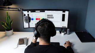
We begin with shapes and fonts, then move on to thinking through colours - or whatever it is you do as your thought process. But you can also start with things from the real world. Maybe you have some great imagery that got generated from a photo shoot, or maybe there's something interesting-looking from your client's office or your own desk that's worth using as a design element.
Bridge the gap
The idea is to pull the visitor out of the browser mentally and have them start thinking about the company or product behind the website as a real live entity or thing. This can help humanise what you're designing for, and bridge that gap between people and the product or service quickly. Using a real-world element as a focal point or even as the underlying visual direction in your work is a great way to build on this and accomplish some solid branding goals overall.
Using the desktop metaphor isn't new, but there have been a few major product website launches recently that rely on it to help lead the potential customer into the mentality of using the product. The desktop is where most of us sit all day and is something we can relate to immediately. Helping customers envision themselves using your product builds trust and understanding before they've even left the homepage.
Make them relate
A good way to get customers to make a purchase or decide to hire your company is to get them to relate to you on a personal level. Showing pictures of your office, or the people in your company doing the work they'd be hiring you to do can help this along in an immediate way.
Here are five examples to check out...
01. MailChimp
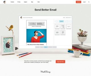
The email marketing app MailChimp uses desktop elements to help customers associate with the app on a human level and relate themselves to the brand.
02. Squarespace
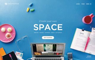
The blogging platform Squarespace visually uses the desktop metaphor to place the customer into its environment using the application.
03. I Shot Him
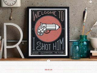
The design firm I Shot Him () uses a photo of its logo in a picture frame as the main hero image, as well as weaving in images of its team doing things throughout the website to help connect you to them personally.
04. House
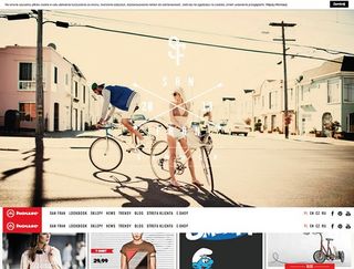
The fashion ecommerce website House uses photos of people who look like target customers using the products to form an association to the products. This isn't new, but this is a great example of it as a main design element in the hero image.
05. Playground
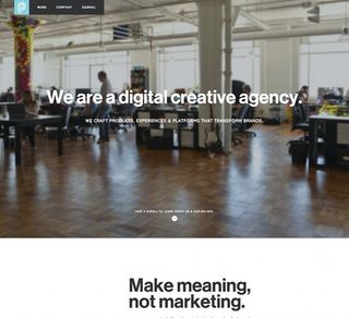
The design firm Playground literally uses an oversized image of their office so you can see them at work.
Words: Gene Crawford
Gene Crawford's projects include www.unmatchedstyle.com and conferences such as www.convergese.com. This article originally appeared in net magazine issue 246.

Thank you for reading 5 articles this month* Join now for unlimited access
Enjoy your first month for just £1 / $1 / €1
*Read 5 free articles per month without a subscription

Join now for unlimited access
Try first month for just £1 / $1 / €1
Get the Creative Bloq Newsletter
Daily design news, reviews, how-tos and more, as picked by the editors.
The Creative Bloq team is made up of a group of design fans, and has changed and evolved since Creative Bloq began back in 2012. The current website team consists of eight full-time members of staff: Editor Georgia Coggan, Deputy Editor Rosie Hilder, Ecommerce Editor Beren Neale, Senior News Editor Daniel Piper, Editor, Digital Art and 3D Ian Dean, Tech Reviews Editor Erlingur Einarsson and Ecommerce Writer Beth Nicholls and Staff Writer Natalie Fear, as well as a roster of freelancers from around the world. The 3D World and ImagineFX magazine teams also pitch in, ensuring that content from 3D World and ImagineFX is represented on Creative Bloq.
